As the Kips Bay Decorator Show House opens its doors in Dallas, Business of Home takes a peek at its dazzling interiors—and taps its 27 designers for tips on how to navigate the showhouse process, even in a pandemic.
The Garden Within by Rottet Studio
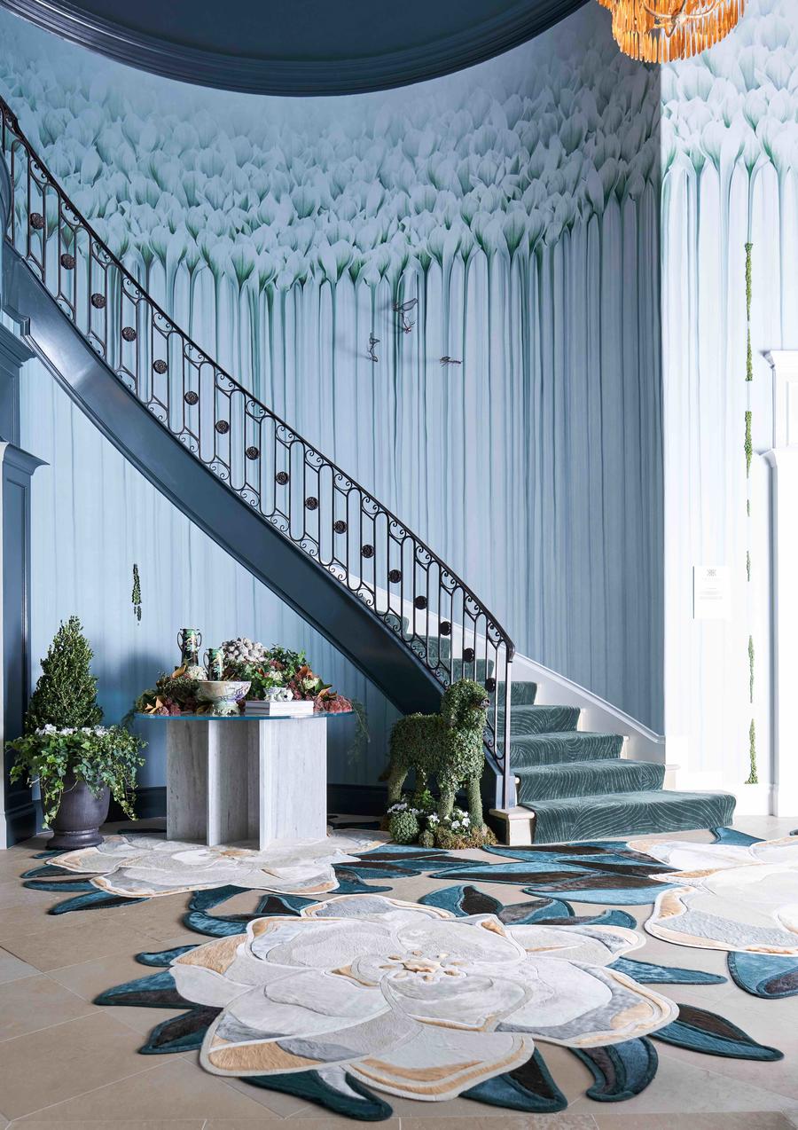
Rottet Studio principal designer Lauren Rottet designed this striking entryway as an immersive cleansing experience from the urban outdoors—there’s even a white marble fountain for washing up. The curve of the banister and an elegant magnolia wallpaper draw the eyes upwards.
Greatest challenge: “It was the first time [we designed] in such a prominent location, and my team almost had a heart attack trying to install with so much foot traffic in and out, but at the end of the day, we got to know so many of the amazing designers, sponsors, contractors, painters and electricians.”
Designer’s advice: “Don’t take no for an answer. Ask for what you need to realize your vision—it may seem out there, but the manufacturers, installers and crews are more than willing to help.”
Artistic Influence by M Naeve
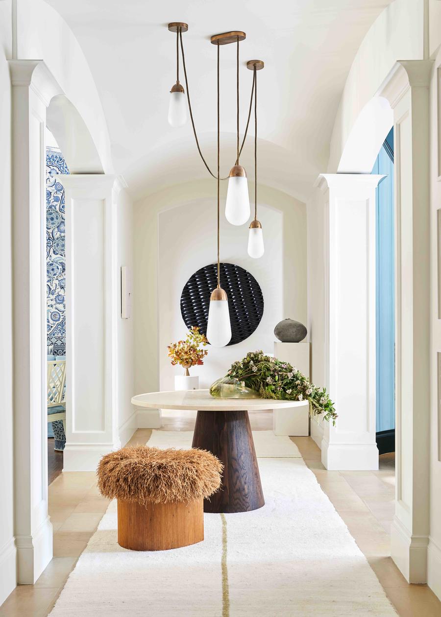
Dew-drop light fixtures are posed dynamically in this powder room designed by Margaret Naeve Parker of M Naeve. Rustic elements take on a refined, sculpted character, united by natural materials and a warm neutral palette.
Greatest challenge: “In my small powder room, [there] was a huge door to an electrical closet. To end up with the design I was seeking, I installed integrated plaster shelving in the door’s original location.”
Designer’s advice: “Make your decisions quickly. Construction always takes longer than you think, so be sure to order those long-lead items immediately.”
A Lady’s Study by Jan Showers
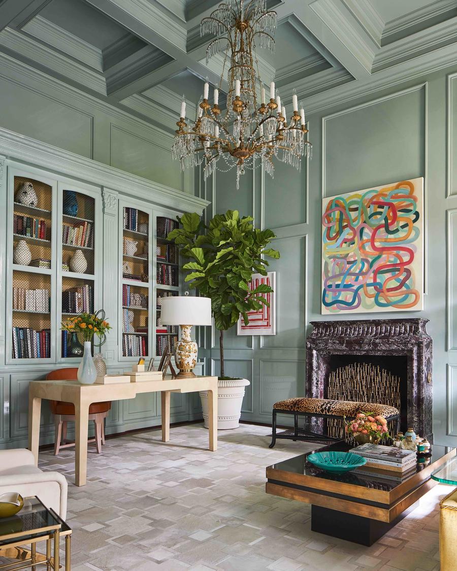
Inspired by feminine elegance, this lady’s study speaks to timeless grace with refined boiserie clad in mint, contemporary artworks, and Jan Showers’s signature refined mix of eras and styles.
Biggest surprise: “This was my first showhouse—I have never had time or taken the time to do one in the past. The biggest surprise for me was how willing and eager all of our sources were to loan or donate for our room. No one said no!”
Designer’s advice: “Installing quickly and well requires a high degree of organization. Get your ducks in a row as early as possible—and make sure they are all where you think they are—so it’s not so difficult on install day.”
The Great Escape by Kirsten Kelli
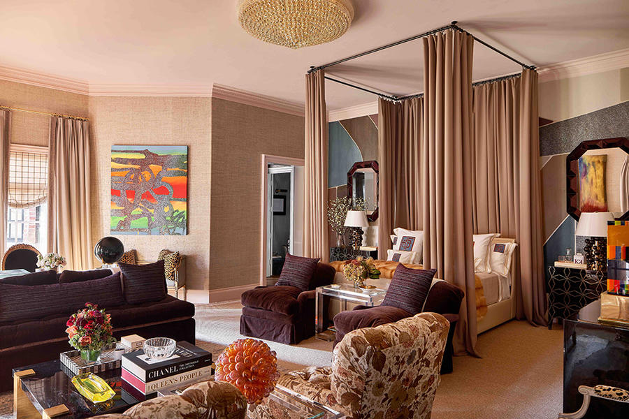
Designer duo Kirsten Fitzgibbons and Kelli Ford created this bedroom as a sanctuary, incorporating jewel-tone details and rich textiles against a glowing backdrop for a gentle welcome. In this room, Kirsten Kelli, often known for saturated designs, deftly demonstrates how a medley of nearly neutrals can combine into a statement look that’s still soft.
Greatest challenge: “The windows are so beautiful, but a tricky shape. We initially wanted to put a window seat in, but are so glad we ultimately decided to do the Allan Knight desk.”
Designer’s advice: “Layer things throughout. From bedding to wallcoverings, art to accessories, layering creates such a lush and rich visual experience.”
Bathed in Moonlight by Doniphan Moore Interiors
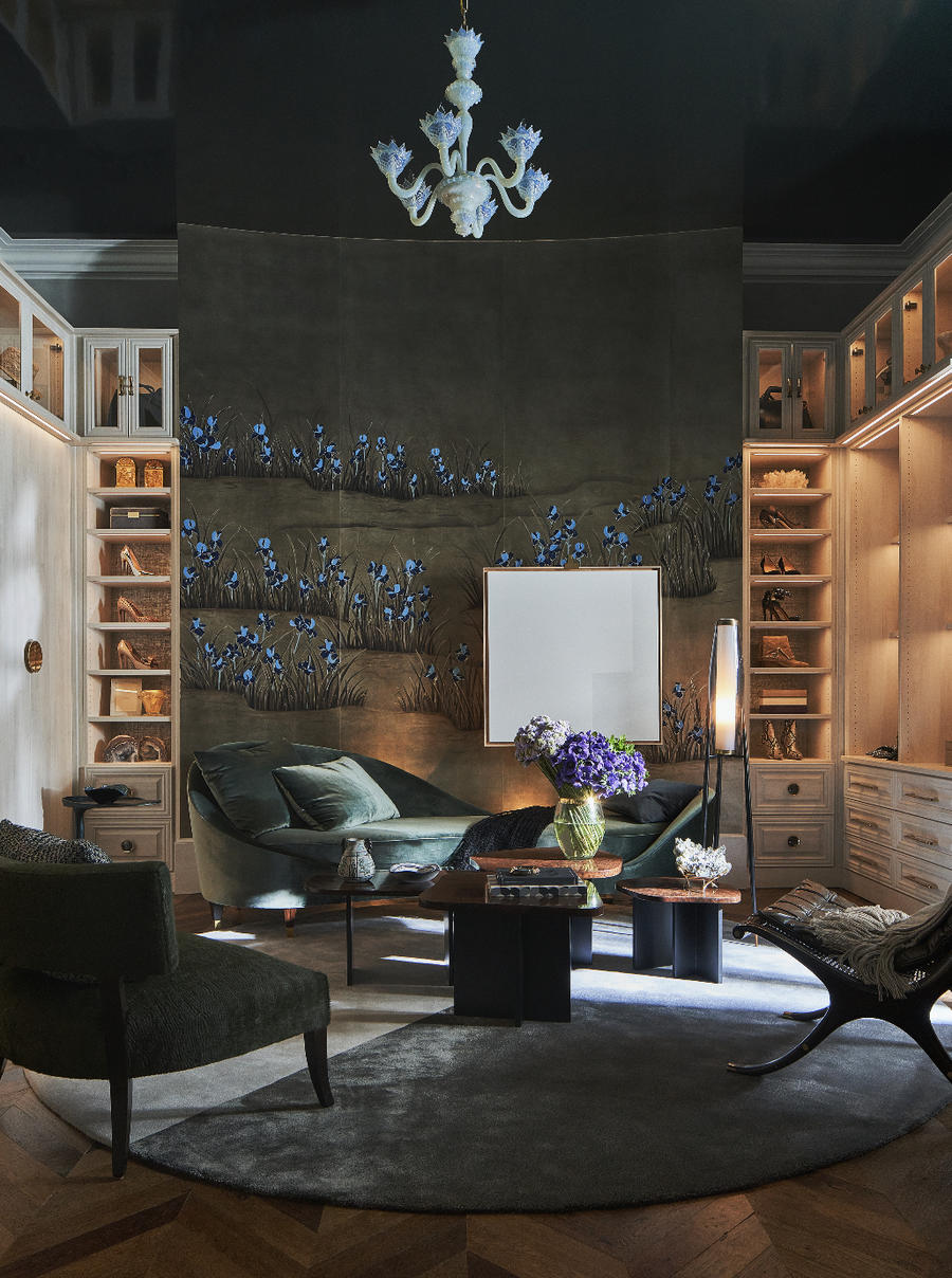
Doniphan Moore, tasked with designing the master bathroom and dressing closet, dreamed up a moody retreat clad in dark metals, ocean greens and an iridescent wallcovering.
Biggest surprise: “Many of the vendors I worked with were very generous with their time and resources, and further strengthening or building new vendor relationships was one of the most enjoyable parts of the Kips Bay design process for me.”
Designer’s advicei “Listen to your gut—if there is a room in particular that speaks to you, or a timeline from a vendor just doesn't seem like it will work, follow your instincts. There isn't enough time to overthink things.”
Casa Fiorentina by Mark D. Sikes Interiors
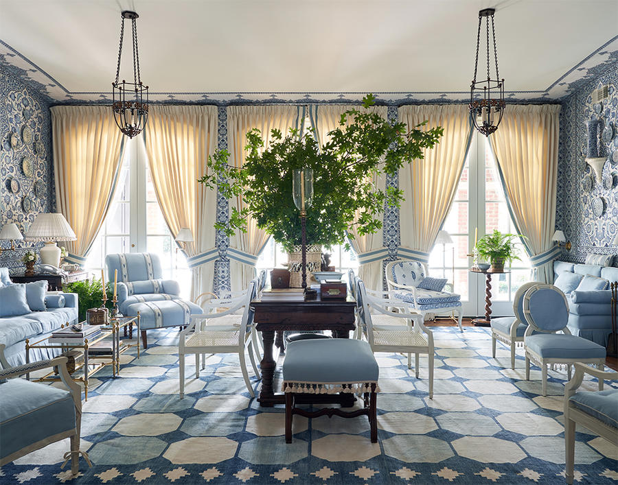
Layers of checks, stripes and paisley come together in this living room designed by Mark D. Sikes. Inspired by the iconic Florentine fashion label La Fiorentina, Italian and Portuguese antiques find themselves surrounded by the designer’s signature blue-and-white palette.
Greatest challenge: “Coordinating a showhouse during COVID was a challenge, but with projects all over the country, we are used to working long distance with wonderful vendors and artisans. It’s all about communication!”
Designer’s advice: “A showhouse is a great opportunity to let your creativity shine—think about a space you’ve always wanted to design but haven’t had the right client to do it for yet. Be true to yourself and design what you love. That authenticity will come out in the room.”
Dining Room by Cathy Kincaid Interiors
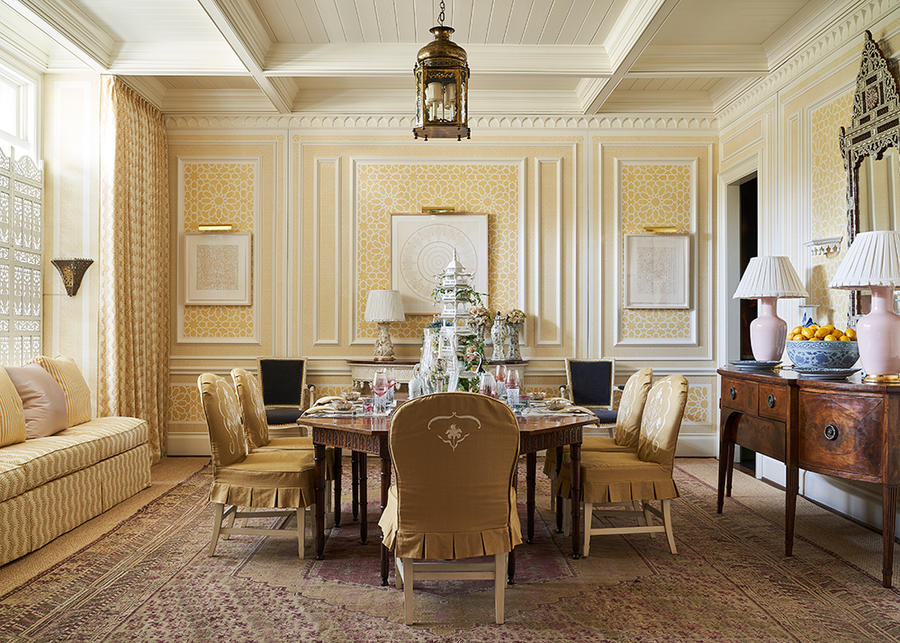
It’s all about the details in this muted lemon dining room by Cathy Kincaid: Custom moldings, a Moorish brass pendant, the carved antique dining table, and skirted dining chairs make for a rich yet welcoming space.
Greatest challenge: “Our dining room called for custom plaster palm trees in each corner, and the palm fronds were not ready in time for press previews and photography. We simply moved on and our photographer was flexible, and came back in time for the showhouse to open.”
Designer’s advice: “Really challenge yourself to bring your most creative ideas and take a chance.”
Bunny Mellon Collie and the Infinite Sadness Bar by Sees Design
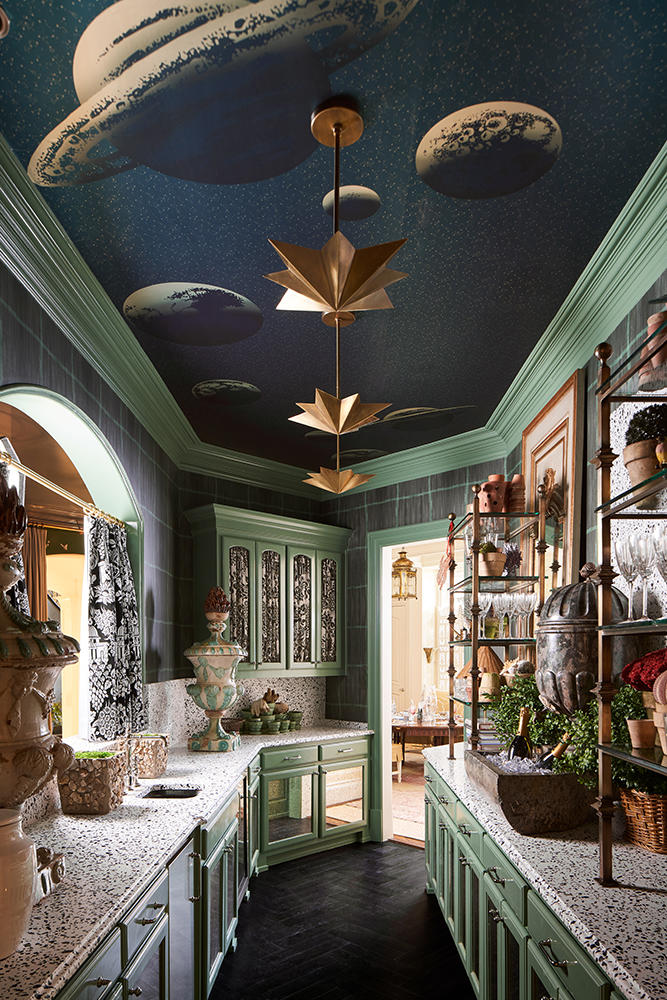
More is more is more in this space by Corbin See, who paired speckled countertops and patterned fabrics with aqua cabinetry and a bold celestial ceiling mural in this Bunny Mellon–inspired bar.
Biggest surprise: “We were blown away by the camaraderie between all of the designers. One of the best memories will be of the new friendships we’ve made during this incredible process.”
Designer’s advice: “Like on any project, the more decisions you can make upfront, the better.”
Emerald Garden by M Interiors
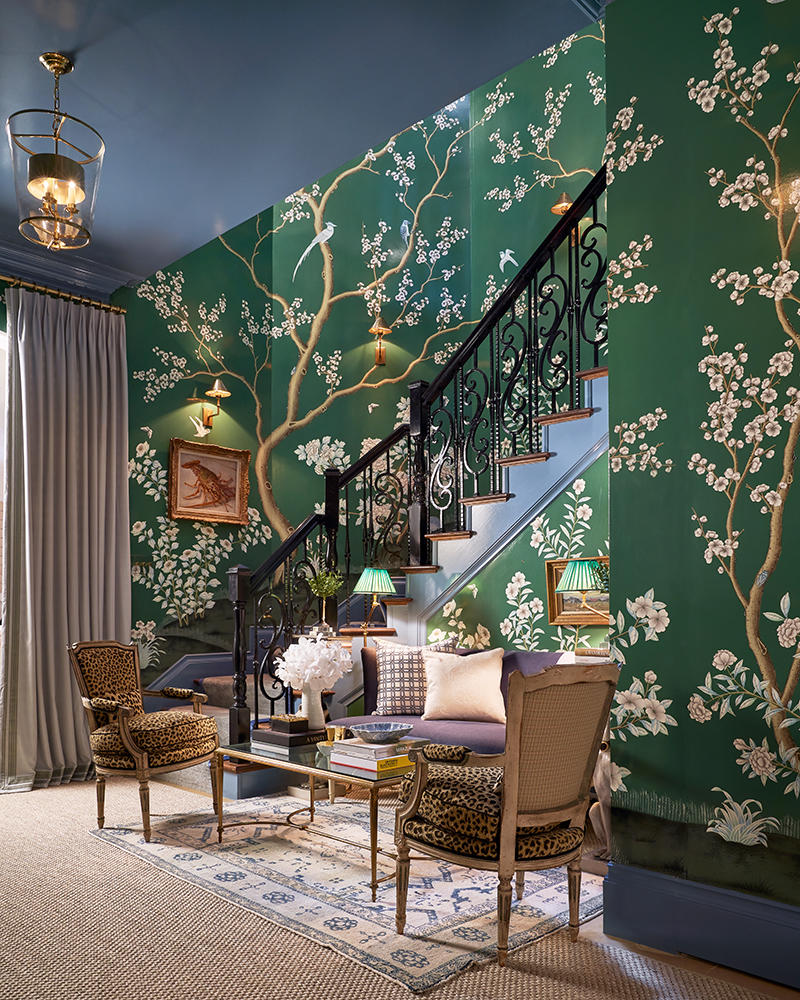
A rich emerald wallcovering by Gracie Studio sets the stage for this back staircase landing designed by Melissa Morgan of M Interiors, where bold leopard upholstery mixes with traditional silhouettes.
Greatest challenge: “The biggest challenge in the space was the shape of the area. It was an oddly shaped center hallway, but we decided to utilize the spaces to create two distinct areas—one small and cozy seating area and another writing table area.”
Designer’s advice: “Start as early as you can. The timelines are extremely short and every day counts. Stay organized and stay calm.”
The Morning Lounge by Marcus Mohon Interiors
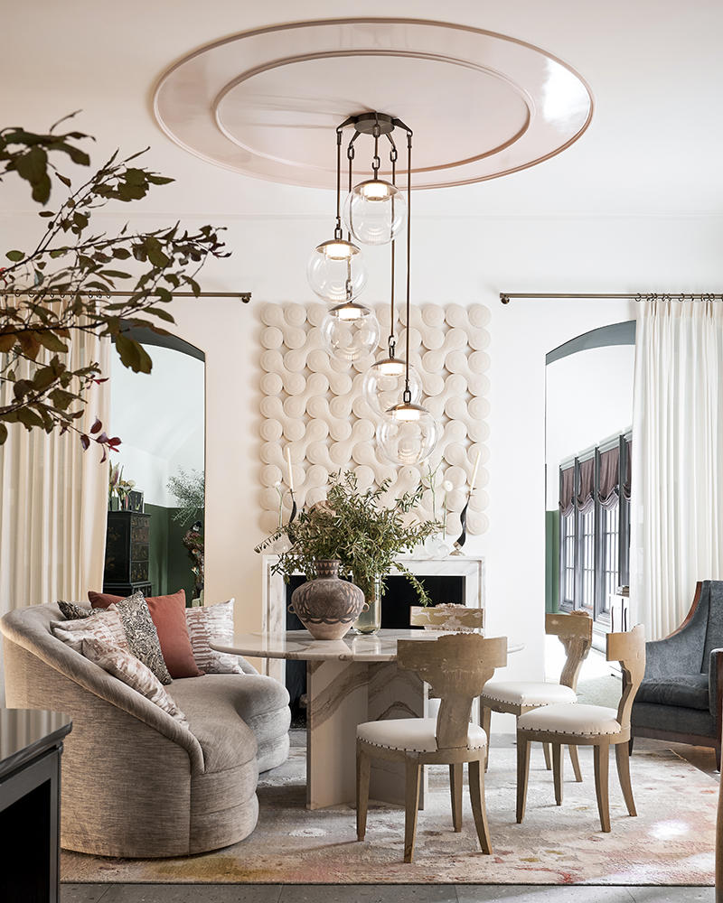
Creamy tones and curved forms dominate the design vernacular in this luminous lounge.
Greatest challenge: “We had an unusually shaped, land-locked space surrounded by other rooms on all sides, so we draped the entire room in sheers by The Shade Store to create mystery and romance.”
Designer’s advice: “Throw both caution and restraint to the wind. This is your opportunity to unleash your dreams!”
A home with the Beachenes from Monte Carlo by Chad Dorsey Design
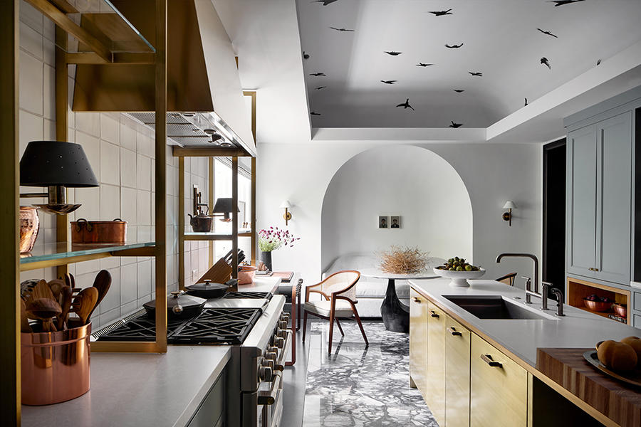
Clean lines and luxurious materials accentuate the architectural elements of this kitchen created by Dallas-based designer Chad Dorsey.
Biggest surprise: “Taking an ugly duckling and making it special is one of my favorite things to do. I always find great reward in a transformation. Deciding to divide the kitchen, [whose] existing materials were very dated and bland, into two unique spaces ultimately became a highlight—they have different requirements and a different feel.”
Designer’s advice: “Keep it edited and real. Too much is not better.”
Walk My Way by Erin Sander Design
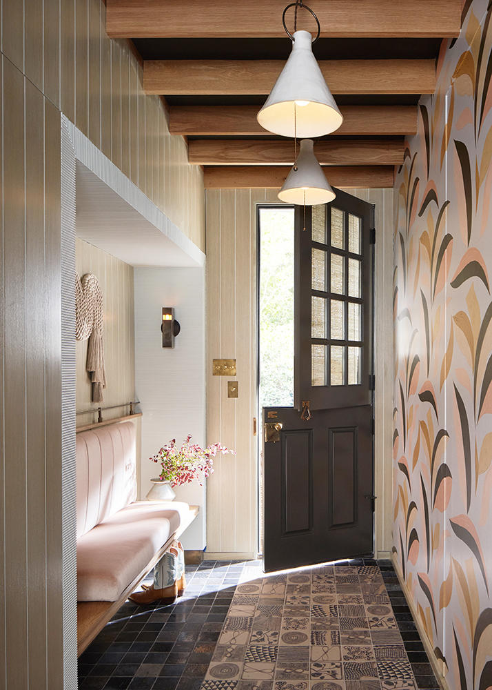
In the mudroom, playful floor tiles, a bright wallcovering and exposed beams are eye candy for those perched on the pale pink bench.
Biggest surprise: “This is our first time doing a showhouse, and we were completely amazed at how a host city, national organization and a design community could rally to pull this event off on such a short timeline during a pandemic. We all leaned on each other (from a social distance) and pulled through as a community.”
Designer’s advice: “Dream, plan and then dream some more.”
We Tell Ourselves Stories by Viviano Viviano
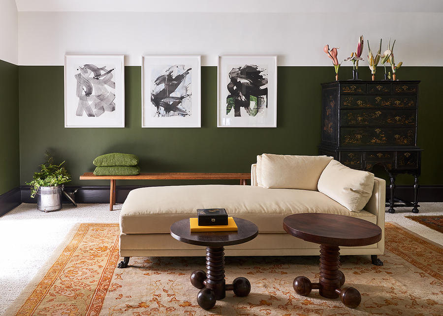
On one side of the family room, traditional materials find a playful expression: custom chaises supported by bronze lion’s-paw feet, novelty accent tables, and cartoon floral sculptures.
Greatest challenge: “We had a few pieces that were meant to be shuttled up from Houston, where we are based, but were stuck due to a COVID outbreak with one of our shippers. We were so lucky that Sputnik Modern and some of our other wonderful Dallas vendors and partners helped us by loaning pieces.”
Designer’s advice: “Be prepared with a slush fund dedicated to the showhouse. It’s a significant expense, there’s just no way around that. At the same time, keep a close eye on your spending.”
Garden of Erdem by Dina Bandman Interiors
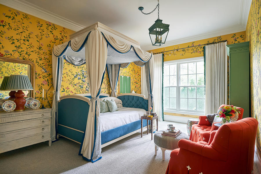
Bright primary colors dominate this guest bedroom by Dina Bandman, who envisioned it as a mini retreat for overnight visitors: Gold hand-painted wallpaper from de Gournay and Erdem Moralioglu, a green pendant, red custom armchairs, and a blue daybed hum with sophistication.
Greatest challenge: “We had a very short lead time for our custom daybed, and working with an out-of-state workroom with limited lead time was a major endeavor. It didn’t allow us to do the shop drawing revisions we typically do to ensure everything will be exact and all questions answered.”
Designer’s advice: “Be organized and prepared—and know that you will be working with quicker turnaround times than normal, which is a particular challenge with custom pieces.”
Flights of Fancy by Traci Zeller Interiors
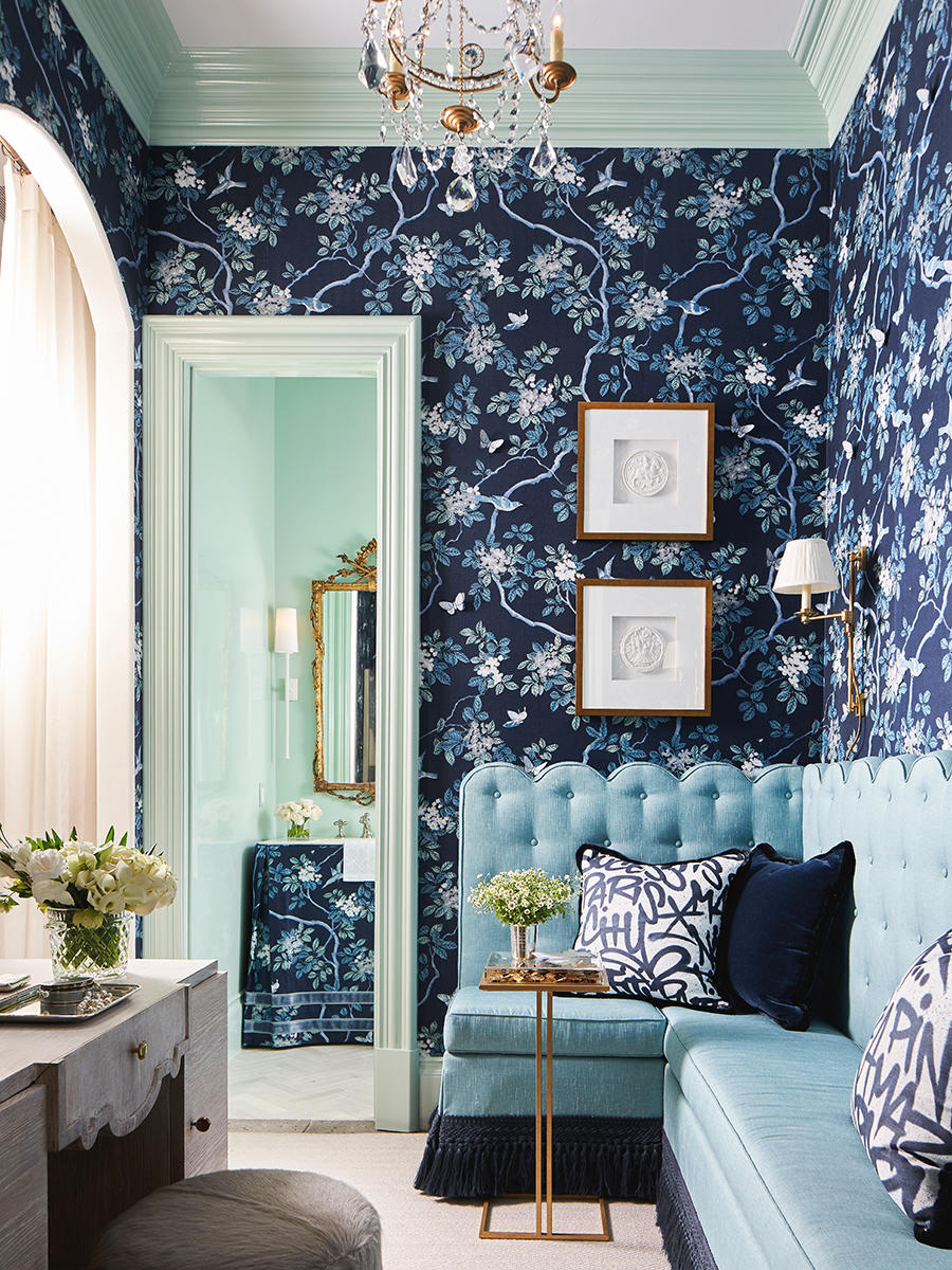
“Words have no wings, yet they can fly a thousand miles,” was the guiding proverb for the gossip room and powder room by Traci Zeller, where a stunning sapphire wallpaper sets off a custom scalloped banquette trimmed in tassels and fringe.
Greatest challenge: “My biggest challenge was products that simply weren’t available to me, most often because the vendor was unable or unwilling to meet the short production deadline. Sometimes I had to start over, but I’ve also learned to view some of those perceived snafus as happy accidents.”
Designer’s advice: “You have to roll with the proverbial punches, because something will invariably go wrong. The corollary to this advice is to hire the best possible trades, because those trades are the ones who will problem-solve for you.”
La Matadora by Tracy Hardenburg Designs
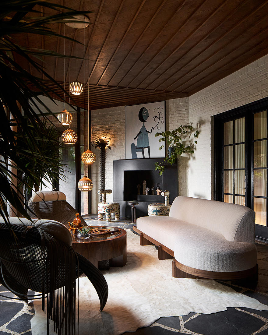
Dark woods and a hide rug create masculine energy in this screened-in porch space filled with seating by Janus et Cie and a statement chandelier by Heather Levine.
Greatest challenge: “My room is the screened-in porch, so there was little wall space for art. So I got creative to bring the design to life through special touches.”
Designer’s advice: “As soon as you are selected, get to work! Every room has a unique design challenge, so planning is vital.”
The Covered Veranda by Kevin Spearman Design Group
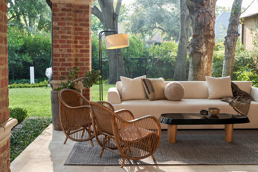
In this outdoor space, designer Kevin Spearman set out to create a simple, serene area using materials like wicker and linen to evoke a relaxed getaway feeling.
Greatest challenge: “Time was of an essence. We utilized local workrooms to produce custom upholstery pieces, which allowed us to meet our deadlines.”
Designer’s advice: “Understand it is going to cost more money than you expect, but also that you have to spend money to make money. And know it’s a ton of hard, obsessive work!”
Magari Garden by Melissa Gerstle Design
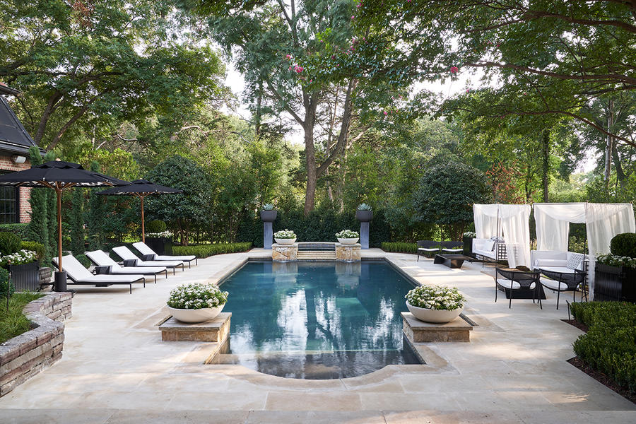
Melissa Gerstle was inspired by the Italian gardens of Villa Caprarola for these poolside spaces, playing with bold geometries and a monochromatic color scheme to create drama.
Greatest challenge: “The obstacles I faced and overcame were tight time schedules, delivery issues and Mother Nature! We were working outside and there were torrential rains that made the site unworkable at times, [so] we really had to work quickly and efficiently.”
Designer’s advice: “[The showhouse] really supports you in getting everything you need in time, and will even support you with marketing. They really care about the end result.”
Room 1 by Letitia Huckaby
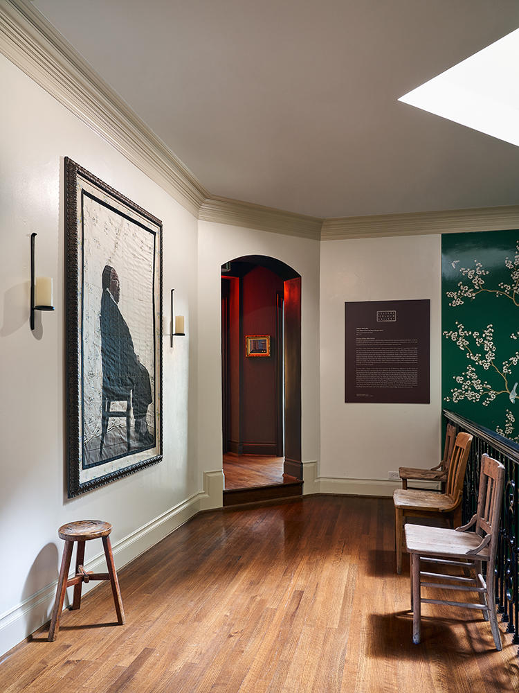
Artist Letitia Huckaby selected Sister Rebecca, one of the largest paintings from her Bayou Baroque series, for its commanding scale and message of strength.
Greatest challenge: “Our challenge was finding the right piece for one wall and making the work shine while complementing the rest of the space—all before knowing what was going to happen [with the rest of the room]! As small as one wall can seem to be, if it’s not the right approach, it will not work.”
Designer’s advice: “Have fun! Everything is a challenge, but you always learn from new experiences.”
Turkish Writer’s Lair by Michelle Nussbaumer
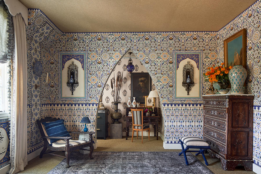
Designer Michelle Nussbaumer used Turkish and Morroccan patterns, including fabrics and trims from Clarence House and wallpaper from her collaboration with Paul Montgomery, to create an immersive writer’s lair.
Greatest challenge: “The room was a really nondescript, architecturally insignificant room. I was initially disappointed, but then decided to open up the closet and create a writer’s nook and bar. We knocked out the wall and created a Moorish arch that brought the space to life architecturally.”
Designer’s advice: “Get started early, meet all of your deadlines, don’t lag behind. There will be glitches along the way and you will need time to troubleshoot those.”
Guest Room for a Sophisticated Traveler by Wells Design
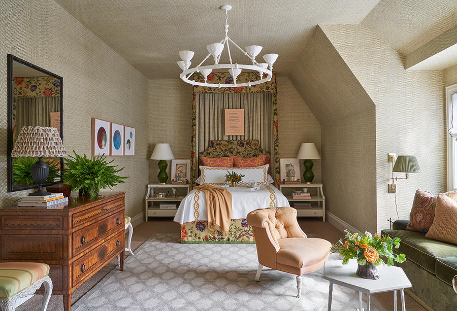
Soft hues and luxurious textile details imbue this travel-inspired guest bedroom by Houston-based studio Wells Design with comfort and warmth.
Greatest challenge: “When designing a showhouse, there is very little time available.”
Designer’s advice: “Enjoy the process. It is very rare that you can design a space for an imaginary client, so showhouses are a great opportunity to let your creativity run wild.”
Hi-Fi Lounge by Cravotta Interiors
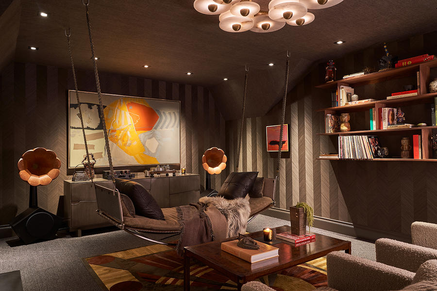
The pieces in this media center contribute a commanding sense of style, from the twin phonographs to the hanging bench seat.
Greatest challenge: “Getting all the pieces in place in such a short time was probably the biggest challenge. The dogged determination of my team, combined with the very generous support of the artisans and galleries we worked with, triumphed in the end.”
Designer’s advice: “Don’t underestimate the immense amount of time required to put your best foot forward!”
Utopia by Sherry Hayslip Interiors
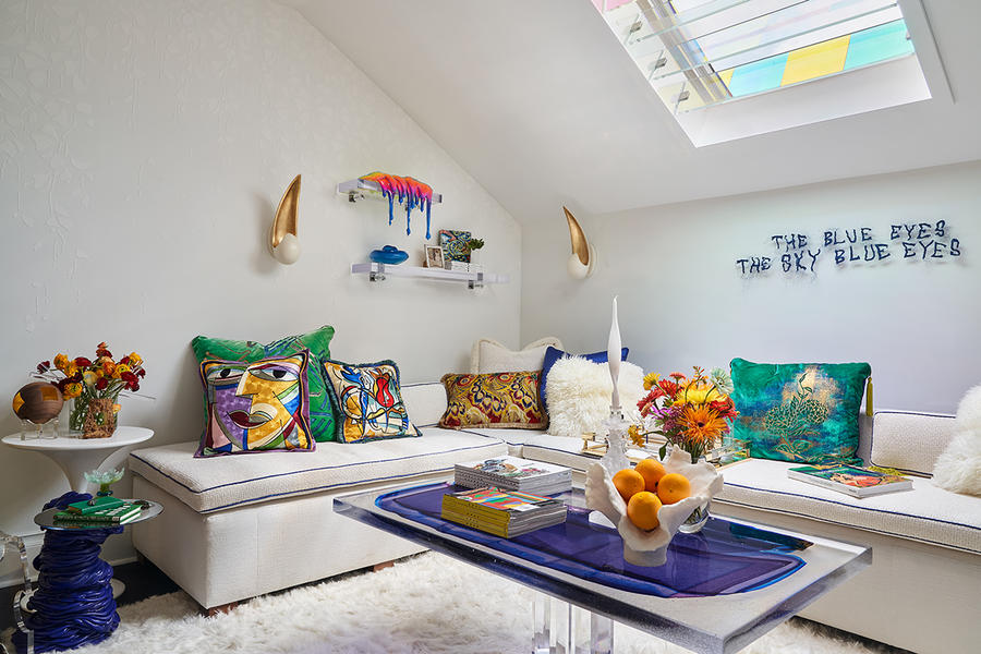
In the home’s hidden loft, electric-colored accents stand out against an all-white background in this light-soaked loft space by Sherry Hayslip.
Greatest challenge: “My space doesn’t have any windows, only a single skylight.”
Designer’s advice: “Take on the opportunity! It’s a fun challenge, like any design project with a quick turnaround, but it’s worth it.”
Chasing Nature: A Boy’s Retreat by Trish Sheats Interior Design
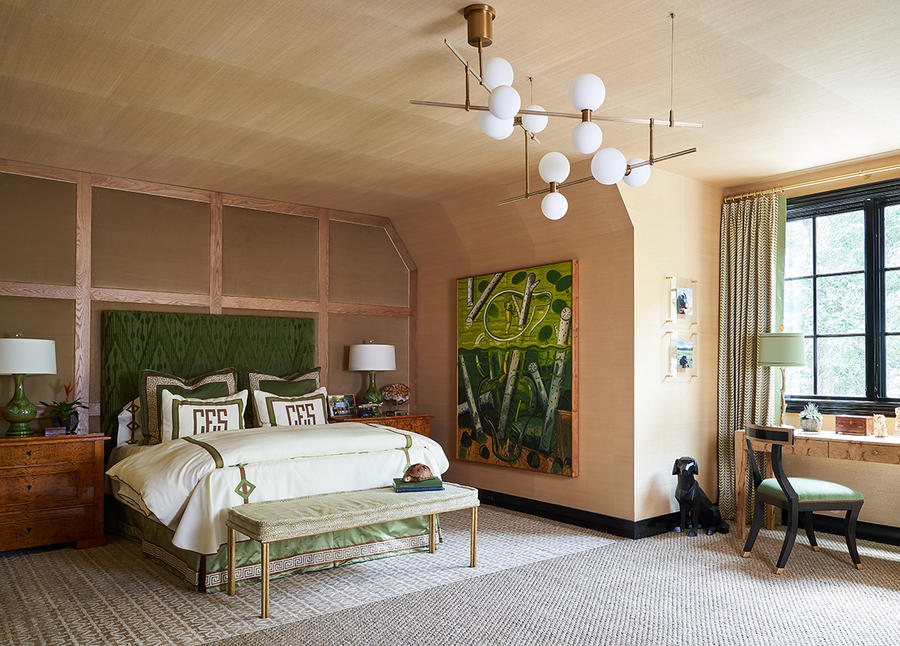
The great outdoors served as the inspiration for this boy’s bedroom, complete with grasscloth wallpaper, wooden furniture, and a green-and-copper color story.
Greatest challenge: “The room was initially pretty dark. We overcame that by adding a large light fixture in the center of the room, as well as fresh recessed lighting to brighten up the whole space.”
Designer’s advice: “Don’t hold back, but stay true to yourself and your style.”
Lounge 13 by Ten Plus Three
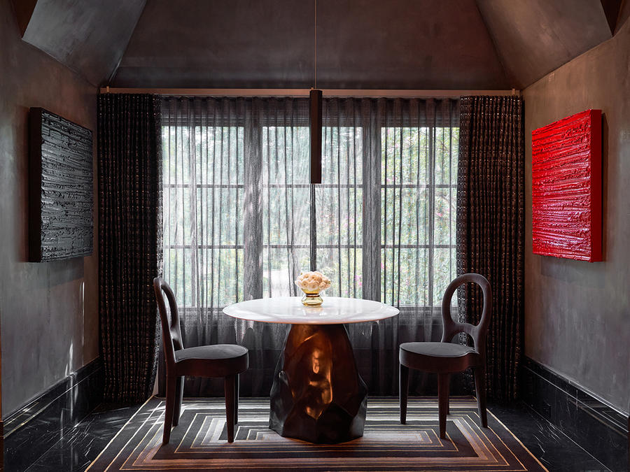
In this ultradark seating nook, glossy finishes catch strokes of light, while matte textures in the rug and seating lend a softness to the entertainer’s lounge.
Greatest challenge: “We encountered a huge challenge just days before our deadline—I was traveling to Colorado and just before I left, I got a call from my office that the cocktail table we were using for our space weighed 1,500 pounds. With less than four days for our room to be completed, we opened the decking of our floor to add sister joists, bracing and a new thick deck. Getting it upstairs required two cranes and 12 men.”
Designer’s advice: “Make quick decisions to give vendors time, as it does fly by! Also, don’t be afraid to ask your favorite vendors for help.”
Wicked by Studio Thomas James
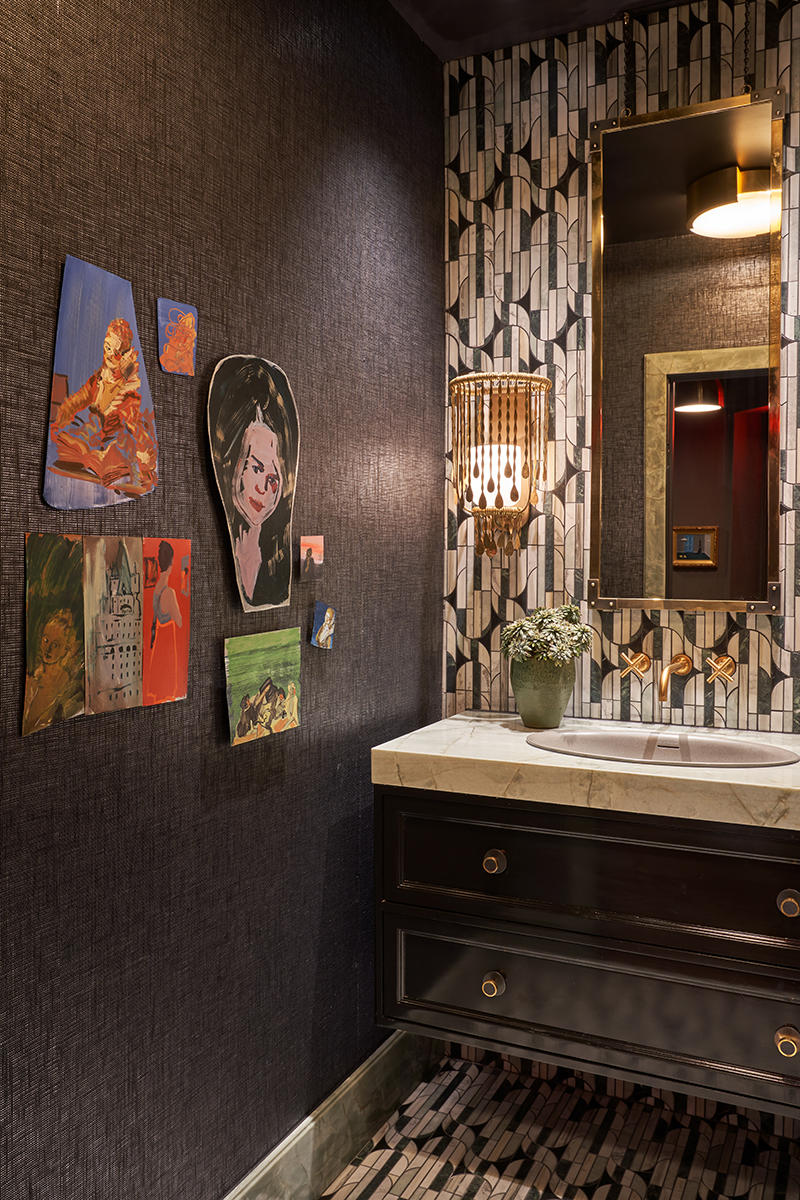
Shimmering 1930s glamour was the driving force behind this powder room, with hand-forged Ralph Lauren sconces and a dramatic art deco mosaic by Kelly Wearstler.
Biggest surprise: “Kips Bay is our first showhouse, and what an experience! We knew it would be great to work on such a special project, but had no idea how much fun it would be, from working with our sponsors to friends in the industry.”
Designer’s advice: “Have fun with your design! It’s not often that you get to run with a design idea entirely.”
The Kips Bay Decorator Show House in Dallas is open daily 10 a.m. to 4 p.m. until October 25. For more information, safety guidelines and to purchase tickets, click here. Not in Dallas? You can still take a virtual tour here. All proceeds benefit the Kips Bay Boys & Girls Club, Dwell With Dignity, and the Crystal Charity Ball.
Homepage image: La Petite Loire Valley Entry Gardens by Lambert Landscape Company | Courtesy of Kips Bay Decorator Show House Dallas


