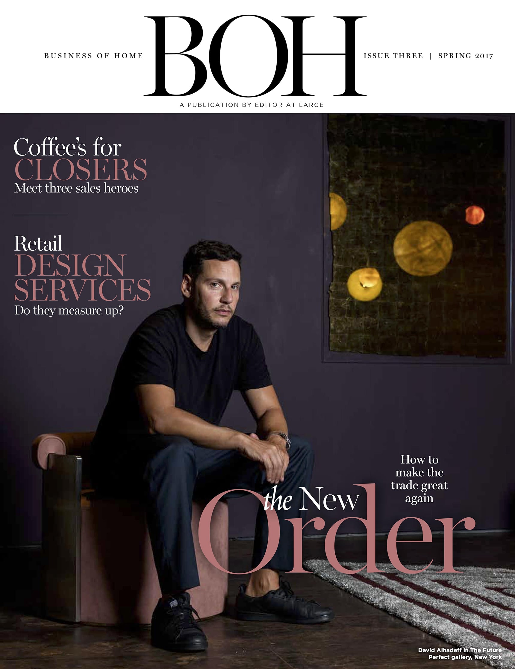
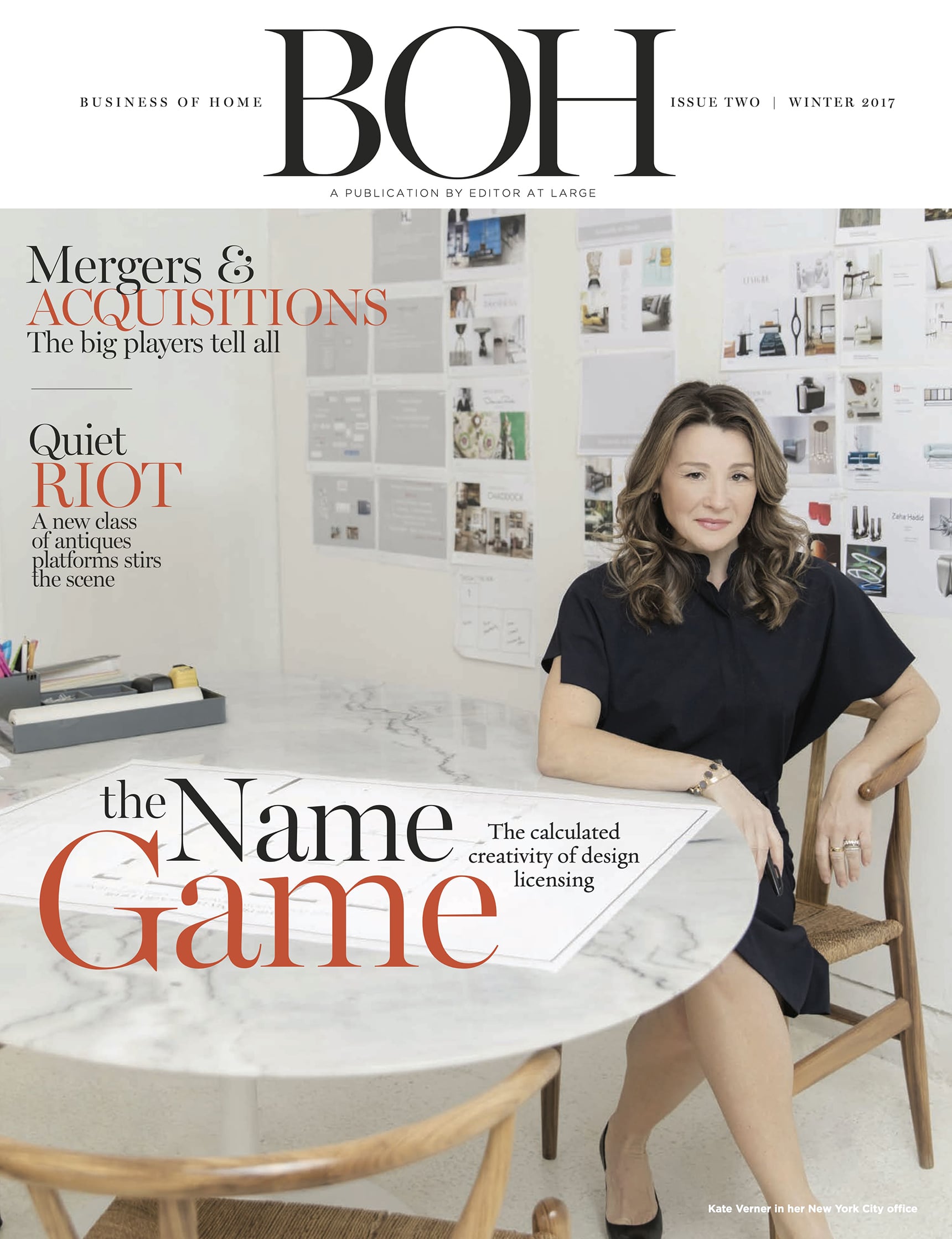
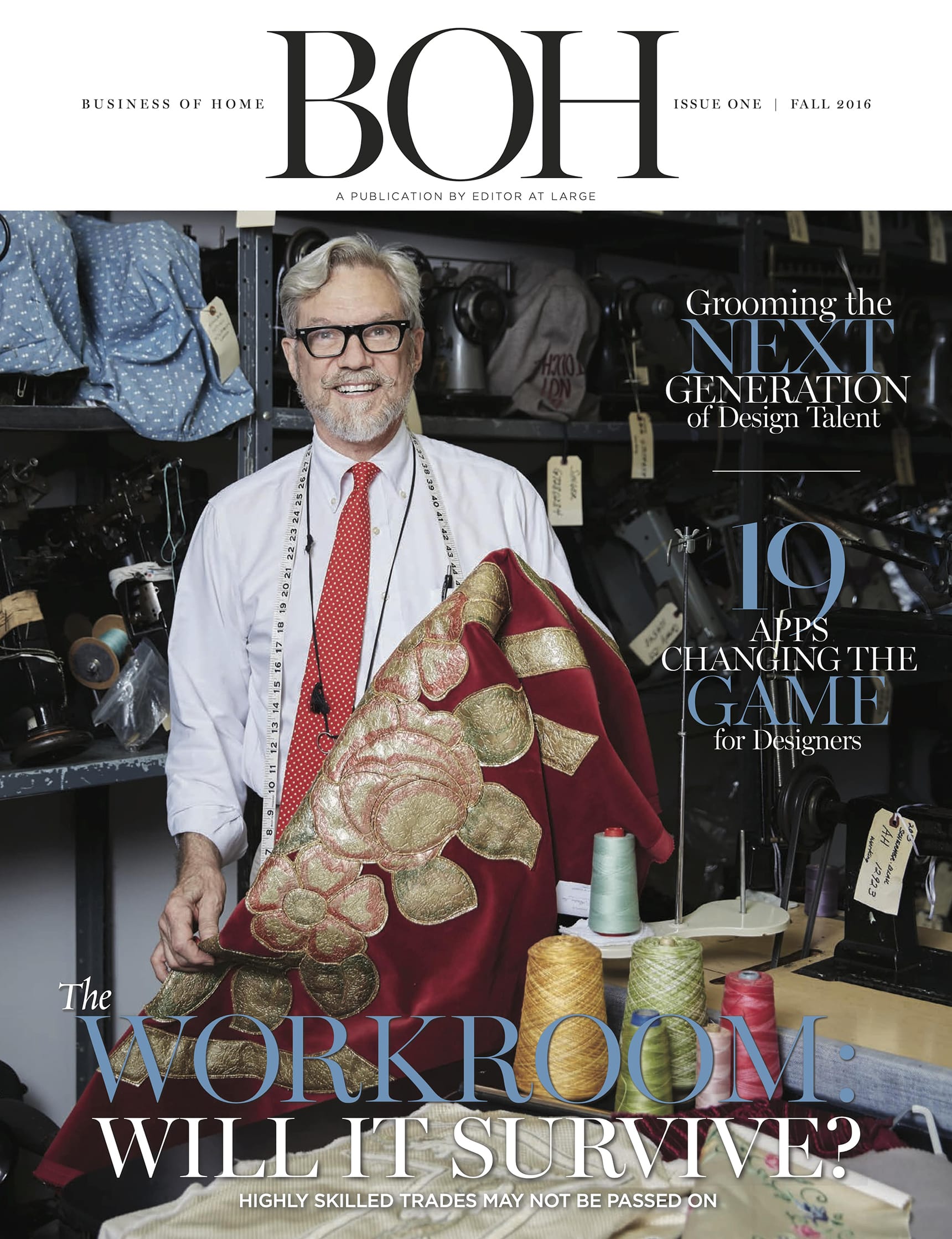
Great creative partnerships are the product of great chemistry—a rare thing in life, art and business. We spoke to the names behind spring’s hottest collabs to find out how they met their match.
Ryan Korban x EJ Victor A statement of fact, not an opinion: Ryan Korban is cool. The young designer cut his teeth in the world of fashion retail, designing boutiques for Fivestory and Aquazzura; collabs with Balenciaga, Alexander Wang and Kanye West came later. He brings a couture mindset to residential design, leaning heavily on custom pieces, exquisite detailing and an intoxicatingly hip mix of austerity and sex appeal. Korban’s new collection for EJ Victor conjures up similar spirits (the press release refers to his love of “romance and brutalism”). The line, 40 SKUs that range from seating to beds to lighting, will feature re-creations of pieces he has designed for fashion houses, as well as an exclusive custom fabric collab with Dedar Milano.
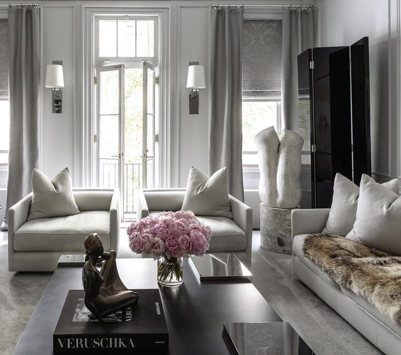
Sarah Richardson x Palliser Canadian manufacturer Palliser is celebrating its 75th anniversary this year with its first-ever collaboration with an interior designer. Fittingly, it has tapped Canadian design star Sarah Richardson, the co-host and producer of eight HGTV lifestyle series. The resulting line is expansive, with four subcollections, each a complete turnkey package including bedroom, dining and occasional pieces alongside made-to-order upholstery in over 55 fabrics and leathers.
Richardson saw the mini-collections as a chance to explore different aspects of her aesthetic. Annex is a family-oriented line with a honey-hued palette; Boulevard is art-deco inspired and designed for urban dwellers; Vista is more luxe, with bold punches of red and tangerine; and Shore is a coastal collection full of handwoven rattan, linen-cast resin and brass.
The designer says she leapt at the chance to work with her countrymen: “I was drawn to the fact that Palliser is a Canadian brand that supports our domestic economy.” Her small team designed the collection without much corporate intrusion, she tells BOH—plenty of creative freedom paired with plenty of hard work. “I will remember our trips to the factories in Indonesia and Winnipeg,” she says. “They were long and tiring, but they are what moved the collections forward to where we are.”
Richard Mishaan x Theodore Alexander Most collections go through at least one round of vetting—Richard Mishaan’s new line for Theodore Alexander went through three. After getting the green light from one CEO, the company made a change at the top, and the designer was invited to pitch again for the new boss … and then again for a new creative director. All three loved it. “The end result was worth the wait, and for each presentation I refined ideas and things got better,” says Mishaan.
The collection itself is big, bold and ambitious—a whirlwind tour through the designer’s influences, among them, Asian, Scandinavian, neoclassical and midcentury design. Standouts include a hand-carved, lacquered chinoiserie decorative chest; a series of four gold-trim vases that nod to The Greenbrier; and the Henning series, unembellished pieces in a wire-brushed cerused finish.
The collection is designed to have crossover appeal for both retail and trade customers, part of a larger strategic push by Theodore Alexander to conquer both markets. For Mishaan, it was an opportunity to “press the envelope on new silhouettes, brilliant wood and paint finishes, textile selections and artisanal attention to detail.” He’s also pleased that there’s a do-good knock-on effect. “One of the collections we produced is an updated version of chinoiserie cabinets and tables. The panels are handpainted, and I think that those techniques are priceless,” he says. “That they are also creating jobs for the local women who paint them from home thrills me to no end.”
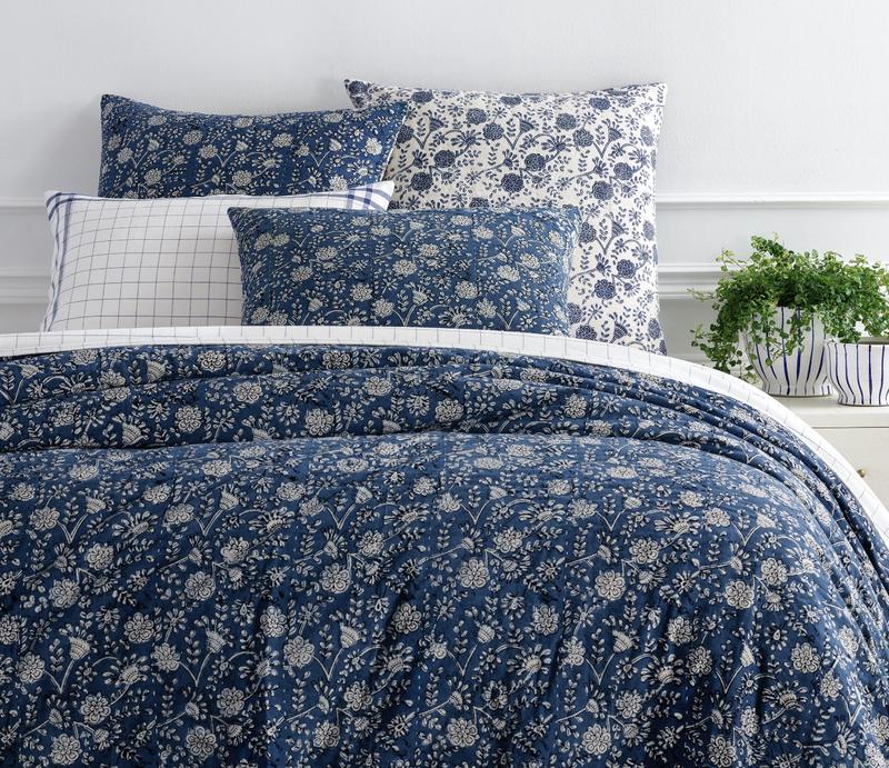
Mark D. Sikes x Annie Selke Mark D. Sikes’s newest line of rugs, bedding and accessories for Annie Selke is a journey from coast to coast. From the East: stripes, checks and florals; from the West: batiks, ikats and embroideries. The collection comes on the heels of Selke’s announcement of a new set of trade-friendly changes—her company now offers free shipping to all comers, and has pulled out of most e-commerce partnerships. Sikes was already a fan: “I have been both an admirer and customer of Annie Selke for many years,” he says. “Collaborating with her has been an honor and so much fun. I can’t wait to use these pieces in my clients’ homes, as well as my own.”
Patina Vie x Castelle Patina Vie is the brainchild of Sarah Willett, a vintage-obsessed product designer. Though her company maintains its studio in rural Wisconsin and retains a boutique feel, Willett has global reach; she’s already worked with everyone from Disney to Karastan. Last summer, she opened a new flagship store in Ripon, Wisconsin (population: 7,800). Now, she’s debuting a line of outdoor furniture with Castelle. Her inspiration? “Al fresco gatherings. Barefoot evenings. Warm golden light,” Willett muses. The collaboration was cemented after Castelle visited her farm. “I knew it was kismet when we bonded over IPAs at the local tavern,” she says. “Some manufacturers would not have appreciated our vision, but Castelle embraced all that is Patina Vie. What more could I ask for?”
Alexa Hampton x Theodore Alexander Interior designer Alexa Hampton’s new line with Theodore Alexander is so voluminous, it demands over 4,000 square feet of space to be shown properly. The collection is made up of more than 120 pieces ranging from seating to mirrors to tables to beds. Hampton saw the collaboration as an opportunity to take advantage of her partner’s manufacturing capabilities and go wild. “No material was out of reach, no finish too complicated, and no metalwork too fine,” she says. “I’ve felt a bit like a kid in a candy shop.”
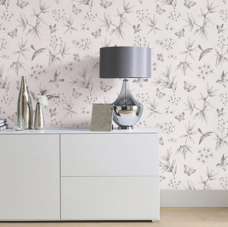
Goop x Tempaper The new collaboration between the removable wallpaper company and the lifestyle brand started with a chance encounter in a catalog. “We noticed that Gwyneth Paltrow used one of our chinoiserie prints as a backdrop in Goop’s CB2 furniture launch and couldn’t resist reaching out about a potential partnership,” says Julia Au, CEO and co-founder of Tempaper. “Gwyneth’s aesthetic and style complemented our chinoiserie pattern so well, why not re-create the style with her?” Why not indeed? The resulting pattern is a riff on classic chinoiserie, featuring a tossed, organic repeat instead of a ground-up design. The palette, a millennial-friendly pale pink accented by white and gray, is intended for bedrooms, powder rooms and living areas. What was it like to work with modern lifestyle royalty? “We took a phone call and hit the ground running,” says Au. “Collaborating with the Goop team has been such an enjoyable experience.”
Carrier and Company x Century Husband-and-wife duo Jesse Carrier and Mara Miller consider their new collection with Century to be a mission statement of sorts: “We realized that this furniture line would begin to truly define our aesthetic and our brand,” they say. No pressure then! The pair drew on the luxurious-but-practical look they’ve developed over a 15-year, award-winning collaborative career to create this line of more than 50 pieces of bedroom, dining and occasional furniture and upholstery.
A few highlights: the Gracie sofa, inspired by prewar Manhattan glamour; the bronze-finished Jacques bed; and the Eve mirror, its name a clever reference to the serpentine metal frame. Carrier and Miller told BOH that they were initially connected to Century by a matchmaker of sorts—their licensing agent. Once the partnership had been forged, they brought the company into their world. “We invited them to our office to see how we work, and had a presentation planned to explain our philosophy and our approach to the collection with a few examples of ideas. We then gave them a tour of a few local projects so they could see firsthand how our work looks and feels.”
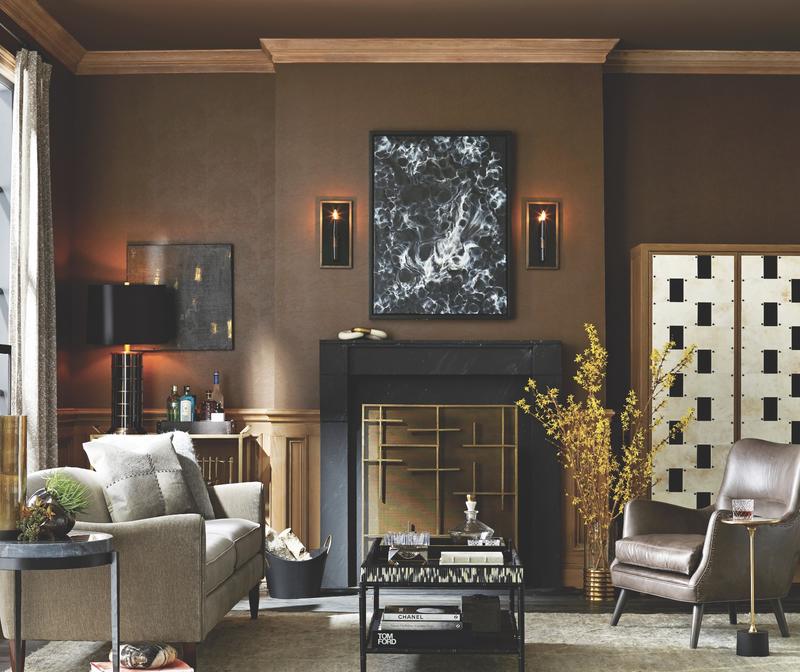
Frank Ponterio x Arteriors Frank Ponterio’s debut collection for Arteriors speaks to the veteran Chicago designer’s range and fluency with materials. Using everything from rope to vellum to a pair of brass knuckles (yes, you read that right), he creates a unified, sophisticated collection of 29 SKUs that includes mirrors, accessories, lighting and a pair of cocktail tables. The crown jewel is surely the Salotto cabinet, which is both a nod to the designer’s Italian heritage (it’s inspired by bronze doors at Villa Necchi in Milan) and a sharp modern marvel. The most memorable aspect of the collaboration? “I’ll remember everything that I learned about doing something at this scale,” says Ponterio. “Working with a very large team in multiple countries, and how seamlessly it all came together in the end—it's exciting to see how closely the finished products resembled my original sketches.”
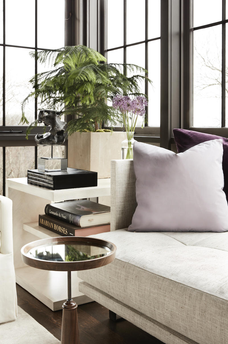
Ray Booth x Hickory Chair Interior designer Ray Booth has come full circle. An Alabama native, he began his career as an intern at McAlpine before moving to New York to work for John Saladino and Clodagh—then returned back to the South to work for McAlpine again, this time as a partner. Now he’s debuting his inaugural collection with Hickory Chair, an expansive line that includes pieces for the bedroom, dining room and living room.
Aesthetically, the collection is anchored more by the “feeling of home” than flashy style. It’s also a showcase for the Hickory workroom’s technical prowess, featuring blind biscuit-tufting, weltless trim on pillows and cushions, and finely tailored top-stitching. “My hope is that this new collection will be a source of continued inspiration that challenges us to rethink our expectations of home and how we interact with our furnishings,” says Booth.
Bobby Berk x A.R.T. Furniture 1.6 million (the size of Queer Eye designer Bobby Berk’s Instagram following) isn’t a bad number of eyeballs for a new furniture collection, but it doesn’t compare to 1.3 billion, the population of China, where A.R.T.’s retail empire is based. The line, featuring pieces for the whole home and outdoor too, is styled in the designer’s trademark warm urban minimalism.
Nina Magon x Universal Interior designer Nina Magon’s new collection with Universal Furniture is designed to bring high European style to an American audience. Sleek surfaces, modern shapes and bold colors dominate the collection, which makes up 50 pieces between casegoods and upholstery. Materials run the gamut, from colorful performance velvets to smoked glass, bronze metal and lacquered finishes to tiger stripe veneer.
