In the BOH series What I Love, we’re asking designers to build us a mood board of what’s inspiring them right now.
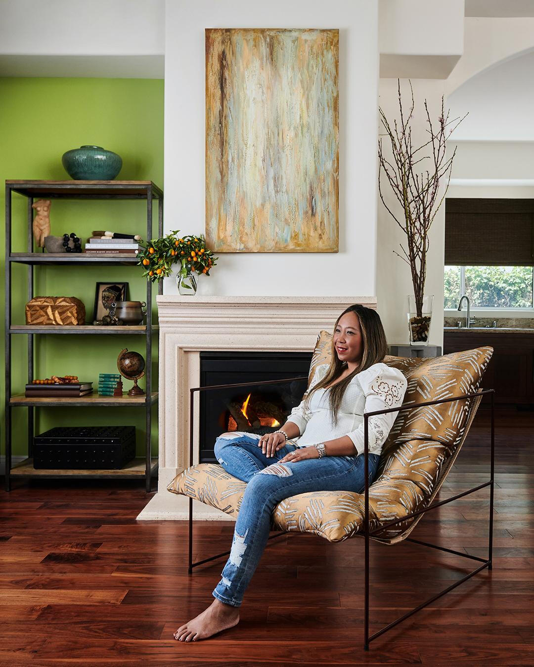
Linda Hayslett sprinkles some Hollywood stardust into all of her spaces. With a background as a celebrity stylist, the Los Angeles designer knows there’s nothing like gold to add a touch of glam to even the most hardworking materials. And to undergird those glittery bits, she employs a comprehensive “arsenal of skills” that expertly balances beauty with substance. “Offering services that integrate design with construction at every stage of a project, from concept to completion, is the best way to provide clients with the lifestyle experience they’re looking for,” she says of her design-build studio, LH.Designs.
Hayslett’s artful combination of the luxurious with the pragmatic is perfectly encapsulated in her mood board. Representative of a real-life renovation taking place right now, it pairs a range of dark-hued tiles with polished brass hardware and gold-flecked wallpaper. “It’s sophisticated beauty with an edge,” says the designer. “Four main colors—black, navy, plum and gold—can be found throughout the entire home, relating to each other from room to room. Golden tones in the fixtures and fabrics contrast with the deeper shades, creating a flow that keeps your eye moving.”
Here, the designer discusses her distinctive curation of pretty bird prints, blue terrazzo and evocative pottery, as well as the contemporary walnut table on top of which she has arranged her choices.
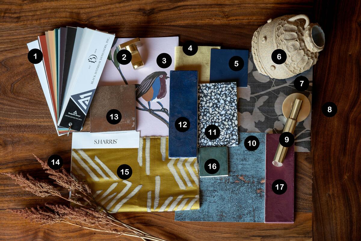
1. BLACK INTERIOR DESIGNERS INC. FAN DECK BY BENJAMIN MOORE
“I chose this fan deck first because the last thing we’ll be picking in this project is paint. I never pick out paint until I have all the main elements in place and we’re close to finishing the drywall. Lighting and space change once things go into a room. Wallpaper, tile and cabinetry color all play a part in how light makes a paint reflect, and this deck has many options to choose from once we get to that stage.”
2. PARALLEL ROBE HOOK BY KOHLER
“This simple robe hook in a vibrant, modern brushed brass will be used in all the bathrooms. The finish plays perfectly with the warm gold tones we’re adding throughout the home. I’ve used this hook before in other projects and love its look and shape—it has a notch that helps hold towels in place.”
3. SPRING CHINOISERIE WALLPAPER IN ROSE BY SHE SHE
“As soon as I saw it, I knew this was the perfect wallpaper for the primary bedroom. I chose it to bring in the plum from the tile in the primary bathroom. It’s a pretty paper that’s not too delicate-looking but will help bring calm into the space.”
4. CONISTON VELVET FABRIC IN OCHRE BY GP & J BAKER
“For the living room, I wanted something fun for the sofa color, so we landed on this yummy velvet fabric. It will pop against the wallpaper behind it, making it a showstopper in the space.”
5. RALPH LAUREN AMALFI NAVY PAINT AS MATCHED BY MYPERFECTCOLOR
“We wanted a navy for the kitchen cabinets that wasn’t too blue and wasn’t too dark. This color embodies the look we’re going for.”
6. POTTERY BY CROFT HOUSE
“I love the texture of this handmade vase and how, even though it’s broken, it can still be an interesting object. We want perfection, but it’s often the imperfect items and the stories behind them that make a home.”
7. SHADOW LEAVES WALLPAPER IN BLACK PEARL BY COMMERCIAL WALL DECOR
“My client has a small bathroom in her basement. We wanted to make it special, so we landed on this pearlized black paper from MDC to give it a luxe feel but also keep it cohesive with the entire home.”
8. YNEZ DINING TABLE BY CROFT HOUSE
“The walnut of this table is the perfect grounding material for other pieces we’re incorporating into the renovation. We’ll be adding walnut furniture throughout to home in on the warm and casual yet luxurious aura. Croft House always has beautiful contemporary pieces with character, and this new table is no exception.”
9. SELECT L-SQUARE FACETED LEVER BY EMTEK
“In the satin brass finish, this is the perfect faceted handle to draw in the brass and gold tones we’re featuring throughout the home. I love that we’re able to choose the backplate and finish. We’ll be using these for all the interior doors.”
10. KABUTO WALLCOVERING IN AMAZONITE BY WOLF-GORDON
“When going through sample materials, this wallpaper stood out because it has some glitter and a golden sparkle in it. It’s pretty on its own, and will make the entire living room shine.”
11. ETHERIUM BY E-STONE LA VENEZIANA TILE IN NERO DUCALE BY TREND
“Terrazzo has been everywhere, but when I saw this tile for the guest bathroom flooring, it was different. I haven’t seen a lot of terrazzo with hints of blue in it. Since we have navy throughout the project, this was the perfect choice to help connect that thread.”
12. CLOÉ CERAMIC TILE IN BLUE BY BEDROSIANS
“I wanted to keep with the moody feel in the primary bathroom but change the color in the guest bathroom, so for the latter I landed on this dark navy subway tile, which will provide the perfect contrast for the gold plumbing fixtures we picked for the space.”
13. NANO CORTEN TILE IN COPPER BY ARTISTIC TILE
“For the primary bathroom’s floor, I opted for this rust-colored tile. The imperfect metallic complements the plum subway tile in the shower, so it was a natural choice to make the space feel luxe.”
14. RIVER REEDS
“I like having some type of plant or flower, be it dried or fresh. These river reeds introduce nature into a space, giving it a calming feeling.”
15. MOA FABRIC IN TAMARIND BY S. HARRIS AT FABRICUT
“I love this woven linen fabric because I designed it with the Black Artists + Designers Guild and used it to commemorate the 10th anniversary of Croft House’s Sierra chair. When my client saw the chair upholstered in the fabric, she wanted it for her home.”
16. CLOÉ CERAMIC TILE IN GREEN BY BEDROSIANS
“This is the second subway tile I selected for my client’s guest bathroom. The green brings a more interesting look to the shower, as we’re only using it as an accent trim on the walls. It will complement the navy tile and make guests feel like they’re staying at a boutique hotel rather than visiting a friend’s house.”
17. VILLAGE GLOSSY TILE IN AUBERGINE BY TOTAL HOME DISTRIBUTORS
“This plum tile is from a local Los Angeles tile shop and has a beautiful handmade look. My client plans to soak in her large Kohler tub, and in order for it to be a showpiece in the primary bathroom, I chose this dark aubergine tile as the backdrop.”


