Once you’re in the door, there’s plenty of advice floating around about style, project management, budget and all the rest—but how do you actually get the job in the first place? We’re asking designers to peel back the curtain and walk us through how they landed a project, step by step. Here, designer Kate Lester of Hermosa Beach, California, explains how she designed You & Yours Distilling Co., a distillery, tasting room and event space in San Diego. The company was the dream project of founder Laura Johnson, a longtime family friend. Together, the two small business owners and pals created a vibe not often seen in hospitality: a bright, airy, unabashedly feminine spot for drinking (and producing) vodka and gin.
What is your typical project, and where?
We are located in the South Bay, which is the Manhattan Beach, Hermosa Beach, Redondo Beach area of Southern California. Our typical project is what we call a design-build-furnish. Most of our clients find a dirt lot or home that they view as a teardown, bring us on board with their architect, and we help them design a home from start to finish. Then we do all of their furnishings.
What is the background of this project?
This is a crazy story. I met Laura—the owner of the distillery, along with her sweet husband, Luke—because her father was one of my very first clients when I started my design firm. He hired me to furnish one of his vacation homes here in Southern California, put me in contact with Laura—who was in college, not yet married—and said, “Maybe you can work with her remotely and figure out what she wants for her room.” We hit it off, and when she would come to visit, she would text me and we would go have dinner together. They became great family friends. I actually had my baby shower at her dad’s house. When she decided to launch the distillery and found a place in San Diego, she reached out to me to help her.
Wow, that’s really close. That’s not just repeat business.
No! And as a small business owner, I knew exactly what she was going through, [trying to figure out:] “I don’t even know if we can pay you—can we trade? What can we do?” It was something that you would do for a friend you were supportive of and so proud of.
At what stage did you get involved, and what was the scope? Did they have the branding in place?
Laura has a great eye for design, so she already had all the branding on point, their logos and color palette. She already had a deck, because she was pitching to investors. We took that and utilized it to build the design concept. We came in when they had drawings with the architects—it was a building with a shell. We helped design the front and back bar, the tasting room, the restrooms. Anything for the general public to see or enjoy, we had our hands in.
What was the vision for the space? It’s a feminine distillery!
Don’t you think that so many of these tasting rooms and craft breweries are just masculine in general? She wanted a place where people could go on a date, or you could go have a brunch cocktail. I think there was a lot of Laura in that brand. She didn’t change her brand to fit the market; she was ready for the market to change to fit her brand. I loved that right away. I knew it needed to be fresh and interesting and different.
How would you describe the style?
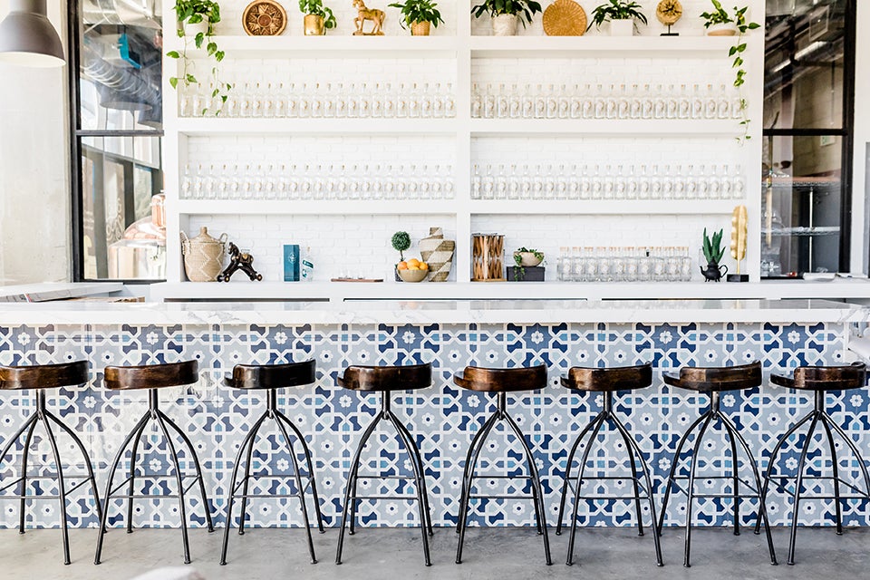
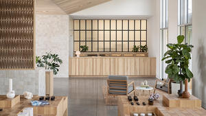
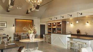
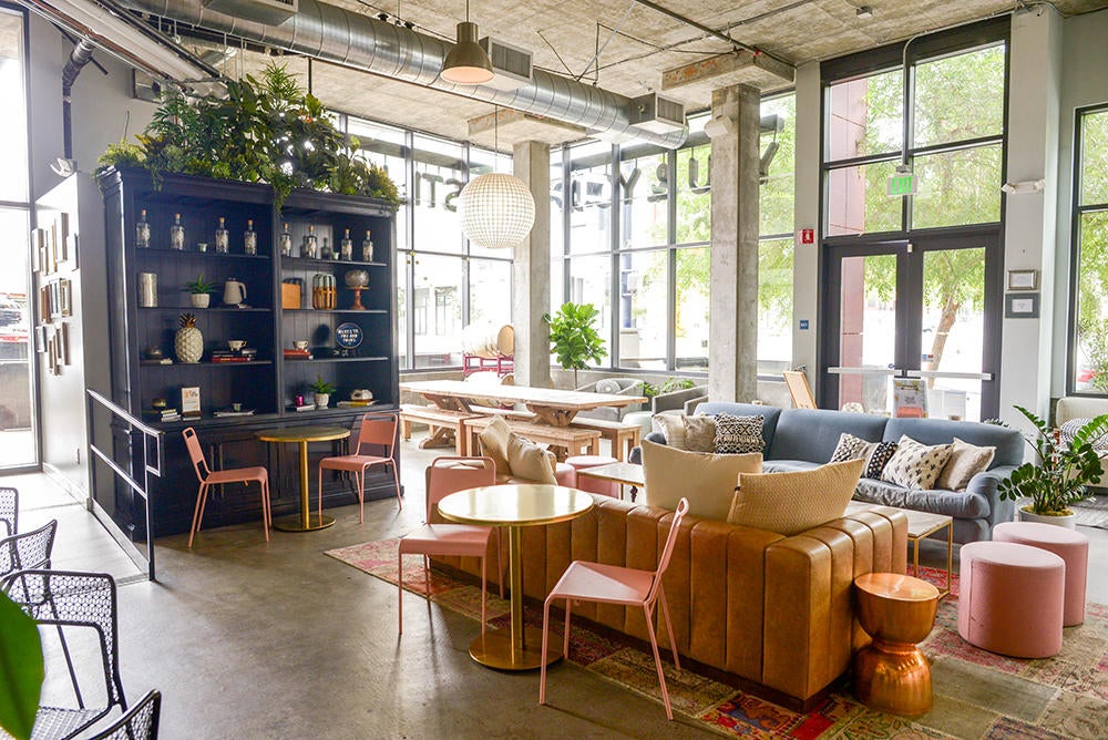
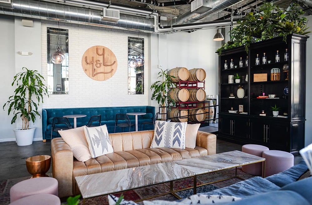
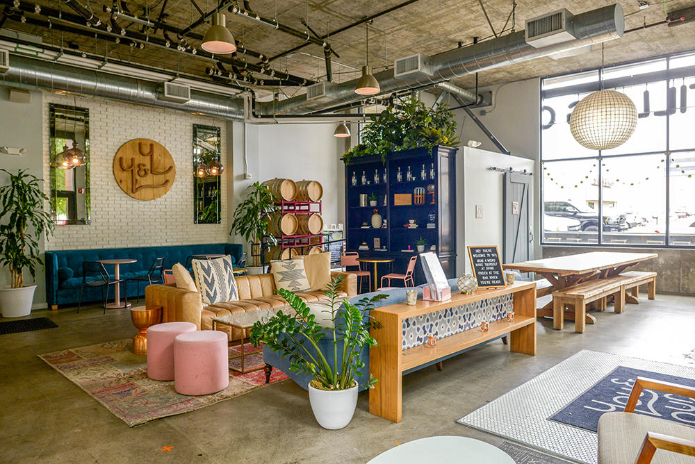
Very California chic. Southern California but with a feminine edge. She wanted it to feel almost homey, like if you’re at a really fabulous house or loft. There is a little bit of an industrial vibe. We added in those steel windows so you could see into the distillery; those weren’t in the original concepts. We added that brick detail [framing the windows]. The tile for the bar is actually painted wood, not ceramic or concrete. It was a great way to add texture and dimension, and it plays on the branding color palette. That was kind of important to me, too, for her first location—for everything to tie together.
What are some of your favorite details or vignettes?
I love everything about the seating areas, because we worked really hard to make those feel collected. We made sure that the vintage-inspired rugs would be durable and that there were velvets and linens and pattern play. I wanted it to feel almost like a luxurious hotel lobby bar where you can tell that somebody had put a lot of thought into picking these interesting pieces and putting them into a welcoming arrangement. The seating concept felt like a couple of little living rooms together.
Were there any challenges in the project as you went along?
Distilling equipment is very expensive, and so is leasing a warehouse space in a downtown area. For everyone involved, being budget-conscious was super important. There were things we really wanted to do that we didn’t get to do. I just kept saying, ‘How can we get more bang for our buck? Where can we high-low? What things can be done in phases?’ Probably our biggest challenge was trying to make it look as fabulous as we could on a limited startup budget.
What is your typical first interaction like with a client?
I know a lot of [other designers] are really formal and have this onboarding thing you fill out. We like to make it a little bit more informal. I would say our clients are mostly 1 percenters, and they don’t have a lot of free time. When we sign on someone new, we try to do a quick meeting at the studio with both decision-makers, full partners, whoever’s involved, to just outline our process. Then we talk about the build binder that we create for them, even though it’s digital now—how we’re going to present materials to them, what they should expect. We outline the way we’ll be working and let them know that we have a pretty firm process.
From the beginning, it lets clients know that you are the businessperson. You want to show them that you’re going to be a good steward of their money. Not only does it let them know that you’ve done this before, it also reminds them that you are driving the bus. We’re not going shopping a hundred times. There’s a real way that we work.
What do you usually wear to a first client interaction?
I don’t think that my aesthetic fully came to fruition until I realized that it was OK to be who I was as a designer. I wore ripped jeans and a 1970s band tee pretty much my entire life, and when I would have a meeting, I would put on a skirt or slacks and it just felt weird until I really came into who I am. Obviously, I’ll dress up a little bit more for my clients, but I mostly do wear jeans, maybe a nice blouse, loafers. But my attire doesn’t stray too far one way or the other, no matter what I’m doing. I think that’s OK, because your clients are coming to you for that sense of style.
You want to be stylish. You want to have your vibe come through in what you’re wearing, what you’re saying, what your office or studio space looks like. That’s all part of the show that people are paying for. It’s a show! From day one, when they walk into the studio, are they offered a coffee, an espresso, a bubble water or still water? Is there a candle lit? Does it smell good? Is everyone friendly? It’s an experience. When people are investing six, seven figures in a design firm, they want that experience. And you want to give them everything they’re hoping and paying for.
You're trying to make them feel special and showing them how you handle yourself.
When you look at some of your favorite interior designers, they’re outside the box. Look at Kelly Wearstler. What’s she wearing? Who can wear that? She’s amazing. Martyn Bullard—don’t you just want to have a drink with him? I do! I think people want you to be a little quirky. If they’re coming to me for a California-cool aesthetic, that’s what I’m going to give them in their experience. It’s just like when you go to a Land Rover dealership or Chanel—there’s a way that you’re treated. The experience starts from the minute people call, email or set foot into the studio.
How do you present your design concept?
Like a 900-year-old lady. I use old-school design concept boards. We print images of everything, and we use actual, physical samples of fabric, tile, wood, metal. To me, it’s a process of all five senses—I want them to feel, I want them to see. When you remove the cover on that design board and see their face light up, you know you’ve got it right. I think it’s really hard for someone to light up or have intense feelings about a digital board. I’m not saying it doesn’t happen! It just feels more dynamic when the textures are there. We encourage them to tear things off the board if they want to. Feel it. Put it under your foot if you’re worried the rug isn’t soft enough. I have a ton of young women on my team who remind me that this is a total old-lady way to do it, but I’m here for it. If you get a 95 percent return, then you shouldn’t change it.
How do you turn down potential clients who aren’t a great fit?
Very carefully. I bartended growing up, and I worked for this bar that had a procedure for literally everything, like how to turn on a light, how to light a match. I loved that. We have our procedures. When someone emails, we send them the one-sheet; if they respond, “That sounds great, except I don’t want to spend that much,” we say: “We totally understand. [But] we’re a small, boutique firm and these parameters are unfortunately not negotiable. Let us know if you’d like a recommendation for someone who might be a good fit.” I don’t always offer that, but if it was a referral from someone I know, I want to go that extra mile.
Do you Google clients before working with them?
Yes. We have a one-sheet that we send to people because we get so many inquiries. When you have a big Instagram following or have been in a recent publication, you’re going to get people emailing, right? They’re going to want you to do their powder room or their son’s dorm, and as much as I want to take everything, I can’t. Every designer, hopefully, has parameters. We send out a sheet saying, “An investment in our firm looks like this, and you should expect to spend this much on furnishings and on our time.”
When we first implemented it, it was super scary. It is scary when you’re sending out a sheet to a hundred people and nobody’s writing you back to be like, “OK, cool!” But it saves so much time, and your time is money. If you’re interacting with all these people who are seriously interested in your service, your rate of actually locking in that client is going to be so much higher.
Homepage photo: The bar at You & Yours Distilling Co., designed by Kate Lester | Photo by Megan Jane Burgess

