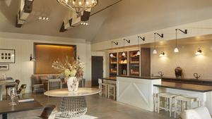
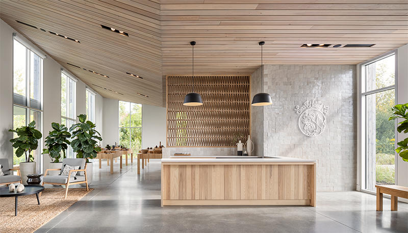
Once you’re in the door, there’s plenty of advice floating around about style, project management, budget and all the rest—but how do you actually get the job in the first place? We’re asking designers to peel back the curtain and walk us through how they landed a project, step by step. Here, Patrick Boothe, an architect and director of the commercial studio at Caleb Johnson Studio in Portland, Maine, discusses his work as the project manager on SeaWeed Co., a surprisingly beautiful marijuana dispensary in South Portland. Though citizens voted to legalize recreational marijuana in 2016, the bill wasn’t signed into law until 2018 and sales didn’t begin until fall 2020—yet Boothe’s client wanted to press on with construction as soon as legislation was in motion. The result is a chic, airy space using local lumber and wood tones that complement the company’s purple mermaid logo. A total departure from the grungier head shops of yesteryear, it represents a possible glimpse at the industry’s future.
What is your firm’s typical project?
The firm has a strong background in high-end residential construction and design and a blossoming commercial sector as well—[we’re] trying to maintain the same reputation with our commercial work as we have for our residential structures. I am the director of the commercial studio, spearheading all of our commercial design efforts.
What is the backstory of this project? How did it come to you?
I think it was 2017 when they approached us, maybe 2016. We’re known for using materials that are appropriate for Maine in new and distinctive ways. Our buildings, they’re not straight-up traditional, but they also aren’t so modern that they become unapproachable. [SeaWeed’s] product is all about being manufactured in Maine, from honest, good materials, and so they saw that in our work. They had a great site surrounded by wooded areas and wetlands, and we [often] have a connection with nature, bringing the outdoors into our projects. They wanted to do that with their commercial work as well.
Can you talk a bit about the demands of a dispensary space? What areas or basics does it need?
It’s just like any retail environment where you have a lot of area to display your goods, in a space that is well lit [and] comfortable. That was the first thing we focused on: a nice experience for the customer. They started with this loose mentality of an Apple Store type where everything is clean, the product is very well understood and there’s always someone there to greet you when you walk in and guide you through the product. We had a very clean[ly] designed retail space, and maybe three-quarters is the retail area. Then the last quarter is support space—the back room, some storage, locked spaces, break rooms, mechanical rooms.
SeaWeed has very distinct branding. How much of that was in place, and how much of the aesthetics or colors came from your team?
They had a branding consultant on board when they started working with us. They developed some logos and iconography for product displays, and we worked with them hand in hand so the architecture didn’t compete but supported that. They have a nice purple color with their branding, and we have this wood stain on the outside of the building—it’s all-natural cedar, but the stain we used is a purplish-gray tone, so it pairs really nicely. There’s illuminated signage outside, and at night it looks really sharp with the gray stain against that logo.
Will you tell me about the lighter woods throughout, like on the tables, and this beautiful etched wood piece in the entryway?
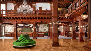
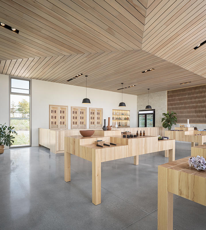
It’s all sourced in Maine, all white ash. It has nice clean colors to it, so that’s the predominance of the woods on the inside. When you first walk in, [you see] the triangulated screen—I think that’s what you’re referring to. We had an associate architect, a great team called MAAM Architecture based out of Los Angeles, and they developed that device. It’s actually terra cotta tiles. There’s a certain regulation about not being [permitted] to see the product right when you walk in, before you get your ID checked, so that was a way to provide screening but also have it be cool and architecturally interesting.
Were there any agencies from the state on hand to make sure these regulations were followed?
In 2016 the referendum was passed, but we had a governor who didn’t really want to make any movement on that. It sat mostly idle for two and a half years or so before [there was] any real effort to make policies and rules, but we started working before we had those rules in place. We were taking references from Colorado and Washington, making best guesses on what the regulations would ultimately be. We started designing some spaces, then there were some [updates] that required us to change the floor plan. It was a very live, reactionary way to adjust to the rules, mostly so that we could be first out the door.
The owners were very cognizant of the fact that this is new to everyone and we might not be the most efficient because we’re not going to know everything [in advance]. But by spending a little extra time and energy to be as on top of this as possible, they could open their doors sooner than anyone else, and that’s exactly what they did. Once we got the design and they got rules in place, then there’s the local jurisdictions—the town of South Portland reviewed it at their level, then the license to run the retail is held at the state level, [at] the Office of Marijuana Policy. Otherwise, it’s just handled normally through a local building permit–type process.
Talk about building the plane as you fly it! How did you set expectations, even from a project-management perspective?
Well, the clients were just great. They knew this project would need to be inventive. There was a point at the very beginning where we didn’t even know if the governor would veto this. We developed a building that, “Hey, if this marijuana thing doesn’t pan out, maybe it could be a restaurant!” They wanted to be able to still make some money off of this project. That’s how flexible they were from the start.
Aesthetics related to marijuana tend to be really grungy or very masculine. Newer ones can also be kind of cold and medical. How did you manage to make a beautiful space instead?
It starts with a great team that has a clear vision. This isn’t a head shop. They don’t want to go in there and see a bunch of bongs. They [also] don’t want it to feel cold and sterile—this is about being relaxed. Even the person who has never smoked marijuana before [should feel] like, “Hey, this looks clean and comfortable and safe. I want to come to this place and try it out.”
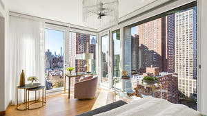
It has a lot to do with highlighting the quality of the product they have. One of the members of the team is a well-regarded organic farmer in the area. If you’ve got high-quality Maine-made products, let’s also showcase that with Maine-made materials and woods. It’s also just having a lot of natural light, which makes you feel like you’re inside outside. You can look out the window and see beautiful vegetation and you feel very comfortable. That’s really the number one thing: [making] a space where anyone could go in to buy this product and not feel out of place.
Are there any other details or aspects of the building that you’re really proud of?
We are a design-build company. I’m the architect, but our construction company, Woodhull, built the space, and our mill shop, Woodhull Millwork, built all the pieces. We have a wood ceiling that fits to the roof shape—and the roof, it flares up as you go. You walk into the building, then the roof pitches up away from you to these 18-foot windows. There’s a singular point in the ceiling where three planes come together. The amount of craftsmanship for that to happen, from framing, to laying out those pieces, to cutting the individual boards .32 of an inch shorter because the geometries are different … it all came together beautifully.
What is your typical first interaction with a client?
A get-to-know-you thing: “What drives you? What do you see?” It’s a lot of listening, really. Then us saying: “How can we help? What can we do for you?”
What do you usually wear to a first meeting with a client?
Business casual. We’re not wearing suits, that’s for sure. That’s not like us. Probably nice chinos and good boots, maybe a sweatshirt, depending on the weather. I’m sure there are a lot of architects that come in all-black and are detailed to the nines; we’re pretty put together, but we don’t overthink it. We’re just professionals having a meeting, and if it includes a beer, great.
How do you first present a design concept?
We start with a lot of back-and-forth. Once we have a clear understanding of what they’re looking for, we develop some concepts and then, depending on how comfortable we are, we either have floor plans or, if we want to go a little further, we’ll start doing some 3D illustrations early on to walk in line with the client. We don’t like to go so far that we’ve done all the thinking for them or we go way off base. We like to have it be collaborative: Do a little bit of the legwork to show where we think it’s headed, then get initial feedback and go back to the office.
What do you bring to a site visit?
An open mind. A camera. I probably don’t bring a measuring tape anymore. If it’s an initial site visit, it’s really just keeping an open mind, having a nice conversation and seeing what the possibilities are.
How do you turn down a client who’s not a great fit?
We refer them on. It happens, for a multitude of reasons. We value architecture design very highly, and although [a project] might not be a good fit for us, it could be for one of our colleagues.
Do you Google clients before working with them?
Who doesn’t, right? Maybe you find something in common, like, “Oh, they run this restaurant. I love that place!”
Homepage photo: Trent Bell


