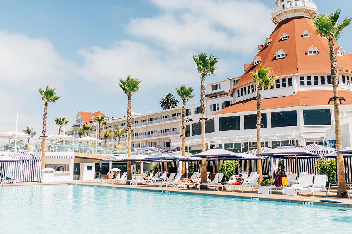
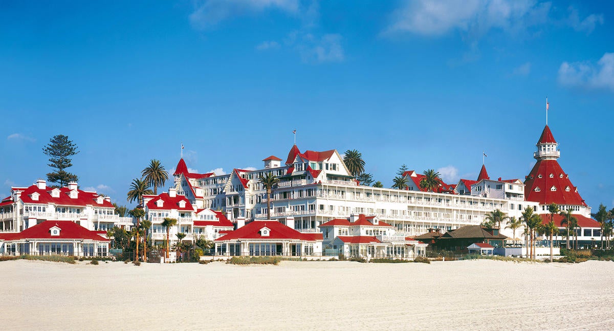
Once you’re in the door, there’s plenty of advice floating around about style, project management, budget and all the rest—but how do you actually get the job in the first place? We’re asking designers to peel back the curtain and walk us through how they landed a project, step by step. Here, Liana Hawes Young, the New York–based creative director of Wimberly Interiors, discusses her work on one of the most important seaside resorts in Southern California, if not all of the United States: Hotel del Coronado in San Diego. When it opened in 1888, it was the largest resort in the world. Young’s firm was tasked with renovating its dark wooden lobby, public spaces and gigantic turret, which also appears in its logo. Young chats about the demands of working on a historic landmark and how she and her team managed to brighten things up while remaining true to Victorian motifs.
What is your firm’s typical project, and where?
Wimberly Interiors was formed about 10 years ago, [when] Margaret McMahon, our [global] director of interiors, rebranded the interiors group for WATG, a large architectural and planning firm; I joined her at that time. The company has always been known for resort work and large hotel projects, so it’s very much hospitality-focused. We have offices in New York, Los Angeles, Honolulu, Singapore and Shanghai. I’ve worked extensively in Asia, the Middle East, the U.S. and the Caribbean.
Had you worked on historic landmarks before?
Yes, Essex House in New York, with the same client that recommended us to the Del. Although that wasn’t a historic renovation to the extent this was, it still required a special level of attention. Essex House—everybody knows the sign above the hotel on Central Park South. There’s a very personal aspect to historic renovation that makes it more challenging. So many people have so many memories associated with these places.
So tell me a bit more about how you won this project.
We submitted our portfolio and were selected. There’s a lot of work going on in the Del, in various parts of the property. We were specifically chosen for the Victorian building, including the lobby and public areas. There are other designers working in other areas of the resort. We all came together and had dinner on-site the other night—all women-led, so it was fun.
Wimberly is currently working on the meeting rooms and the grand ballroom, which is recognizable from the exterior elevation—it’s the big space on the end with the tall turret. And we’re tackling the massive renovation of all the guest rooms. Different historic codes apply to different areas. This was very much under the watch of a historic renovation and preservation architect and members of the community: specifically a gentleman who guards San Diego’s historic properties and has particular love for the Del. Over the years, different parts of the building had gone through various levels of renovation and a lot wasn’t done in a historically accurate way. Given the breadth of this renovation, this was their opportunity to do it correctly.
Regarding the Victorian aspects, what did you need to restore, and what did you want to change?
The interior is all oak, a white oak originally from Illinois. The main building was constructed in the late 1800s, so the Del was one of the first hotels to have electrical lighting. One of our big, big, big pushes was to get the original stain of the lobby correct. This was the complaint of everybody who came to the space—you’re going to a seaside resort, but you have to walk into this dark lobby. Victorian [architecture] is known for having darker stained woods. We wanted to lighten it, , but the preservationist said, “No, it wouldn't have been that color.” So we said, “OK, well, it’s dark, but maybe if it wasn’t so opaque?” Like, let’s strip it down to its original condition and even if we stain back on top of it, we can get the lightness of the original grain of the wood. It’s an extensive process, figuring out what the original stain was, how that would look, to get this entire lobby stripped. That’s where COVID worked in our favor, because it was a long, extensive process. I mean, it was painstaking.
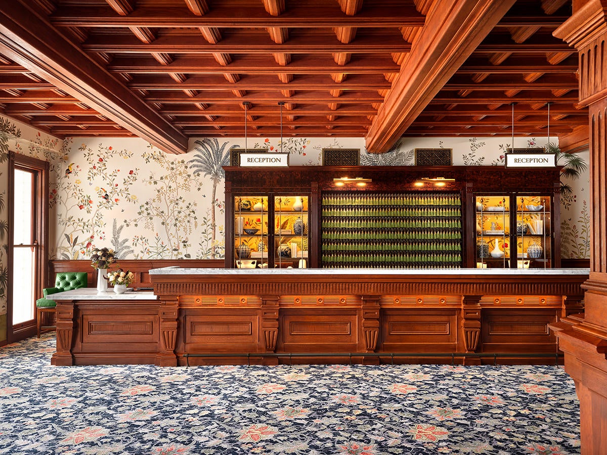
Another thing that helped was to push the existing front desk check-in to some back-of-house space and open up some natural light from windows that were previously closed. We re-created the existing front desk with the same detail as when it was originally built. We studied the existing photography. We designed the light fixtures so that they looked like the original sconces. We never intended for it to look like the day it opened, but we wanted to make sure that we were being true to pieces of history.
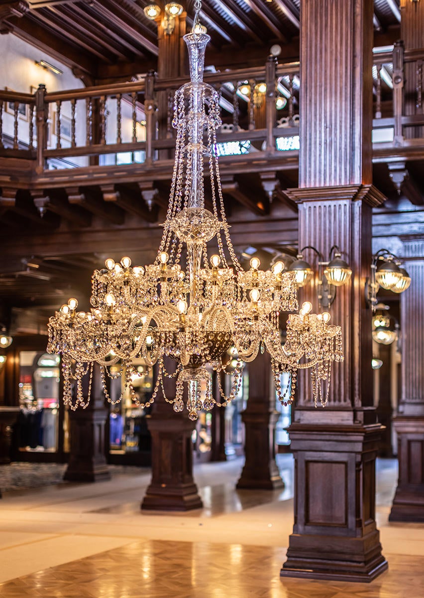
The original chandelier was just not something we aesthetically wanted to put in the space. It didn’t have the look we were going for. We researched many different Victorian chandeliers and found one we wanted to purchase, but we ended up having to reproduce it because we couldn’t get it in place safely. But it looks like a vintage chandelier. It’s not specific to the Del, but it’s specific to the period. The consultants gave us a pass, saying, “OK, because you’re honoring Victorian history, you can use it, even though it’s not an exact replica.” That was the delicate balance we tried to achieve with the design—how can we make people come in and say, “Wow, this is a really beautiful space,” but also be respectful to the Victorian period?
What are some of the ways you modernized the building?
The Del is the quintessential Victorian beachside resort, and there are not many left, especially not in the United States. We wanted to make sure guests knew they were coming to the beach, but at the same time there was a formality to the Victorian design. So we brought in this fun wallcovering around the front desk. It’s De Gournay, [with] tropical birds, animals, but it’s also not so far a departure that it wouldn’t fit into a Victorian setting. That’s one aspect where we decided to bring in a little bit of whimsy. Same with the wallpaper above: a Victorian damask in a superlight taupe on white, so it’s really crisp and bright. The Victorian period had beautiful, scenic wallcoverings, but their colors would be flipped, a much darker background than what we did. This is San Diego, this is the beach, you walk outside and there’s this great pool scene. We don’t want to do a dark, rich wallcovering.
We had to make sure we were connecting the design to the resort as a whole while making it feel Victorian. Like the bright poison green—it’s this superfun burst of color, [but] if that had been Victorian, it would have been a much deeper, darker green. The carpet is a brighter blue, with pops of pinks and greens, but its pattern is still within a Victorian vernacular.
For the artwork behind the front desk, we got tassels—the room keys would have been put on them in the olden days. Obviously, the hotel has keycard access now, but we did an art installation. So when you walk up to the desk, you see these hundreds of green tassels. They hearken to the old world.
What were some of the challenges of the project?
There was a lot of structure we had to move around, and that’s always tricky in these old buildings. Our architects came up with some brilliant solutions to get around and rework systems and structure. The client signed off on them because, [with] COVID, people want more space in the lobby. Before, you’d walk right into the front desk and there were always queuing issues.
And then, I don’t think anybody had any idea of the scope of the challenges with the wood stain. We were on the East Coast; this is on the West Coast. They’re staining on-site during the middle of COVID, and we had to get to San Diego back when people were still wiping down groceries and had no idea how this virus was transmitted.
When you’ve got passionate people working for the same end goal but coming from different directions—the historical architects, the historical consultant and then ourselves, the designers—everybody’s got different opinions as to how we get where we’re going. There was definitely some push and pull, but at the end of the day, that makes for a better result.
What is your own favorite aspect or detail in the space?
I love how the light spills in. It was dark and cavernous before, and there’s a lightness to the space now that they never, ever expected we would be able to achieve. That feels really good. The Victorian period isn’t associated with much happiness, but the Del really is a happy space. I hope it opens people’s minds to different periods. Just because something has the reputation of being one way doesn’t necessarily mean it has to be that way.
What is your typical first interaction with a client?
We love to meet the client on-site and just get to know them in the space. What are their goals for the project? What’s their vision? It’s our job to listen intently at the beginning. I just want to hear them talk and experience the space myself before I start throwing out ideas. If it’s an existing hotel, you want to talk to everybody and anybody who works there—from functionality to aesthetic to guest profile. Who’s coming? What are their complaints? We have so many different conversations before we even start the design process.
How do you usually present your design concept?
We pivoted to a lot of virtual [during the pandemic], but now people want to have that in-person experience again. We usually present plans and elevations. Most of our clients want to see how the space is coming together, digital renderings, so we do that. Of course, loose color material, samples—we’ll put a palette together in a tray. As we go forward, it becomes more developed and things get more specific, but in the beginning, it’s just palettes.
What do you usually wear to a first meeting with a client?
I always try to gauge the formality of the client, but generally, most of mine are pretty casual. I’m usually in a tailored denim jean and a fun top. I wore a lot of puff sleeves when [working on] this project—that just felt Victorian to me. And then I usually wear a flat shoe because we’re on-site, walking a lot.
What do you usually bring to a site visit?
I always bring a notebook, my phone to take pictures, a measuring tape.
How do you turn down a client who’s not a great fit?
It’s so much about chemistry. We’ll go to pitches and know if the chemistry works. You definitely don’t want to sign up to work on something with somebody you don’t have that chemistry with. I’m really big on listening, but that has to go both ways too. You want to work with people who are hiring you to listen to your expertise. You want to make sure that relationship is there.
Homepage image: Inside the Hotel del Coronado | Courtesy of Hotel Del Coronado


