
Once you’re in the door, there’s plenty of advice floating around about style, project management, budget and all the rest—but how do you actually get the job in the first place? We’re asking designers to peel back the curtain and walk us through how they landed a project, step by step. Here, Jacob Royster of Hirsch Bedner Associates’ San Francisco office discusses the design of Elusa Winery, a boutique winery near Calistoga, California, in the Napa Valley. He shared the difficulties of designing spaces people want to stay in (but which also gently urge them to move along), how to avoid vineyard cliches and the importance of never burning a bridge.
What kind of projects does the firm typically work on?
HBA is a global company, but in our San Francisco office, we focus primarily on domestic and international hotel development. We occasionally get involved in some larger resort projects as well, and then we do luxury multifamily development. As we’ve all seen over the last few years, amenities have exploded exponentially. We do a little bit of high-end residential work, but mostly on a referral basis for our hotel clients who have a personal home they want to do.
What is the backstory of this project, and how did it come to you?
The project is an entire resort development. We actually joined well into construction; the development of the Four Seasons Napa Valley Resort had been going on for years. There was always a winery component in the original design and construction of the property, but they had some changes in interior design firms and contractors happen over time, and they re-envisioned some aspects of what they wanted the winery to be throughout that process. We were engaged as the interior designer on the resort to help them get through construction and solve design problems—we implemented the guest rooms, public areas and residences—but the winery was still an empty shell, so we were able to design it completely from-scratch within the architectural envelope. Everything you see in the winery was an HBA decision.
We got the project through the work we’ve done for years with Pebble Beach Resort and the Pebble Beach Company. A lot of our work in hospitality is through referrals. The project manager for the ownership group of the Four Seasons Napa Valley and the winery used to work for Pebble Beach Company, and so they ended up recommending us. You see a lot of the same people throughout the years. Never burn your bridges in this industry, because you’ll see the same people over and over again.

What was their vision, and the firm’s vision, for the winery?
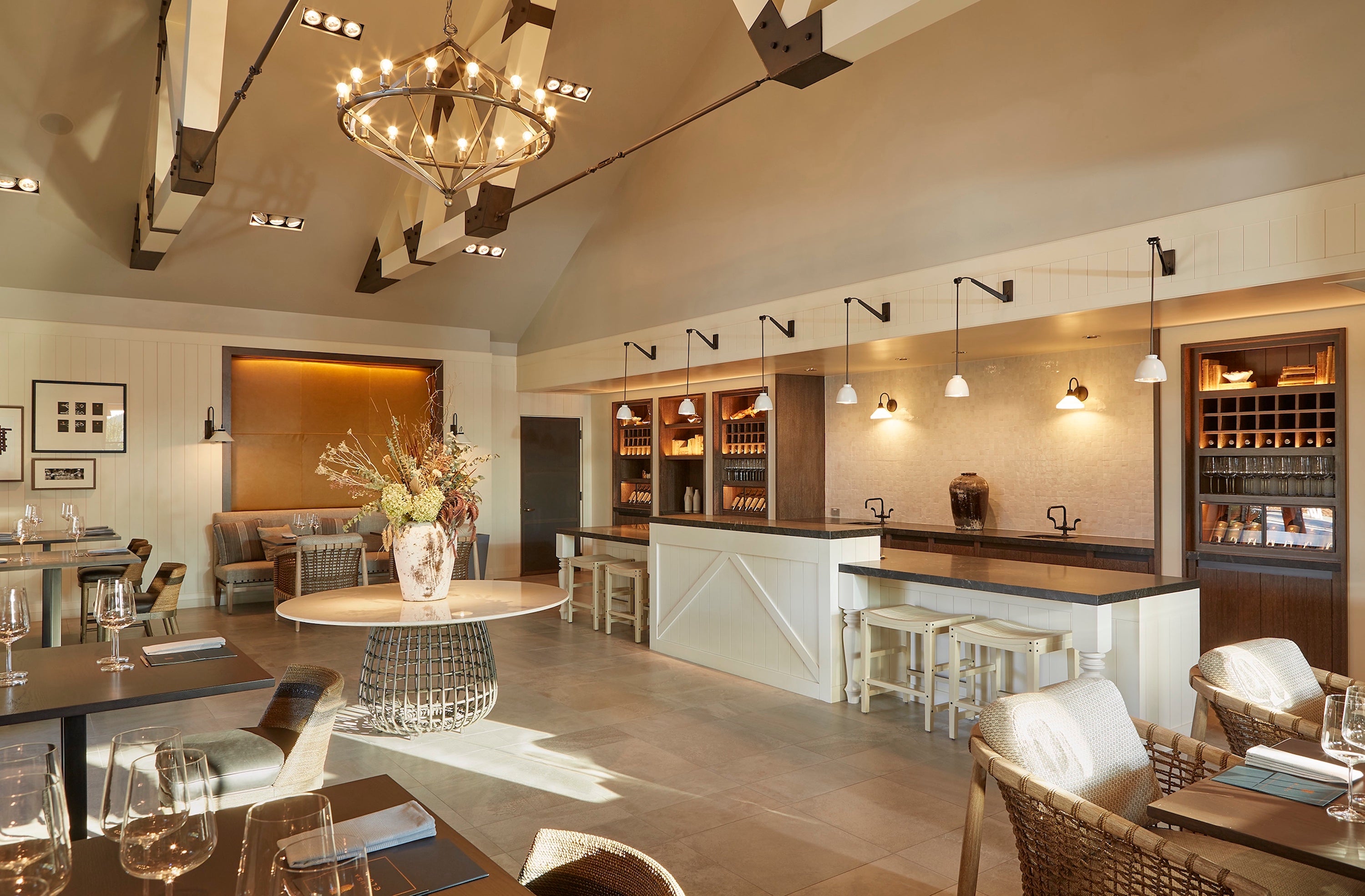
One of the very interesting parts about the property is that they integrated vineyards and the wine-making process into the whole resort experience. A big part of the design of the winery is educating guests who are there for a tasting about their process from start to finish—all the way from seeing the grapes on the vines to being in the fermentation room. With the design, they had two different public-facing components that they wanted us to develop from scratch: the members area and the visitors areas.
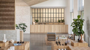
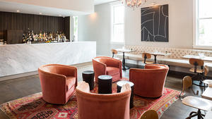
For visitors, you’re trying to draw in—you want them to experience this Elusa brand and generate excitement about it. For the members, it’s a little bit more established. They already know they like the wine. They’re in more of a lounge-like setting. The architecture and design of the spaces took those different approaches. So, the visitors’ tasting room is a vaulted, double-height space. There’s a lot more volume that can receive more people, and there’s a more communal aspect to how the furniture was arranged, with these long banquette walls. When there’s a tasting going on, different groups end up interacting with each other because of how communal it is. The members’ tasting room is a little bit more low-scale. We took all the finishes to a darker tone, and the furniture groupings are a bit more catered to a private event. You’re probably only going to be in there with a few people in your party; there aren’t going to be many people in the space at the same time.
Can you talk a little bit about winery design in general?
Obviously, being in Napa Valley, the entire resort aesthetic is built upon this agrarian route, and that was a primary design theme throughout the entire resort. The ownership asked us to make sure the new winery component would fit in aesthetically with the rest, but also would be able to stand on its own as a unique element. When you’re looking at the Four Seasons brand or the Elusa Winery brand, which are high-end labels, you have to take some of those raw agrarian elements, like reclaimed and rustic wood and a lot of unrefined metals, and figure out how to class them up so that it still feels appropriate for that sort of clientele. We utilized elements like the raw metals and wood more in accent features. So in the members’ tasting room, there’s this magnificent copper sculpture that hangs from a pretty white architectural envelope. The idea is that the doors to the space will flow open when it’s used, and eventually it’ll start to oxidize a little bit and develop a patina, which I think is a very rich theme in agrarian culture. [There’s a balance between] polished and rustic elements, and light and airy versus dark.

Are there certain cliches of winery design?
I think that a lot of them end up being relatively neutral. What we wanted [was] an overall neutral architectural palette, but we tried to interject a fun pop of color in each space that still felt relevant to the region. In the visitors’ space, we used a mustard tone; in the members’ room, we ended up using a burgundy-toned leather. The cliches in winery design, especially in Napa Valley, are a lot of that barn-look architecture, so we tried not go quite that rustic.
Not to lead the question, but I really love that fireplace in the members’ tasting room…
I actually think that fireplace in the members’ tasting room is also one of my favorite elements. When you’re trying to fit multiple components onto one wall—so in that room, for instance, we have wine storage, a fireplace, and they asked for a wet bar element. All of these elements can end up feeling piecemeal if you don’t create a cohesiveness to them through the design. We created that whole amenity wall as a monolithic tone, so while there’s multiple finishes happening on that wall—vertical paneling that’s painted, handmade tile on the fireplace, and the stone countertop and little metal details—all of those elements fell within the same tone so it doesn’t feel overbearing when you look at that overall wall elevation. It feels like this big map. You see that trend in design happening a lot in museums and very curated spaces, so that’s why we wanted to go that direction.
My other favorite element is definitely the oversized banquette in the visitors’ tasting room. Immediately when you walk the space, there are these banquettes that span the whole wall, wrapped in that mustard color. And then above them, we created a gallery wall to show the history of Napa Valley. With Elusa being new, obviously there’s not a lot of history, so we tried to tie in art elements that would highlight Elusa being a new brand alongside the history of Napa Valley.
Are there design challenges with a winery that make it a bit different from, say, a restaurant or lobby lounge?
You want to create a space that’s very comfortable for the guests to enjoy their time while they’re tasting—but obviously, for a winery, if they’re thinking about profit, they’re going to want a large turnover. They’re not going to want people to be hanging out all day long, taking that seat space. That’s why we made the visitors’ tasting a little bit more communal feeling; it’s not this cozy little nook where you can hang out and forget the rest of the world is out there. [The challenge is] creating that experience where it’s comfortable enough while you’re sitting there, but you still get up after a period of time and leave, versus the members’ tasting room, which was designed with residential furniture elements that you could really sink into and hang out in all day if you have the time.
What is your typical first interaction with a client?
Our typical first interaction would be, and on this project was, touring the site so you know what your design parameters are. You know what the spaces’ volumes are like: Which orientation are the buildings facing? How much daylight am I going to be able to rely upon? That California aesthetic the property really aligned with is very reliant on daylight. Our first interaction with a client is usually on site, making sure we’re the right fit.

What do you typically wear to a first meeting with a client?
It might be the designer uniform: myself and many of my teammates, we wear a lot of black. My typical uniform would be a pair of black Chelsea boots, black jeans, and depending on the weather, either a black, short-sleeved button-up or sweater. I don’t like to compete with the materials of the project.
How do you usually present design concepts?
In this day and age, we present a lot digitally, but no matter where you are, you want the client to be able to touch and feel the materials. There’s only so much that can come across in this digital world. Being able to meet them on site is super valuable, especially when you’re at the point of picking and deciding on finishes, so that they can feel the texture or see the shimmer of the tile. It really makes or breaks the design decisions for the project. If they only saw a flat digital version, they might reject something because they weren’t seeing the true luster and beauty of the piece.
What do you bring with you to a site visit?
Always a tape measure and a notebook. Our clients are always a wealth of knowledge about their particular property or what their vision is. We’re always jotting down tons of little tidbits and comments.
How do you turn down clients who aren’t a good fit?
At the end of the day, we all want what’s best for the project. There’s a lot to be said about the harmony of how a team works together. I feel like the best way to approach it is to come back to them with a referral, someone that you think might be a better fit than you. You can make the client happy with that connection and you can make whoever you’re referring happy with the fact that you recommended them.
Do you Google clients before you work with them?
For sure. I mean, you always want to know what you’re up against. If you’ve never worked with them before, you want to know a little bit about them personally and professionally, maybe put a face to the name. I feel like in this world, we’re on calls so much—not everyone turns their camera on, and you don’t even know what someone looks like! Researching a little bit before the project can not only make you look good if you know a bit more information, but it’s also just humanizing the process. We aren’t machines going about implementing a design. Design is very much about collaboration and the different personalities that are on the project.
Homepage photo: Visitor’s tasting room at Elusa Winery | Noah Webb