In BOH’s new series On Trend, we’re asking designers to share their favorite of-the-moment finds.
Sleek, simple and ultramodern, acrylic furniture is a trend that continues to stand the test of time. Though Lucite and plexiglass decor pieces hit peak popularity in the 1960s and ’70s thanks to designers like John Mascheroni and Charles Hollis Jones, they reemerged in the early 2000s—Philippe Starck’s Louis Ghost Chair, anyone?—and continue to provide decorators with a dash of drama without occupying a lot of visual space.
“Acrylic is durable and versatile, and its transparent nature lends itself to adding a modern touch to interiors while creating the illusion of a more spacious footprint,” designer Courtney McLeod tells Business of Home. “And there are so many multicolored acrylic options for a fun dose of kaleidoscopic whimsy.”
Curious how to incorporate a translucent decor item into a space? We asked McLeod and designers Paloma Contreras and Gioi Tran to each tell us about their three favorite acrylic pieces and how to use them at home.
COURTNEY MCLEOD | RIGHT MEETS LEFT INTERIOR DESIGN

New York–based designer Courtney McLeod has a knack for creating vibrant interiors. The founder and principal of Right Meets Left Interior Design approaches each project utilizing a toolbox of eclectic textures, patterns and colors to design one-of-a-kind spaces that express each client’s unique personality and lifestyle.
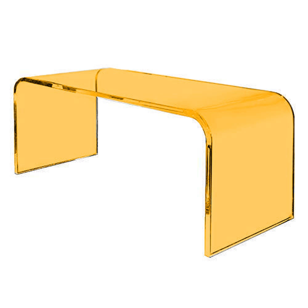
Colors 1" Thick Acrylic Waterfall Rectangular Coffee Table by Clear Home Design
“Bold and modern, this acrylic Lucite cocktail table is a fabulous way to introduce a pop of color. I would love to see it paired with a boldly patterned contemporary rug.”
Hikari Signature Table
“I love the iridescent, multichromatic finish with the soft curves of this table. It would be perfect for a room flooded with natural light to bring out the ethereal hues. I would use this as a starting point for a room and pull in elements with coordinating colors.”
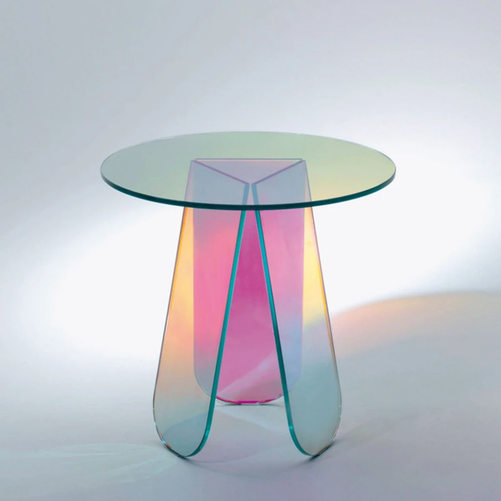
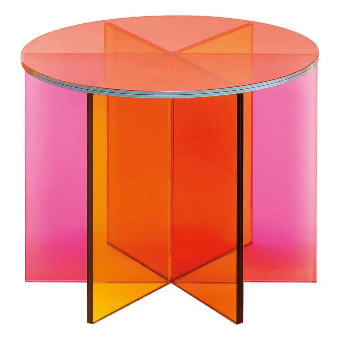
XXX Small Low Table by Johanna Grawunder for Glas Italia at 1stDibs
“I love to blanket a room in bold colors and patterns, but I would like to design with this prismatic piece as the only element of color in a modern, all-white living room. The sunset hues and starburst pattern would be quite a statement among white-hued textures and materials.”
PALOMA CONTRERAS | PALOMA CONTRERAS DESIGN

Houston-based designer Paloma Contreras believes that the best rooms have a sense of tension. Using seemingly disparate items, she creates timeless interiors that combine modern and traditional elements—including colorful patterns, classic silhouettes and glamorous accents—to achieve visual harmony and a truly bespoke aesthetic for each client.
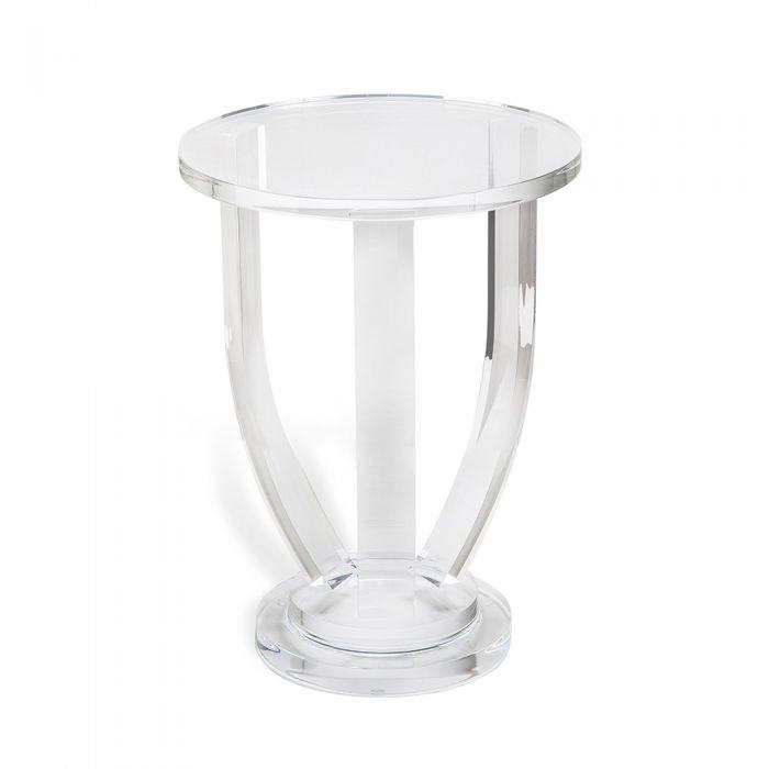
Lila Small Side Table by Interlude Home
“I’ve used this little table a few times. I love the silhouette, which works nicely in a variety of spaces. Sometimes, an acrylic drinks table is just the thing you need, because it adds functionality while being perfectly neutral and working with any of the other finishes in the space.”
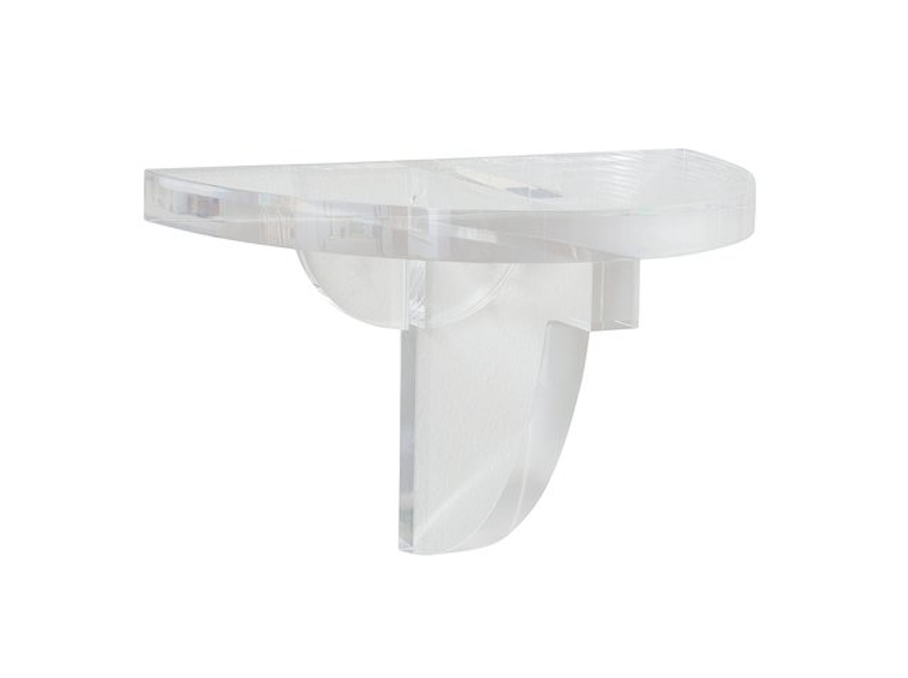
Floating Acrylic Bracket by Paloma & Co.
“These brackets are perfect for displaying beautiful pottery because they disappear into the background. I used them in a room I designed for the Lake Forest designer showhouse in 2020 that featured an Iksel chinoiserie wallpaper, and they added a perfect, modern touch in the space.”
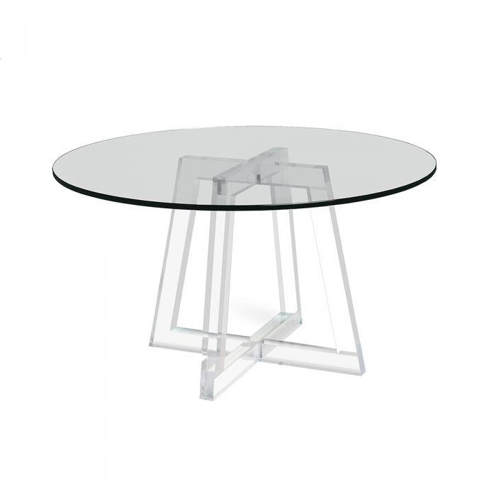
Stella Acrylic Dining Table by Interlude Home
“I designed a home for a client that had a very choppy floor plan as it had once been a duplex and had been converted to a single-family home. As a result, a small breakfast room sat squarely between the kitchen and den. It also opened onto the backyard, so it was a very busy thoroughfare. I opted for a dining table with an acrylic base and glass top because it took up very little visual real estate!”
GIOI TRAN | APPLEGATE TRAN INTERIORS

Gioi Tran is no stranger to innovative interiors. One half of San Francisco–based firm Applegate Tran Interiors, the designer relies on bold hues, clean lines and luxurious decor accents to create warm, elegant spaces that allow clients to emotionally connect to their living environment.
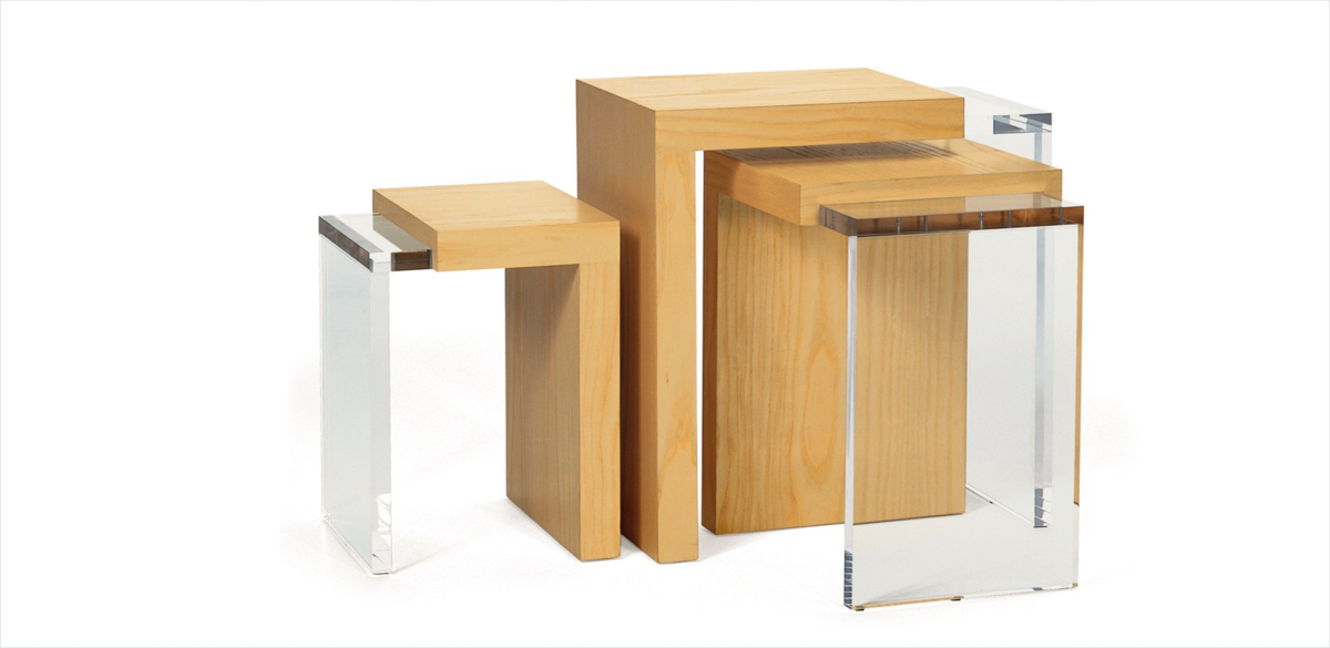
Ted Boerner 3-Way Nesting Tables Set at Hewn Showroom
“The combination of wood and acrylic creates a juxtaposition between organic and man-made materials. Because it is a nesting set of tables, this piece is highly versatile. The three-piece set can be arranged together as a coffee table or styled separately as a stand-alone piece.”
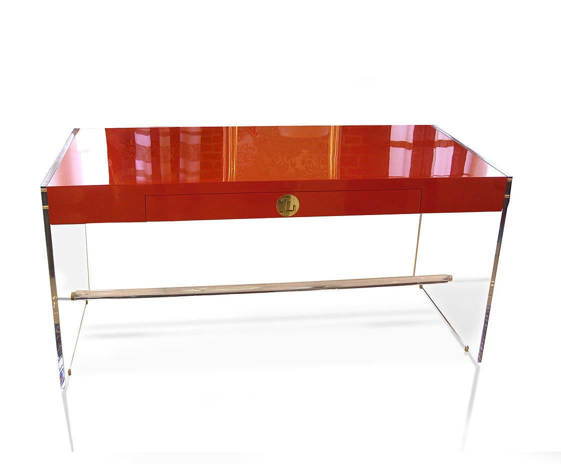
Claudia Lucite Desk by DWM | Maloos
“The Claudia Lucite desk rounded out our project in a client's modern workspace. The top of the desk retains the look of a classic wooden writing desk, with entirely transparent sides that extend to the ground. The clear table sides add to the weight and dimension of the tabletop. We find that the absence of color in the base gives this piece a very light and understated appearance—the perfect addition to any home office.”
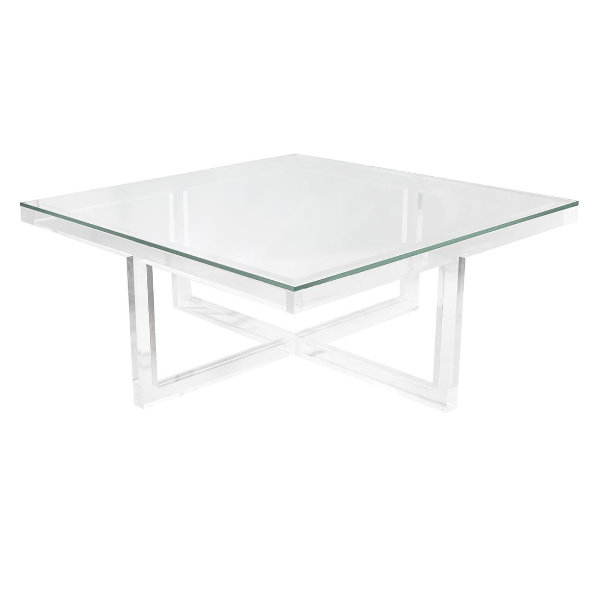
Thompson Square Cocktail Table by Kravet
“This piece really makes a statement in any living space, and we recently used it in a Boston project. You can even use small ottomans to push underneath and bring out when you have guests over as additional seating.”
Homepage photo: A project by Applegate Tran Interiors | Courtesy of Applegate Tran Interiors


