Once you’re in the door, there’s plenty of advice floating around about style, project management, budget and all the rest—but how do you actually get the job in the first place? We’re asking designers to peel back the curtain and walk us through how they landed a project, step by step. Here, Chapel Hill, North Carolina–based designer Kristin Bartone of Bartone Interiors, who specializes in biophilic design, discusses a boutique orthodontist’s office created to resemble a cool coffee shop. The architect on the project, Richard Gurlitz, worked on the original space in the 1980s and brought on Bartone, a frequent partner on projects.
What is a typical project for your firm, and where?
We’re really focused on The Triangle: Raleigh, Durham, Chapel Hill. We do have a couple of vacation homes by the lakes and beaches and mountains, and that’s typically a second home for a client we’re already working with. Commercially, we do new buildings and we do tenant fit-outs. The difference ... is with a fit-out, the core and shell are there and we’re renovating or building out the space to meet the client’s needs. From a residential aspect, we work on new construction and then major renovations and furnishing and styling.
You specialize in biophilic and sensory-based design. What does that mean?
I found out through my son, in creating a home environment for him. He is on the autism spectrum, and my other son has ADHD, so in setting up our own home to be a respite for them from the outside world, which is very overwhelming, I found that a lot of clients needed the same things. The same issues were coming up: “I’m really sensitive to light.” “This space needs more organization.” “I don’t like coming into this room, because there’s all this visual clutter that makes me anxious.” We found out that almost every client has one of those issues, or they have a tactile issue where they don’t like scratchy things. I try to ask all of those questions so that we create a space that is truly calming. I think when your home doesn’t provide that for you, you’re on edge.
Can you give a specific example of how you recently solved a problem like that on a project?
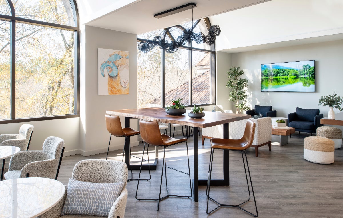
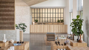
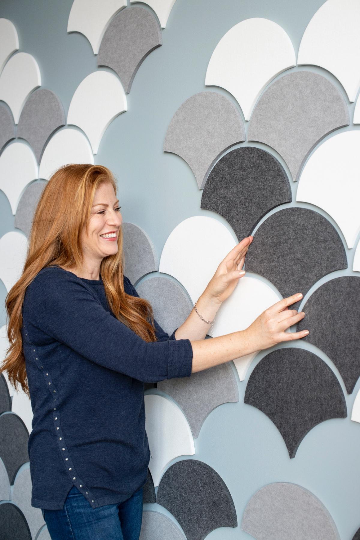
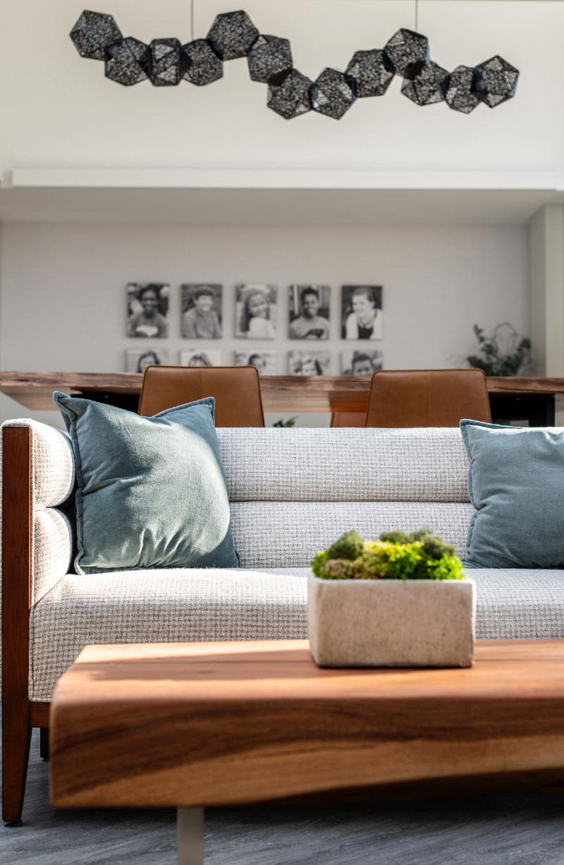
One example would be a home where the client really wanted it to feel like they were on vacation all the time. We have the master bedroom oriented to where it looks out onto this pool deck and landscaping. One of the big things with biophilic design is just incorporating natural views or nature or fractal patterns, which is a repeating pattern that happens in nature. A palm leaf, that’s a fractal pattern. That’s actually something we did for the orthodontist’s office. In the bathroom, there’s a print of leaves. In a common area, we have a bar-height table that’s live-edge, reclaimed wood. And then on their TV screen, they have rotating images of nature that are active, so if there’s a picture of a stream running through a mountain area, the stream moves.
Yes, what’s the backstory on the orthodontist’s office?
There was an architect that we share office space with—I had done a project with him four or five years ago on a residence where we were friends with the homeowner, and they then introduced us to Richard Gurlitz. ... He took me under his wing as a mentor and has let me share office space with him. I didn’t have to pay him rent for the first few years, because I didn’t have enough money. He actually has been an architect in Chapel Hill for 40, 50 years, and he designed the original building that this [orthodontist’s] office is in. He brought me into the project, and I interviewed with the clients. It’s sort of this spiderweb of relationships.
On June 25, Mason Lane Art Advisory founder Katharine Earnhardt—who works on projects across North America and the United Kingdom—shares her expertise on sourcing and selling art. Click here to learn more and remember, workshops are free for BOH Insiders
We want to hear your thoughts! Take BOH’s annual reader survey, an 8-minute questionnaire that helps us get to know you better and will allow us to tailor our storytelling to your business needs.
What was the vision for the office? How do you create a soothing orthodontist’s office?
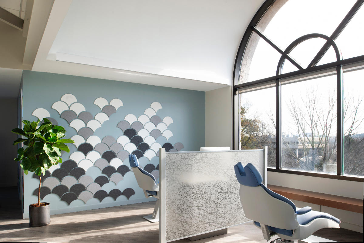
A lot of natural light, and an open plan and a welcoming environment. The architecture itself is curved, so you’re walking into a curved line, which is more restful and peaceful than a straight line. There’s a soffit that curves, and the reception desk curves. The first thing you see are natural elements: that live-edge table, leather, glass, granite and all these natural materials. That’s a way to put people at ease; those are all biophilic design elements.
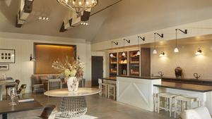
There’s a cafe—we tried to make it almost like a Starbucks atmosphere. Parents come in and have to wait for their kids for an hour and a half, two hours. They can sit and have a cup of coffee, pull out their laptop if they want to check their email. We also made it more of a comforting and homey atmosphere through the seating: a couch and chairs and the bar-height table and the little cafe tables. It all relates to somewhere where you actually would want to be. ... You walk in and it doesn’t really look like an orthodontist’s office—it looks like a place to meet up with a friend for a cup of coffee.
I think the windows help, too. Were they already in place or part of the renovation?
No, they were original. One of the things that ... really sold the client on renting the space is the barrel ceilings that parallel those windows. It was nice to have Richard involved with these ceilings. The original idea was to have wood slabs, and they didn’t have enough in the budget to do that, so we painted them and left them exposed and simple so that, again, you could see that curve of the architecture—the transom [and] all those soft, flowing lines really also support the architecture in being calming and serene.
What is your typical first interaction with a client?
We start every client with a discovery call. They’ll either submit something through the website or send us an email, or it’ll be a friend of a friend and they just call us. We’ll schedule a discovery call, and we have a list of questions to see if we’re a good match for that client.
What do you wear to a first client interaction, which might be happening on Zoom these days?
I’m driving to meet a client right now. It’s not a new client, but I’m wearing a dress and some little platform sandals. The dress is so fun—it actually has all these houses on it, like a painting. I try to dress the part and be artistically dressed, but also not too wild and crazy, so that I can relate to most people. When you’re hiring an interior designer, you want them to look like an interior designer.
How do you typically present a design concept?
We have a three-step process and it’s discover, design, deliver. Our first step is discover, and we go out and measure the space and ask all the questions. Our second step is the conceptual design, and that right now is being presented mainly on Zoom, because our concept phase is typically trying to nail down a floor plan. Usually, with us, it involves removing some walls, moving some halls, and some sort of construction aspect, along with a furniture layout and things like that. I also do AutoCAD for the floor plan, and if we are moving walls and renovating, I will do a SketchUp model to really help them understand what their space is going to look like. Because most people, the reason they’re hiring a designer is that they can’t envision those on their own.
What do you bring to a site visit?
I bring a laser measure, a tape measure, my notebook. I bring my iPad Pro with cellular, so that I can show clients images of other projects, idea images and inspiration images of their project. If I’m talking about a specific feature, like if I say an accordion door or a nesting door or ghost screens, I can look that up and show the client what I’m talking about.
What do you want to know about a client personally?
I’m looking for personal interests. If their profession is in a creative industry, if they’re artists. We had one client who makes quilts and used to make yarn purses that she took to craft shows in Philadelphia and all over. We’re looking for connection points, things that we can use to ask questions to further get to know the client and fit our knowledge of what they may want their space to look like.
How do you turn down a client who is not a great fit?
Typically through the discovery call, we’ll find out if they’re a good fit or not. Sometimes if it’s not a budgetary fit, that’s easier to tease out than if it’s not a good personality fit. But when we talk about our process and our level of involvement, we include the clients along the way, but we have a pretty structured process to keep all our projects on track and moving forward. We do a presentation about our process, so that’s the second touch point. The discovery, when we go out and measure, is the third touch point. And then we have two concept meetings, two detailed design meetings, and then a meeting at the end to go over all the pricing and the invoicing and kind of go line by line and make sure we know what they’re approving.
We basically have eight connection points with the client before we order, and then we’re going to be meeting them for implementation—meaning trades—and installing. Some people are comfortable with that, and some people want to call you every day. We just can’t keep up with that with our client load, so some people will not want to work with us after they find out that we’re only going to meet with them eight times.
Do you refer people when it’s not a good fit?
Yes. Some people will want things that are services we just don’t provide, like home staging. We have a three-room minimum, so if they just want to do a kitchen and no other space, then we’ll refer them to a kitchen and bath designer.
Homepage image: Inside a boutique orthodontist’s office designed by Kristin Bartone of Bartone Interiors | Lissa Gotwals


