Rooted in science, biophilic design is far more than just adding a plant wall in an office lobby—it’s proven to trigger significant stress relief and mood modulation. Here’s how to harness the research.
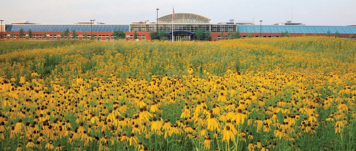
In 1995, Herman Miller moved several hundred factory employees from an old windowless building to a new facility designed by renowned green architect William McDonough—a bright, well-lit space surrounded by West Michigan prairie. It wasn’t just a change in scenery: In addition to being a pilot for the development of the LEED certification program, the transition was advised by a team from the Rocky Mountain Institute, a think tank dedicated to sustainability research. Their goal? To find out if employees who felt more connected to nature would be more productive.
Bill Browning, a member of the original Rocky Mountain team, recalls the observation that cracked the case. “What the research discovered was the daytime shift had a fairly dramatic gain in productivity, the swing shift data was inconsistent, and the nighttime shift had no gains in productivity,” he says. “From this it was concluded that the landscape was the significant contributing factor.”
In the following decades, Browning and his contemporaries have sought out and analyzed a wide range of studies that examine the psychological and physiological impact of nature on humans. Over time, they have organized their findings into 15 patterns, or principles, of biophilic design, all of which have been proven to reduce stress, boost cognitive performance and improve mood.
Browning currently helms the New York–based environmental strategy and architecture firm Terrapin Bright Green, which contracts with big-thinking clients like Google and Clif Bar to harness cutting-edge research to solve design problems. We caught up with him to talk about why the Guggenheim is a biophilic building, the importance of “peril” in design, and how to create moments of awe in interiors.
The patterns, or design elements, of biophilia fall into three broad categories. How do you break them down?
The first group is Nature in the Space, involving direct experiences of nature, like plants, animals, water, sunshine and breezes. The next group, Natural Analogues, are indirect connections to nature, like the use of natural materials, or the use of biomorphic forms in patterns and shapes. Because the brain is attuned to those, it actually takes less energy for the brain to process them and lowers stress levels when we see them in fabrics, details and surfaces in built environments.
The final category, Nature of the Space, are the spatial experiences themselves. Originally, we had four patterns [falling under this category]: Prospect, which is an unimpeded view through space; Refuge, where your back is protected and you have some canopy overhead—and if you put the two together, think of the big overhanging roof covering a raised porch on the front of a Craftsman bungalow. You have a view all up and down the streets—that’s a great Prospect condition—while your back is protected and you’ve got the shelter overhead. The high-backed booth where you’ve got a view of the whole restaurant is another example.
So it’s all about a sense of security?
Not exactly. Mystery, [the third Nature of the Space pattern], is a condition where there’s partially revealed information that prompts you to go explore and see what else is there. A classic example of this would be a curving street in a medieval town; another is the sound of a water feature in the distance, where you’re compelled to go see and explore it. You can do a curving wall inside as well, or an aperture that reveals some of what exists, but not all. What’s important is that you can’t see the full dimension of the next space, which makes you want to explore it.
The fourth is Risk, sometimes called Peril, which is a pattern you don’t want to use too much of: a potentially risky situation where there’s possible danger, but also a sense of safety. For example, at the Guggenheim Museum in New York, you go up to the top, look down over the rail, and Frank Lloyd Wright made that rail on the ramp just a little bit too low.
I’m scared of heights, so I’m always a little wary.
Exactly. It’s not low enough that you’re in danger falling over it, but it’s just low enough to make it really exhilarating to look over that edge. Or go to a Japanese garden and you’ll find stepping stones through a shallow pond. Are you going to fall in the water? Maybe. Is it going to be dangerous? Probably not so much. But it is a little thrilling to walk across that.
We’ve also added a new [Nature of the Space] pattern through a lot of recent research that has been sponsored by Google. Their culture is: If you don’t have the science, you can’t lay out the pattern. So we had to go full science. We developed a set of guidelines for their design teams for their spaces and campuses worldwide. The new pattern is one we wanted to include in our earlier set, but until recently there wasn’t enough science to really lay it out. That’s the experience of Awe.
You walk up to the edge of the Grand Canyon, or up to the Great Buddha of Kamakura, or into an old cathedral—what happens? What you see watching people is pretty much the same response: They stop, their jaw opens slightly, their eyes get brighter and wider, and their breathing changes as they pause. That’s a really distinct brain response. It’s actually several centers in the brain overloading simultaneously, rushing forward to the prefrontal cortex. You’re humbled; you tend to exhibit more pro-social behavior; you tend to be more charitable after having an Awe experience.

How do you create that awe-inspiring moment in an interior space today—something that’s not a relic or a Wonder of the World?
The first time you walk into the Oculus [train station] at the World Trade Center—the tourists that come in all stop and have the same reaction. It can be done with music as well, but it’s predominantly that visual response.
So you know what the patterns are—how do you implement them in an interior space in a meaningful way?
We created a chart that lays out which of the patterns help support stress reduction, those that support cognitive function, and the ones that impact mood and preference. The first step is deciding what outcome a client wants to support. And that helps us choose which of those patterns are most relevant to implement in the space. The lesson we’ve learned is: Don’t try to do all of them. Pick one or two and just do them well.
What happens when you try to do all of them?
Well, one, most of us don’t have the budget to do it. And two, if you try to do all of them, you wind up doing none of them particularly well—it’s sort of slapdash and haphazard. Instead, really focus the design on one or two [patterns] and implement them effectively. We see folks spending huge amounts of money on beautiful green walls in a space like a lobby, which is fantastic for the folks working the front desk, but everyone else just sees it for five seconds as they walk past. Put them in spaces where they’re visible to a larger number of the folks working for longer periods of time.
What does that look like in real life?
In some cases it may be artwork, or the patterns and fabrics and floor coverings as a minimal intervention. If I can put in a water wall, fantastic, because we know that the sound of flowing water is, by far, the best masking sound you can put in a space—not because it’s the best acoustic masking sound, but because of the way the brain processes sound. We did a whole paper on our psychoacoustics and brain responses; there’s some really good work going on now around birdsong as well.
Even the studies done on what kind of artwork resonates worldwide—inevitably, it’s a landscape with a whole series of elements that tie to what’s called the savanna hypothesis. All the best evidence is that humans evolved on savannas in Africa, where the conditions are copses of shade trees; open water; calm, grazing animals—places with distant views where you can sit and be safe. The hypothesis is that when you see artwork that does that, that tends to be highly favored. We replicate analogs of savannas all over the place—in suburban lawns and parks and golf courses.
You choose the intervention that’s going to support people. We’re working on the redesign of an airport terminal right now, and it’s a massive space—400,000 square feet per floor, almost 10 acres of interior space with lots of stressed people moving through it. So we are looking at where, in this huge space, do we have the largest sources of stress? And then we’re picking interventions in those specific portions of the space. The queue going into the TSA screening would be one of those, and the space right after you’ve been through the trauma of taking your shoes off and you’re repacking all of your stuff—these are where key interventions are being made to reduce passenger stress and support the folks working there all day long.
You mentioned budget. There is a common assumption that prioritizing well-being in a design costs more. Do you find that to be true?
The biggest cost of a building per square foot, more than 10 times the rent, is the people—their salaries, benefits, everything. Focus on things that are going to help support them. For example, one of the intriguing things we are seeing in workplaces is that everyone’s going to open-plan offices with benching and unassigned spaces. Those can be really effective at supporting collaboration and interaction, but [not] if that’s all you have—[because] people need to be able to get away, even if just for a few minutes, take a private call or chill out and reset. They need that refuge experience. It can be as small as a really big wingback chair, but you need those experiences mixed through the space. In home design, having that little breakfast nook or even just big window seats, those are all ways of creating that experience.
Is there one aesthetic that lends itself to biophilic design, or can it be incorporated into most design styles?
If you go back and look at vernacular architecture and older buildings that people have preserved, they tend to have pretty strong elements of biophilic design. In older homes, you’ll notice hardware that looks like leaves or a seashell. You’ll see traditional decorative elements that reference nature. One of the [frequent] comments we make is that a lot of this is really intuitive. It’s what people have been doing for a very long time. And what we’re doing with biophilic design is helping give the science of why people have those responses, then using that to help designers make their designs even more effective.
Homepage image: Courtesy of Herman Miller