


In a new Q&A series, BOH taps leading designers to take us inside kitchens, baths and mudrooms that deliver—revealing the technical considerations, material choices and design decisions that make these hardworking spaces sing. This week, we’re chatting with Jess Weeth, who launched her Rehoboth Beach, Delaware–based design business in 2019. Her five-person team offers a fresh take on coastal design for clients up and down the East Coast, and kitchens have always been her forte thanks to a soft spot for millwork and cabinetry. Ahead, she walks BOH through a recent renovation for a pair of repeat clients who worked with her on an addition and the rest of the living spaces in their Central Delaware home before deciding it was time to tackle the kitchen.
What were some of the unique challenges of this space?
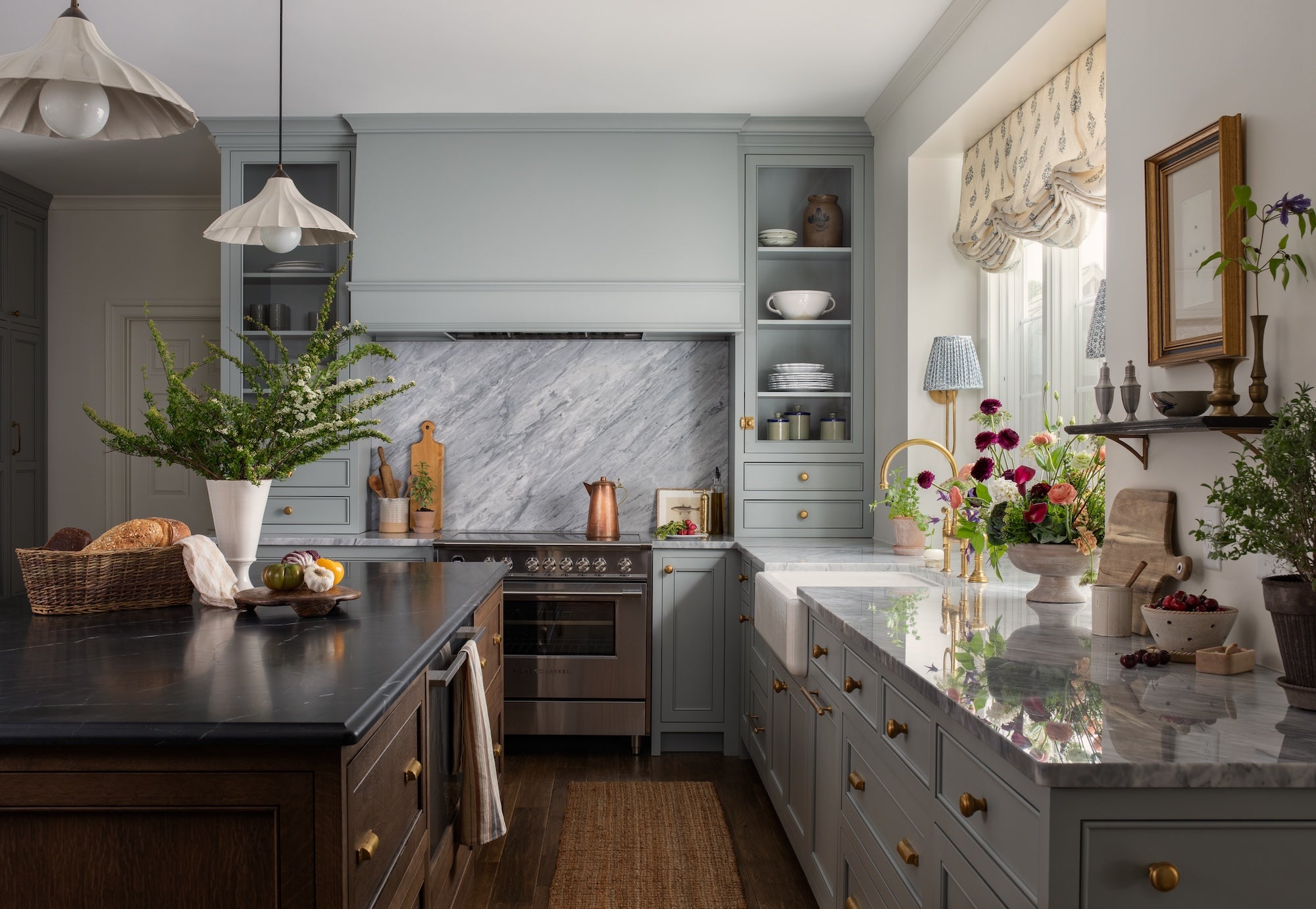
For one, it’s a compact space. This is a big family with four kids, busy schedules, some nanny help—so the kitchen is the center of their home without being a huge area in terms of square footage. Making the most of every inch is not a unique problem, but it’s definitely something we had to focus on.
There was also a big lack of natural light. The ceilings are low. They had one window over the kitchen sink—it was a small, maybe 28-inch window—and it was kind of a dark hole in that corner because the upper cabinets didn’t extend all the way to the ceiling. Everything felt very small and dark.
Finally, the addition they put on the house had created an outside corner in the kitchen, which is a spatial challenge you don’t see every day. It was a challenge to make the lower cabinetry wrap around an outside corner without making the space feel too closed in. A lot of kitchens are L’s or U’s, so you’ve got those corners to work in, but when it starts to extend into another adjacent space, the way we approached the floor planning aspect had to get a little bit more creative.

What was the client looking for from a functional perspective?
Like a lot of modern families, the clients wanted a lot of appliances but didn’t want to see a lot of appliances. That’s [something] we get asked for often: big refrigerators, big freezers, refrigerator drawers, dishwasher drawers. Having all of those things in a small space—and in this case, they didn’t have a walk-in butler’s pantry, which is where some designers call for a lot of things to be shoved so they don’t have to be in the main space—we had to make sure they were beautiful and functional, but also really pack them in. That included the full freezer and refrigerator columns we designed into the wall directly facing the sink, and then we designed that wood hutch for their coffee bar so they could have a nice little home for their smaller appliances.
What about their design inspiration? What were they looking for in this space?
When we do intake, we ask a lot of questions and probe for inspiration photos. Sometimes those come in a beautiful, organized format, but more often than not, it’s a random picture where they’re like, “I like this, not that exactly,” so we’re trying to read what they’re actually asking for. In this case, we knew she liked that cozier, layered feel—timeless, traditional elements, but with a twist.
During our concept phase, it’s very common for us to present two different approaches. When we presented to her, we had one with the pretty smoky blue utilized throughout the main cabinetry, with two different stone countertops, the dark island and brass fixtures—that’s obviously where we landed. But we also had presented a creamy—not quite buttery, but a rich cream—perimeter with a dark blue island, and then more towers of wood throughout. She went for the color-forward option, so it was nice to see that she was already feeling like she wanted to have something that was more of a statement. She wanted us to push the limits while still [creating a space that] worked with everything else she had throughout the house—especially since this opens up into the living space, so it wasn’t its own pocket.

What are some of the intake questions you’re asking to get a feel for how clients will use the space?
We try to get a sense of who is doing the cooking in the kitchen, and what does that look like? How much prep space [do they need] and how often are they utilizing all of their appliances? Especially in smaller kitchens, we’re often striking that balance of form and function—in this case, we have that tower of cabinetry that flanks the range and creates that little hood alcove moment—and it’s always a bit of a give-and-take: Is that enough space for you to the left and right of your range while you’re cooking? We really do try to get into the ins and outs of how often they’re cooking, what kinds of tools they’re using, and how that impacts what they need in terms of countertop space.
You could go on for days about all of the ingenious ways you can utilize your drawers and doors with dividers, integrated cutting boards, those appliance contraptions that can pull up, all of those things. But from a macro standpoint, we also like to find how much visible dishware and kitchen items they are open to seeing. We usually try to encourage having an element or two of life in the kitchen. Everybody likes the idea of putting away mess and having it look clean, and I can definitely appreciate that, but if everything is all closed cabinets—outside of photo shoot day, when you might have a beautiful floral in there—it’s going to look a little more dead than if you can really utilize actual storage space and not be too precious about it. In this case, there was a debate, and we really pushed. I was like, “I think you’re going to love having glass cabinetry. When you flank that range, it won’t just be a wall of cabinets, but you’ll have some of the styling opportunity and life and visual interest to give your eye a place to dance around.”
Lighting is another huge topic for any task-oriented space—how you’re going to layer in lighting. A lot of people know it’s very in vogue to not have any recessed lighting—and of course I love that look—but when we’re talking about clients’ practical preferences, a lot of times that is something that ends up staying within a design so that they can really clean at full blast. They like having that option, but we also bring in additional [layers of] cozier light. In this case, the pendants over the island are typical, but we also created that deep jamb within the window case to have those little sconces, and that’s what helps make it feel like a living space. We’re trying to understand functional needs of lighting, but also how we can supplement that.
What do clients see to help them through the decision-making process?
We start with a concept document that we share with our clients, which is more about visual imagery, but we also do an initial rendering of the space. [This kitchen] had two different color palettes associated with it, showing how we could take the design one way or another.

From there, Exhibit A is what we would consider moving into the true design development phase. We do bring back some of the imagery that we discussed in the concept phase, just as a reminder for the client—so here we have that as the overall color inspiration; an example of a range alcove with the full-height stone backsplash; two-tone countertops in a darker stone on the island with this wood; and the brass hardware we really liked—all with some visuals for the client to understand.

Then Exhibit B is a mood board of the specific fixtures and finishes we intend to use. This is showing our two countertop selections—we went with a Bardiglio marble for the perimeter and the backsplash, and then a honed Taj Black, which is like a soapstone but a little harder, so it wears a bit better. Stone is such a big component of kitchens—and not one without some controversy in terms of performance, durability and beauty. This was one area where the stone that went in, Bardiglio, has some characteristics that made it hard to hone. It’s more of a polished stone, and the stone team did have to come back a couple of times to fix up some spots of that perimeter.
How do you talk about the pros and cons with clients?
If you’re somebody who can live with a little bit of imperfection, that [marble] is going to still feel authentic over time, versus quartz, which can be really beautiful and will always look new, but may not have that depth. In this case, knowing that the full backsplash was going to be stone, that’s definitely where we wanted to push to get some of that natural beauty.
What about the cabinetry? How do you help clients understand what decisions they need to make?
I pulled some finishes from our collection with Unique Kitchens and Baths, so all of the cabinetry in the space was done with the door styles and colors that we’ve developed with the UKB team. We’ve been doing kitchens with them for over five years now, and their ability to handle customization and the details is why we love to partner with them, and why we have been able to deliver some really beautiful spaces. This is the Tidewaters color. We almost hide it at this point because we’ve done it so often, but people continue to love it because it can work with warms and cools—it’s a chameleon color that goes a little green-blue sometimes, or it goes smoky sometimes. It really has that depth, whereas there are other blues that we love that can come off a little bit cleaner and preppier. This one is moodier but doesn’t feel dark. We went with that for the perimeter, and then did a dark-stained oak on the island for a bit of a rustic feel.
In this phase, you were also pitching a pretty major transformation to the space.
One of the most formative changes was expanding the window—from the one single window over the sink to the three larger windows. We also bumped it out so that there was a deep jamb extension. The countertop extends into the windowsill, which creates a beautiful place to put plants—[the client] loves plants—and to bring some life into the kitchen. It’s amazing what that extra six or seven inches gives to the breathing room when it’s that tight of a space.
Even when I’m doing Expert sessions, that’s one of the first questions I ask: “Are you locked into your windows? If you’re going to invest all of this into the kitchen, are you open to considering a different placement of windows, or larger windows?” That obviously comes with some additional exterior work and cost, but often it’s one of the best changes you can make. So many of the kitchens that we love are the ones that don’t have to try too hard to have great natural light in them.

Once clients say yes in the design phase, how does your process unfold?
That’s when we get into the space planning. Exhibit C is a good view where you can see that outside corner I was referencing, and where we bumped out the window. We give locations for dishwashers and trash; this also [shows] the little coffee-bar hutch we added, and their eat-in breakfast table lives [in the space to the] right. It’s kind of a pass-through to the addition they put on their house, and their living room is [to the] right. You can see where we ended up adding these little interior windows, so you can peek through from the living room. It gave some really nice distinction to the spaces so it wasn’t one long open concept. It also gave us the ability to change paint colors, which I always want to do.
[The area at the center bottom of the plan] was a little drop zone when they first had the house built; it was kind of a messy countertop catchall—which I could relate to—but we decided to utilize that space for the fridge and freezer columns, with a microwave in between. On the left is an area off their garage, but it’s not a distinct space. We ended up doing their mudroom cabinetry in the same color as the kitchen cabinets, just to make the space feel unified and not too jumpy, because we didn’t have any type of cased opening or dropped header to delineate [the spaces and justify] a totally different style and finish. The benefit is that it does end up making the kitchen feel larger.

And then Exhibit D is the elevation view, which the clients will also see at this phase. This is the little coffee-bar hutch and outside corner I mentioned. The cabinet opens on both sides into the shelving, but the drawer is only functional on one side, even though it looks like it’s functional on both sides.
Once you’ve gotten this far, how do you think about layering in the decorative details?
The star of the show was always going to be the colored cabinets—that is probably what grabs people’s attention most, that unique blue color. But then it’s like: How do we enhance that and give it something unexpected? You could probably envision this with a light oak island and white countertops, and it would be very pretty, but I think in this case, finding some darker materials to add contrast is what gives it layers instead of being overly sweet. The stone and the island we landed on were about giving it more depth and character.

I find the trend reports on metals so funny, because it’s always a pendulum [swing] one way or the other. It’s brass, it’s nickel, it’s bronze. I could eat my words in five years, but we always have, and I think always will, utilize all the finishes. It’s just about mixing them well, and what actually complements the other colors. This particular blue looks so beautiful with the warmth of an unlacquered brass that patinates over time—they’re just really good friends. That is what brought a little bit of the warmth and charm to the space; if you picture it with cooler metals, it goes in a very different direction. With the hardware, we did think about mixing—I see so many successful kitchens where you have a mix of knobs, latches and cup holes in different areas. But from a balance perspective, we didn’t want to overdo it with huge pulls everywhere in a kitchen as small as this—that can make it feel either a bit too transitional or contemporary, or just not in proportion. I like to utilize smaller, appropriately scaled hardware in spaces like these.
What about the appliance selection? How involved are you in making those choices?
A lot of times, our clients go for these beautiful-in-their-own-right ranges, so we’re often designing around that. But I love the fact that this was a Wolf stove that they knew they wanted. It feels functional, but also beautiful in the sense that it’s functional, if that makes sense. It works with everything, without needing to be overly pretty. And then it’s funny how the smallest things—like the pleated shade on the sconce, or the gathered, relaxed Roman [shade]—add the attitude and the casual beauty, keeping it from feeling like just a task-oriented space.

My guidance on appliances is always going to steer people toward making sure they have enough and that they’re in the right places, but from a functionality standpoint, it is really personal. We have certain models that we see used all the time, but that’s one area where I encourage clients to go [experience the appliances] and understand the technical components. It’s amazing the things you just intuitively get used to because you have them—or that you know you hate. We can make so many things look beautiful; if you have a beautiful range but don’t love the way it works, that defeats the purpose.
We always petition for panel-ready appliances when we can, and we make sure that we’re voicing all of the latest technologies and models so our clients are aware of them—like panel-ready warming drawers and dishwasher drawers, or combination steam ovens, which people who haven’t renovated a house in a long time don’t think of. But when it comes down to how you’re going to use your gas range or your refrigeration, that’s something a client should be involved in, because it’s so functionally a part of their day to day.
Where did these clients land on appliances?
Dishwasher drawers were one of the things they opted for. Other than that, it was more moving to the refrigerator [and] freezer columns that we see a lot of people utilizing and liking. Having this sleek unit here ended up looking a lot more beautiful and balanced, and gave [the homeowner] more space than she’d had before with the French door over a freezer drawer.
Were there any other design challenges your team encountered during this project?
One of the things that can be challenging about kitchen renovations is how hard it is to undergo as a family if you’re going to stay in your house. These clients are so gracious and incredibly patient, but it’s a challenge as a designer too—to advocate for the right decisions for the long term, while knowing that they’re living with a toaster oven and whatever other sacrifices they’re making along the way. As an empathetic person, it can be a challenge to know the hardship.
We’re also trying to stay the course of timeless decisions. Custom cabinetry doesn’t turn around in three or four weeks, and you have to demo the space in order to measure, and then you have to wait for the cabinets to come in, and then there are so many things that have to happen after the cabinets come in. The time associated with these projects can sometimes be the hardest part. Craftsmanship takes time. That was definitely a challenge here, just wanting it to go faster for this young family but knowing it was going to be worth it in the end.

There’s also only so much control you have over that timeline.
As a designer, you’re walking a line of: “We’re not a general contractor, and there’s only so much project management we can control.” We’re not the one opening up the house for the stone delivery; it’s the contractor who is doing that. However, unlike a large, full-scale build—where there’s a team in place that has software managing the build, and weekly check-ins with the client and all of these process-related things—a renovation like this falls somewhere in the middle. It’s just as hard, if not harder, than a new build, because you’re working around existing elements. Kitchens have every component you can think of, from the mechanical side to framing to all of the finest trimwork details, but it’s usually a small project for someone if it’s not [part of] a full house [design]. We have to establish great communication, but also advocate for our clients while protecting ourselves in terms of saying, “This is our lane. We deliver the design. We won’t miss any deadlines as it pertains to selections that need to be made, but in terms of the total time of the project, there is the general contractor side of it.” In this case, we were able to work collaboratively with the contractor throughout the whole process, but there are some projects where it can be uncomfortable when there’s not that greater visibility into the timeline that a lot of larger renovations or new builds bring with them.


