














In a new Q&A series, Business of Home asks leading designers to take us inside kitchens, baths and mudrooms that deliver—revealing the technical considerations, material choices and design decisions that make these hardworking spaces sing.
This week, we’re chatting with Lauren Sullivan, who launched her virtual studio, Well by Design, in 2020. In the years since, she’s cultivated a social media following for her slow design ethos and debuted Well Found, an online resource for the European antiques she imports. She recently walked BOH through the kitchen design in her new-build home in East Tennessee, where she designed a space around living, working and hosting—and just a bit of cooking.
This was a ground-up project, and it’s your own home. What was it like working without constraints? And what inspired the concept of a kitchen that’s not centered around cooking?
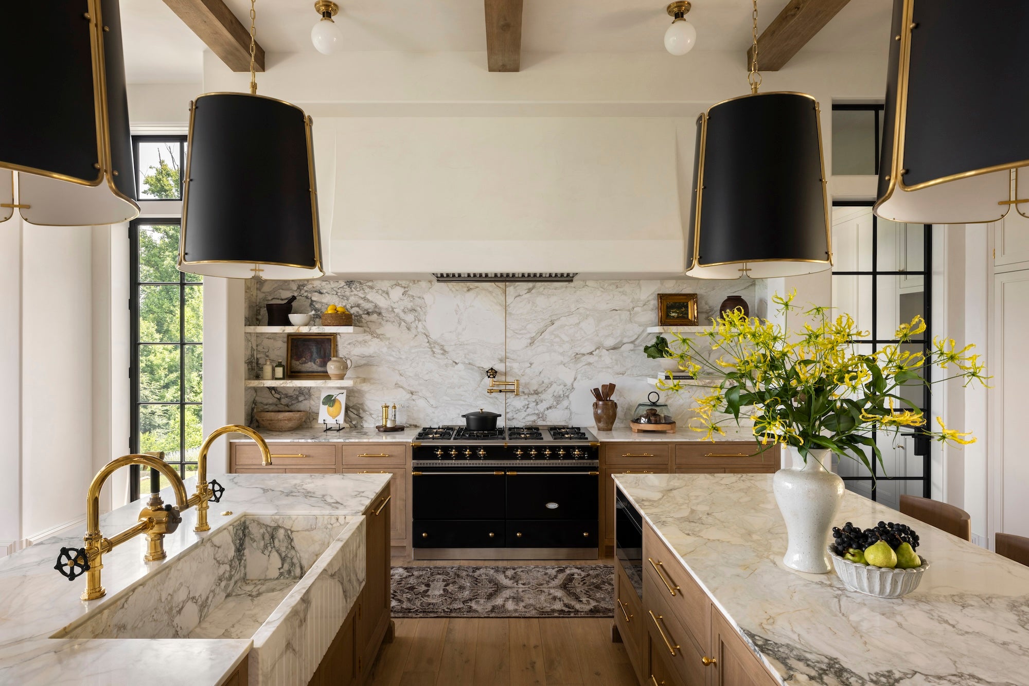
It doesn’t just function as a cooking space. We work from the kitchen island all the time because the views are beautiful and it’s the center of the home. One island has the sink and all the functional stuff; the other has storage and a microwave in it, but it’s primarily serving as seating. If we have people over, we eat there—we’re there ourselves more than at the dining room table. We work on our laptops there, so it can charge our devices. It also has views into the living room, so if you needed to see a TV, you could with the pass-through. It’s nice because it opens the kitchen up to the living room, so you don’t feel cut off, but it also doesn’t feel like an open floor plan—it’s the best of both worlds. We worked in close collaboration with Brooks & Falotico, our architects, on the entire house, and they were extremely helpful with a lot of these sight lines and the design as a whole.
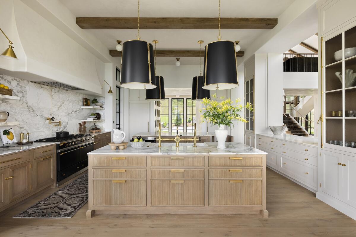
When I say it’s not centered around cooking, I feel like the biggest thing we would have changed if we were cooking every single day in our kitchen is that we wouldn’t have done an integrated marble sink. We aren’t putting a bunch of pans in that sink every day. I think if we were using our oven or our stove all the time, we would have rethought that decision. It is beautiful, and it works for us, but it is probably a little impractical for someone who cooks regularly. That’s not to say you can’t have an integrated marble sink if you cook regularly, but I think that there’s more of a risk with chipping or cracking the marble.
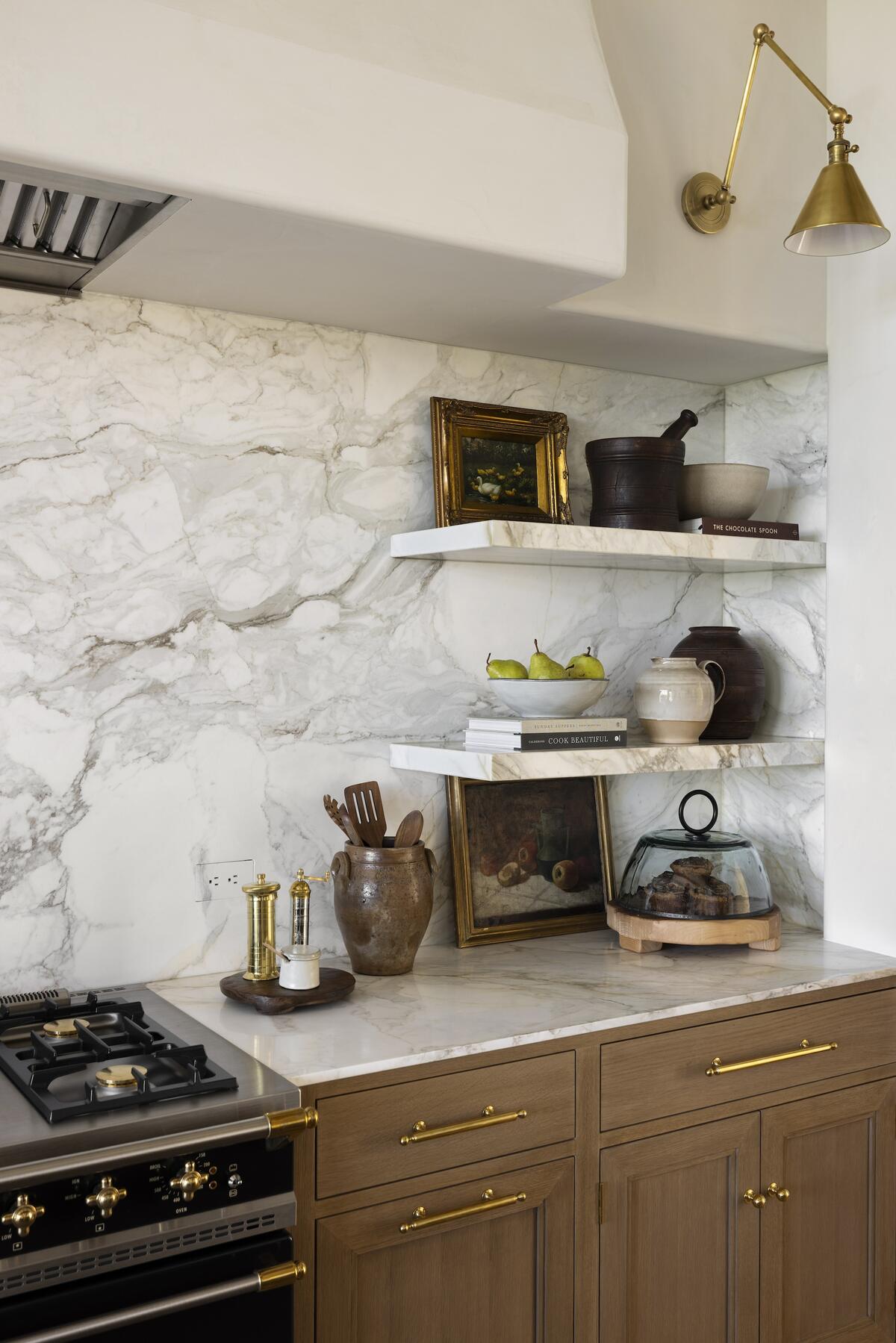
You have to tailor your kitchen storage to your lifestyle and how you cook. Just like the sink, we might have done things a little bit differently on our range wall if this house was for a family that cooks often: how much marble is surrounding the range, or the transitions with the plaster and those kinds of details. We have all the [cooking] gadgets—we just don’t use a lot of them, [so] we have a lot of lower cabinetry storage, but not so much upper cabinetry. We store seasonal items that we don’t need often in the [highest] cabinetry, and they’re touch slabs, so they don’t even look like they’re actually storage and cabinetry. We have drawers with pegs in them for the dishes instead of cabinets, which we love—it’s just really accessible.
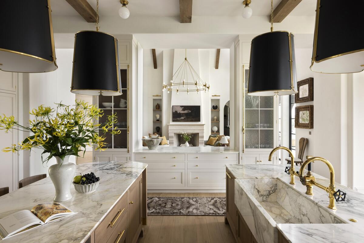
Aesthetically, we have glass cabinetry on the wall facing the living room. I wanted them to have a very old-world feeling with cremone bolts, and then we did Gothic-type blurry glass from Bendheim. That way, you can see what is in the cabinets a bit, but it is just mottled-looking to not make it out fully. It just adds another layer of texture. We did exposed hinges on all of the cabinetry as another old-world touch. You want to make those decisions early on, like if you’re doing exposed hinges, because that does change the way the cabinetry is constructed.
When it came to designing the space, what features were at the top of your list?
We wanted it to be very European inspired, but also not feel stuck in a time capsule. I knew that I wanted a black Lacanche range, so we centered everything around that initially. I love the Lachange ranges—they’re timeless and a bit iconic. And when we do cook, it works beautifully. I love that one oven is gas and one is electric, so you have the option. Ours is not customized to a chef-level cook, but they have endless customizations; we basically chose the model based on size and what would fit the space.
I also knew that I wanted to use Calacatta Paonazzo marble, which became a quest to find the exact slabs we would use. I had seen it floating around the internet, and I just loved the look of it. We found a specific slab that I liked even more than a lot of the Calacatta Paonazzos that I had seen, so that sealed it for me. I don’t mind the imperfection of it: Ours has etching marks on it from where we’ve had holiday gatherings and stuff has been spilled, but that’s part of the beauty of marble. And we didn’t want bookmatched marble; we wanted it to be continuously flowing across the range wall to give it a more organic look.
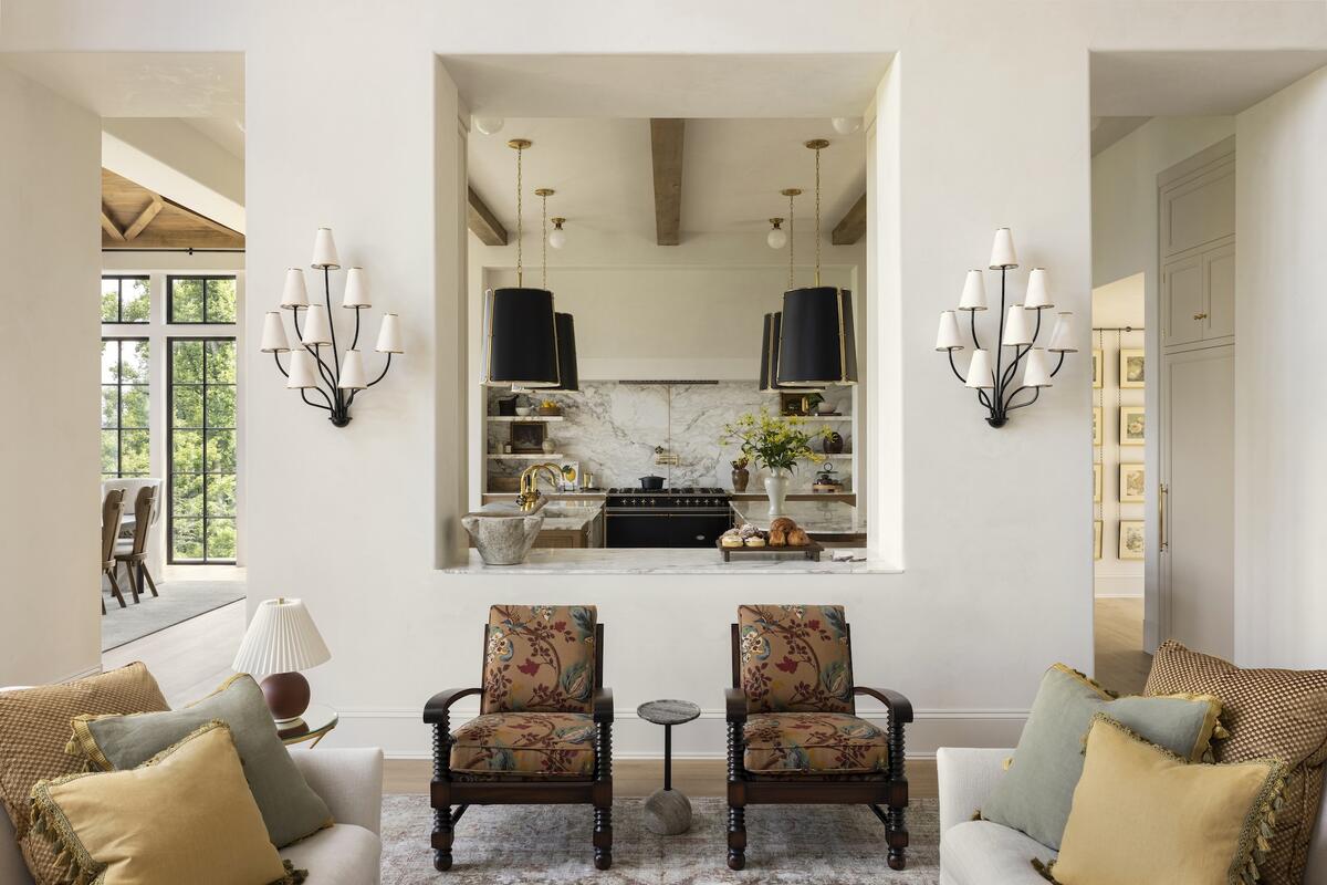
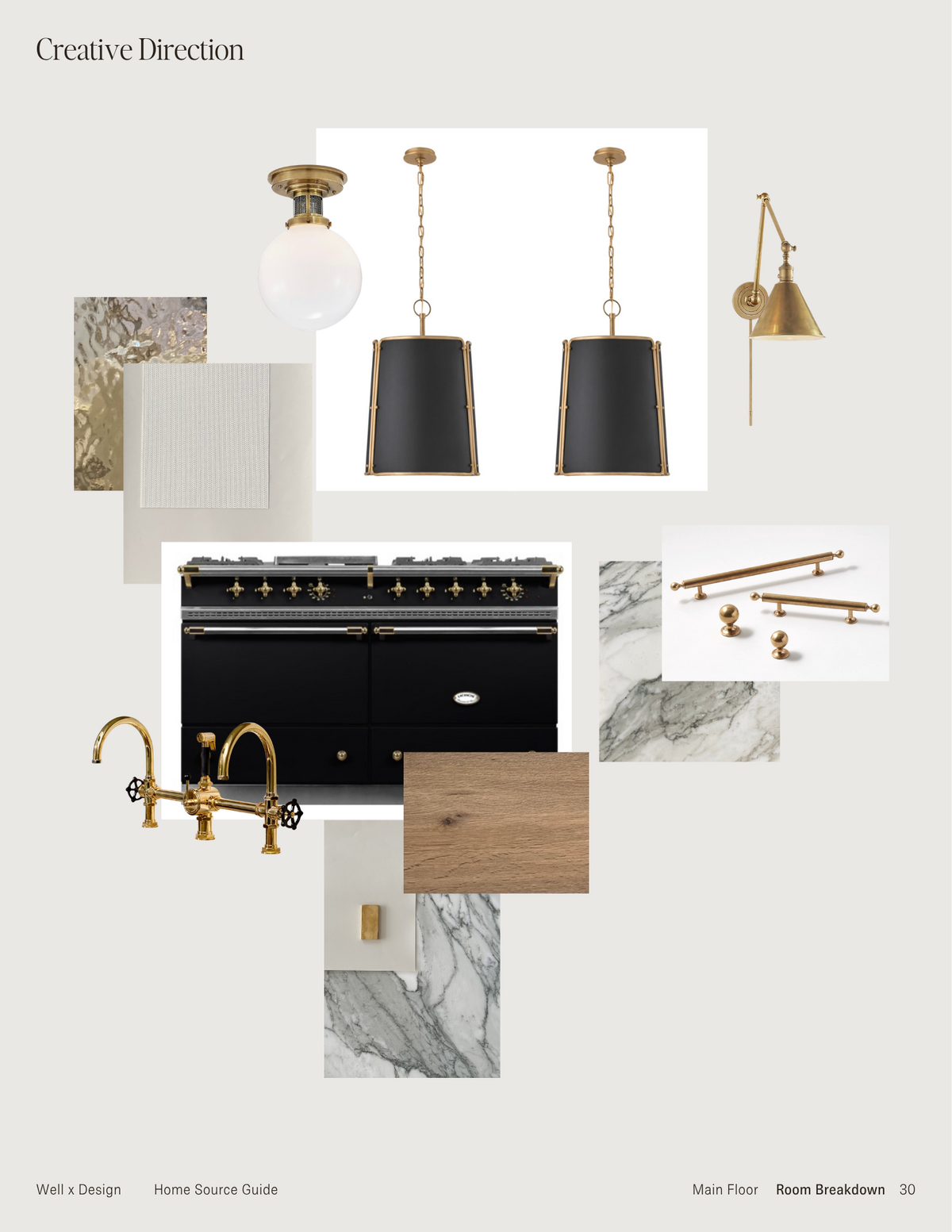
Once we sourced those items—everything centered around the marble and the range—I knew I wanted unlacquered brass details and beams on the ceiling. The ceilings are very high, so we intentionally chose the large pendant. That was a way for us to bring the ceiling height lower and make the whole space feel cozier. It plays with your eye and makes you think the ceilings are lower than they are.
How did you light the space?
We knew that we wanted to do flush mounts rather than recessed lighting, [and] we knew we wanted a mix of different lighting sources. The pendants provide light over the islands, and then the flush mounts provide plenty of overhead lighting. We also wanted to do the wall sconces on the range wall for an added layer. The glass cabinets also have built-in lighting, so we can really light those display cabinets up in the evening, and they’re very pretty.
We concealed our outlets in the marble on the range wall. There are two outlets, one on either side of the range, but you really don’t see them.
Walk me through some of the more decorative elements you chose.
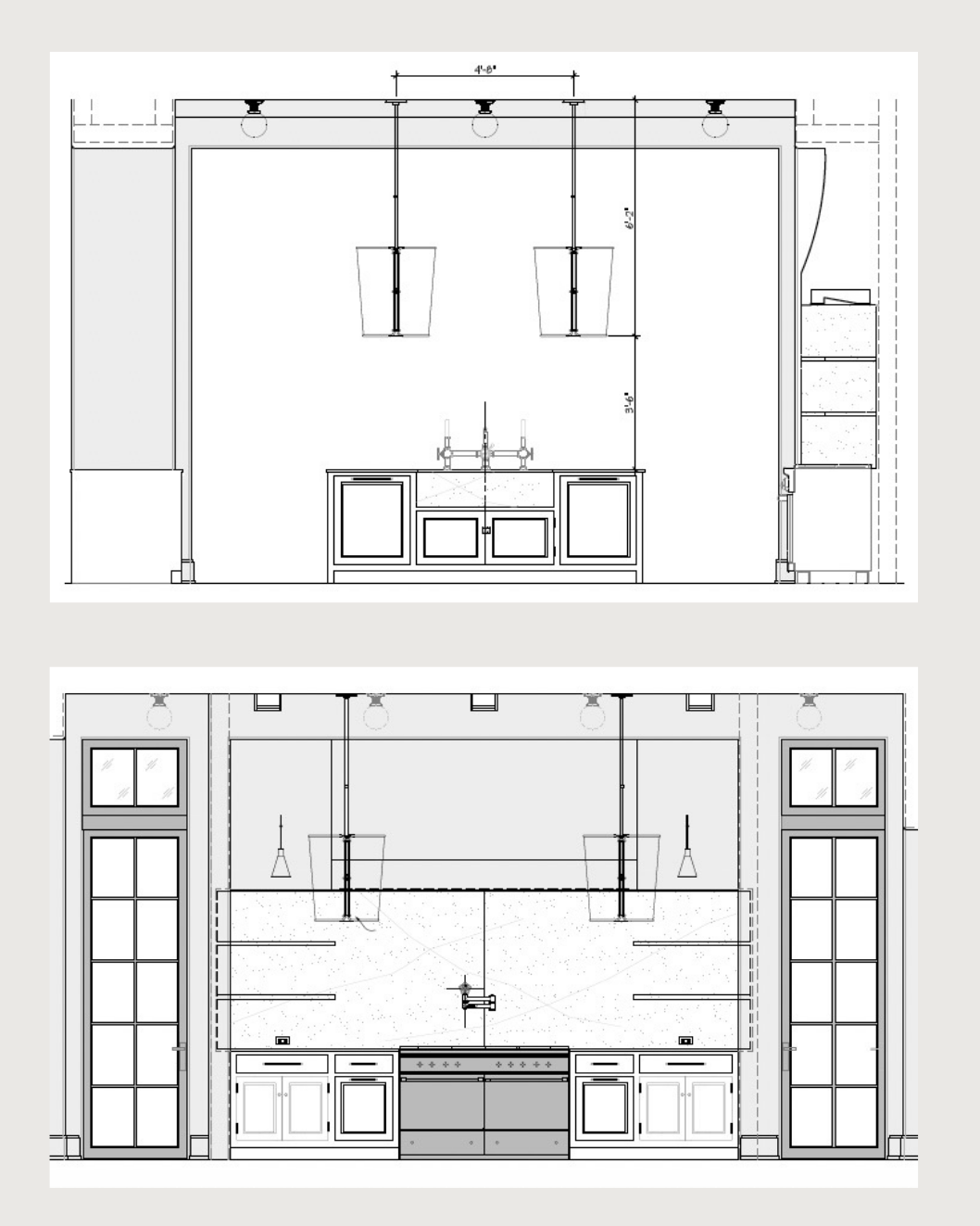
We kept the countertops at 2 centimeters. I didn’t want to build them up at all; I wanted a thin [surface]. We used the reeded panels along the perimeter and the ends of the islands in the center galley. The primary work zone—where the sink, dishwasher, waste bins and microwave are located—is in that center aisle between the two islands, so we didn’t put any reeded paneling there, for practicality reasons. I wanted to have applied base moldings around the islands to make them look more like furniture, but along the center of the islands we did recessed toe kicks.
We used all flush-inset, rift white oak cabinetry, which was super important. We did a mix of painted and stained [finishes], and we had this custom stain that was just a step darker than the flooring, so that it blended a bit more seamlessly. This painted cabinetry is Sherwin-Williams Symmetry, and we used hardware from the Armac Martin Latchford collection. In the mood board, you can see how we wanted to mix the hardware a bit: knobs, handles and the Armac Martin cupboard latch. It’s all the same finish in the kitchen, but the styles [vary], so that [the room] gets a few layers of hardware. It also shows all three types of light fixtures, some of the hardware, the marble, the faucet, the glass. We wanted to be sure the microwave sat flush with the cabinetry, instead of built out from it.
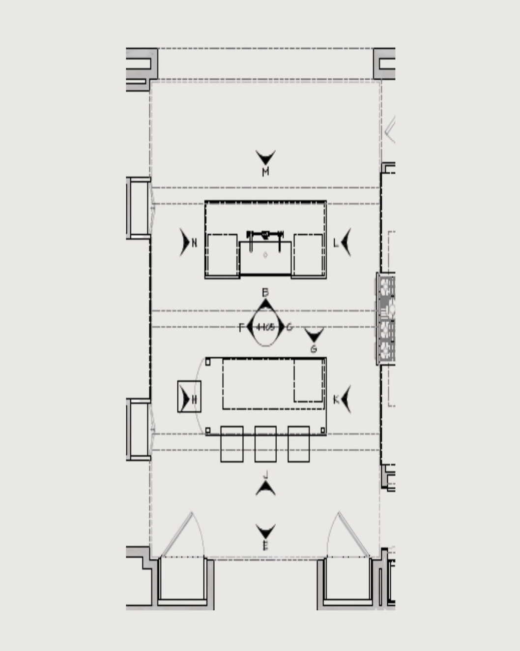
We have a separate freezer and refrigerator, and they’re opposite each other—you can see where they are in the floor plan, which was nice for storage. Over the stove, the hood is plaster. I had some early inspiration images that we used to create the shape of the hood and the way it’s almost in its own little alcove area. Initially, I loved the more compact English-inspired alcoves, but then I needed more space. I feel like you need them to be a little more functional sometimes with where to set stuff, so ours ended up being enlarged. We also did a brass seam detail along the back of the range wall, where the slabs of marble meet. That was planned very early on, after I’d seen that done at my friend Jean Stoffer’s home in Michigan.
How did you land on this layout?
In the floor plan [Exhibit C], you can see that the islands are positioned close to the range. We have [the work triangle] in this layout, so we wanted to keep everything close by. The pantry is just off the kitchen to the right of the range wall. It’s a tight little pantry, but we maximized the storage pretty much to the ceiling. We also have our water filter in there with a pot filler that specifically fills the water filter. It’s one of those Berkey water filters, and you always have to yank the hose to fill it, so from the very beginning, we carved out a space in the pantry for it to sit on the counter, and then we put a water pot filler above it that flows directly into it. Then there’s an exterior door that mirrors the pantry door on the other side of that range wall, so the kitchen is set up around a bit of symmetry.
Do you have any advice for designers on a “non-kitchen” kitchen?
You just have to pay close attention to how your clients actually live, because that can determine a lot of factors in the design. There are a couple of things I would do slightly differently next time. The location of some of our outlets in the islands is not my favorite; in the pantry, we’ve got a drawer designated for two large trash bins, and we would have been much better off just having more storage space, because [we’ve found that] we only need waste bins in the kitchen.
The kitchen is just so unique to how people actually live and use the space. There’s no one-size-fits-all approach—in any room at all, but especially in the kitchen.


 Withdraw Consent / Manage Privacy Preferences