Once you’re in the door, there’s plenty of advice floating around about style, project management, budget and all the rest—but how do you get the job in the first place? We’re asking designers to peel back the curtain and walk us through how they landed a project, step by step. Here, Baton Rouge, Louisiana–based designer Rachel Cannon explains how her firm’s marketing strategy brought in a unique client.
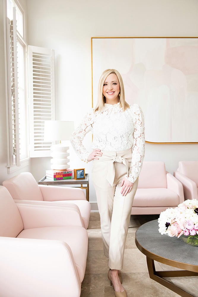
What’s the backstory on this project?
It’s a mother-daughter duo who are both plastic surgeons. The mom, Dr. Ann Ford Reilley , was the first woman in Louisiana to be certified by the American Board of Plastic Surgery. Her daughter, Dr. Katherine Ford Chaisson, had been following me on Instagram and loved our firm’s philosophy, which is about designing for introverts. Our social media and brand marketing cuts to the chase—we’re speaking to a specific personality. Katherine really responded to that concept.
What was your first interaction with this client like?
Katherine booked a discovery call with me and told me that she and her mother were opening a new medical practice, and that she felt like their vision and my firm’s vision were very aligned. That struck me as interesting, because you’d think these are two very different businesses—a design firm and a plastic surgery office. But really, we’re both focused on creating an experience and helping people to feel their best. We both have to build trust with our clients, nurture them and understand their concerns.
And you designed most of this during the pandemic, right?
Yes, we were hired right before COVID, which prolonged the design and install process. Most of this project was designed virtually. We did meet a few times in person, but most of the stuff was done via Zoom. I would mail them samples, too.
I know you do both commercial and residential, but had you done medical facilities before?
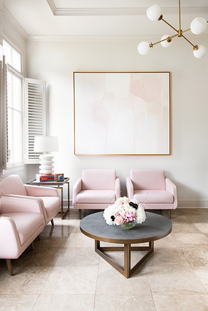
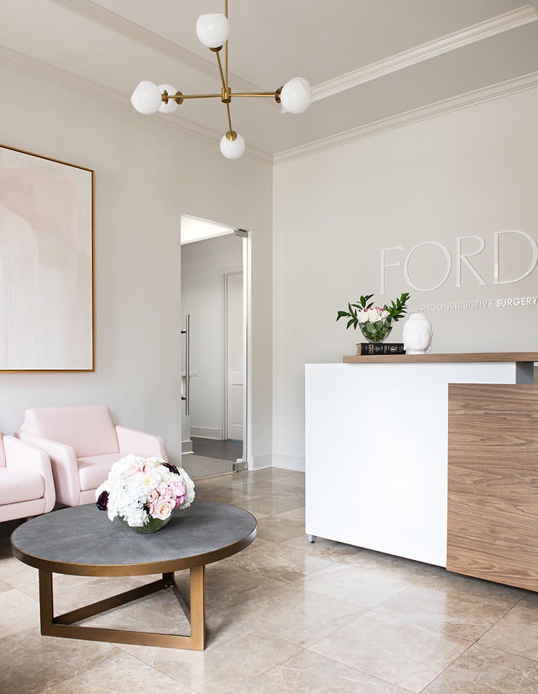
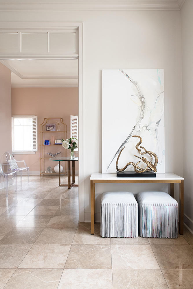
I am a NCIDQ licensed interior designer and I had done a few dentist offices, but this project was different. The clients had strong ideas about color. They wanted rosy tones that would feel warm and complement most skin tones. We wanted it to feel really comfortable because these clients have to disrobe for a lot of these appointments. So, we used pink tones and warm lighting that wouldn’t feel harsh and clinical. Another element that the client brought to the table was the idea of having two waiting rooms, with one dedicated to postoperative clients so they could have some privacy. They thought, you probably aren’t feeling your best when you have to come in with bandages and that sort of thing, and you don’t want to have to see a lot of other people. So, we created both of those rooms, again using a combination of fleshy pinks and this pearl-like porcelain fabric on the waiting room chairs.
What are some other considerations you had to keep in mind for a medical space?
We talked about making sure everything was very tasteful. If you walked into a plastic surgeon’s office and thought the decor was tacky, would you really trust that person with your appearance? But on a more serious note, there are rules in place for medical facilities that you have to keep in mind. The floor has to be seamless. You have to use fabrics that are resistant to mold and bacteria, should something like blood get on them. The clients found this beautiful grasscloth wallpaper that they wanted to use in the exam rooms, but it didn’t meet code requirements. Aesthetically, I wanted to keep in mind that people are seeking these doctors out because they feel uncomfortable, so what can we do design-wise that will make them more comfortable?
Do you charge differently for a project like this than for a residential project?
No. I have always charged a flat fee for design services. Especially on a project like this, I’m not selling product, so doing a markup wouldn’t be valuable. If I could drive home any point to other designers, it would be to charge for your services and don’t worry so much about selling product. Product is a whole other ball game. If you’re not equipped to service a product after you’ve sold it, it can be a nightmare. If you’re like us, we just have an office. We don’t have a store. We can’t take anything back. So, we have flat fees for design based on the square footage of the space, the scope of work and our level of involvement. If we are selling a product, there is absolutely a markup on it, and we explain that to the client by taking them through the entire process of what it takes to order, track, receive, and install something in your space. It’s the lion’s share of work, honestly. I think it’s important for clients to understand that.
What’s your typical first interaction with a client?
In my experience, when I've reached out for any sort of luxury experience, I want to speak to a person. So, we have a form to schedule a discovery call on our site. You literally fill it out and pick a time on my calendar—you don’t have to wait for us to schedule it with you. And that’s a free 15-minute call with me. It’s their opportunity to see if they even like me and feel it out. For me, it’s a chance to see if this is more of a consultation, a tiny project or a major project, and where that fits into the services that we offer. I’m very honest with people about timelines and expectations. I’m not doing anyone any favors on a call if I promise the moon just to get a project and then can’t deliver.
If someone calls with unrealistic expectations—I just had one of these conversations the other day—I’m very honest. The woman kept saying, “This is not a full bathroom remodel,” but then she described everything she wanted to do, and she really wanted to take it down to the studs. I told her, “That’s going to start at $30,000.” She was like, “That’s absurd!” I agree! But that’s what it costs. I don’t want to take your money and then spring something on you later.
And how do you turn down clients if it’s not a fit?
It’s a case-by-case deal. If someone is rude, I don’t have a problem saying no. A lot of the time, people come in with a referral from a past client, and you have to be as diplomatic as you can. If it’s not a fit and you know that, I don’t spend time stringing someone along. I say, “I’m sure that your project is going to be great, but I don’t think I’m the right person for you.” I can tell if someone says something like, “I love your portfolio, but I don’t want as much color as you normally use.” OK, not a fit! There are lots of their designers who would do that better than me. Know your limitations, and don’t be embarrassed by them.
Do you refer potential clients to other designers if you don’t end up working with them?
I don’t pass people on. I don’t want to send someone who I think wasn’t a good fit for me to someone else. That’s the client’s responsibility.
What do you typically wear when you meet with clients in person?
We like to look professional. We have a no-jeans policy, which I know is radical in 2021. But I’m aware of the stereotypes of interior designers, that we’re flighty or generally not serious people. I’ve made it my mission to buck those ideas, so my staff and I are always on time and always look professional.
What do you bring with you to a site visit?
For the initial consultation, we always have a branded notepad, measuring tape and marketing materials. When I’m on the consumer side of things, I love a surprise. I went to the dentist once on my birthday and they had a cupcake and a balloon waiting for me. I loved that! So, we always bring a welcome gift to new clients once a contract is signed. That makes them happy.
How do you present design concepts to clients?
It’s done on a client-by-client basis. We have a lot of clients who inherently trust us and don’t need renderings. For every client, we’ll pin up the fabrics, make a booklet with a floor plan and images of the furniture.
Do you Google clients before you meet them?
Every time. Our senior designer is a super sleuth. She’ll look at their Linkedin, Facebook—everything. And if they have no social media, that tells us something about them too! Ultimately, what we do is a luxury, and I don’t want to waste either of our time if you can’t afford it. It’s also always interesting to see if you know people in common. The longer I work, the smaller the social circle gets. It’s always smart to know who you’re dealing with.
Homepage photo: The waiting room of the plastic surgery office by Rachel Cannon | Photo by Haylei Smith


