In the BOH series What I Love, we’re asking designers to build us a mood board of what’s inspiring them right now.
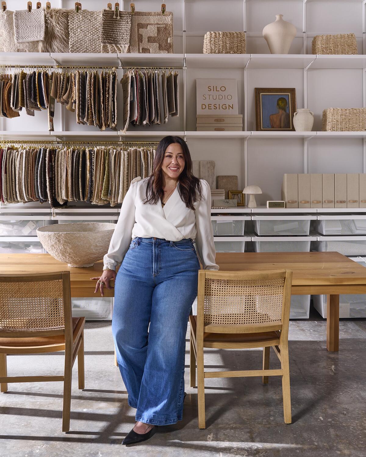
Nubby sisal, slubbed linen, rutty limestone: Gabriela Eisenhart gravitates toward touchable organic textures in soft neutral shades. But she grounds her selections with an unexpected edge. “I find that black brings balance to a space,” says the founder and principal at Silo Studio Design, based in her native Atlanta. Whether peppering a rug or rooting the wild botanical pattern of an Arts and Crafts wallpaper, the dark, dramatic hue may hardly be noticeable at first glance, but it still serves a purpose. “The key is to layer the color subtly and intentionally—just enough to keep everything feeling cohesive,” says Eisenhart.
In a mood board that magically captures the golden light of a late autumn afternoon, the designer introduces hints of blush pink through quartzite stone, zellige tile and a wallpaper cheekily populated by abstract unclad ladies. The carved cubes and beads of a vintage wood door remind her of a salvaged treasure chest in the Spanish Revival style she admires. And lustrous metallic accents—from the vessel for an amber candle to cute-as-a-button cabinet knobs and the camel-colored crown motif on a plush velvet—give a pleasing gleam to the proceedings.
“The subtle patina of a vintage brass bowl makes the assortment feel both quietly luxurious and timeless,” adds Eisenhart. She pictures all the components in her flat lay coming together in a warm, curated great room where everyone is welcome. “The mix of natural materials and the calm color palette infuse the space with depth, character, and easy, understated charm,” she says. Below, the designer describes each of her chosen pieces.
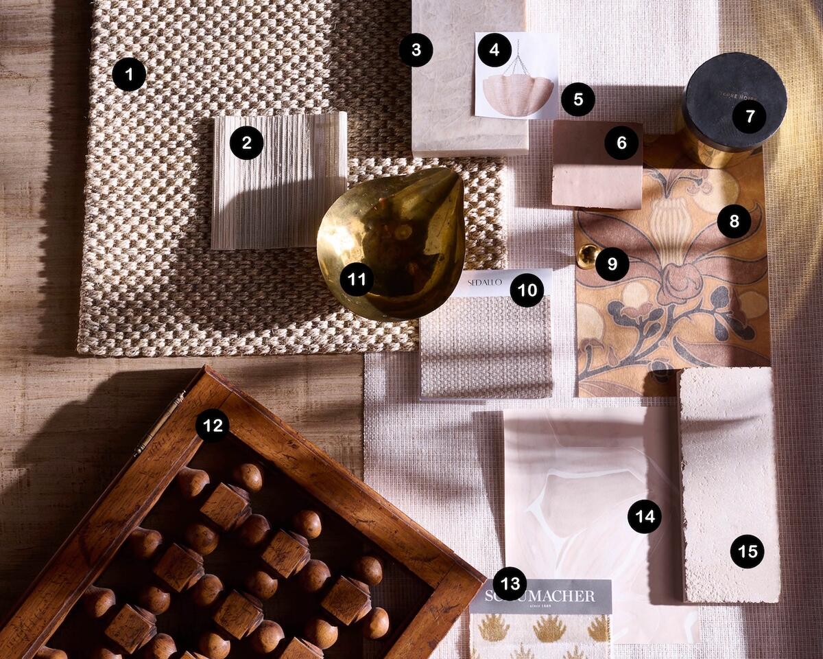
1. NATURALS SANIBEL SISAL RUG IN NAS07 BY JAIPUR LIVING
“This rug has a way of pulling a room together. It provides the perfect balance of subtle texture and works beautifully in both casual and formal spaces. I especially love the hints of black.”
2. AVERY SEMI-SHEER SHADE IN NATURAL LINEN BY HORIZONS
“This lightweight fabric is ideal for window treatments, especially Roman shades. Its sheer texture is indulgent, and it pairs beautifully with other organic textiles. So much warmth is born from layering materials like this.”
3. TAJ MAHAL QUARTZITE BY MSI STONE
“Taj Mahal quartzite has a quiet way of making a room say, ‘I’ve arrived.’ The natural movement and the undertones of tan and blush within the stone are breathtaking—and it’s durable to boot!”
4. ISLA CHANDELIER BY PALECEK
“This light would be a standout when paired with natural materials like limestone and Taj Mahal quartzite. There’s something about its organic shape, rope material and matching chain that make a more casual design approach feel polished.”
5. LINEN & PAPERWEAVE WALLPAPER IN NATURAL BY SCHUMACHER
“A step above your typical woven wallcovering: Its linen blend adds a subtle softness that can calm a space.”
6. 2-BY-2-INCH ZELLIGE TILE IN GLAZED EARTH BY ZIA TILE
“Zellige tile pairs exquisitely with honed finishes. It reflects light effortlessly, and its inviting imperfections add instant character and a sense of history to a room. The blush undertones of this soft neutral color evoke an elevated warmth.”
7. AMBRE NOBILE CANDLE BY MAD ET LEN
“I believe the right fragrance can truly shape the way you experience a space. The scent of this candle is grounding and refined. When I discovered it in Paris this summer, I was instantly sold on the bold brass and black metal vessel.”
8. PASSION FLOWER WALLPAPER IN TAUPE & SISAL BY C.F.A. VOYSEY
“There’s something special about the boldness of this paper, anchored by earthy tones and black. It feels striking yet balanced, and it nods to the Mediterranean design I so appreciate.”
9. BALL CABINET KNOB IN UNLACQUERED BRASS BY REJUVENATION
“You can’t go wrong with unlacquered brass hardware. I often use ball-shaped knobs in my designs—they’re a timeless, playful detail.”
10. ATRANI FABRIC IN BEIGE BY SEDALLO
“A great upholstery fabric for anchor pieces—it’s neutral but far from boring. The tonal woven check pattern adds texture and movement, introducing the right amount of interest without overpowering a space.”
11. VINTAGE BRASS BOWL
“Vintage brass is a hallmark of all my designs, as it instantly brightens a room and adds warmth with its natural patina. Vessels are among my favorite finds—I often repurpose them as planters. The contrast of a vibrant, leafy-green plant against rich, timeworn brass creates such a striking statement.”
12. VINTAGE WOOD DOOR
“I found this pair of vintage wood doors when I was antiquing, and plan to repurpose them for a vanity or furniture piece. I’m really drawn to Spanish and Mediterranean Revival design. These doors look like they came from an old chest—the way the geometric detailing complements the rich, warm wood tone is stunning.”
13. CORONATION VELVET IN CAMEL BY SCHUMACHER
“I find this fabric bold without being overwhelming. Upholstering an accent, it would add a pop of pattern to a space.”
14. FIGURES WALLPAPER IN NUDE BY THE LAWNS
“This wallpaper is so unique. From a distance it reads like an abstract watercolor, but up close you notice the subtle repetition of female figures. It’s definitely a conversation piece.”
15. ATHENA CREME LIMESTONE BAR TILE BY RENAISSANCE TILE & BATH
“Limestone offers an unmatched sensory experience. From the way it looks to the way it feels, it’s one of my favorite choices for flooring.”


