




Designers may be experts on mixing materials, patterns, silhouettes and styles, but the element that ties them all together can prove challenging to the most seasoned pros. “Even designers need color inspiration sometimes,” says Sue Wadden, director of color marketing for the Sherwin-Williams Global Architectural Marketing group and a 28-year veteran of the company. Perhaps best known for its exterior paints, the legacy brand—now in its 160th year—spans consumer and commercial applications. To centralize its color expertise and trend-forecasting for the trade, Sherwin-Williams now debuts its Design+ program, which offers color leadership, personalized service, practical tools and professional benefits all in one place. “Features and products that designers and architects might not have known about before are all seamlessly resourced together,” says Wadden. New to the portfolio: Symmetry, an acrylic interior paint incorporating plant-based technology, which Design+ members can purchase at an insider discount.
INDISPENSABLE TOOLS
Upon enrolling in Design+, designers receive a link that connects them to an online dashboard where they can freely access not only such discounts—“They get exclusive trade pricing, consistent across all Sherwin-Williams products,” says Wadden—but also a comprehensive package of color tools and inspirational content. Color samples in large, designer-only sizes, Gloss & Sheen guides, and fan decks help members tell their color stories, and the ColorSnap Design Pro Suite, a portable kit of the brand’s complete color system, is conveniently sized to grab and go for client presentations. Specification tools like digital swatches empower designers to plan in Adobe and AutoCAD, while downloadable palettes simplify color curation by pairing two core, classic hues to anchor the primary rooms of a project with several complementary shades for nuance and creativity in secondary spaces, plus a single metallic accent to highlight select spots.
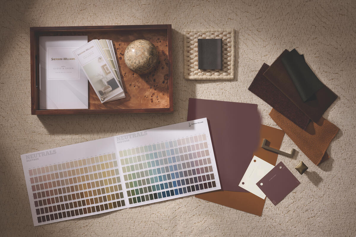
In addition to consolidating myriad color resources in one location, Design+ supports and streamlines project logistics. Members can connect to their Sherwin-Williams account executive for advice, as well as find specialists in their region through the contractor liaison service. “Whatever a designer needs to facilitate the job, from specification to delivery, the Design+ platform makes those conversations easy,” says Wadden.
TREND-FORWARD FORECASTS
How, exactly, does Sherwin-Williams anticipate the trends that inform its ever-evolving palettes? Through the direction of its Trendsight Team, made up of prominent thought leaders and design professionals in the field. With over 200 years of collective experience across industries, specialties and continents, these experts combine research, analytics and diligent trend-tracking to monitor and report on any monumental changes—often many years in advance—that will define the future of design and color. Their findings are the basis for the brand’s annual Colormix Trend Forecast.
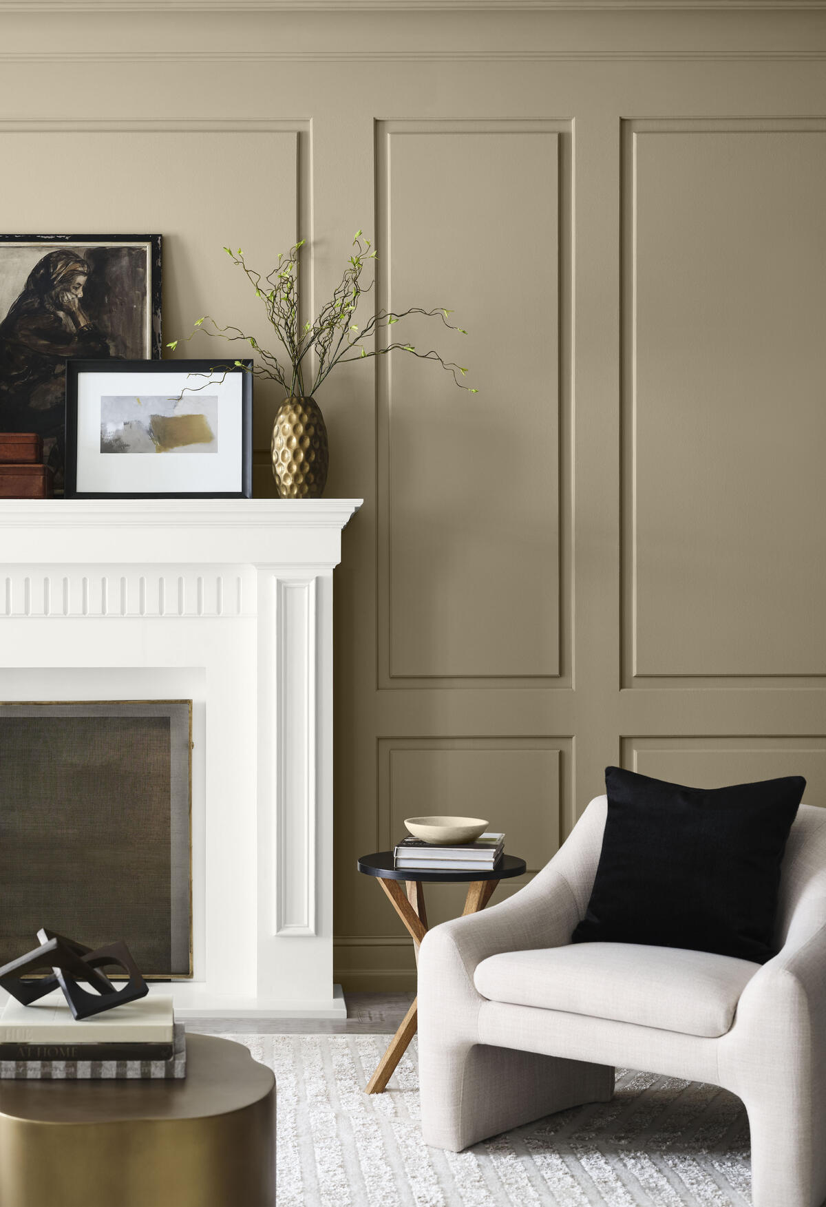
“This is the 20th year of our Colormix forecast cycle—not to replace a designer’s insights and instincts, but to offer guidance about where color is going,” says Wadden. After scouring trade shows, talking with designers and devouring data all year long, the team assembled in November 2025 at a workshop where they began sifting through the discoveries that now appear in the Colormix Trend Forecast 2027. Out of a total of 48 hues, the team ultimately chooses the Sherwin-Williams Color of the Year (Universal Khaki holds the title for 2026), along with a key shade for each month. Their conclusions form the narrative of the company’s marketing and social media campaigns. “My team crafts the colors, builds out the ideas, and then we work with our communications team to tell the story,” Wadden explains.
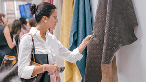
Emphasizing the company’s commitment to color education, this storytelling includes a CEU-accredited course, as well as special events and other industry activations across the country, including at trade shows like High Point and KBIS. “In any given year, there are 75 to 100 events that designers in different regions can attend in person, and we host a webinar on or soon after the report’s publication day,” she adds. Design+ members also receive their own Colormix 2027 Designer Kit, which contains a limited-edition sample set and a lookbook featuring all 48 shades.
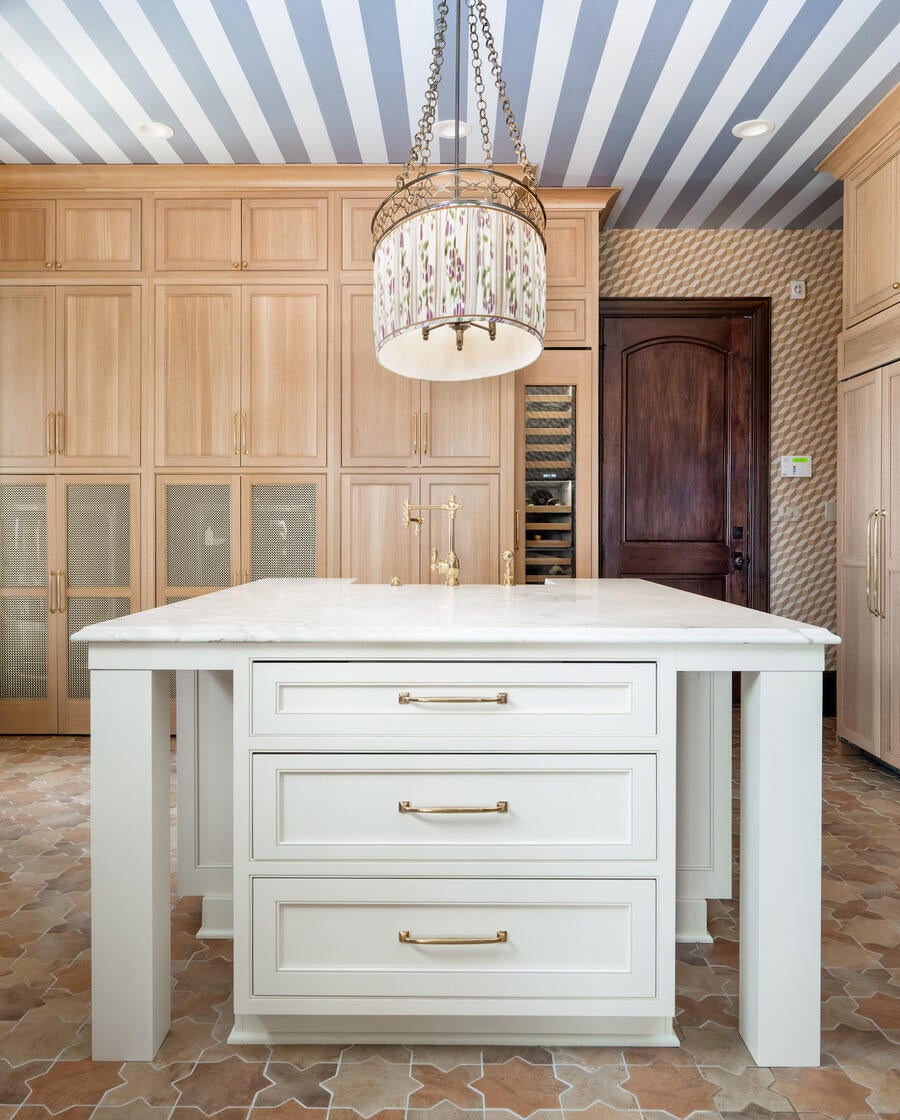
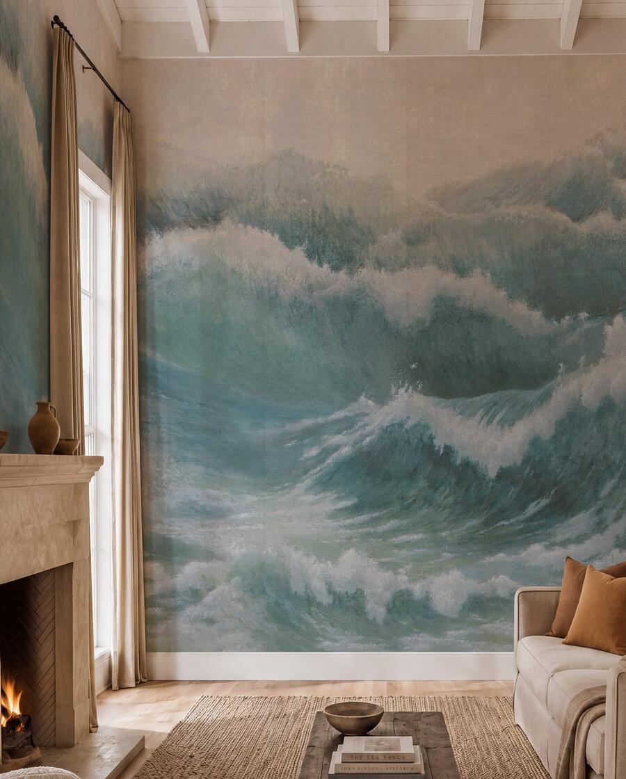
“We shoot our own photography, taking the colors that are in the forecast and applying them to real-world schemes,” Wadden continues. That could mean Leapfrog green kitchen cabinets or pale Shiitake brown in a bedroom. “The lookbook is so helpful as a communication tool, because it can be difficult for even experienced designers to visualize how a color will appear in a space.”
INNOVATIVE PAINTS
With nearly three decades of history at Sherwin-Williams to her name, Wadden has seen it all when it comes to color trends. After weathering what she calls “The Blandemic”—the era of the 2010s, when cool, minimalist whites and millennial grays dominated monochromatic interiors—she’s thrilled to welcome the renewed interest in both deeper, richer tones and dopamine brights. “Tried-and-true neutrals will always be important, and there were many macro factors that contributed to that trend, but there’s been a change that’s making design feel much less homogenized and much more personal again,” she says. “I think we’ve all been starved for color.”
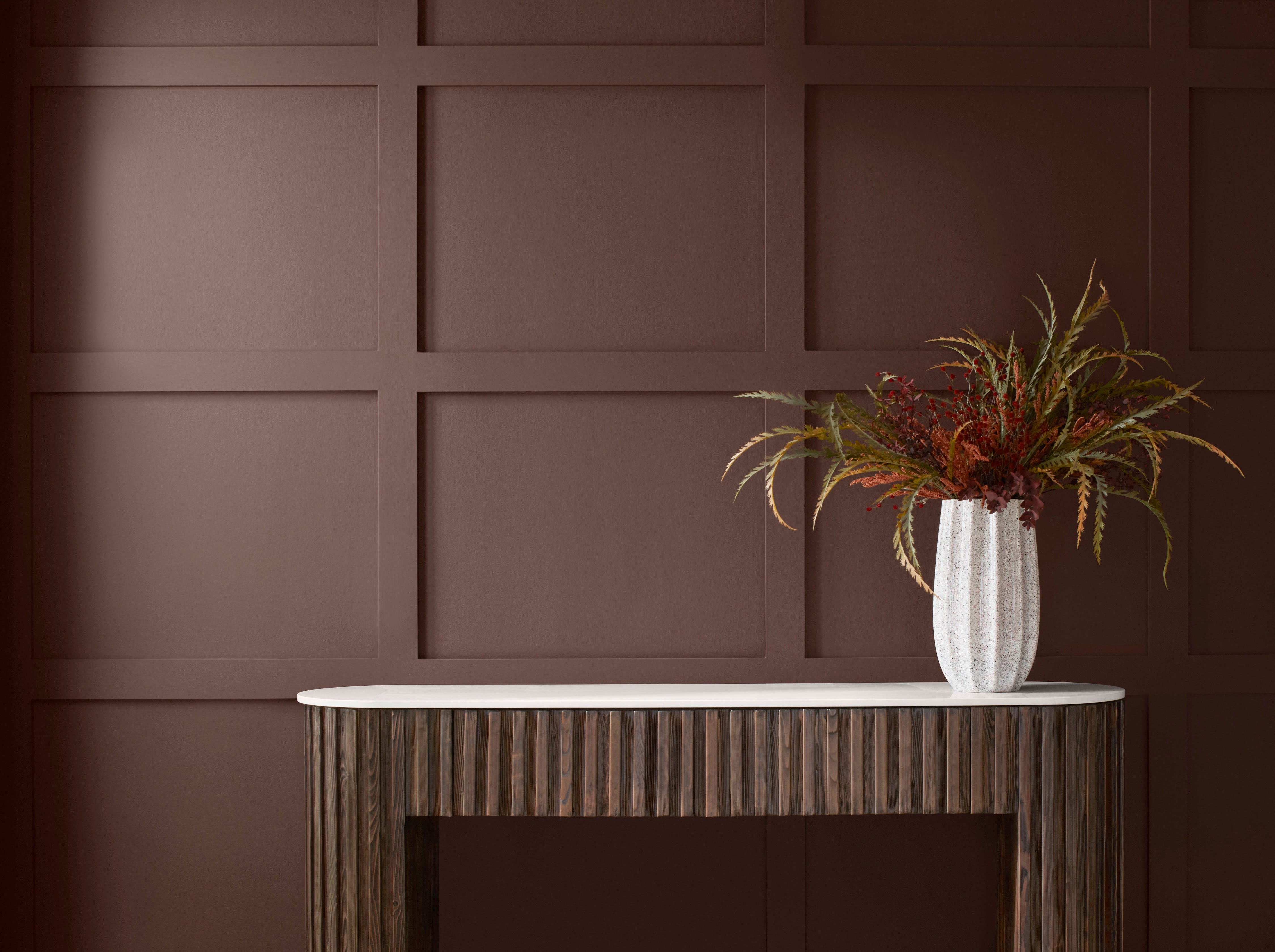
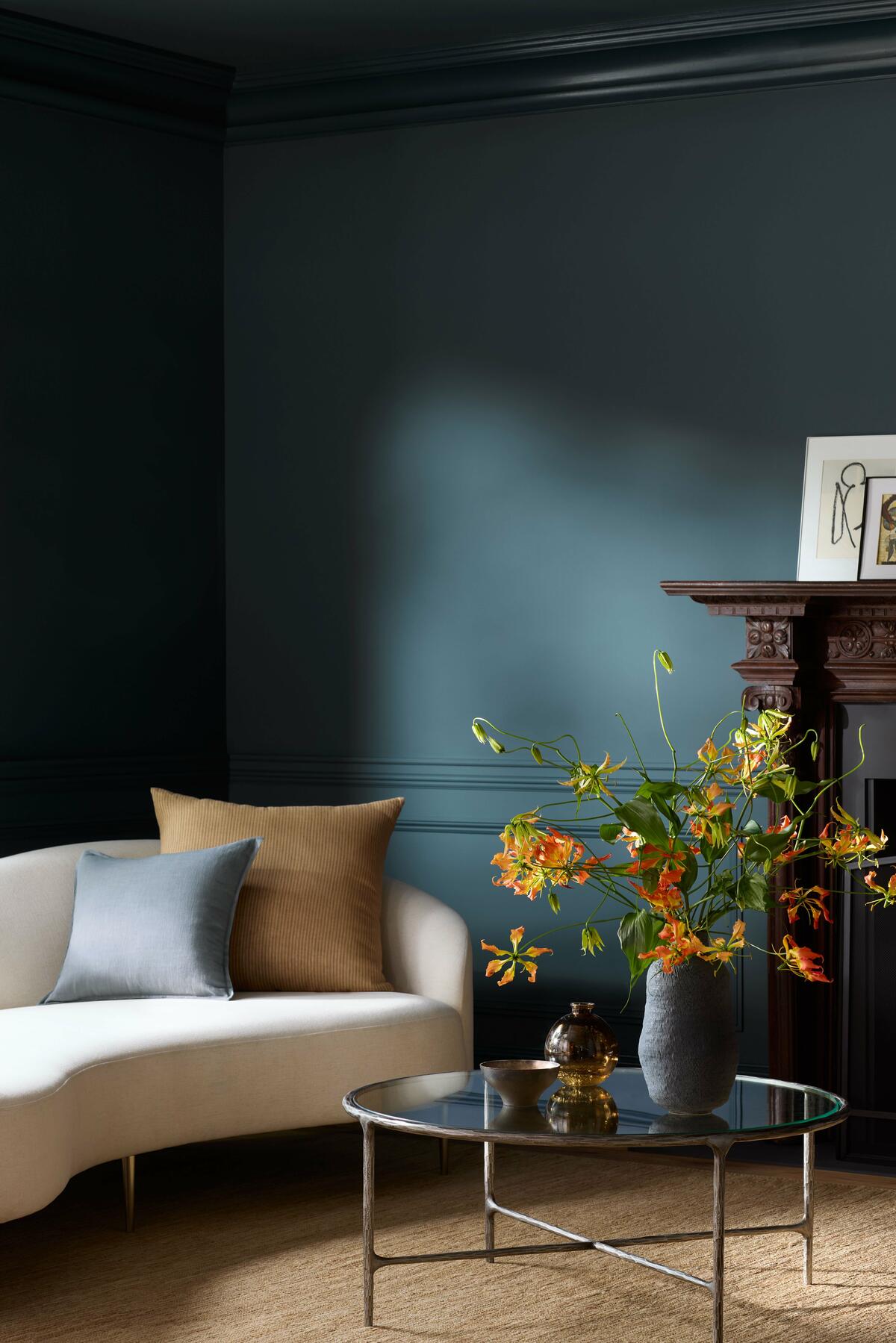
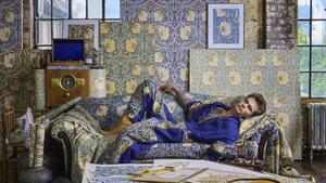
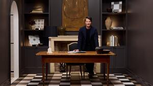
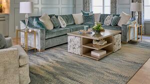
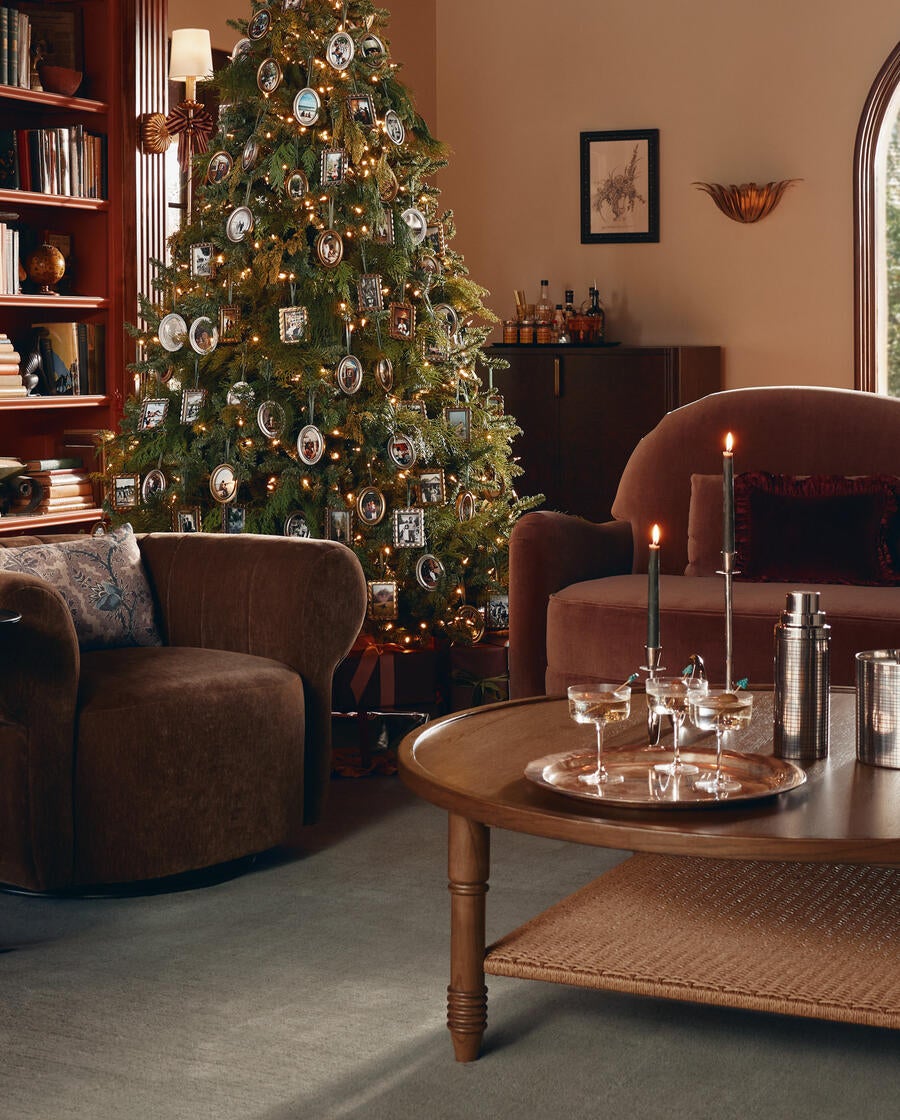
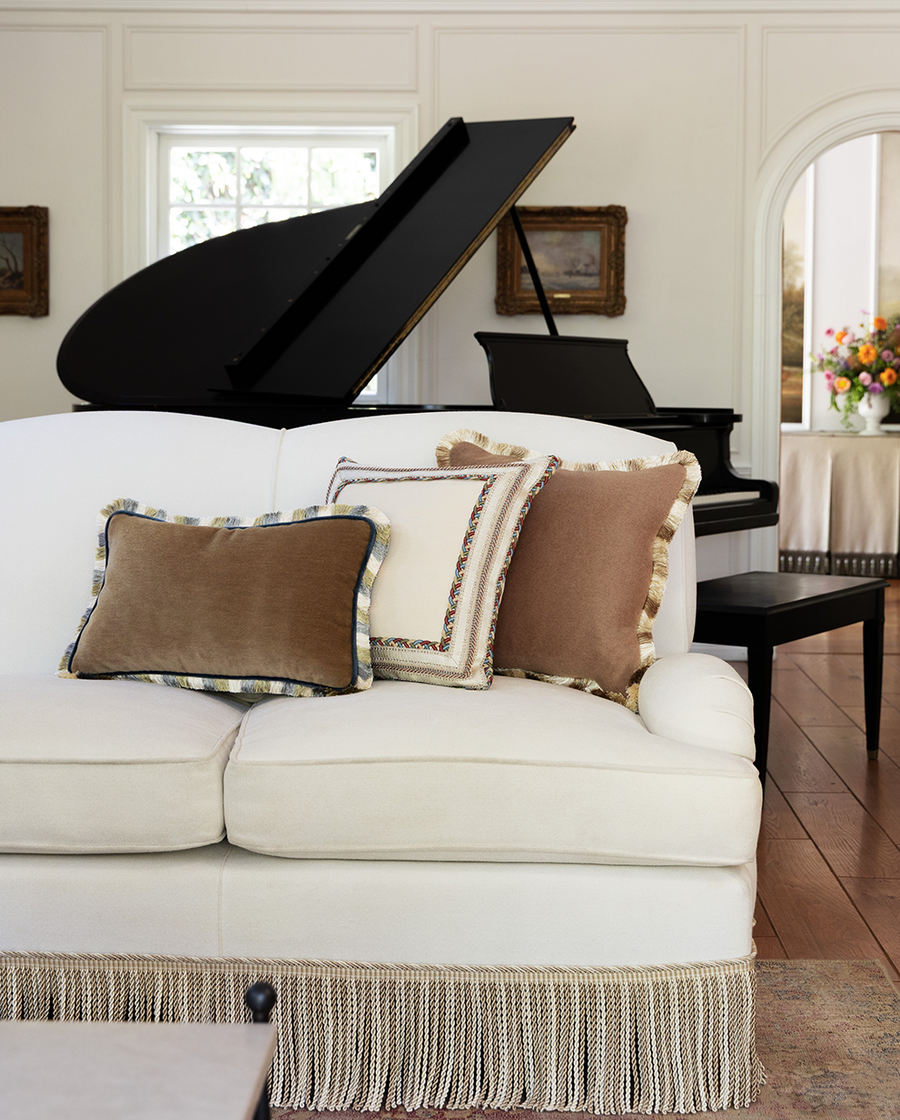
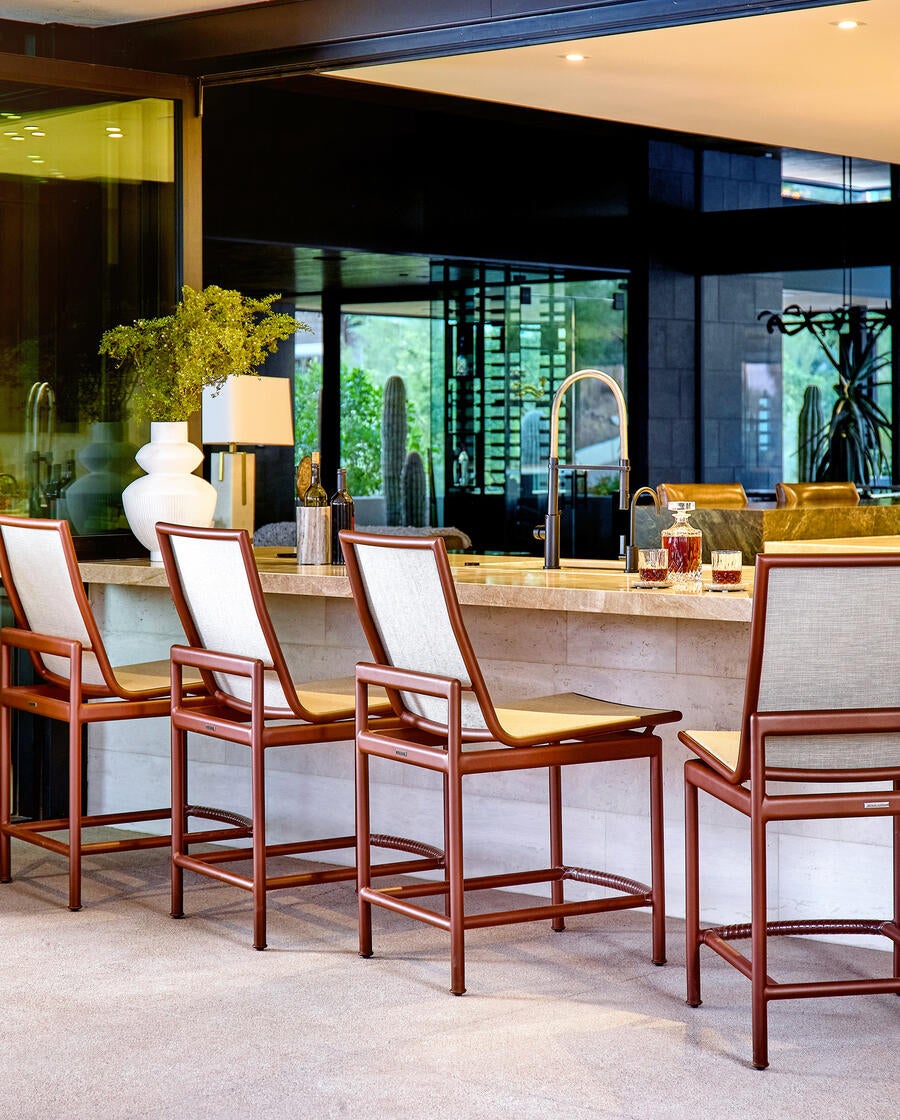
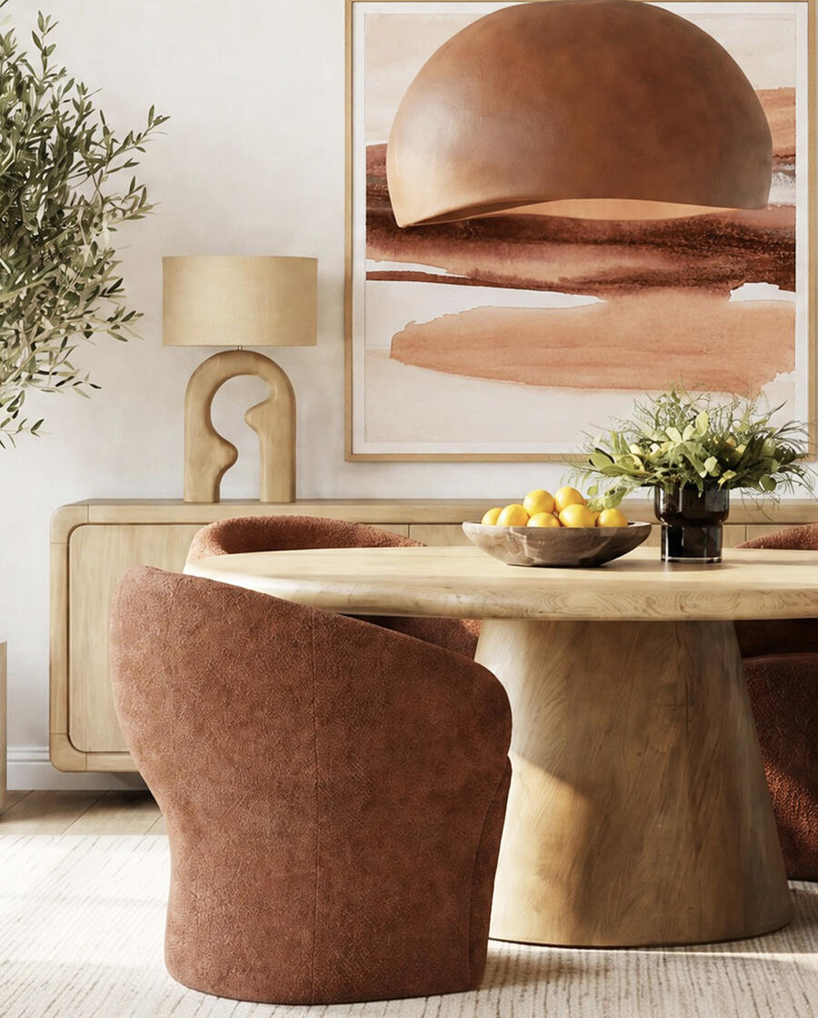
For 2027, Wadden and her team predict subtle evolutions as opposed to seismic shifts in palettes. Black, which she identifies as a significant dark tone since 2021, now takes on a “warmer bronze expression,” as seen in Turkish Coffee. Formerly brassy gold translates to softer, paler Champagne. Silvers are staging a comeback—“Icy, mercurial blue-grays stood out at Salone,” she says—while nonmetallic blues and greens like Naval and Isle of Pines are considered the new neutrals. “We’re seeing 30 percent growth year over year in russet browns and wine reds like Cordovan and Burgundy,” she adds.
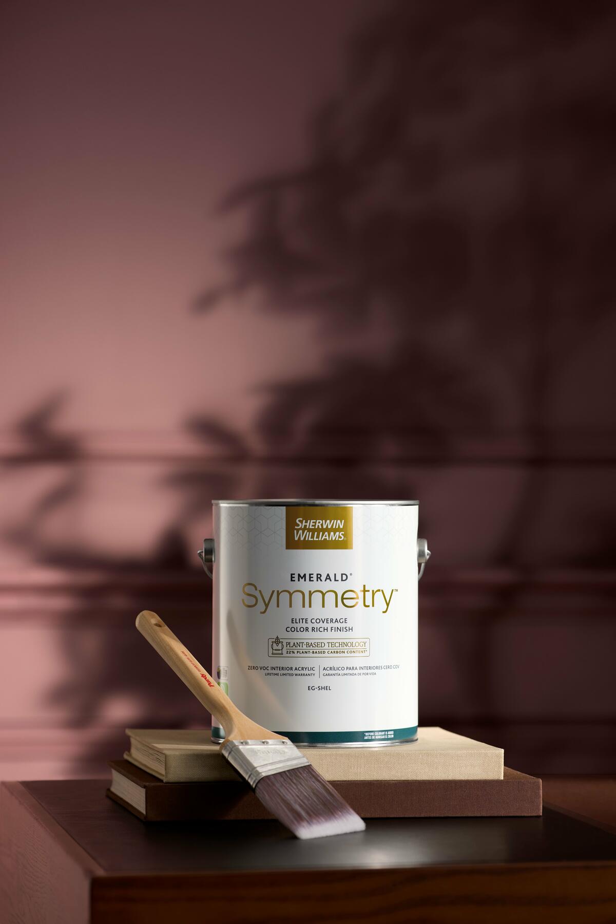
Designers can now explore all those color directions—and as many whites as their clients desire—with the newest interior paint in the Sherwin-Williams Emerald collection. “Instead of a solvent structure, Symmetry is 23 percent corn-based,” says Wadden. “From an innovation standpoint, it’s our most premium product, with an incredibly smooth application, exceptional coverage and color saturation, and a virtually flawless finish.” Underscoring its performance is sustainability that’s sure to speak to customers’ concerns: Symmetry is Greenguard Gold–certified for low chemical emissions and contains no VOCs and a minimum of 22 percent plant-based carbon content, which varies by sheen.
“Sherwin-Williams is not only about color leadership; innovation is equally important, and our products are best in class,” she continues. Design+ connects all the aspects of the company’s offerings—creative, inventive and pragmatic—in one accessible nexus where designers can be confident of finding both the trend information and the technical advice they need to specify the paints that will make each of their projects enduringly unique. “Designers want more color in their work,” says Wadden, “and Sherwin-Williams is here to show them how to do it.”
This story is a paid promotion and was created in partnership with Sherwin-Williams.
Homepage image: As anticipated by the annual Sherwin-Williams Colormix Trend Forecast, rich red-brown hues are increasingly popular choices for modern interiors | Courtesy of Sherwin-Williams

 Withdraw Consent / Manage Privacy Preferences