












Arts and Crafts master William Morris created patterns of such singular fame that designers today might consider the highly ornate, era-evoking styles suitable for only the most traditional (and English) of homes. But think again—and take a close look at the latest colorways. Anchored by its over 160-year-old archive yet ever-evolving, Morris & Co. has so much to offer spaces minimalist, maximalist and modern. Forget nostalgia for the 19th century: Behind the legacy, at the beginning, its founder built the brand’s reputation by blatantly rejecting bland conformity and breaking all the rules.
“William Morris was very much the original design rebel—quite subversive, and a socialist who resisted the automation of the industrial revolution and the sameness that was happening in Victorian decor,” says Claire Vallis, the design director for the London-based brand, which was first established in 1861. “He believed art was the highest expression of labor, and wanted to slow everything down and get back to the hand of the maker.” Sound familiar? “From AI to fast fashion, it’s as if we’re living through that same age of instant gratification and disposable trends again,” notes Vallis. Well over a century later, the craftsmanship at the heart of Morris & Co. still stands strong as a counterpoint to mass production, presenting not merely an aesthetic but a purposeful, intellectual and tactile way of authentically connecting with the world.
A COMMITMENT TO CRAFT
“The hand-drawing in the studio at our headquarters, Voysey House; the inking process in our factories: We make everything the same way now as we did then,” says Vallis. “The workshop scenes alone are incredibly beautiful living tableaux, with swirls of color in the inkpots and splatters all over the craftspeople’s shoes like a Jackson Pollock painting!” Legendary patterns such as Acanthus, Pimpernel and Strawberry Thief are already perfect, so the Morris & Co. creative team—guided by lead designer Jessica Clayworth—starts from a place of the utmost respect when reinterpreting the templates. “The originals are sacrosanct, but the fact that they are so well made means we can play with them, because the symmetry and the movement work seamlessly on the wall,” Vallis explains. Rather than consisting of a single image, each Morris & Co. pattern encompasses several layers, which allows for precisely calibrated tweaks to the palette or proportions that, though small, completely change its perception. “It’s a fine balance,” she continues. “We’ll keep the symmetry, but repaint the lines with a looser brush mark that softens the flow, or add a vertical stripe for more structure.” Such refinements are now sometimes achieved digitally: One new effect involves a rotary screen ground that enables digital printing on top of metallic ink. “We continue to invest in our factories, incorporating technological innovations into our printing processes,” she says.
The advancements are intended to enhance, not replace, handcraftsmanship. Across its textiles and wallcoverings, Morris & Co. preserves a range of traditions, from custom block-printing to crewelwork and appliqués, which it features in jacquards, tapestries, velvets and other specialty weaves. “Some of the mills we work with are taking the art of embroidery even further through techniques like overdyeing, which is when different yarns in the same pattern retain a color to different degrees,” says Vallis. The resulting nuance and gradation subtly add to a fabric’s dimensionality. In the next iteration of the brand’s Pure Morris concept, planned for 2028, she also anticipates introducing texture through a wider variety of organic and sustainable raw materials.
TRUE COLORS
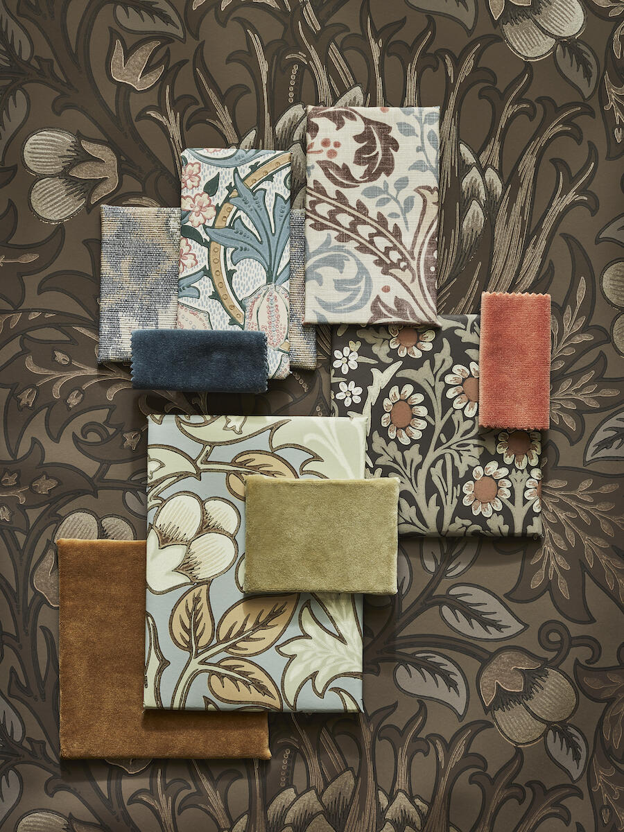
This autumn, however, heralds the Colours of Morris, a harmonious reimagining of a curated selection of heritage wallcoverings for contemporary homes. Each is produced in the company’s London studio and surface-printed in its U.K. factories to guarantee rich hues, precise details, a tactile finish and true artistry. “We approached the palettes case by case, pattern by pattern, asking what else we could add,” says Vallis. In some instances, that meant reviving a dormant shade from decades past. In others, it was an opportunity to introduce brand-new combinations.
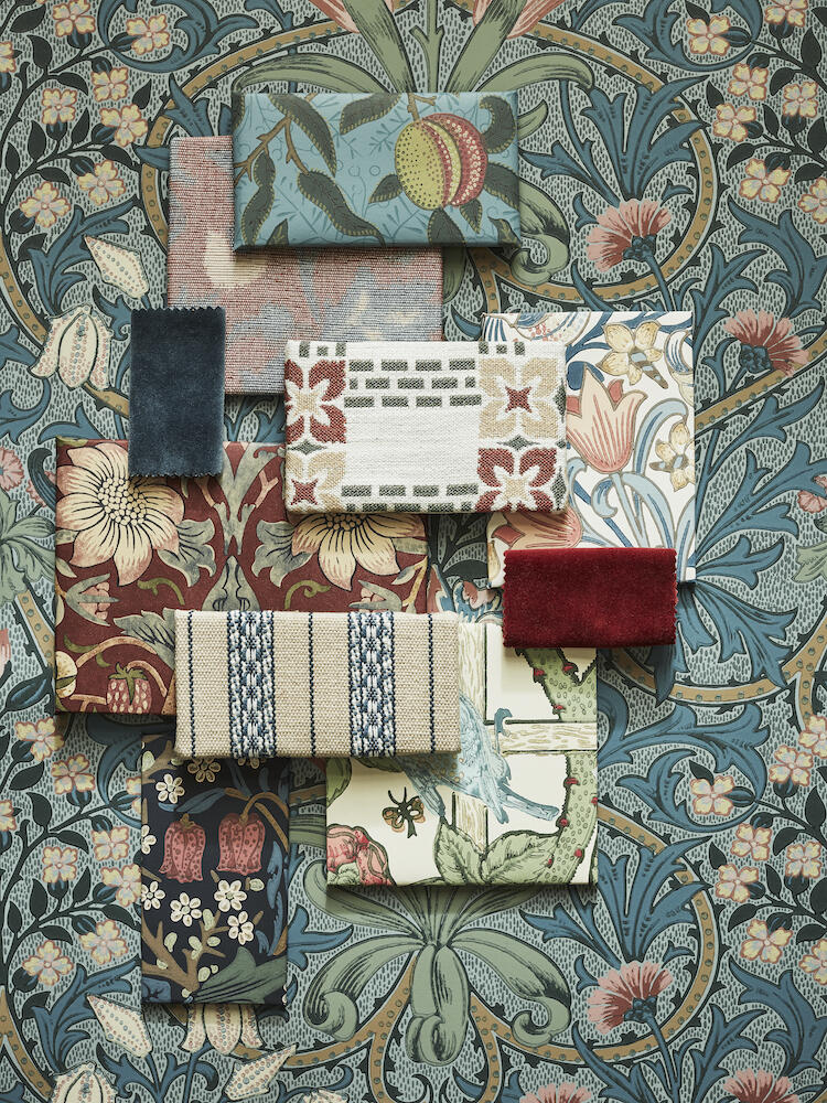
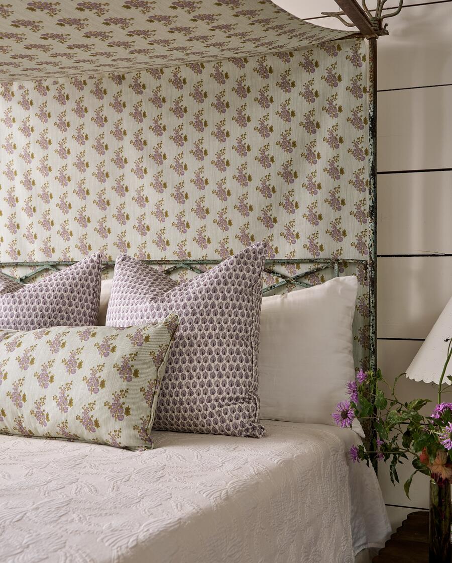
Woodland Weeds, for example, previously existed in just two colorways. “And it’s a beautiful design, so I didn’t feel like we’d tackled that one fully,” she says. Bayleaf/Wheat, Rose/Woad and Rose/Weld now cast the pattern in various pairings of sage, yellow, blue and pink. Bright vermilion also punctuates the blossoms of Trellis in Sage/Rose, while Strawberry Thief takes a surprising turn. “In Crimson/Slate, Strawberry Thief is obviously iconic. Everybody knows that red,” she says. “But something a little bit more mulberry feels right at the moment.” The new colorway, Wine, conveys a depth that’s intoxicating. To “cleanse the palette,” the pattern is now available in cool Slate/Vellum too.
“Blackthorn is a design I’ve wanted to get my hands on for quite some time,” Vallis continues. Tipping her hat to William Morris’s penchant for the dyeing technique, she gave the Indigo interpretation a strong blue ground, also reimagining the pattern’s brambles, leaves and blooms in soothing Charcoal and luscious Rosewood versions. “Chocolate is a great neutral and another earthy, grounded expression,” she says of the latter colorway. Bestselling Pimpernel adds four options with Bayleaf/Chalk, Indigo/Hemp, Rose Cockle/Sage and Walnut/Sage. “At first I thought, ‘What more can we do?’” she recalls, but then was inspired to investigate the popular pattern’s original palettes. “What we’ve done is dropped the grounds to clarify the colors at the forefront and give the design dimensionality.” In Woad, the Fruit wallcovering also benefits from a historic blue background that had been designated to the drawers. “It’s interesting,” she notes. “You go back into the archives with fresh eyes and suddenly bright blue is resonant again.”
THE FINEST OF FIGURES
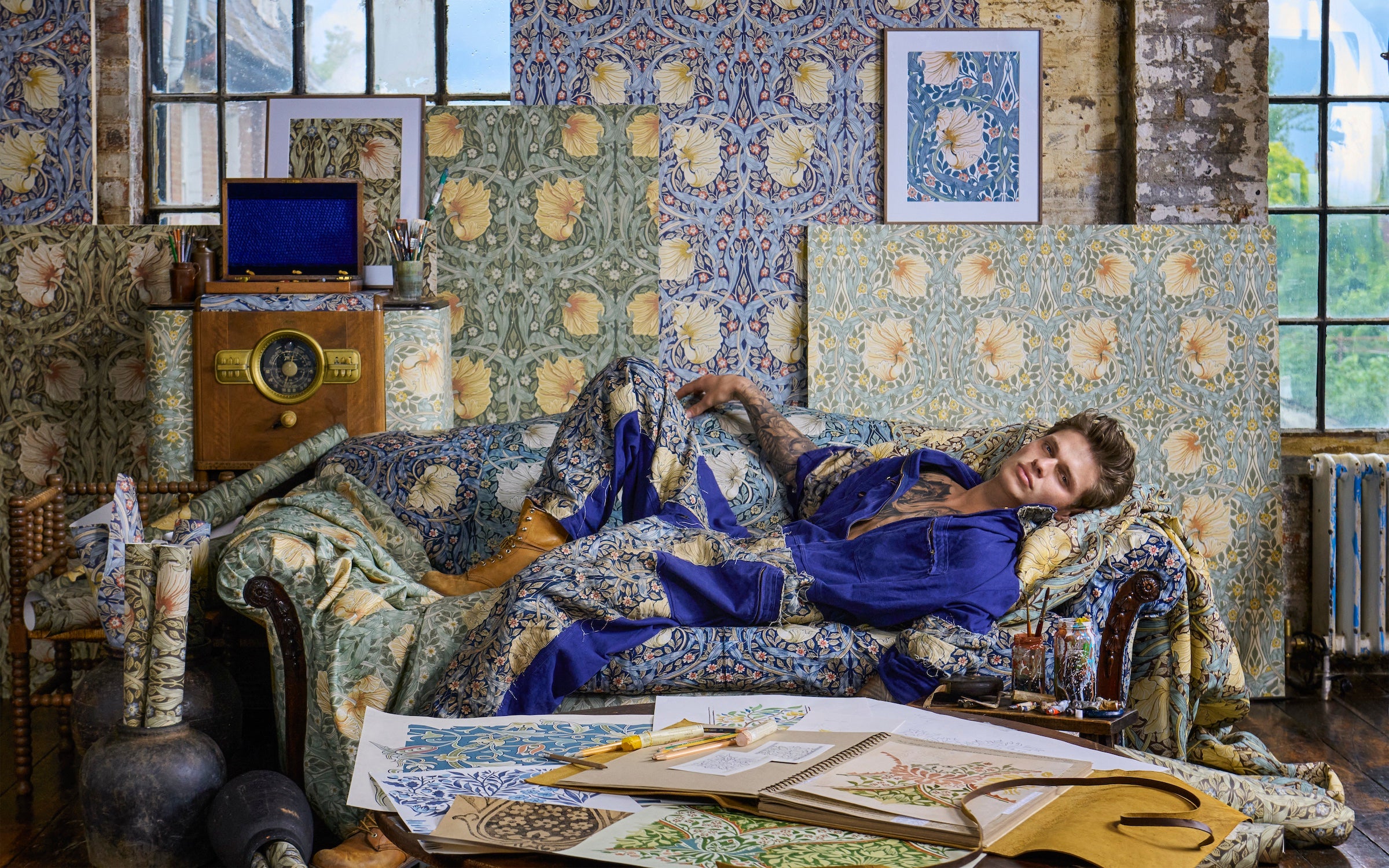
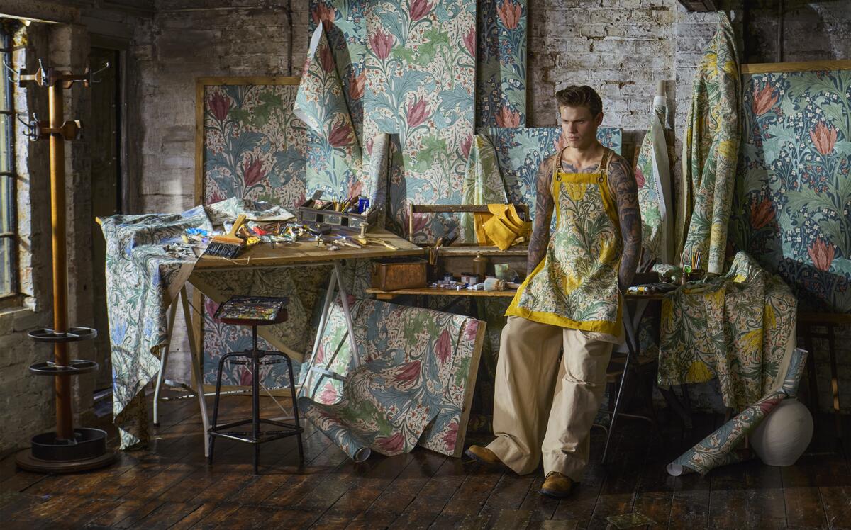
To showcase just how modern these new colorways can be, Morris & Co. came up with an arresting advertising campaign where its designs are not the only eye candy on display: Astride a factory stepladder flanked by undulating rolls of wallpaper and sprawled across a plump sofa draped in bolts of florid fabric, a muscular model exposes patterns of his own—the intricate tattoos of his bare arms and chest appearing to merge with the century-old motifs. “Nothing wrong with that, is there?” jokes Vallis. “William Morris did say to surround yourself with beauty!”
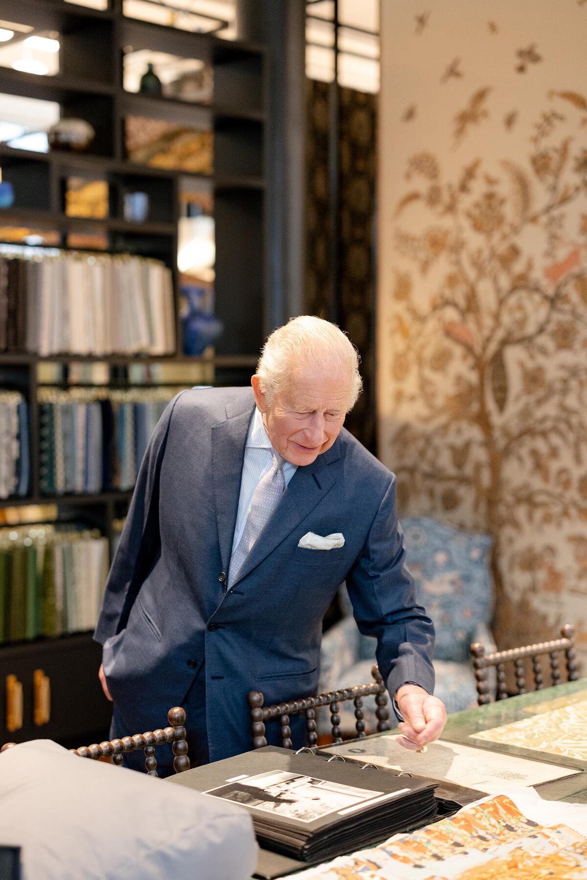
A cheeky way to celebrate the brand’s craftsmanship and remind viewers of its identity as a design pioneer, the images posit one response to the question: What is Morris today? And they stand in striking contrast to another series of commanding portraits—these of an impeccably (and fully) attired King Charles III, documenting his tour of Voysey House this past May. “It was an absolute validation,” says Vallis of the royal visit, recounting that the monarch praised the company for its commitment to made-in-the-U.K. workmanship. The event echoed an appearance by King George V in 1924. “And in a hundred years’ time, the future Morris & Co. creative team will be looking at our pictures and telling our stories,” she says. “It’s about taking our place in history, I suppose, and has definitely given us a boost of confidence.”
To extend its legacy, the brand continues to expand its footprint. For all its national pride, some of its newest designs hail not from London but Los Angeles: The Unfinished Works collection, released in summer 2025, sees to completion 26 sketches and partial designs by Morris protégé John Henry Dearle that are archived at The Huntington. A second batch of finished wallpapers, borders, fabrics and embroideries is on the docket for early 2027, with individual patterns like Lent Lily fast becoming favorites. “As with the fresh colors, the collection is bringing new audiences,” says Vallis. “They’re discovering that Morris & Co. is not just an aesthetic; it’s a way of life.”
This story is a paid promotion and was created in partnership with Morris & Co.
Homepage image: In a recent advertising campaign, a tattooed model lounges in Morris & Co.’s factory, surrounded by several new shades of the brand’s beloved Pimpernel pattern | Courtesy of Damian Foxe for Morris & Co.







 Withdraw Consent / Manage Privacy Preferences