As the 21st century teeters between its teens and its twenties, it’s a perfect time to take stock of an eventful decade. Over the next week, we’ll be exploring the forces that have shaped the design world over the past 10 years. Next up, BOH contributor Sophie Donelson weighs in on the home-related trends, aesthetics and ideas that mattered most.
1. Going Full Kondo
With her seminal 2014 book, Marie Kondo delivered a new framework for assessing the blossoming stuff-piles in our homes. All at once, everyone from your assistant to your sister-in-law was dog-earing The Life-Changing Magic of Tidying Up and wondering: “Does it spark joy?” (Dumpy cardigan sweater: no. Vintage matchbook: yes, actually.) So vast was its reach—and powerful its proselytizers—that for a while, you could divide your friend group into those who were Kondo-ing and those who were keto-ing. And only one group gained it all back a month later. Combining notes of minimalism, a dash of wellness, and a bingeable Netflix special, Kondo’s movement is the ur-trend of the last decade, wrapping up everything we felt about home into a tidy, joy-sparking package.
2. Chip & Joanna-fication
The TV-famous Texan couple has exerted a colossal influence on mass American design tastes, even after Fixer Upper’s five-year run ended in 2018. Let’s just say this: There are small towns in Kentucky that estimate losing 20 barns a year thanks to barnwood thieves. Fueled by the market’s obsession with modern farmhouse style, the bandits pocket up to $2 a plank, but all we have to show for it is another replicant kitchen to post on Houzz. You could argue that the popularity of rough-hewn materials is a paean to our country’s agrarian roots, or a defiant revolt against an era of facial recognition and robot overlords. Or you could hope for more color and less shiplap in 2020.
3. Millennial Pink
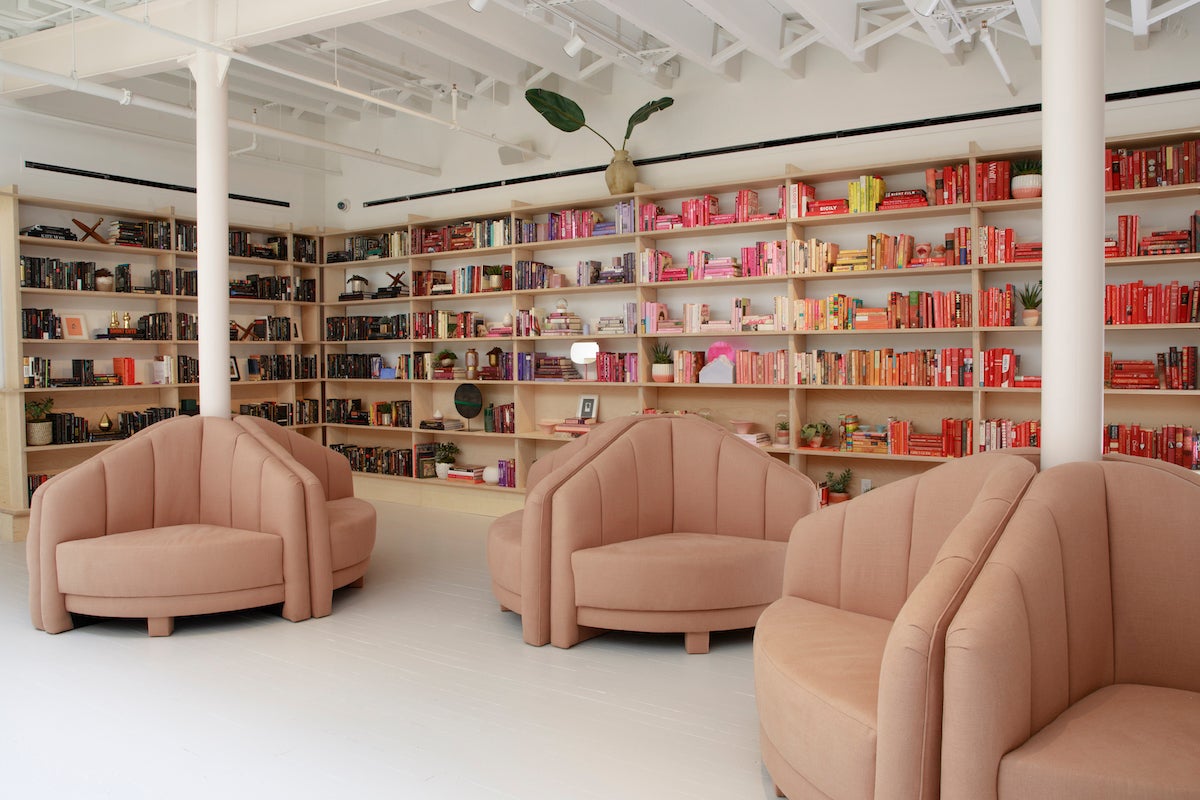
It was the summer of 2016 when The Cut ran an article about a particular pink, a hue somewhere between a Band-Aid and a newborn piglet, that seemed to be everywhere that millennials were. Or, at least everywhere people were marketing to millennials, from the interiors of the trendy women’s co-working chain The Wing to the branding of bucket-bag designer Mansur Gavriel and cult beauty brand Glossier. The color had both newness and sophistication—not easy for a pink. And though not everyone could wear it, its application on items from KitchenAid mixers to key fobs made it hard to avoid at home. In the future, it may be considered the avocado green or harvest yellow of the 2010s, but at least it had a point of view.
4. Suzani & Ikat
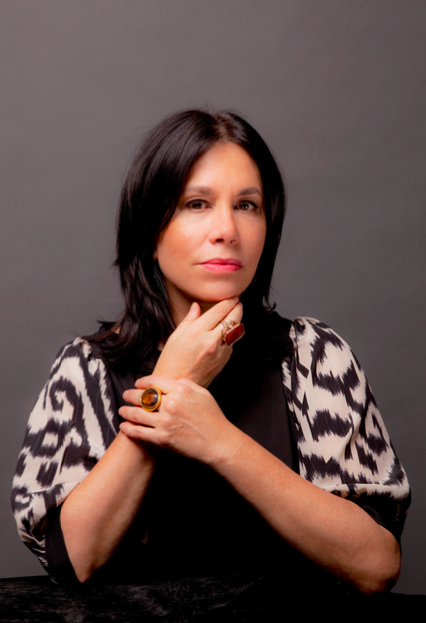
Let’s get one thing straight: “Ethnic textiles” aren’t a fad. They’re a woven manifestation of generations of culture and meaning. From a Western design world perspective however, these two patterns were downright daring when they entered the collective want-list via Elle Decor during the heady, global-glam Margaret Russell years (she helmed the title from 2000 to 2010), with textile designer Madeline Weinrib leading the charge. At the time, both motifs were unquestionably daring (again, by Western standards). Over the past decade, they became part of the mainstream, and today you can browse 22,000 ikat pillows on Etsy.
5. Hygge
Propelled by the tongue-twisting word itself (say it with me: HYOO-guh), the benevolent cultural appropriation of the Danish art of coziness took morning shows and the gift-book market by storm. Or did it? This trendlet was a nonstarter. Don’t be mistaken: Our curiosity was real! If Scandinavians could find comfort and warmth in a season with low-single-digit daylight hours, then maybe we could pull through a morose February indoors. But it turned out hygge wasn’t just chunky knits and candles—its soul rests on the fellowship of friends, communal cooking, nature walks and even board games ... It’s a way of life, not a quick trip to West Elm. This hard-core relaxing turned out to be better suited for a nation of socialized medical care, maybe not for those of us still hustlin’.
6. Instagramming Your Shoes on Tile or Terrazzo
It’s the decor equivalent of Instagramming your eggs benedict: an overhead shot looking down at chic shoes on to-die-for tilework. Who among us isn’t guilty of posting an #ihavethisthingwithfloors pic? (Not even when you were in Italy? Really?) Over the past decade, as Instagram tightened its stranglehold on our collective consciousness, cute hashtags suddenly had the power to drive trends and move the market—the folks in Carrera must have lost their marble(s) when they realized how much free media they were getting. But honestly, tile and natural stone are cool and the digital universe’s adoption of chic flooring was perfectly timed to our recovery from a collective Beni Ourain hangover that just. wouldn’t. quit. Marble has delighted for a millennia. The 2010s proved it has another millennia left in it.
7. Pinterest
Best worst thing ever. Or worst best? It depends on who you ask. Opened up to the hoi polloi in 2011 as a “catalog of ideas,” the board enjoyed a hockey-stick curve of popularity thanks to rabid wedding planners and, quickly thereafter, bloggers. To design professionals, it became part blessing and part curse. Magazine publishers panicked: So, we’re going to pay for a photography team, stylist and writer—and then you’re just going to publish our images for free? Plenty of decorators reviled it for being reductive and simplistic. Others recognized the game-changing power of offering a visual encyclopedia to the masses. Charlotte Moss told the BOH podcast recently that before Pinterest, clients had no way to articulate what styles they enjoyed. A pin board changed that. And lots more, that’s for sure.
8. The Brand Formerly Known as Restoration Hardware
It might just be the story of the decade. In 2010, the store that was then called Restoration Hardware began its transformation from listless trinket vendor to upscale lifestyle juggernaut. The name change followed six years later and with it the democratization of Belgian linen and the return of a glamorous, intoxicatingly scented retail gallery experience. But let’s not forget the missteps: the desk that looked like a riveted vintage airplane; the knockoffs; and the 17-pound, 3,000-page 2014 catalog, signaling both the rebirth of catalogs and the death of god knows how many trees. (Take that, September issue!) RH rounds out the decade as one of the best-known home brands ... even if everyone still calls it “Resto.” In the words of the proverbial would-be client: Why would I hire a designer when I could just walk into RH and get it all done for me? Disruptive is an overused term, but it applies here.
____________
 Sophie Donelson speaks and writes about the connection between people and their homes. She presents frequently to audiences in and beyond the design community; recent venues include the Design Influencers Conference, 92nd Street Y, the Dallas Woman’s Club, and the BOH Future of Home conference. She was previously editor in chief of House Beautiful and has been a guest expert on the Today Show and Good Morning America. In 2017, Sophie published the best-selling Style Secrets: What Every Room Needs.
Homepage photo: The Wing in SoHo, awash in millennial pink | Tory Williams Photography, courtesy of The Wing

