Once you’re in the door, there’s plenty of advice floating around about style, project management, budget and all the rest—but how do you actually get the job in the first place? We’re asking designers to peel back the curtain and walk us through how they landed a project, step by step. Here, Bay Area–based designer Noz Nozawa of Noz Design explains how a pandemic obsession led to her taking on the wildly exuberant design of Fiat Lux, a new jewelry store and piercing studio in the Fillmore District of San Francisco.
What’s the backstory of this project?
I love jewelry. I always have, but it definitely became a pandemic coping mechanism—while I was stuck at home in 2020, especially in the first half during shelter-in-place, I was spending a lot of time online admiring things. There was a jewelry store in the Mission District of San Francisco called Fiat Lux that I’d heard plenty about. As soon as things started opening back up, I popped in and became connected with Marie [McCarthy], the owner. She asked what I did for a living, came upon my Instagram, and realized, “This is the designer I want for my Fillmore Street store.”
She was opening a new location?
Incredible decision-making by a very badass business owner: “We’re going to open a new location during a pandemic!”
What are your typical projects, and how often do you take on these sorts of special ones?
Our typical project is residential. On the commercial and non-residential side of our project set, I’m very picky. I used to design offices, but I never enjoyed it the way that I enjoy residential. Now, we do things like that on a select basis—we want to work where the client is the owner of the business, because it makes it a meaningful project for us as a design team. I’m not interested in working on the next Starbucks. This is Marie’s second Fiat Lux, and in a totally new part of town that doesn’t have a heritage in having piercing and tattoo salons, so it was really exciting.
We are also working on a really fab restaurant coming up—a nouveau diner in North Beach in San Francisco—and [it’s] the same thing there, where we are really lucky to be partnering with two femme business owners. We pay close attention to honoring the narrative of how a business came to be, and what they want the client experience to be. When all of the stars align in terms of what the client wants from us, what they want from their business, and what kind of a business it is, it’s really amazing.
What did Marie want for the space?
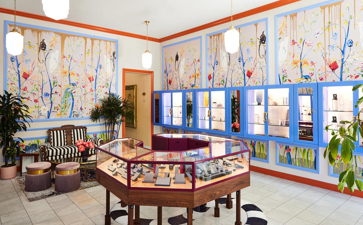
She wanted joyful maximalism. The joyfulness piece was this being a celebration, an expansion, a new market for them. Fillmore Street is a very vibrant part of San Francisco’s commercial district. Marie described the original Fiat Lux, which has been around for over 10 years in the Mission, as this badass, punk rock, youthful store; she wanted the Fillmore Street store to be the fancy rich auntie.
How did you land on this vision specifically?
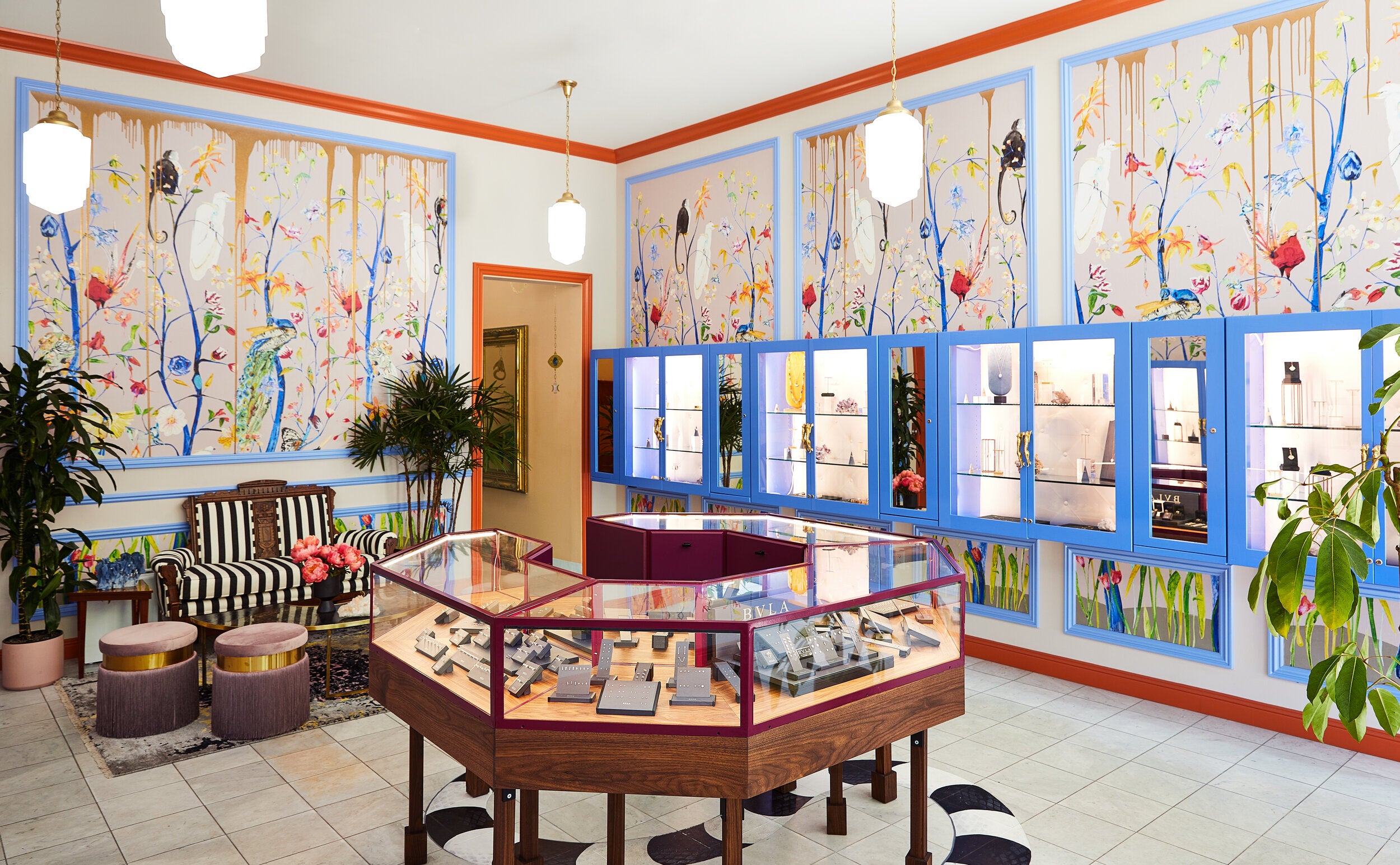
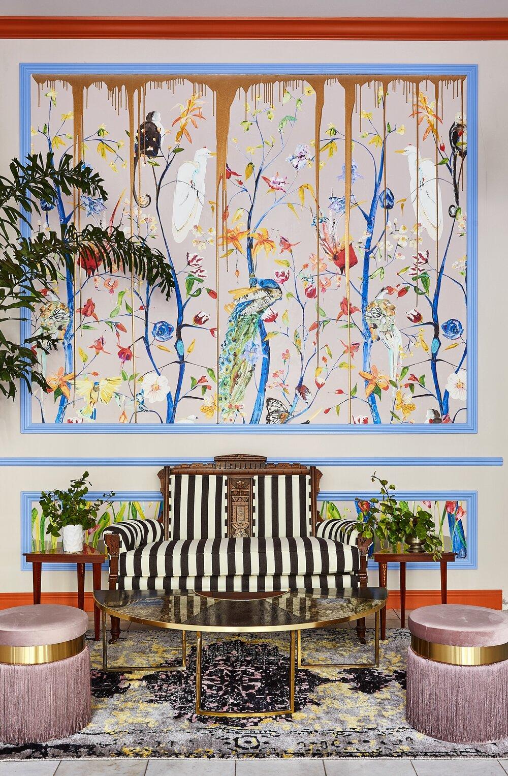
I knew I wanted to design the store in a way that celebrated some of the motifs of the jewelry. We wanted animals to be a part of it, and I immediately thought of this wallpaper from Voutsa. Based on that and the colorway, which was kind of a dusty, rosy mauve, I was like, This is the anchor for the rest of the space. The color vision came by finding complements.
I did most of the design myself, which is crazy, because normally the team is very much a part of this [process], but I hunkered down and bashed at this design for an entire night, and by the next morning, I was like, “I think I have it.” I explored 40 different options before we landed on the complementary colors for the rest of the walls, next to the wallpaper, and the trim.
I also love the idea of the wallpaper not just being wallpaper—there [had to be] something weird about it. What if we buy really expensive wallpaper and then I screw it up? We had [artist] Caroline Lizarraga’s team come in—she invented this concept, which is pouring gold resin down the wall. We also hired Caroline to paint a bandy-bandy snake on the floor. There’s just a lot of heritage in jewelry with regard to the snake motif. We painted a sapphire in its head as a nod to antique jewelry—like Queen Victoria, when she got married to Prince Albert, his engagement ring to her was an emerald-head snake ring.
What elements of the store are your favorites?
That’s so hard! The first thing is the black-and-white settee at the rear of the store, which is a little zone for people to wait for both their [piercing] procedure and also private shopping appointments. I basically rage-bought that settee during the pandemic. I’m obsessive—I needed it, it’s so beautiful—but my home is filled with chairs, so I needed to find a home for this. I’m thrilled that it went somewhere that I get to visit all the time.
The other thing that I’m quite proud of—I had this wackadoodle idea because we needed a [jewelry] case. The store’s actually quite wide, and the jewelry they sell is tiny, so we needed a way for the case to make the store feel full. I designed this octagonal jewelry case and then painted it burgundy with walnut trim, and then there’s a hundred legs underneath it. That is an exaggeration, but there’s definitely at least 12 or 16 legs—it’s a lot of legs. Everything is my favorite thing, but that’s something I’m particularly proud of. I don’t think I’ve ever seen an octagon jewelry case before.
What is your typical first interaction with a client?
We’ve been very lucky that it’s always been inbound interest, pretty much. A lot of it is folks finding us online, [seeing] our work on Instagram or on Houzz. We send an email with a little questionnaire, and then if it feels like it might be a fit, we do a quick phone call just to share a little bit about how we work, what our fees are, ask questions, [and see] if they have questions. If after the phone call it feels like, Hey, this is mutually exciting, this could be a really good fit, then I go out and do an in-person consultation, on-site if possible. All three of our [current] projects in New York came during the pandemic, so all of that had to happen over Zoom and video chat, where the walkthrough is a video and I’m taking screenshots of the video footage in order to capture certain details.
What do you typically wear when you’re meeting a client for the first time?
Generally speaking, I’m casual on clothing and then pretty maxed out on accessories. I am often wearing a ton of jewelry. My 22 ear piercings, they never come out. They’re basically like installations. A lot of earrings, a lot of necklaces, and then whatever I felt like putting on that day, which is usually jeans and some sort of a voluminous top. And then killer shoes, because I’m good at shoes. So I’m an accessories queen and then the rest is like, Who cares?
How do you present the design concept to clients?
We do everything digitally for the most part—a combination of SketchUp, Revit, Photoshop—and then we present things on screen. During the pandemic, it was Zoom screen-share. Some of it is us using Miro, which is a whiteboarding [site]. We skip the mood board phase. I can’t stand mood boards; I don’t like, “Oh, here’s a PowerPoint slide that has a swatch of a fabric.” We try to do everything in context, so we skip straight to more scaled drawings and illustrations. By the second round, we are showing up with samples so that everyone can physically feel and touch as much as possible.
What do you bring to a site visit?
Always my phone, a pad of paper and a pencil. Also, a laser measuring tape, a regular measuring tape and a box cutter—the crews never have a box cutter on them! That’s it. But the best way that I take notes is I just take pictures of everything and then I go look at my pictures later.
How do you turn down a client who’s not a great fit?
Many potential clients coming to us have never worked with an interior designer before. We’re very lucky that we have an opportunity to really shape their experience with interior design as an industry, so I take that really seriously. Whenever it’s not a fit, we try to tell them why, and to do it in a way that keeps everyone’s dignity intact. A lot of times, it’s just geography—I don’t like driving. We try to take a lot of care with each of our clients, which inevitably means that we can only take on so many projects at a time. Similarly, if it’s just a scope thing, the way that we try and explain things is, “Your budget is a perfectly reasonable budget, but it’s not a match for the kind of work that we do best, which includes a mix of more value-driven options and antique and vintage and partnering with independent makers and designers to create something custom for you.” I want people to understand, and I don’t want them to feel blindsided and rejected.
Do you google prospective clients?
Of course. Who doesn’t? We google them just to understand who they are and [for] data about their job, where they are and if they have family. If it’s possible to find their face, we try to do that. Design, especially for residential, is incredibly intimate, and so you’re treating the first phone conversation with some amount of curiosity, like online dating.
Homepage image: Inside the jewelry store and piercing studio Fiat Lux, in the Fillmore District of San Francisco | Aubrie Pick Photography


