


We’re just weeks away from 2022, and with the new year comes another round of paint brands announcing their Color of the Year predictions. In fact, the practice has become so popular that it’s often abbreviated to COTY, and everyone from automobile manufacturers to nail polish companies make official selections every year (Opi’s chartreuse-hued Pear-adise Cove, anyone?).
Where do COTYs come from? It’s a common misconception that they’re bestsellers, but that’s not necessarily so. Behr, for instance, picks its color of the year after months of reviewing trends in other areas of pop culture, including fashion, entertainment, travel and, more recently, nature and hobbies. Dunn-Edwards analyzes everything from demographic shifts to socioeconomic conditions before selecting an emblematic hue. “The color of the year is really a symbol of a larger trend and its influence at work through a variety of current events and industries,” says Sara McLean, color trend expert and stylist at Dunn-Edwards. “I cast a wide net in research to capture the full story of what the macro trends are before narrowing down to the color that best represents the trends moving forward.”
Interestingly enough, it seems these trend forecasters are on the same page regardless of who has hired them: Six leading paint companies chose earth tones as their 2022 COTYs. “Brands look at color from a psychological perspective, and the paint colors they choose tell a bigger story about consumer behavior,” says professional trend analyst and forecaster Jaye Anna Mize, who serves as vice president of creative at Fashion Snoops. “As consumers, we are overstimulated and in need of more calming spaces, and earthy colors help us stay connected to nature, even when we're indoors.”
What’s more, all but one of the colors could be described as a soft shade of green, a far cry from the rainbow of teals, terra cottas and bronzes pegged for 2021. Mize says the synchronicity is unsurprising because of the cultural connotations of the hue. “Not only is green closely tied to conversations about nature and sustainability—more recently, it’s been trending in wellness,” she explains. “Consumers are prioritizing mental health and well-being, and greens are associated with self-care and nourishment.”
Selecting a specific color to convey a collective social sentiment might make a great marketing strategy, but does it actually work? According to Ashley McCollum, the associate color marketing manager at PPG Paints, sales of the chosen hue often triple after the company announces its color of the year. The sales boost isn’t limited to that year, either: “Nightwatch, the 2019 color of the year, continues to be one of our bestselling paint colors, and one of the top 40 most tinted colors for PPG,” she says.
Sales aside, Mize says colors of the year should be taken with a grain of salt—or as a slight suggestion at best. “COTYs provide consumers with a common ground to build their palettes on, ” she explains. “About six months after they come out, you’ll start seeing the colors popping in interiors, and eventually across industries.”
Here, BOH takes a closer look at each pick, chatting with the companies’ forecasters to break down their choices.
EVERGREEN FOG SW 9130 | SHERWIN-WILLIAMS

A true midtone green with silvery gray undertones, Evergreen Fog is meant to evoke the spirit of the great outdoors. “It’s a nostalgic green,” says Sue Wadden, director of color marketing at Sherwin-Williams. “It brings that pastoral vibe back into the home.” Wadden says the brand settled on the hue partly because greens have been so popular in fashion and decor the past few seasons. “We saw that neutrals are warming up, [and that] sustainability and organic living are key design trends right now,” she explains. “From a color psychology standpoint, green is the color of nature, revitalization and growth. Evergreen Fog is soft and delicate—like a seedling emerging, it doesn’t come out intense. It’s subtle.”
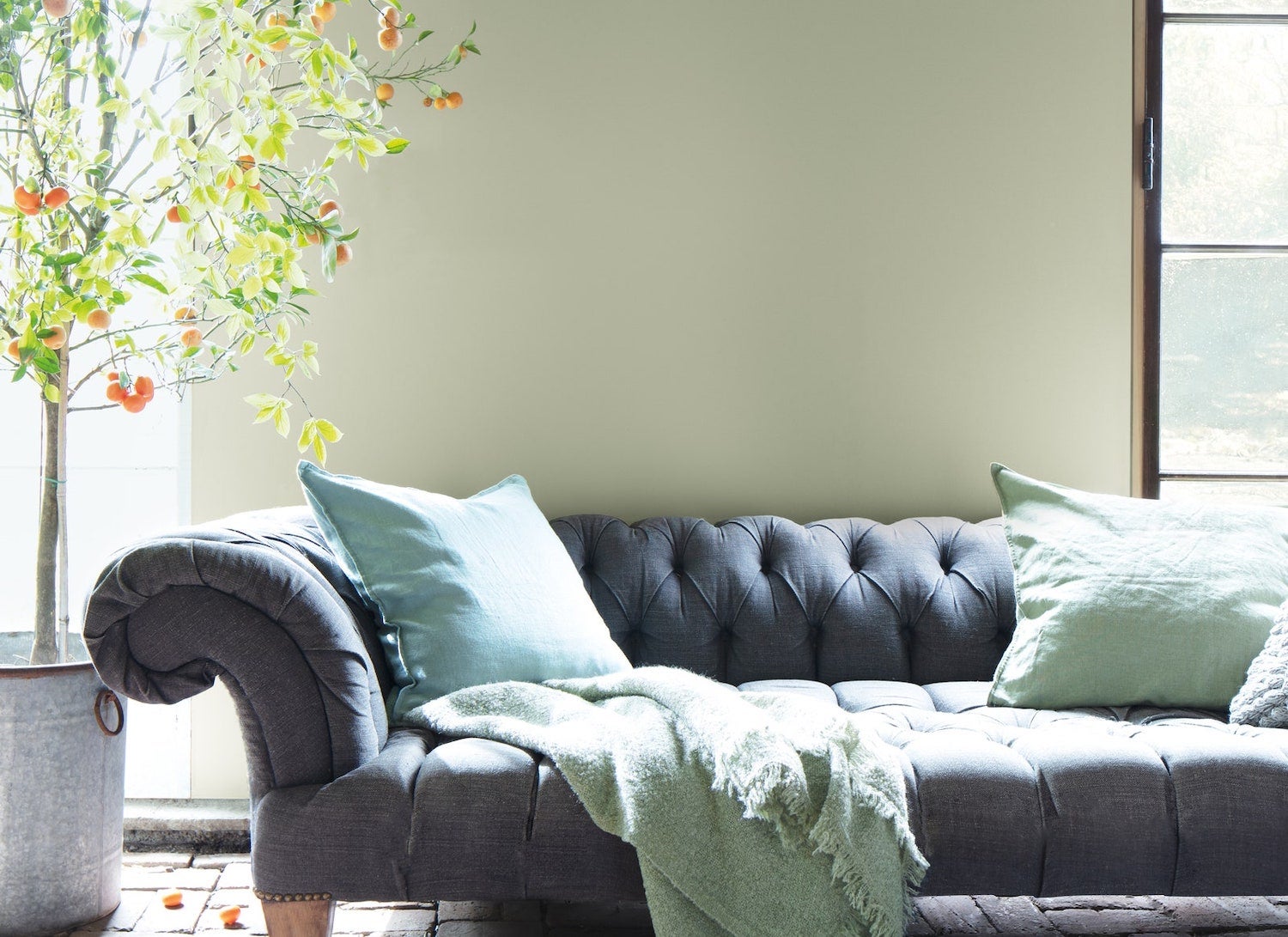
OCTOBER MIST 1495 | BENJAMIN MOORE

Inspired by the color of flower stems, October Mist by Benjamin Moore is an earthy shade of sage green with (you guessed it) pale gray undertones. The hue is “extremely versatile,” says Andrea Magno, director of color marketing and development at Benjamin Moore. “It has a silvery quality that allows it to read as a neutral in some applications, or as a soft, dreamy green in others.” It’s the kind of grounded whimsy and flexibility that only a true earth tone can provide, and ultimately why Magno says the brand selected it as its 2022 Color of the Year. “October Mist was a standout not only because it nods to the need for comfort and stability, but also because it captures the desire for escape and imagination,” she says. “There’s a balance to October Mist that feels right.”
BREEZEWAY MQ3-21 | BEHR PAINT COMPANY

A soothing minty blue-green, Breezeway by Behr is inspired by the hue of natural sea glass. It’s saturated enough to make a splash on cabinetry or moldings, but thanks to its gray undertones, can also be used in lieu of neutral wall paint to create a calming vibe in a room. “Breezeway’s gentle and cool hue instills a sense of peace,” explains Erika Woelfel, vice president of color and creative services at Behr. “It’s a color that bridges our feelings of contentment and curiosity.”
ART AND CRAFT DET682 | DUNN-EDWARDS

The only non-green paint COTY in this year’s mix, Art and Craft is a sunbaked cinnamon brown hue that moonlights as a midtone neutral. “As we move out of the pandemic, we’re seeking comfort in warm, classic hues,” explains McLean. “Art and Craft is a nourishing, nature-based hue that envelops and creates a sense of stability and calm.” McLean says Art and Craft pays homage to nature as well as to an array of emerging design trends. “Browns are moving to the forefront of influential colors as we see the warming of all hues over the past few years,” she says. “Recent trends, including cottagecore, rural fantasy, and light and dark academia all emphasize the importance of using earthy palettes to create warm and cozy atmospheres.”
OLIVE SPRIG PPG1125-4 | PPG PAINTS

A soft green inspired by the great outdoors, Olive Sprig is meant to brighten a space with its natural liveliness, though it’s muted enough to act as a neutral. “During difficult inflection points throughout history, we often see consumers gravitating towards bolder designs, as previously seen during the Roaring Twenties,” explains McCollum. “As part of this cyclical history, PPG is seeing post-pandemic optimism start to infiltrate residential design spaces to create a sense of escapism.” She says the brand selected the hue after bringing together more than 30 PPG global color experts from the automotive, consumer electronics, aerospace, and home paint and stain industries to discuss what color trends were emerging across different segments. “We found a 240 percent year over year increase in searches for green paint colors,” she adds. “Olive Sprig represents the tone of 2022, as it embodies the regrowth and renewal we’re all craving.”
GUACAMOLE PPG1121-5 | GLIDDEN PAINT

A soft lime green that almost reads sage, Guacamole by Glidden (a PPG-affiliated brand) is equal parts energizing and easygoing. Inspired by the color of ripe avocados, the hue is designed to reinvigorate a space without overpowering the decorscape. “It’s spirited, but also brings a grounding, organic element to a space,” McCollum explains. Much like PPG’s choice of Olive Sprig, she says Glidden picked Guacamole partly because earthy greens were so popular throughout the pandemic. “Green reminds us of nature’s resilience, which is precisely why it’s poised to be the ‘it’ color of 2022,” she explains. “We’re all looking for rejuvenation after these unprecedented times.”
Homepage photo: October Mist 1495 by Benjamin Moore | Courtesy of Benjamin Moore


