Once you’re in the door, there’s plenty of advice floating around about style, project management, budget and all the rest—but how do you actually get the job in the first place? We’re asking designers to peel back the curtain and walk us through how they landed a project, step by step. Here, designers Lina Galvão and Erin Coren of the family-focused East Coast firm Curated Nest Interiors discuss a nursery project like no other.
The clients, with whom the duo had worked twice before, were pregnant with twins and decided to keep the sexes secret from themselves—but not their designers. They handed Galvão and Coren their enveloped ultrasound and gave them carte blanche to surprise them with a fully designed and installed nursery. “As a designer, how often do you get someone to say, ‘You can do whatever you want,’ and then you get a big reveal?” says Coren. “It was great,” Galvão agrees. “We felt like we were on HGTV.”
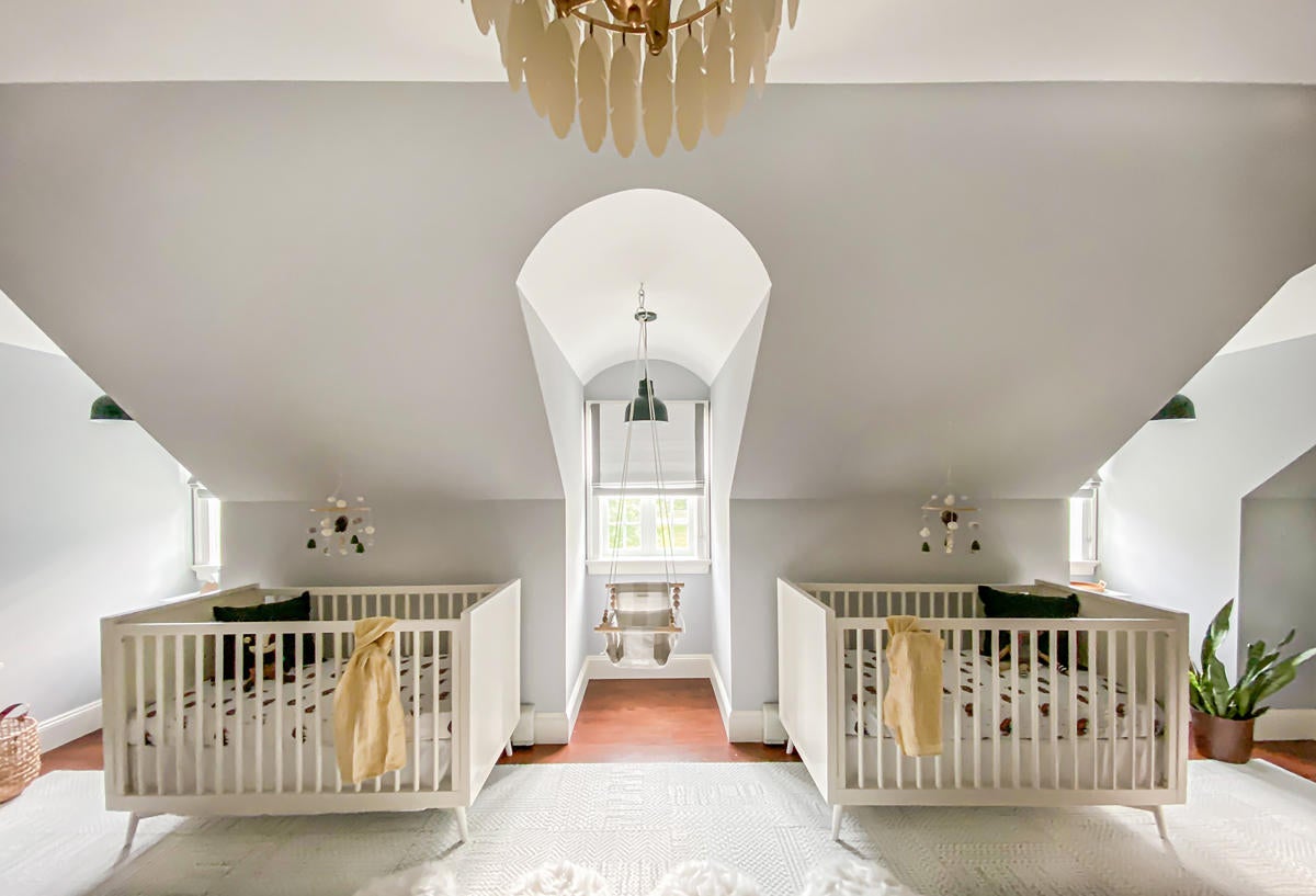
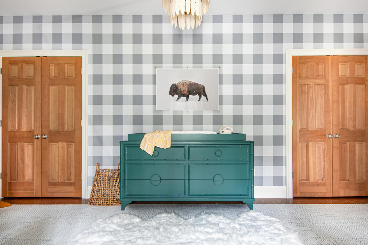
The designers didn’t get to reveal the space pre-babies, due to yet more cinematic reasons they explain here, but the final room is outfitted in serene gray buffalo check with hits of deep color that Coren says can be switched out as they age. “We really wanted the space to grow with the boys.”
What is your typical project, and where?
Lina Galvão: Erin and I are the founders of Curated Nest Interiors. We're a small boutique firm based in Greenwich, Connecticut, and we serve southern Connecticut and Westchester, which is just north of New York [City]. Primarily high-end residential, our niche is that we work with a lot of families.
What is the background of this project?
Galvão: These folks were longtime clients. We had done their home in Jersey City, just outside of New York. When they moved to a much bigger suburban home, they asked us to do that house as well. They had only one child at the time, and we kept joking with them, “When are you going to have another? We’re dying to do your nursery!” Sure enough, two months after we finished their home, they called us and said, “Guess what? We’re having twins.” It was totally unexpected—did not run in the family—and it was a really exciting moment for them. They said, “You guys know our style. You’ve been working with us for a long time. We’ve got a lot on our plate. Why don’t you make the design a surprise for us?”
How was the sex of the babies given to you?
Galvão: Oh, that was one of the best parts.
Erin Coren: Before we knew the gender, we put together the concepts—whether it was two girls, two boys, or one of each—and then they gave us a letter and we went upstairs and sneaked a peek. They had no insight as far as overall style or any items we picked—nothing had to be approved. We just went ahead with our budget and designed it any way we wanted.
Galvão: We did tell them to go through Pinterest and show us some nurseries that they liked, and we talked about the [general] approach [based on gender combination], but it certainly wasn’t anything as formal as a mood board or a design concept. I’ll put it this way—it was a fraction of what we normally do.
What was your vision for the space?
Coren: We wanted it to be very neutral—a space that the boys could grow into.
Galvão: There was a very popular style going on at the time with the buffalo check, sort of like a mountain nomad, boho theme. Our goal was to combine several of those elements and draw from the rest of the home; we knew that this family loved decorating with neutrals and pops of color. That’s where we came up with the idea of keeping the room in neutrals—gray, tan—and then the dresser was the big pop of color with forest green.
What are some of your favorite details or vignettes around the room?
Coren: The custom-made dresser in a really nice, deep hunter green [paired] with more neutral tones was my favorite design detail. Also, how we laid out the space for twins with the architecture of the room, [which has] the three dormer windows. We joke about that: Had it only been one baby, the layout would not have worked so well, because you didn’t have the symmetry with all the dormers. They really helped us out.
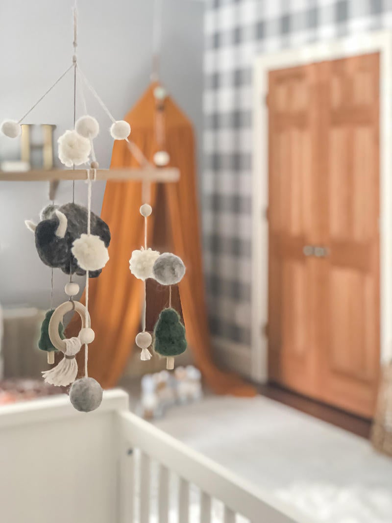
Galvão: For me, it was just how the room felt in the end. This is one of my favorite nurseries we’ve ever done. When you are in the room, it feels really soothing; the bright green and the canopy, it blends really nicely. There’s a soft light coming in from the dormers. It has a really lovely feel.
Were there any challenges to the project?
Coren: When we showed up at their house on the install day, everything ready to go, knowing that we had one day to pull this off, we got a call from our client as we were walking in the door: “You told us we need to be off-site, so we decided to go the hospital and have the baby.” I think it was three or four weeks before the due date, just to give some flexibility, and sure enough! It was almost like a TV show.
You specialize in nursery design and kids’ rooms. What is it about those spaces that draw you in?
Coren: When you do a space for kids, you can really make it whimsical. As long as you’re picking base furniture that can grow with them, and then art, accessories, wallpaper—all that can be transformed over time as styles change, preferences change. So you can go crazy with those little details.
What is your typical first interaction with a client?
Galvão: From the first time that clients contact us, usually through our website or from a referral, we have a questionnaire that we send. It’s very basic, just to get a sense of: Where do you live? What rooms are you interested in? What’s your budget? If you want to renovate. That kind of thing. Then we have a call where we talk through the questionnaire and their project needs. We explain how we work and share our family-friendly philosophy. Then we do an on-site consultation, which usually leads to a full project. We’re very clear with our clients that function is first—we’re focusing on making the space flow, and making it more efficient for family, friends, living.
What do you wear to that first meeting with a client?
Galvão: Both Erin and I wear a lot of black. We’re New Yorkers. Maybe black pants and a black shirt, or dark jeans.
Coren: Nice shoes.
Galvão: Nice shoes! Even though we end up taking them off in clean houses. We don’t go too formal or funky. We don’t want to be overly taste-specific. We try to be chic and elegant.
Coren: I’ve noticed, whenever I go to presentations with a client, that sometimes I pick out clothes that really go with the style of their house. It’s not even intentional!
How do you present design concepts?
Galvão: We’ve been doing them more and more on Zoom, but typically it’s in person. The concept is usually on a screen, whether on a client’s large TV or our laptops. We go through several floor plans, mood boards, and we pause in the middle to get their feedback. But our goal is to make it fun and collaborative for them, and make sure that we understand and discover any needs that maybe they didn’t even know.
Coren: We do a concept presentation before the final presentation. I know a lot of design companies do this differently. But when at the final presentation, we do boards so they’re able to see everything together.
Galvão: The final one has all the fabric and wood samples. It’s a lot more tactile.
What do you usually bring to a site visit?
Coren: We bring lots of measuring equipment—measuring tape, laser. Once we have anything picked out, like finishes, we always bring those. We have an accordion file where we keep all their fabrics, tile, wood. We bring it just in case we want to see certain things in the natural light of the space, or artificial light. We want to test and make sure that all of our fabrics and finishes actually look good in that house, not just in our office. We bring notepads. Sometimes we’ll bring a little something for the dog, or if they have children.
Do you google clients before working with them?
Galvão: We do, yes.
Coren: It's such a long-term relationship that we’re interviewing them as much as they’re interviewing us. If we have two people on different pages, it’s just not going to be a successful relationship. So, anything that we can do to really get a better understanding of our client going into it, I think it makes for a better project.
Homepage image: Inside the blank-slate nursery designed by Curated Nest Interiors | Erin Coren


