








In the BOH series What I Love, we’re asking designers to build us a mood board of what’s inspiring them right now.
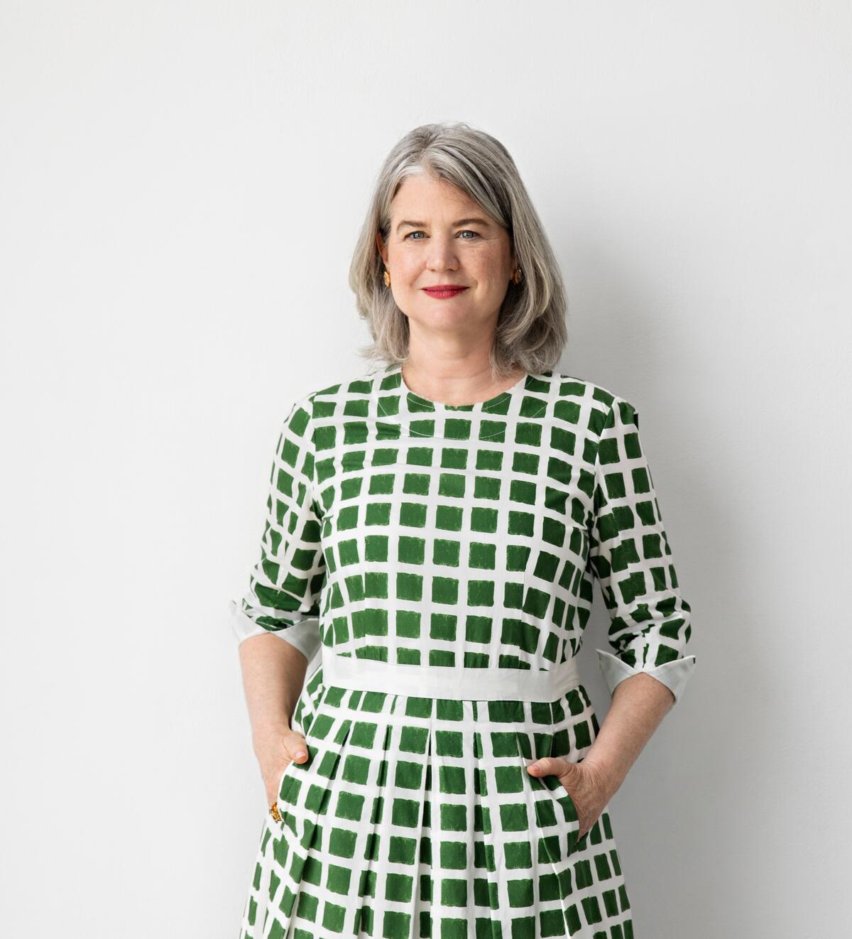
Designer Leslie Banker believes contrast and balance are critical to a well-designed space. Perhaps that’s because she’s used to navigating her own competing aesthetic preferences: The native New Yorker revels in the cold elegance of city life, but she often finds herself drifting toward the light, bright hues of a more pastoral existence. “I am generally drawn to greens and blues,” she says. “They remind me of being outside: the blue sky and green grass. You will notice that in much of my work.”
A sunny disposition is also evident in this upbeat flat lay, the design equivalent of a summertime idyll spent daydreaming on the banks of a long-forgotten pond. “I was looking for colors that worked together, a common denominator of things that are cheerful and brighten a space literally or figuratively,” she says. Moss-hued mohair grounds the collection, allowing the lily pad–like greenery of nasturtium blossoms to furl out beneath a playful ceramic frog. Structure reveals itself in an array of tidy goldenrod stripes and a woven textural grid, setting the scene for subtle juxtaposition. Then there are the bunnies, a whimsical counterpoint to the metallic luxury of a Buccellati shell dish and Tiffany & Co. saucer.
“Balance comes at many levels: The colors throughout a room, the furniture arrangement and the lighting all need to be balanced to create a general sense of ease and equilibrium,” says Banker. “Contrast highlights the different forms and creates interest. A room feels blah without it. The bunny fabric is a one-off, but every room needs something that is a surprise.”
Here, the designer shares the thoughts behind her selections.
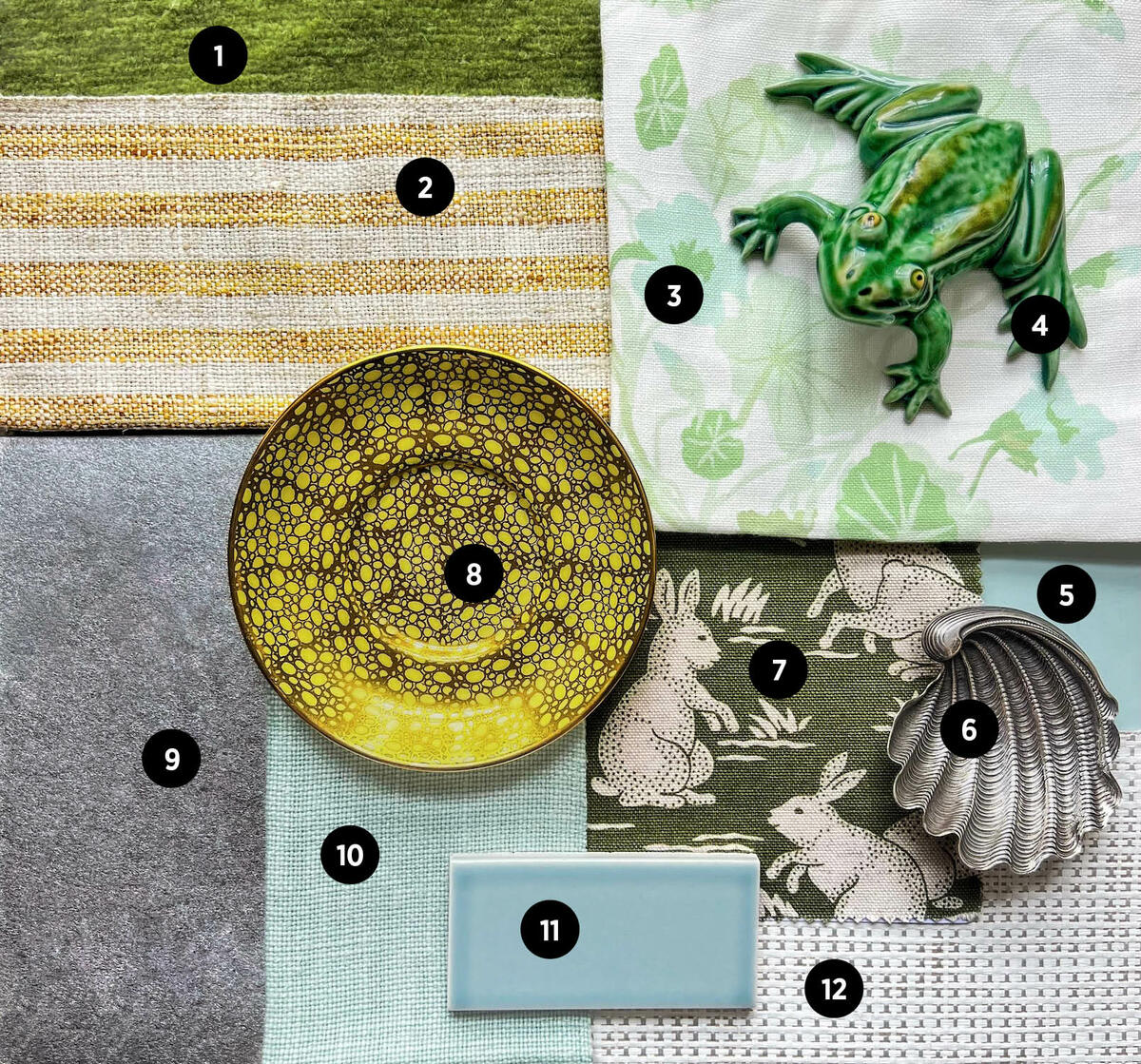
1. HAND-KNOTTED MOHAIR CARPET BY BEAUVAIS CARPETS
“Mohair is so luxurious and durable and has a spectacular depth of color. It adds texture and richness. Fun fact: Old-fashioned movie-theater seats were covered in mohair because it is so hardy.”
2. BUNGALOW CHIC II FABRIC IN COLORWAY 416 BY KRAVET
“The best rooms have a mix of freeform and geometric patterns. I love a stripe, and this one is on a sturdy fabric, which is practical for a chair seat and much more.”
3. GROWING NASTURTIUMS FABRIC IN GREENS ON WHITE BY WATERHOUSE WALLHANGINGS
“So light and happy. The nasturtiums are best suited to curtains, headboards and throw pillows, as it’s a thin fabric. We used this on a project recently for curtains and a chair in a guest room.”
4. EARTHENWARE FROG SCULPTURE BY BORDALLO PINHEIRO
“I love the green of the frog and the whimsy it provides. Whimsy keeps things lighthearted and fanciful. Even in a formal room, there should be some whimsy to keep everyone from taking themselves too seriously.”
5. WALL PAINT IN MIDDLE GROUND BY FARROW & BALL
“We painted a library in this color recently and were very pleased with the outcome. It’s blue but it’s also a neutral.”
6. TRIDACNA SHELL DISH BY BUCCELLATI AT S&K LTD.
“I have a pair of these small dishes and love how they look on a tabletop. [They] bring texture, pattern and elegance to the mix.”
7. COTTONTAILS FABRIC IN MOSS BY SCHUMACHER
“I see [this fabric] on a lumbar pillow or in some small moment in a space. In this collection, it feels cheerful, adds a freeform pattern and is a focal point.”
8. ANTIQUE PORCELAIN SAUCER BY TIFFANY & CO.
“I always like to use at least a few old things in a space, whether they be antiques new to the client or—better yet—[their] heirlooms and treasured items. Without this, a room lacks soul and interest. I love the gold-and-yellow pattern here—does it look a little like sharkskin? It adds a fine touch, some elegance and a small-scale pattern.”
9. TEA LEAF WALLPAPER IN SOLID SILVER FLECKED BY GRACIE
“Gracie tea paper on a ceiling is the best way to bounce light around and keep things interesting. It’s a favorite trick of ours, and [the paper] always reads as a neutral, so it goes with everything else here.”
10. MIA LINEN IN AQUA BY MANUEL CANOVAS
“Manuel Canovas has the best colors. This fabric is cheery and clear in color and picks up the blue of the paint and the tile. It would be great on a sofa or chair with some throw pillows.”
11. R220 CERAMIC TILE BY PRATT + LARSON AT ARTISTIC TILE
“They come in such a terrific variety of colors and in many sizes. A kitchen backsplash and a bathroom are some of our recent applications for this tile, but maybe [it translates to] a ceramic vase filled with fresh-cut flowers.”
12. TIDAL WEAVE WALLCOVERING IN WHITECAP BY PHILLIP JEFFRIES
“This is a great paper. It’s light, adds texture, and has little metallic flashes to keep it lively.”

 Withdraw Consent / Manage Privacy Preferences