On Sunday night, the nation was treated to a 90-minute reprieve from Tariff-Palooza when HBO aired the feverishly anticipated third-season finale of The White Lotus. 6.2 million tuned in. When the credits rolled (no spoilers here!), they wrapped up an obsessed-with stretch of prestige TV defined by two shows—The White Lotus and Severance (both already renewed for another season)—in which interior design could almost be considered a member of the cast.
Most great shows have a striking sense of place. Even so, The Sopranos did not lead to a collab with West Elm, or inspire a flood of social media posts exploring the histories of Tony Soprano’s chairs. In both The White Lotus and Severance, the setting is so loudly part of it that it can’t be ignored. And it isn’t: The two shows have kicked off robust conversations in the design press. But as that chatter unfolds in different ways, the divergence between them points to a split that has long existed in the home industry.
Severance is weirder, so let’s start there. Set in a fictional New England town during an ambiguous time period, the show posits a surgical procedure called “severance,” in which a person can elect to separate their work and personal life by splitting their brain into two separate consciousnesses: an “innie” and an “outie.” The technique is used by a powerful yet mysterious corporation, Lumon, to create a special class of employees. When these employees are on a specific floor of the office, their “innie” selves do enigmatic, top-secret work. When they leave, they become “outies” and remember none of it.
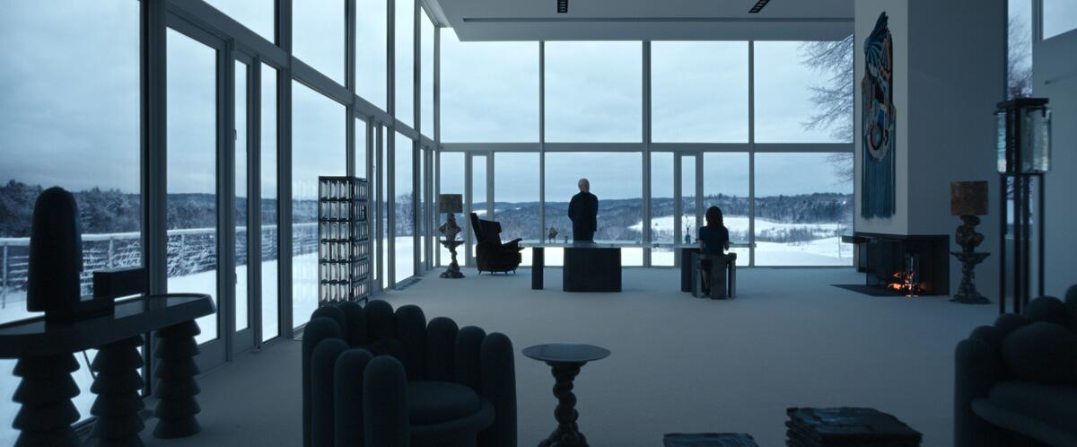
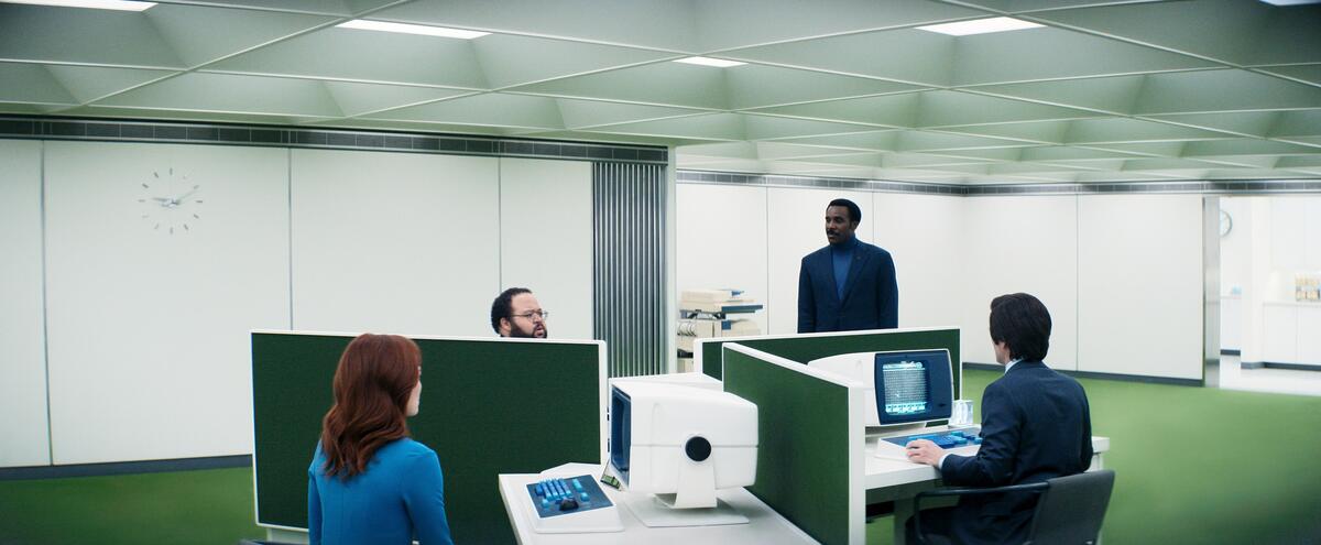
The show is a darkly comedic rumination on human nature and control—a puzzle box full of plot twists and upside-down riddles. It’s also absolutely stuffed to the gills with modernist design classics.
Largely, they can be found in the headquarters of Lumon, the show’s Big Evil Corporation. There, the aesthetic is midcentury modern at its coldest, stripped down for surreal effect. Four workers sit in an X-shaped cubicle workstation lit by harsh fluorescents in the middle of an enormous, otherwise empty room. A Braun record player by Dieter Rams is the only item adorning the walls of a sadistic doctor’s office; Luigi Massoni’s Dilly Dally vanity sits in the corner of a strange “testing room.”
On April 16, business consultant and certified DISC practitioner Jody Seivert shares how to foster more positive relationships, reap the financial benefits, and relish the sweet relief of stress-free business dealings. Click here to learn more and remember, workshops are free for BOH Insiders.
The conversation around the design of Severance has been robust. Outlets from Marie Claire to Curbed to The Architect’s Newspaper have cataloged the vintage bonanza and analyzed the way the show uses architecture to tease out its subtler themes. On social media, design junkies picked apart each episode to ID new pieces and speculate as to what clues they might hold to the show’s many mysteries. (A collection of vintage Dansk pepper grinders was heavily scrutinized.)
Commentary on design in Severance tends to have a cerebral, deep-thinking tilt—much like the show itself (a sample YouTube breakdown: “How Severance Uses Architecture as Mind Control”). Analysis can also take on the flavor of academic criticism. In the Substack newsletter For Scale, design writer Sophie Lovell muses that the show’s extensive use of Dieter Rams pieces is a tonal misfire, given that his work was all about democracy and egalitarianism—a far cry from the oppressive corporate totalitarianism of the Lumon offices.
The Severance conversation is the industrial design conversation. We know the names of the people who designed the chairs in Severance. We know the philosophy that underpinned their work, and how it relates (or doesn’t) to the themes of the show. It’s a little intellectual. It’s a little cool. It’s a little European. It’s one for the Salone crowd.
The White Lotus is simpler, at least in concept. Each series starts with the discovery of a dead body—we don’t know whose. The show then flashes back to a group of tourists arriving at a five-star hotel, the titular White Lotus. Largely, they are rich and miserable, and their money does little to help them over the course of a week that sees the characters bounce off of each other with heightened intensity. By the end of the season, someone (or multiple someones) winds up dead, revealing the mystery of the corpse. Rinse and repeat.
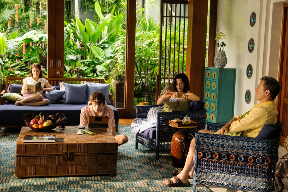
The show has changed its location three times—Hawaii, Italy, and now Thailand—but the setting is always an unimpeachably luxurious hotel. (The White Lotus is filmed at real-life Four Seasons resorts.) The meaning of the setting tends to shift over the course of the season. At first, characters marvel at the glamour of their surroundings. By the end, the idyllic environment has become an ironic backdrop to the characters’ miseries.
In the first season, a running subplot involves a spoiled frat boy growing increasingly furious that the impossibly beautiful room he’s staying in for his honeymoon is different from the impossibly beautiful room he had booked online. The White Lotus’s setting is more pleasurable for its viewers than its characters: Great design can’t solve these people’s problems, but it makes them more fun to watch.
There’s a discourse around the design of The White Lotus, but unlike Severance, there’s also a lot of commerce. Especially in its third season, the series has birthed an almost comical array of product licensing deals. There are White Lotus–inspired lines at H&M and Banana Republic, White Lotus chocolate bars, and White Lotus coffee creamers. In the home realm, this spring CB2 launched a White Lotus–inspired capsule collection that includes everything from decorative brass monkeys to upholstery featuring Thai motifs.
There’s something ironic about the fact that a show about the superficial allure (and letdown) of material luxuries is now licensing its name to advertise products of all stripes—a little bit like how The Wolf of Wall Street, a movie that satirized the soulless excesses of a financial huckster, was taken as aspirational content by thousands of would-be finance bros. But The White Lotus is clever enough to have its cake and eat it too. Thailand really is beautiful, and the hotels really are gorgeous. If the Four Seasons is squeamish about its connection to a show where people are murdered in hotels, they don’t show it—this season, the chain formalized a promotional partnership with HBO in a deal The Wall Street Journal called a “marketing jackpot.”
There’s plenty of chatter about the series in both the design press and on social media. Much of it follows the standard “get the look” playbook that now accompanies any interior that enters pop culture’s bloodstream. There are deeper dives as well, with commentators picking up subtle plot hints in the art direction, and thoughtful looks at how the rooms come together as a whole—designer Gala Magriñá offered her take on whether the design of the Thai location exemplified the wellness principles the fictional hotel claims to tout.
The White Lotus conversation isn’t superficial per se, but it’s very different from the obsession with objects and the European geniuses who made them that Severance inspires. It’s an interior design conversation, about the cohesive look and feel of an entire space and how it relates to the people who fill it. It’s about vibes and glamour and feeling. It’s pattern, it’s color, it’s mood, it’s monetization.
It’s not surprising that these shows should provoke two wildly different design conversations. Severance is an artsy sci-fi riddle, while The White Lotus is a voyeuristic dramedy. Their aesthetics are about as far apart as can be. But the schism between the conversations they inspire is an interesting one, as it’s one that has long existed in design.
On the one hand, you have the segment of the industry that puts the object and its historical context above all else—habitués of collectible design fairs, Salone die-hards, those who can rattle off B&B Italia collections in reverse chronological order. On the other, you have those who think in projects, clients, and homes and how they work.
There’s plenty of crossover between these worlds. But they feel a bit more split in home than in other creative industries. In fashion, the connection between Paris runways and retail shops is a familiar one. Home feels more fragmented: What’s happening in Milan this week may never reach the halls of your local fabric showroom—and vice versa.
It’s a shame. At its worst, the Severance discourse is opaque and intimidating. At its best, it injects the excitement, historical heft and intellectual energy of fine art into interior design. The White Lotus discussion can be light, but it more closely represents the way most people think of their homes: a collection of functions and feelings, not a showcase for Important Objects.
Both shows are worth watching. Both conversations are worth having. The more crossover between them, the stronger—and more interesting—the design industry gets.


