


In a new Q&A series, Business of Home asks leading designers to take us inside kitchens, baths and mudrooms that deliver—revealing the technical considerations, material choices and design decisions that make these hardworking spaces sing.
This week, we’re chatting with Claire Staszak, who launched her Chicago-based firm, Centered by Design, in 2015. More than a decade later, her 10-person team tackles everything from ground-up new builds to historic restorations, with a particular focus on crafting kitchens that balance function with aesthetic flair. She walks BOH through a recent project for a pair of clients who wanted to refresh the kitchen in their new Chicago townhouse without starting from scratch after relocating from New York.
What was the brief for this project?
I’m sure everyone says this, but truly, we adore these clients. This was a young family with three kids, just busy working professionals and longtime clients making this big life change moving from New York to Chicago. This wasn’t a full gut renovation—it was a newer home, so things were in good condition—but we were really trying to have a different look. It was built for the prior owner, and when people build their own house, it’s very specific. We were trying to strip away a lot of those things and add what felt appropriate to this couple. It was a mix of creating a little bit more of a laid-back aesthetic, more of a California vibe, but without doing that too literally. In my opinion, that doesn’t work super well in Chicago. Instead, we were trying to blend that more organic California sensibility with something that worked for the Midwest.

What were some of the unique challenges of this space?
Every room was touched, including a full bathroom and kitchen renovation. The goal was trying to strip away some of the details that didn’t really fit this family or the architecture—for instance, the multilevel tray ceilings. Architecturally, we were trying to simplify, and then from a decorating perspective, we wanted to add a lot of layers, a lot of warmth, and a lot of wood and plaster that would feel welcoming and bring that West Coast feeling. We also brought in a lot of beautiful European and midcentury antiques to add to that feeling of it not being a new home.
What was the client looking for from a functional perspective?
Part of the reason they bought this property is it’s on a double-wide lot, which is rare for Chicago, so it felt a little more like a suburban-size home in the city. One of the suggestions we made was, “You don’t need to gut this kitchen. We can do a lot to update it without fully starting over.” We didn’t have tons of time to get them in, so anything we could do to reduce the overall project timeline was appealing.
With the kitchen specifically, we are trying to understand what their day in and day out look like, and how we can either create the storage they need, or what type of plumbing fixtures they want to touch every day. We also reno’d the butler’s pantry—also not a full gut—so we had to look at all those spaces and [determine]: What can we change that’s going to really elevate the feeling of this kitchen without starting over?
What did you keep from the existing space, and what did you replace?
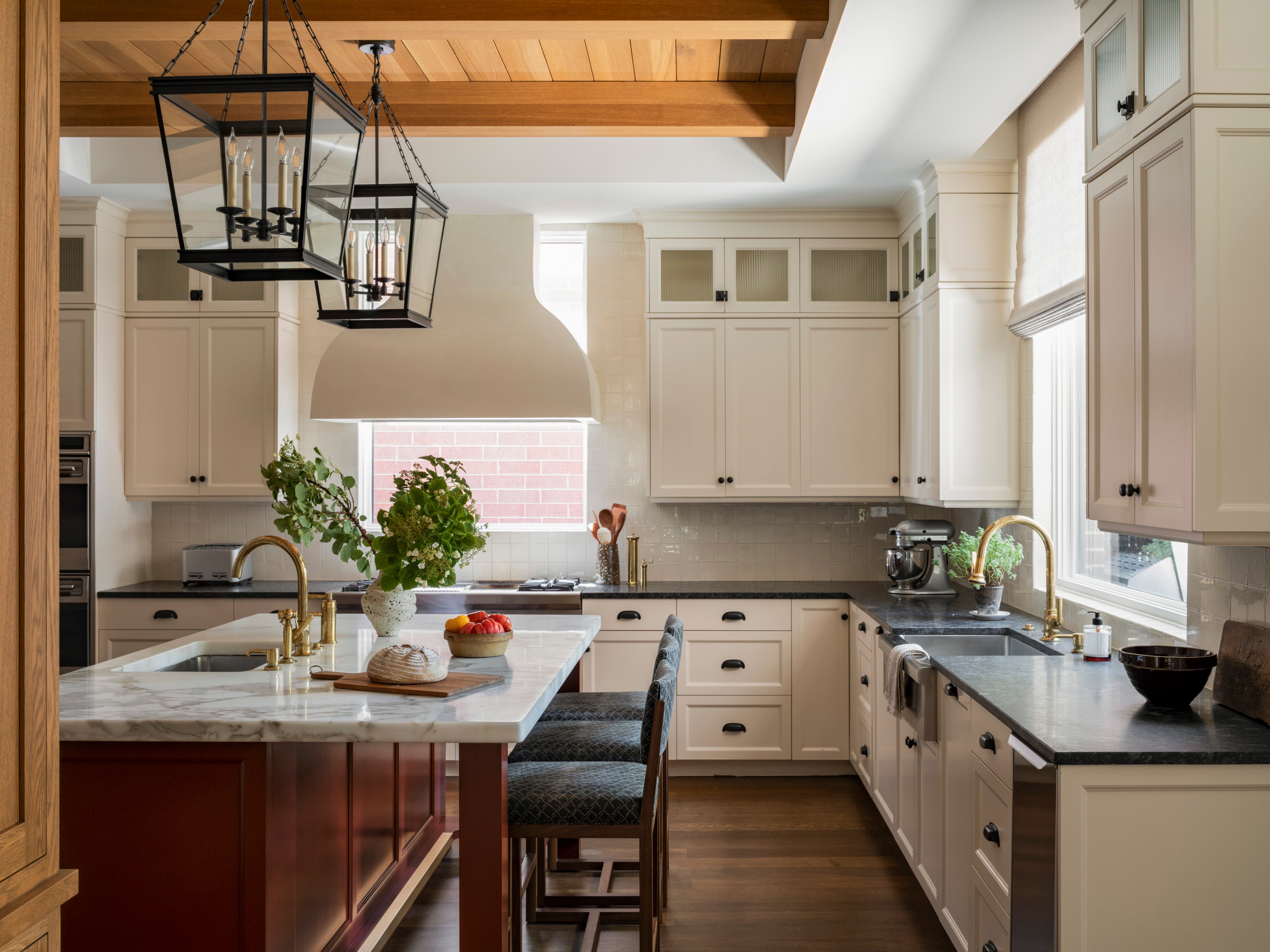
We wanted to leave the perimeter intact. The cabinetry was inset, which is a type of cabinet we typically design, and it was a neutral color that was easy to work with. The layout was pretty good as it was; the appliances were also relatively new, so we kept those. But I felt like we could give it an entirely new life, because we were dealing with something that was fine, but not great.
The white cabinetry with the black countertop—that all stayed. We just changed out all of the glass at the top of the cabinets from regular to reeded to add another layer of interest, and updated all the hardware. One of the biggest differences is the window behind the range. That was originally a strange custom design that we changed to clear glass, and then we designed the plaster hood to go in front of it because we felt like the kitchen needed a beautiful focal point.
We were able to leave all of the tile and those perimeter countertops as is, but we changed the plumbing, which appears on both the perimeter and the island, to fixtures from Waterworks in unlacquered brass—we love using living finishes to help add character. We did a new island, but reused the stone top because it was the exact same footprint. I don’t think I’ve ever been able to completely reuse a countertop like that before, but it was really beautiful marble and it ended up working. The before was just a black island with metal legs—we weren’t mad at the layout, we just didn’t like the aesthetic. We felt like it would be fun to bring an interesting color in. This client wasn’t afraid of red, so we were excited to go for this really deep, beautiful color. We added some pretty molding around the bottom, a brass toe kick, and some more elevated cabinetry details so that it would feel custom and beautiful, not just utilitarian.


The other big thing we wanted to do was introduce wood into the kitchen. For us, wood and plaster go hand in hand with that West Coast feeling we were trying to incorporate. The wood just really warms up the space. Bringing it into the kitchen also helps set the tone for other types of wood we were using throughout the house, like the oak built-ins we did in the family room across from the kitchen.
We took out some weird layers of detail in the tray ceiling, and added wood planks and beams. Then we ripped out the white cabinetry and some tile that was on the far left wall of the kitchen and built this custom cabinet that feels freestanding and houses the microwave. With this wood hutch, the wood on the ceiling, and then the red islands, it all feels like how we usually do a kitchen when we’re planning from scratch. We tend to use wood elements, a painted element, and then a neutral of some sort.


What was that process like in the butler’s pantry?
What’s interesting about this area is that the full-height cabinetry on the left is original; we just painted it. On the other side, we ripped everything out and designed new custom cabinets to match the doors on the other side. We were able to get everything they wanted for a pantry and a bar in that space: There are refrigerator drawers, a wine fridge, a microwave hidden in a custom hutch, lots of storage, the beautiful stone, and open shelving. By saving the stone on the island and keeping the perimeter cabinets, we were able to invest in the beautiful, interesting stone and beautiful cabinetry in this space.
It’s nice to be able to have those trade-offs when you’re thinking about a budget and how to stretch money. We could have ripped this whole other side out and just built it all new, but when it’s going to be virtually the same thing, we’re happy to help our clients reuse that—from the perspective of the environment, and also just being creative. It’s really fulfilling to do a job like this; we call it “cabinet surgery.” It doesn’t always work, and it can get very complex when you’re trying to do bits and pieces, but if you can make it work with a whole side or a whole perimeter, then it can be really effective.

Can you walk me through some of the process documents you shared?
Exhibit A is a 3D rendering of the kitchen, which is always helpful when we’re trying to help our clients visualize our ideas. In particular, we wanted to show what the hood looked like, [as well as] the wood on the ceiling, the red island, and the lanterns above the island. It helps a client to see some of these disparate elements. We have two countertops, two cabinet colors, a wood tone—it’s a lot for the average person to absorb and trust that it’s all going to look good together. The rendering actually helps us, too. You can see that the fabric on the counter stools is the same fabric, but in a different color, because it helped us see, like, “I think that fabric would look better darker.” And so in the final images, we changed the fabric to a darker color.

Exhibit B is the layout of the first floor, which shows the section over the kitchen where we added the beams—that’s really more contextual for the layout of the butler’s pantry and the kitchen.

Because this perimeter cabinetry was existing, we didn’t do the detailed cabinet drawings that we would typically do when we’re building; the hood elevation in Exhibit C is really just a visual for our client, and also for our subcontractors building the hood. We can show the curve and depth of the hood, and get a sense of the scale of it in the space.

The island and the hutch are detailed a bit more in Exhibit D. Those are representative of the level of detail our cabinetmaker needs to understand our design. It actually took a good amount of engineering. Designing that bottom part of the island with the brass detail and how the legs sit into it—that’s where it gets pretty technical. You can’t do that without [turning to] custom cabinetry.
You mentioned the lantern lights above the island—how did you approach lighting the space?
We definitely wanted something with presence. Typically, having a statement light over the island is the way we go, but they don’t always need to be super oversized. This hood was pretty big, and with the wood on the ceiling, it could handle these bigger lanterns. The glass helps them stay airy. In the original kitchen, there were three smaller [lights over the island]. Three just feels really dated these days.
How can a designer fine-tune their process to offer clients a kitchen refresh without doing a gut renovation?
The first step is to understand: Are the clients happy with the layout but just don’t like the look, or is the functional layout not working? If the functional layout doesn’t work, no amount of aesthetic change is going to help them like their kitchen better. But if it’s like, “No, I don’t think we would change the sink or fridge location,” then there might be a lot of ways to update it without having to start over.
In those types of projects, we often update the island. If you can keep your perimeter intact and repaint, then add an island and a different piece of cabinetry—like we did with this project—that’s kind of our formula. We are doing another project right now, [where] they’re keeping the perimeter, we’re building a beautiful new island, and we’re building a banquette on the other side of the kitchen. We had to move a window to do it, but it’s totally worth it—and they’re not having to rip out their whole kitchen.


