


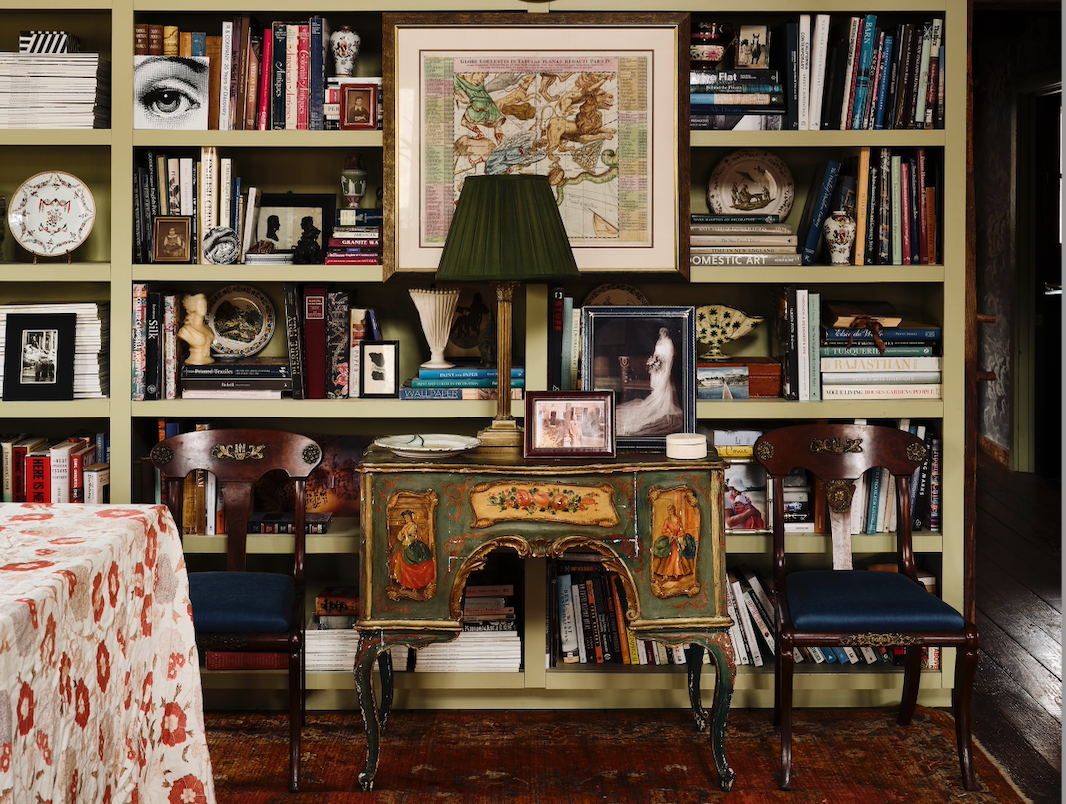
Here’s an assignment: Pull out a design magazine, flip through the glossy pages until you get to what’s called the “well”—the section with all the projects—and find a living room. Let your eye travel to the coffee table, then go up just a hair. You are looking at a stack of books.
A casual viewer might assume that these books found their way into the photo by chance—that the owner of that eight-bedroom house in Sagaponack just happened to be flipping through an illustrated history of whaling vessels before getting up from the sofa so that the photographer could take the picture for Architectural Digest.
You know, of course, that nothing could be further from the truth. Everything within the meticulously cropped frame of the photo—from the beach-breeze-teased floral curtains to the chessboard with one black pawn advanced—has been considered, reconsidered, adjusted, zhuzhed and Photoshopped within an inch of its life. No, someone put those books there, in that order, for a reason. What was it?
There is no industry standard as to how design books are chosen for photos, save one: It’s never the client who does it. Mostly, what makes the final stacks is a collaboration between the designer, the photographer and, if there is one on the shoot, the stylist.
There are no rules about where the books come from either. But again, it’s rarely the client who provides the titles that end up in the final shot. More often, a stack is lugged into the home, distributed artfully, then lugged back out. Books are universally beloved for the way they add character to a room—and universally resented for their weight. “It’s kind of miraculous how little space books take up for how extraordinarily heavy they are,” says stylist Mieke ten Have. “Filling a bookshelf can be kind of an endless vortex.”
Books make for interesting decor, containing, as they do, two meanings. First, there is the book-as-object, the physical presence of the thing. There are normal-sized books, there are coffee table books, and then there are the hulking, 20-pound books sold by Assouline that could double as load-bearing walls in a pinch. Stylists tend to prefer the big ones (they show up better in photos), but the choice more often boils down to color than shape.
It is no surprise that, when it comes to design photos, book-as-object is what counts most. You will never see a bedroom rendered in delicate shades of violet with a giant stack of orange and red tomes on the coffee table (unless contrasting colors are the point). No one puts an ugly book into a photo because they liked the characters.
As pure decorative objects, books are surprisingly versatile. Want a pop of color? It’s a lot easier to pull a bright red spine from a shelf than it is to spec a custom pillow. Need a little bit of height to showcase a sculpture, lamp or objet? Simpler to stack a few books than it is to get the carpenter involved. If books did not exist, stylists would have invented something like them as handy fix-its for shoots.

Then there is the other angle: the book as vessel-of-meaning, and the way that its cultural cache can add flavor to a design photo in ways that a Moroccan pouf cannot. Consider a nightstand with a small red book on it. If the spine says English Roses, that is one thing. If it’s The Communist Manifesto, that is another.
This, too, is an important consideration. The color, size and aesthetic vibe comes first, but you will rarely see a stack of books where no consideration was paid to the titles on the spine. Usually, the books say something about the home they’re in or the designer who put them there. And in some cases, the stack contains hidden messages that only industry insiders can decipher: the codex of the coffee table.
Often the selection is simply a nod to the taste of the home’s owner. The most common situation is a client who has no books, prompting the designer to thoughtfully procure a few titles that line up with their interests. But even within that framework, there are limits. A client may be equally obsessed with Star Wars and Renaissance paintings. Guess which book is going in the shoot?
In other cases, books send subtle shout-outs to friends, mentors, collaborators and sources of inspiration. Connecticut designer Deborah Pianin—a veteran of publishing giant Condé Nast—likes to style her projects with books by designers she admires, not only to throw out kudos but also to indicate the direction she’s taking with her own work. “My designs are very neutral, so I’m looking for books in that color scheme,” she says. “I’m also thinking about the designers I love, like Jake Arnold and Colin King. I’m a huge fan of Brian Paquette, so if I need a pop of color, that book is coming out.”
The same principle applies for industry veterans. A case in point: Hunt through a photo shoot of a Williams Lawrence project and you’ll find titles by architects like Gil Schafer, who Bunny Williams has frequently collaborated with in the past. “We definitely put people on the coffee table who we like,” says her partner, Elizabeth Lawrence. “Gil is a good example: His work is beautiful, and we collaborate with him all the time.”
Other designers do the same. Stylists and photographers will slip in titles by their other clients. The choice of books in a photo often traces a web of industry relationships that will be invisible to most observers—but if you know, you know. Inside jokes are not unheard of. Lawrence says that many of the firm’s projects have a copy of Donna Tartt’s The Goldfinch somewhere on the shelves—a reference to a playful office debate over whether the bestseller lived up to the hype.
“I used to work for David Easton, and I happened to be there when his book Timeless Elegance came out,” says Chicago designer Laura Tribbett. “Sometimes my coworkers and I would say, ‘Ahhh, timeless elegance,’ as a joke as we were hauling cardboard boxes and shopping for light bulbs—doing all the unglamorous work you do in design. I loved my experience there, [and now] I try to include that book in photo shoots as a nod to my design upbringing.”
Sometimes the absence of a book can be meaningful. Architectural Digest’s centenary retrospective AD at 100 is everywhere these days—its spine is a usefully neutral beige, and what designer doesn’t want to be associated with AD? Yet you’ll be hard-pressed to find AD at 100 in a project published by Elle Decor or Galerie. (Like any other unwanted element of a design photo, book titles are easily smudged away in Photoshop after the fact.)
Sometimes that editing happens on set: “I was on a shoot once with a designer on a project, and the client had a few books out by another designer,” recalls stylist Benjamin Reynaert. “We put them away for the photos. I was like, ‘This project isn’t about them—it’s about you.’”
Like ivory boucle sofas and fiddle leaf figs, there are coffee table books that have become cliches through frequent use. Ask any designer, photographer or stylist for the best example of this and the first answer is always Tom Ford, the 11-pound black-and-white behemoth published in 2008 by Rizzoli.
For the past decade and a half, Tom Ford has been such a photo shoot staple that its ubiquity has inspired Substack essays and TikTok rants. No one can say exactly how it rose to dominate coffee tables the world over, but it neatly satisfies both sides of the design book dichotomy. As a pure object, its heft gave it the gravitas of a minimalist sculpture (it doesn’t hurt that black goes with everything); as a vessel of meaning, it conveyed hip modernity at a time when Ford himself was at the peak of his cultural power.
There are others. For a time in the 2010s, Taschen’s enormous Cabinet of Natural Curiosities was adding a quirky touch of coral to coffee tables everywhere. Surf Shack by Nina Freudenberger has been a go-to for waterfront locales. More recently, Assouline’s brightly hued travel books have become a frequent choice for a shot of color—and perhaps a sense of worldliness.

As is the case with the Tom Ford book, it can be difficult to know exactly why certain books start popping up in design photos everywhere. Jill Cohen, Luxe’s editor in chief and a longtime macher in the world of design publishing, says that the recipe for a hit can be ephemeral. “[There’s often] a combination of a very simple title with the right typography in the right size,” she says. But even so, a winning formula doesn’t always pan out the second time around: “Everybody tries to copy these books, but somehow it just doesn’t work.”
Though books popping up in design photo shoots is certainly not a bad thing, Cohen says it’s not really a driver of sales. Publishing companies will be happy if their title makes it onto a nightstand of a big House Beautiful feature, but their real goal is to reach retail buyers at trade shows who will scoop up hundreds or thousands of copies in bulk. Seeing a spine everywhere, she adds, is usually the end product of an already successful book rather than the cause. Though there can be crossover there: Mark D. Sikes successfully marketed his debut book, Beautiful, with the hashtag #topofthestack and, according to Instagram, it did indeed end up on top of a lot of stacks.
It may be a fickle trade, but the business of books-as-design-objects is a real one, with a very high end (see Assouline’s $400-plus status tomes) that trickles on down to the murky world of faux books, itself a robust economy. A search for “decorative books” on Amazon reveals sellers offering up linen-wrapped no-title books that sell for more than $30—enough to buy a real book. Elsewhere, a company called Roomicle manufactures fake ones, often sold in packages of three with titles on their spines that spell out a motivational message when stacked up: “Happiness” “Is a Journey” “Not a Destination.” The inspiration stops there. Inside, the pages are blank.
As is the case in every other consumer category, knockoffs are abundant. Online, a swarm of dupers offer up everything from blank Assouline titles to a fake Loewe retrospective. Even Tom Ford is not immune: More than one Etsy vendor offers up a hollow “box” version of the classic title that can be used to store tchotchkes.
Designers need not go there—it’s rarely the coffee table books that push a project over budget (and books, unlike custom upholstery, are easily returnable). If there is a complication to sourcing books for a project, it’s usually filling up the miles of empty shelves of an expansive library when the client’s entire collection consists of one copy of Eat Pray Love and a dictionary.
That particular dilemma gave rise to services that sell books by the foot. There are many now, though maybe none quite as famous as the one offered by New York’s iconic bookseller The Strand, whose company motto is “18 Miles of Books.” There, booksellers will pull together a selection of titles organized by color, subject or both. The Strand has curated serious literary yardage for designers like Daniel Romualdez and Steven Gambrel, as well as hotels like the Four Seasons and Waldorf Astoria.

Most designers and stylists tend to agree that books-by-the-foot is better than blank shelves or cheap faux volumes, but really, the best is when the client’s own collection is filling up the shelves. “That is what’s ideal. The idea of arbitrarily buying books that the homeowners have zero interest in ever reading, just to fill the shelves—there’s something slightly painful about that,” says Ten Have. “Nothing beats authenticity apropos of books. … I never want anything to feel self-conscious. If you’re looking at a picture where all the books are facing the camera, and the spines aren’t oriented towards where you’d actually be sitting, I flip it.”
If there is a debate over the philosophy of book styling, it seems to lie there. To paint with a very broad brush: Many designers seem to be drawn toward a more neat-and-orderly approach to their stacks, while many stylists push for a more lived-in look. It makes sense. After all, designers are marketing themselves to clients who want to bring order to their lives, while stylists are more frequently thinking of the storytelling approach favored by magazine editors. Whatever the reason, stylists tend to see a more casual approach as the cutting edge.
The bleeding edge? Reynaert pointed to a photo recently posted to Instagram by British designer Ben Pentreath. The picture, from a project published in Galerie, shows a living room with a small mountain of books dominating the foreground. Atop it is the board game The Settlers of Catan and a card game called Exploding Kittens. Contained in the stack is a box still clad in bubble wrap.
“I’m in a group chat with some stylists and editors and we were talking about it, like, ‘What’s going on there? There’s a book covered in bubble wrap?’” he says. “It’s almost like another level of styling there. It feels edgy. There’s a sense of: I don’t care. It’s almost a punk vibe.”
That same photo published on Galerie’s website tells a slightly different story. The games remained, but the bubble wrap had been Photoshopped away. Some stacks, it seems, are too punk for publication.


