


There are lessons you can only learn from those at the top of their game—and Business of Home is creating a new destination for those important conversations. By asking the industry’s brightest minds how they’ve developed and refined their aesthetic, we’re uncovering the ingredients of great design. For the inaugural interview, BOH asks Los Angeles– and Paris-based designer Timothy Corrigan to define his three rules of comfort.
I want to talk about this idea of finding your aesthetic—of seeing a pattern emerge in your work; of identifying it, believing in it and refining it. When did that start to happen for you?
It’s crystal clear to me: It’s when I moved to Paris. I was 30 years old, and it opened my eyes to the world of design. You almost can’t spend time in France and not be awakened by the sheer beauty of the art and the architecture—and, more than that, by the integral role it plays in everyday life.
But at the same time, my American perspective helped me realize that the French really, really do not understand comfort. It’s never been a part of their design aesthetic. There was a historian who wrote a book called The Invention of Comfort, which [detailed] how revolutionary it was to have a chair that had some upholstery on it—and even then, it’s still not comfortable. I went to France while I was working in advertising, but when I decided to become a designer [in 1997], I decided to make comfort the cornerstone of my design.

I’ve heard you say people viewed that as an oddball choice when you were starting out.
When I was first named to the AD100, their [article] made a comment like, “Corrigan believes that even the most beautiful rooms are not successful if they’re not also comfortable”—as if the idea was radical. The industry was very much about how it looked, and not how it worked, particularly as it related to more traditional design.
At the time, I actually trademarked the phrase “A World of Comfortable Elegance.” Over time, that has evolved into what I would say is European elegance infused with California comfort. It’s that combination of the two that crystallized into what I’ve become known for as a designer. I mean, that’s how I [landed] the emir of Qatar as a client—he [visited] one of my projects, and he said, “This is beautiful, but it’s also so comfortable.”
Prioritizing comfort has certainly become much more normalized over the years.
It has. But if you look at some contemporary French furniture companies—even today, they’re not that comfortable. If I’m working on a European project, I still have all of my upholstered furniture made in England, because they understand comfort so much better than the French.
When you first decided to put comfort at the forefront, where did you encounter the most friction?
The friction was that people weren’t open to it. I’ll give you an example. I was working with Madonna on her kitchen and family room. She had one child and was pregnant with another, so I suggested we use awning fabric for the banquette in the kitchen—this was back before they had performance fabric. She said, “Why would I want to do that?” I said, “Kids spill. Why wouldn’t you want something that’s more practical in this space?” Before, you had to choose between beautiful and comfortable, but you couldn’t have both. What has happened over time—and it’s not just in fabrics, it’s with so many different materials—is that there’s less of a trade-off now.
When you talk about comfort, I know you literally mean: “Is this comfortable to sit on?” But it feels like you’re also talking about a sense of ease.
Yes—and it’s so perfect that you should say that. As I started doing this, I realized that comfort is more than just how something feels, and that there are three fundamentals of what I would call comfortable. One is the physical: Is this chair soft? Does the fabric have a nice texture? Then there’s the psychological aspect—we’ve all walked into rooms where the layout or the scale of the furniture is wrong, and you can’t comfortably get through a space, or maybe you feel cramped. And the last one is the practical aspect. We’ve all walked into someone’s house where you can tell no one uses that living room because it’s a little too pristine and perfect—there might as well be a little rope across the entrance saying, “You can look, but don’t touch.” Or maybe you can tell that the host or hostess is not really comfortable using the space you’re in, and therefore you don’t feel comfortable in it.
Here’s an example: When you look at a very contemporary space in a magazine, it’s beautiful. But it’s going to look ugly the second [real life steps in]: when the dog leash comes down, or your shoes go on the floor, or your newspaper sits on the table. It’s been curated to look the way it is, but not to be lived in. A space that is already layered is so much more accommodating to actually living.
What did defining those three aspects of comfort crack open for you as a designer?
If you add all these different layers of comfort—the physical, the psychological and the practical—you actually cannot help but walk away from a space saying, “I felt comfortable there.”
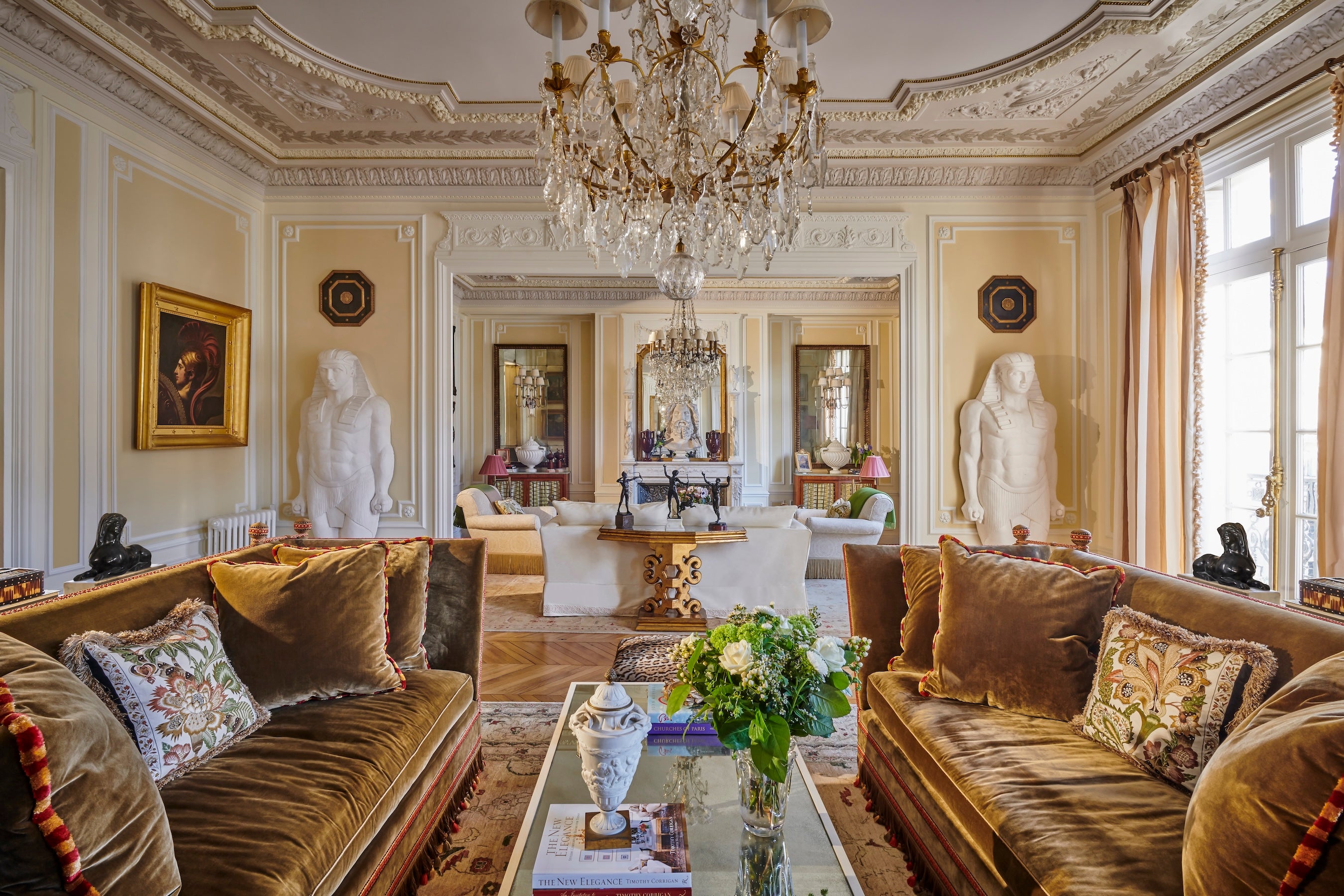
As a designer, what’s been more difficult is how you translate those different aspects into photos. Because when you look at my rooms, they don’t necessarily look comfortable. When Michael Boodro came to my apartment in Paris for the first time, he told me, “You know, I saw this in AD, and it looked so formal. But this is so cozy.” How do you communicate that comfort? I’ve even talked with photographers about it—like, “Do we leave the bed a little messy?” But then it looks like they didn’t do their job as the photographer. I still don’t know how to get around that. It’s been one of my bigger issues, because I have no doubt that the comfort proposition is the right proposition. It’s just how to visually communicate it.

You started designing your own homes first, then taking on clients. How did they influence the creative direction of your work?
I come back to my advertising and marketing background, where it’s always, always, always about listening to your customer. We actually go through a whole two-hour process in our very first meeting where we ask clients to come to us with things that they like—and, equally important, things they don’t like. In some ways, it’s almost more important to see what they really don’t like so that it just comes off the table.
Design should be a very collaborative process. I am not the kind of person who says, “Here’s the one option, take it or leave it.” We work with our clients to build the project based on decision after decision of theirs. So we will show five to seven options for this chair, and then five to seven sofas. And let’s say they’ve picked a chair, but now we get to sofas—I may have to say, “OK, that chair you picked doesn’t really go with this sofa you’ve selected, and let me explain why.”
That education is one of my most important roles as a designer: to explain why those two don’t work together, and to say, “You can have this or you can have that, but not both.” What’s so great about it is that they feel empowered because it’s not a black box where there’s a secret answer. They actually start to understand, and so in the end, they take more ownership. They really feel that it’s theirs. Getting out of my head and trying to get into the client’s was the key step when making that transition from doing something for myself to doing it for others.
To have that many product options, and to allow the client to choose their own adventure at every stage—what does that mean for your creative process?
We always start with the basic shell first. It goes back to the story you and I worked on [for BOH magazine] about whether to start designing a room with the rug or the walls. I say walls, because you can always change that rug, but changing the whole shell is much more expensive and takes more time. We present concepts on that level first, where we’ll show three or four different concepts for a room. At that stage, it has nothing to do with the furniture or colorations. It’s: “Do we want this to be a tented room? A lattice room? A paneled room? A plaster room?” We show images of what those could look like in relation to that space.
The other first step is really spending time with the space. I know this is going to sound corny, but it’s letting it tell me what it needs. It’s about looking at the basic structure and figuring out, “How do I make this space work better for this objective?” Let me give you an example: We’re doing a project right now that has a badly designed two-story living room that—I mean, frankly, the scale and proportions are just wrong. You kind of feel like you’re in an airport because the ceilings are so tall, but the room’s not that big. But this is the main living room, so I have to figure out how to make it cozy, warm and inviting. For that project, the first stage is about looking at the faults of the space, figuring out my objectives in terms of how I want to use that room, and then establishing how to overcome those issues. In this case, it’s about how to make it feel more intimate and how to bring those ceilings down—but how we do that has nothing to do with, “Is it red? Is it blue? Is it Louis XV?” At this stage, the decoration almost doesn’t matter.
What kind of solutions did you propose for that project?
With ceilings that high, it’s often about figuring out how to integrate that upper level with the lower. I was working it out this weekend, and I’ve actually developed three different options. In one, you take the architectural elements that are down at the face level and bring them up to connect that upper and lower level. Another one is just putting elements up on the top, because right now, it’s just bare walls up there. That could be creating paneling that has elements that actually connect the spaces, or using graphics or murals that connect the spaces and make it feel better. I’m also looking at wall textures. For example, because this room feels tall and echoey and not inviting, one option is to upholster the walls to soften the space and make it feel more cozy. Each of those techniques can offset the room’s inherent problems.

How do you help clients make those kinds of big-picture decisions?
We show images of what [each option] could look like. It may be a rough sketch. I’ll often take a photo of the room and just draw on top of that space: “Let’s say we put a big door over here, because that’s going to bring your eye up a little bit”—literally just scribbled—“and we’re going to have X here or Y there.” That helps clients understand. Once they like one direction over the other, we come back with different options on that course of action. There’s never one answer.
This sounds magical, but also very time-consuming.
I will say, our projects probably take double the time of what other designers do, because we’re showing five to seven options for every single thing. It’s definitely longer—and, frankly, since our clients are being asked to make so many decisions, you have to have multiple meetings because they can’t make all these decisions at once. You can’t say, “All right, we’re going to meet all day and knock this house out.”
Right. You’re seeing too much stuff.
Exactly. When you go to a museum, you can only take in so much. After that, you’re just looking. You’re not discerning anything. Yes, our process takes longer, but the end result is that nearly 75 percent of our business is repeat business.
They want to do it again.
Yes. What that tells me is they not only liked the end result, but they liked how they got there. And that, to me, it’s the strongest endorsement that this approach is right.
What detail do you obsess about the most?
Gosh, a lot. But [mostly] the physical understanding of how the space is going to work, getting the shell right, and getting the furniture placement right. Because even the most beautiful desk or chair or sofa [won’t add to a room] if the furniture plan is not right, or if it’s not conducive to how you want to live, or if the scale of the furniture is not right. I would say the final [key detail] is really understanding the role of color and how it impacts a space. But it is all the physical stuff that is most important to me—the nuts and bolts of how it works, not “Gee, look at these beautiful fabrics.”
I want to keep talking about color. I visited your Château de la Chevallerie in France this past winter and was so captivated by the colors you chose. You told me a funny story about finding the right yellow for your living room.
There are certain colors that create a sense of harmony and happiness. Yellow is sunny and happy. It’s spring flowers. You walk into that space and you go, aah. But in this case, I was trying to match [Nancy Lancaster’s] famous Yellow Room in London, so I took a Benjamin Moore ColorReader and I color-matched it. What I didn’t take into consideration is that the light is completely different in London, and that room had only one window, which was facing north. So what was a perfectly lovely, nice color in gray London looked fluorescent in the French countryside.
With light streaming in on both sides.
Yes, and green grass and gravel outside, versus other buildings. And it was just like, “Oh, man. You are smart enough to have not made that mistake.”
How did you bounce back?
Well, then I went too far in the other direction. I overcorrected to this pale, wimpy yellow. After that, I literally took four different colors and painted them all in big sections, and then lived with it.

When I asked our readers on Instagram what they wanted us to ask in this series, someone specifically replied that they wanted me to ask you about window treatments. And it’s true: No one does them like you. Where does the inspiration come from? And what is the technical process of getting from idea to completion?
I want to come back to practicality—I must sound like the most boring, technical person, but you’ve got to look at the exposure, how much sun [the window] gets and the direction of the sun. Often, I want a really beautiful silk brocade on a window because I love the way that feels, but then I’ll figure out how to put a solution-dyed-acrylic leading edge fabric that makes it look beautiful but won’t get destroyed. From there, the trim is added so that it doesn’t look too commercial. I look at those different layers. What’s interesting is that when you take that practical aspect but add other things on top, something like a solution-dyed-acrylic leading edge actually looks like a design element as opposed to a practical element. I often find that the more restrictions you have, the more creative you’re forced to be.
As a designer, I would always rather work on an old house that has lots of quirky problems than something brand-new. We do our own architecture sometimes—we’re doing a 55,000-square-foot house in Qatar right now—and it’s not the same challenge as figuring out how to make something work. I think that you become more creative when you have restrictions, even when they’re budgetary restrictions. Figuring out the solution is what I really enjoy.
Getting back to window treatments, how do you present something like these, which have so many components?
That’s an area where we don’t get the client so involved. I’ll show the main fabric and the fabric we’re using as a leading edge and explain that we will add those other elements on top of it to disguise it. There are some clients who want to be involved in every little trim, but most clients don’t, so we don’t have to get to that level of involvement on that.
We do the same thing when it comes to accessories [by] building them into the budget [without selecting them in advance]: We take each room’s budget, and [reserve] 10 percent of that for accessories. I think more designers should do this, because so many jobs get completed and there’s no budget left for accessories, and they kind of look unfinished.
How does that work in practice?
We have fixed budgets for each phase, with a low and high [for every line item]. If one item comes in a little higher than budgeted, we know we have to bring another item in lower than that. So let’s just say the room budget is $100,000; we know we’re going to have $10,000 for accessories. We say to clients, “Any accessory that’s under $1,000, just let us pick it.” Those are things that we usually find at flea markets or at auction, and you can’t get clients involved on all those little things. Then when you do the installation, it becomes like Christmas. They have things that they haven’t seen before.

When I was brainstorming what this interview series would be, I liked the idea of exploring both the art and the science of design. Do you see yourself as a scientist first, or an artist first?
I think you have to see yourself as the artist first. You have to have the vision and the goal of what you’re trying to accomplish. But if I want to get to the moon, I also have to say, “OK, how am I going to get there?”
Do you see your work changing today? Do you feel like you continue to evolve?
I think you have to. You have to be willing to take into consideration that we are now working in a global marketplace—you can’t just rely on your local suppliers, and you have to continually look for new ways to do things. I’m actually using generative AI right now to develop some wall sconces. Obviously it’s only giving me a starting point that I will have to fine-tune, but this technology is here, and you’ve got to expose yourself to it.
Do you see the aesthetic DNA of your projects evolving? As your process to get there changes, does the end result change too?
I just read a really interesting book called Joyful. The author [Ingrid Fetell Lee] was in a branding company, then went to Pratt, got her [master’s in industrial] design and decided to specialize in creating joyfulness in all of her projects. To write this book, she studied what creates a sense of joy in people [across] cultures. With design, the big shift for me is that up until now, I always strived to create spaces that were inherently comfortable, where people felt safe to be their very best selves. I still want to achieve that, but in the past 18 months or so, I’ve wanted to add that next level of joyfulness.
How has that realization changed your process?
It changes a lot. It changes the way you experience a space. I was very conscious of that at the chateau, which is why I chose a lot of the colors that I chose. I wanted you to walk in and a smile comes to your face. And it’s not just color—shapes do that, textures do it. So as a designer, I’ve tried much more consciously to figure out: “How do I create joyfulness as a key component in the designs I create?”
Circles and curves make you feel happier than very angular [pieces and shapes]. Polka dots, for example—I don’t really love polka dots, but they make people smile. The other thing about joyfulness is introducing an element of surprise. Not a scary surprise, but something that makes you say, “Oh! I wasn’t expecting that!”—it brings a smile to your face because it’s a bit of whimsy.
For me, it’s about going in saying, “I understand this space,” which is what gives you the sense of safety and security. That’s why symmetry is so important to design: You walk in and you just get it, and that [familiarity] gives a sense of comfort. Then when you add that aspect of whimsy and surprise, it doesn’t negate the comfort level—it adds that next level of playfulness. In my house, I’ve added little things that people wouldn’t expect in a fancy chateau, like a little stuffed hedgehog. Maybe it makes you go, “Oh, that’s kind of cool.” Maybe you hate it. It doesn’t really matter, it’s still a surprise.
For more great insights from Timothy Corrigan, check out his latest book, At Home in France: Inspiration and Style in Town and Country.


