Mary McDonald and Michelle Nussbaumer review one of the most iconic interiors.
Classic style has no expiration date. Take Nancy Lancaster’s Yellow Room. The essence of English country house style, the drawing room of Lancaster’s Avery Row flat holds as much—if not more—design precedence today as it did in the 1950s, according to several of today’s top talents. Designers Mary McDonald and Michelle Nussbaumer share how they’ve been inspired by the room and, if given the chance, how they might update it.
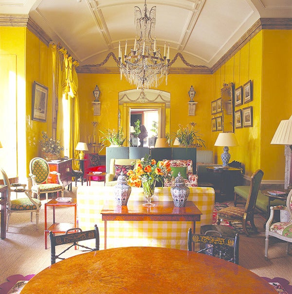

What design choices make this room work? Mary McDonald: Great architectural bones. The barrel ceiling, height and millwork detailing represent elegant classicism. The bold and courageous yellow repeated in the classical curtain treatment hung at crown height further emphasizes the bold architectural heights of the interior. Although these are not the original interior furnishings [in the pictured image], the room is so famous for having balanced seating groups repeating the exterior window niche areas. It helps keep a consistent repetition of space, albeit less grand than the original. The choice to keep a pair of urns on brackets flanking the far-wall doorway successfully repeats the classic symmetry. The same can be said for the wall montage of mirror and flanking prints as you enter. [It’s] a consistent use of a focal point bracketed by pairs.
Michelle Nussbaumer: Nancy’s famous Butter Yellow—which translated “butta” in her genteel Virginian accent—with her famous marbleized baseboards is a classic. Nancy and John Fowler created this as a kind of stage set for clients to view their work. It is a quintessential English country house look. I love the festoon curtains, overscaled chandelier and collected objects. It works because it feels authentic—which is, sadly, something that is missing in design today. Nothing trendy here.
What are a few ways you’d modernize this room? MM: If this were Nancy's original whimsical and dramatic room furnishings and textiles, I would not do much [except] add some more contemporary lighting. But since this is a more practical traditional interior against the original yellow canvas, I think I might reupholster the furnishings in ivory with one striped yellow accent fabric for punctuation. This would give the furnishings a crisp freshness against the famous yellow backdrop.
I might also open the seating groups to ramble more throughout the room—instead of three distinct groups that are a beginning middle and end—create more meandering spaces open to the next space, with low slipper chairs and stools easily moved throughout the room. Then I would add some more contemporary tables and floor lamps, with a few pieces, such as acrylic or small metal drink tables. On the pair of walls with the chests, I would hang two very large, overscaled pieces of contemporary abstract art, ideally complementary, to add a current vibe to this elegant space.
MN: How do you update or modernize perfection? Obviously, one doesn’t try. The only problem I see in this particular shot is that someone did try. Someone replaced the creamy yellow sofas to this large-scale yellow and white check. I’m not for it. The thing that is great about this classic English interior is that family members add their own personal mementos from generation to generation. Therefore, I wouldn’t mind seeing a contemporary portrait of the next generation, if I had to change something.
I think we have all been inspired by this room and so many iconic rooms like it. I very much like the trick that John and Nancy used around the doorway opening. Very often, they would have pieces of mirror cut around these openings to create grandeur and drama, while opening up the space even more. I have used this trick often and first saw it done [here]. My own work is very layered and personal, as I lived so many years abroad in Europe. I find lots of inspiration from Nancy Lancaster.


