In the series What I Love, we’re asking designers to build us a mood board of what’s inspiring them right now.
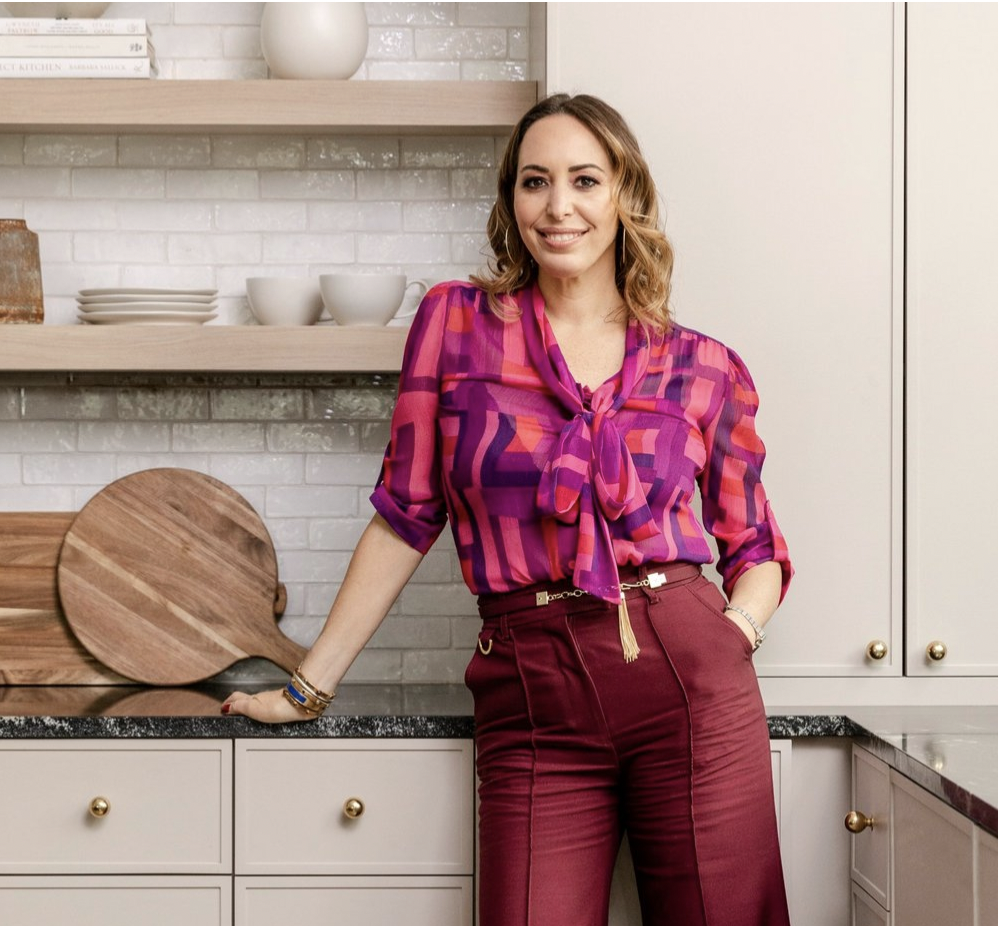
Zoë Feldman believes a home should be a sanctuary. The Washington, D.C.–based designer is known for creating spaces filled with a soothing mix of rich hues and sumptuous textiles. “I think that the pandemic has ushered in a desire for spaces that feel cozy, safe and comfortable,” she tells Business of Home. “We have been leaning into that heavily, and deriving our inspiration from layered spaces with warmer palettes.”
Her current mood board is an excellent example. Teeming with luxe textures, eclectic motifs, and the occasional zip of color, the look was designed with comfort and cohesion in mind. “Like a warm sweater, it’s ideal for cozying up by the fire,” Feldman says of the palette. “Everything feels somewhat monochromatic with quiet moments of juxtaposition.”
A keen eye for pattern and color is evident throughout the flat lay, which includes a beloved antique china dish the designer inherited from her grandmother. “The china brings a beautiful heirloom quality to the palette, while the quiet layering of patterns makes the entire scheme feel more cohesive and modern,” she explains.
Here, Feldman breaks down the details—from curly chenille swatches to olive green fabric samples.
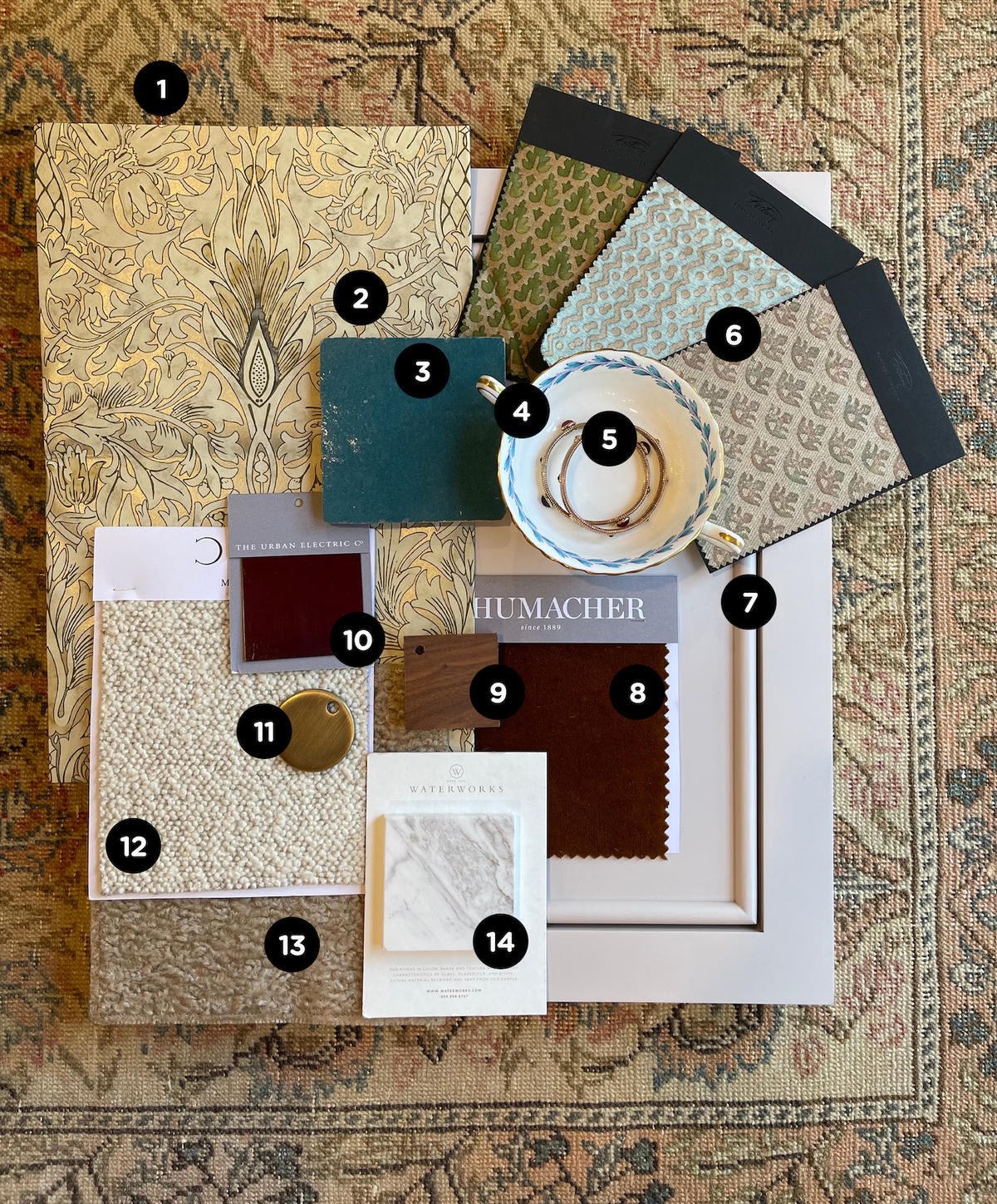
1. ZOË FELDMAN VINTAGE TURKISH RUG NO. 26 — DISTRICT LOOM
“I’ve always loved and have been hugely inspired by antique rugs. This vintage Turkish Avanos rug from my collection with District Loom is an unusual pattern with a tighter weave that is quite refined. We started here to develop our palette of creams, blushes, blues, taupes, and moodier colors like charcoal and oxblood.”
2. SNAKESHEAD WALLPAPER IN STONE/CREAM — MORRIS & CO.
“William Morris feels classic and modern the way Biedermeier furniture does. It has a moodiness to it that plays well with how we all have been feeling lately. We also like to use a lot of art in our interiors, and while this wallpaper has a busier pattern, it still reads neutrally enough that it doesn’t clash.”
3. ZELLIGE Tile IN FIRED OPAL — CLÉ TILE
“Morocco is a huge inspiration for me and my work. The density of color and imperfect nature of this terra cotta tile is so appealing, as I never want a space to feel too perfect.”
4. ANTIQUE CHINA
“I have been obsessing over this china since I was little and recently acquired it from my family. The field color is a milky pale blue with gold and Wedgwood accents, and it’s beautifully monochromatic.”
5. STRADa BRACELETS — GAS BIJOUX
“I got these bracelets when I was in Paris before the pandemic. We’re very inspired by French design, and these embody that, as they were created by an amazing French designer.”
6. MURILLO Fabric IN GREEN & GOLD; TAPA IN AQUAMARINE & SILVER; and CANESTRELLI IN TAN, OLIVE, PLUM, & SILVERY GOLD TEXTURE — FORTUNY
“I’ve been a fan of Fortuny since I started designing 20 years ago! I love the color saturation and the patterns; they play well as a neutral but still pull your eye in.”
7. LUCY CABINETRY — ZOË FELDMAN Design x UNIQUE KITCHENS & BATHS
“This is one of my favorite cabinets from my collection with Unique Kitchens & Baths, named for my elder daughter, Lucy. I love how it has the perfect amount of classical detailing while still feeling clean enough to be modern, and how the pink gossamer color can be used as a baseline neutral that adds femininity to offset some of the deeper tones.”
8. ROCKY PERFORMANCE VELVET IN NUTMEG — SCHUMACHER
“We tend to use some sort of velvet in all of our rooms because it is family-friendly but retains beauty and depth. The color is perfect because it has richness to it, and it’s brighter than a chocolate brown.”
9. WALNUT STAIN WITH CLEAR SATIN SEALER — VERELLEN
“Walnut is a wood that we’ve been using a lot lately; it’s not too dark, not too light, and it adds the perfect amount of warmth into a room.”
10. Bookish RED PAINT FINISH — THE URBAN ELECTRIC CO.
“Our favorite for sustainable lighting, The Urban Electric Co. has a black-red paint finish for metals that’s an easy way to add color without chaos, and would be ideal for a sconce or pendant.”
11. ANTIQUE BRASS FINISH — WATERWORKS
“Waterworks is our go-to for plumbing—they turn fixtures into jewelry, and one of the ways they do that is through living metals that add richness to any room.”
12. PERU Fabric IN IVORY/Natural — C&C MILANO
“I was drawn to this fabric because even though it has a light feel, it’s very textural and has hints of other tones that keep it from feeling too one-note. Plus, cream always adds extra warmth.”
13. CURLY Fabric IN PEBBLE — KRAVET
“A soft chenille is perfect for pillows or the occasional lounge chair. The warm, soft fabric is the perfect thing to fall asleep on, and the color is a neutral tone that makes a great canvas for any room.”
14. Polished KEYSTONE FIELD TILE IN AGATHA — WATERWORKS
“Stone is the earth’s art, and these slabs are especially beautiful because of purple undertones and the amount of movement. It is additive without being overwhelming.”
Homepage photo: A flat lay by designer Zoe Feldman | Courtesy of Zoe Feldman


