In the BOH series What I Love, we’re asking designers to build us a mood board of what’s inspiring them right now.

Todd Raymond strives to strike the balance between classic and contemporary. The New York designer seeks out markedly modern pieces with colors and materials that stand the test of time. “Most of our projects are rooted with a hefty dose of versatile neutrals and tactile textures,” he tells Business of Home.
He crafted his present mood board—brimming with soft earth tones and touchable organic finishes—with a current project in mind. “While designing this home, we found ourselves with so many great palette directions that we couldn’t use them all,” says the designer. “So, we decided to use those pieces for this flat lay, as though we were imagining a new space for the same residence.”
The final scheme boasts a rich array of gradient brown and ivory hues, alongside of-the-moment accents such as ombre area rugs and glossy crackle tile. “The goal was to create a well-layered space that’s both stylish and sophisticated,” says Raymond.
Here, the designer breaks down the details, from a travertine dining table to a shagreen-covered credenza.
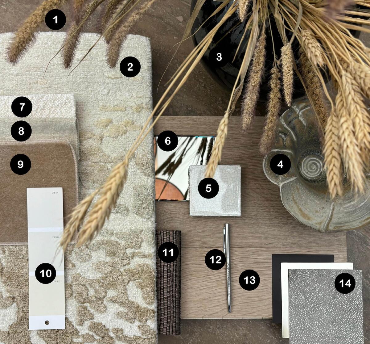
1. MODENA DINING TABLE IN LIGHT TRAVERTINE BY ARHAUS
“This palette started with this travertine table. It has nice red and brown undertones, which we used to ground the rest of the lighter colors.”
2. GLACIER RUG IN GOLD COAST BY ROSEMARY HALLGARTEN
“This ombre area rug brought a pattern into the room and helped ground the entire design. Its size and scale juxtapose perfectly with the solid fabrics in the space and the understated rectilinear shapes of the furniture.”
3. VINTAGE BLACK CERAMIC VASE
“Black is a color that we use often in our interiors, either by employing a vintage vessel like this, or with other decorative accents.”
4. VINTAGE BOWL
“We love vintage pieces, and this one’s provenance is where the client is from, so it was a nice, soft way to make the space feel personalized.”
5. W88 TILE BY PRATT + LARSON
“We love designing custom furniture, and we thought this crackle tile was beautiful for the inset top of a bespoke drink table.”
6. ARCHITECTURAL MIRROR IN GLAMIR CHAMPAGNE BY BENDHEIM
“We opted for champagne-tinted mirrors in the millwork to double down on the caramel and amber tones of the space.”
7. KARAKORUM FABRIC IN IVORY BY DEDAR
“Chunky textured fabrics like this boucle are a must for our designs because they add warmth and dimension.”
8. ANDRO FABRIC IN 887 BY ZIMMER + ROHDE
“A sofa fabric like this [by Zimmer + Rohde] adds a really nice, soft hand to the space.”
9. ANTOINETTE FABRIC IN SALTED CARAMEL BY ROSEMARY HALLGARTEN
“Splurging on mohair upholstery really brings an element of layered luxe to a space that clients love. It’s so soft, both in its feel and its subtle color.”
10. LIME WHITE, PRENTIS CREAM AND BRACKEN CREAM PAINT BY BENJAMIN MOORE
“The walls, trim, and millwork in this room were all varying tones of cream and buttermilk paint from Benjamin Moore.”
11. PEZZARA PEARL LEATHER IN AGATE BY STUDIOART
“Woven leather adds a heavy dose of texture to the scheme—a much-needed departure from all of the soft, solid fabrics. This one has a metallic finish, which helped add a level of sophistication that the client was going for.”
12. POLISHED NICKEL PEN BY STUDIO TODD RAYMOND
“This personalized pen adds an accent of polished nickel, a metal we love using in homes. As opposed to chrome or stainless steel, polished nickel has a yellow undertone, which warms up a palette instantly.”
13. SWITCHGRASS FLOORING BY THE HUDSON COMPANY
“We chose European oak flooring to make the space feel light and bright in a modern wide-plank format.”
14. MIRÒ MULTIFUNCTIONAL CABINET FINISH SAMPLES BY ARMANI/CASA
“We love how the simple form of this shagreen and polished-metal credenza allows the materials to shine.”


