Custom wallpaper company Paper Mills is celebrating its 10-year anniversary with a number of notable appearances, from Daniel Park Design’s powder room at the Designer Showhouse of New Jersey and Wesley Moon’s vignette at the Ronald McDonald House of Long Island to Design New England’s September/October 2015 issue. Known for contemporary prints, hand-painted textures and silkscreened graphic patterns, Paper Mills was founded by sisters, artisans and trade veterans Amy and Noelle Mills. Amy spoke with EAL and shared a look into the company’s past and future.
Share a bit about how you got started. Did you found your company in response to a particular problem faced by designers?
I got started in 2005 with my partner and sister Noelle Mills after we both spent a decade working in the trade in various manufacturing capacities. We both felt that we had a unique vision and skill set that could fill a hole in the market. We are both trained as fine-art block printers, and after years of studying Matisse and Picasso while working in high-end fashion for home. We started out initially trying to re-create the patterns that Matisse lived and collaged and painted about. It was a very personal endeavor that I think Noelle wanted to function as a way to continue our fine-art dialogue. But I had other ideas and was eager to go to market and test the feasibility of what we had made. So I went off and took the papers to market to much praise and acclaim early on!
Which designers have you worked with?
Over the years, we have worked with many designers! Wesley Moon interior design has been using Paper Mills over and over in his projects. He launched his practice a few years after we got started, and it’s been a great working relationship, developed over years. Today, I think we really understand what each other is doing to such a degree that there is trust and accountability there. Cloth & Kind is another firm I have worked with again and again to great success! They, too, are fearless in their custom coloration explorations! It’s exciting to work with them and see my tried-and-true patterns reimagined in new hues. I can’t always get there on my own, and the designers help so much.
Of course, we have worked with many others; to name a few: Tom Scheerer, Erica Millar, Pierce Allen, Sally Trout and Katie Ridder.
Tell us about some of your favorite projects and designs.
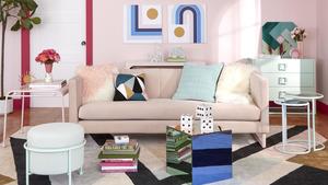
I have a lot of fun doing designer showhouses, even though sometimes the budget doesn’t allow it! A project we participated in this year was for DXV luxury bath & kitchen: We provided wallpaper for a vignette designed by Cloth & Kind that was in the fearless department... They chose fuchsia and black to color an existing pattern of mine (Shanti), and it was so striking and great to see the finished design. Another was the Ronald McDonald House of Long Island. We provided our Vales wallpaper for Wesley Moon’s vignette, and again—seeing what he did to style an impossibly small space! Often, I don’t get to see the final product installed, so the showhouses allow me to see my work installed and styled in ways that push the boundaries a little more than some residential work might.
Another huge project we did in 2014 was the Design Hotels in Tbilisi, Republic of Georgia. We made 10,000 meters of wallpaper for all the rooms of the hotel. This allowed me to prove production techniques that were just theory. Yes, you can have a large-volume order of a labor-intensive product delivered on time and with the highest quality. We scaled up quickly, and the team of artisans at my disposal now is enabling me to try for more large-scale work in the future.
As for my favorite design, I love our Topo Hum, which works well in any environment. Little Havana is a best seller of ours that I love that harkened back to our beginning (Matisse/Picasso). And of the new group of work I’m doing, I think I’m going to really get to love Vales wallpaper, because I’m going to be doing this paper 80 percent of the time! It’s our new best seller by far.
I look at Fortuny, Gracie, Clarence House, William Morris, Andy Warhol Foundation, Zuber and others and draw inspiration from all.
Walk us through the process, from design concept to completion.
The process goes something like this: It all starts with a concept in my head, or our heads—Noelle and I have a lot of conversation about what we want to create. Usually, we are on the same page, but the California collection, I created on my own. It all starts by sketching. Drawing it out, especially if we don’t have a material or an object found in nature we are referring to. Once there is a drawing that is mature enough, we scan it into the computer and step-out the repeat so that we can make sure there aren’t any weird shapes being formed in repeat.
When the drawing is in repeat and it works, we print it to scale and transfer the image to our block. Which gets carved by hand, adding a little bit more handmade mark-making. Sometimes pattern decisions get made in the carving process, if we want to add a hatch or not.
Once it’s carved, we can start block printing. Every block behaves differently because of the positive and negative space of the image. Sometimes that limits what sort of techniques you can use for printing. The thickness of paint matters here. You can play with effects, or be limited by the effects you can use. Sometimes we end up needing to carve out a lot more to get a cleaner look. Usually, we keep a lot of the carving mark intact, as it is an important part of why we choose block printing. We are not screenprinting for a reason.
I like to layer printing with different faux finish techniques to add a certain quality feel to the papers. Layering makes the paper have a kind of patina that I’m wild about mixing with the block print look and feel. It’s about putting different marks together.
Usually, once I know which techniques I want to blend together, I can start working on palette. Sometimes I have a preconceived idea of what colors I want to use, but lately, the pattern itself informs me of what colors to begin with. Sometimes it’s an old dress I remember from childhood, a taffeta. Usually, the colors have less to do with interior design trends and more about colors I like working with that I’m inspired by from looking at art. This is why I stress our specialty of doing custom coloration. You might want beige. You might want sea foam (heaven forbid!). I’m not necessarily going to work in that palette, but I can easily customize to fit your palette. So, we don’t keep inventory. We make everything to order to accommodate each designer. To make the product unique for the end user is our goal.