Located in Bald Head Island, North Carolina, this year’s Southern Living Idea House is the result of a collaboration between architect Eric Moser of Moser Design Group, designer Lindsey Coral Harper of LCH Interiors, and builder Jeff Sanderson of Whitney Blair Custom Homes. Choosing a beach house is a departure from the magazine’s most recent showhouses.
Zoe Gowen, senior homes editor at Southern Living, explains how she and the team chose this year’s location: “We had not done a beach house in a long time and we were very intrigued by the no-cars-allowed, laid-back ethos of Bald Head Island. Bald Head Island is one part beach and one part tropical jungle. There’s no other place like it. The lush vegetation is reason enough to go to the island.”
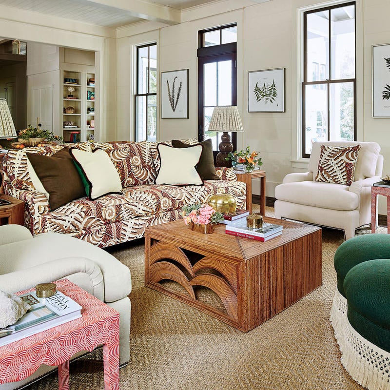
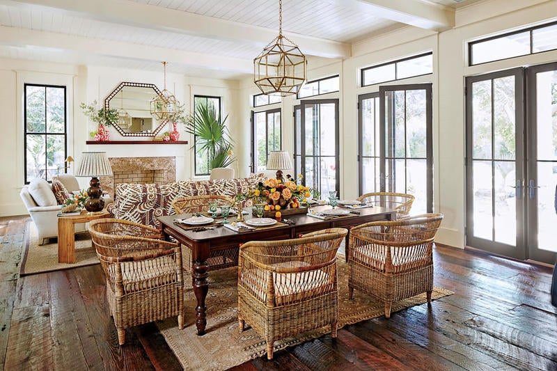
“The first thing I did was take a site visit to Bald Head Island, to see the actual plot and to see how the house was going to be situated on the property and get a feel for the island,” says Harper. “The builder had these 100-year-old reclaimed distressed floors he wanted to use. They were a rich tobacco color, so I knew we had a warm palette to work with for the interior. That led to my design choices and color palette. Although I have done a lot of work in Charlotte, I had never even been to Bald Head Island! It is so adorable and charming and I really love any place that you get around by golf cart.”
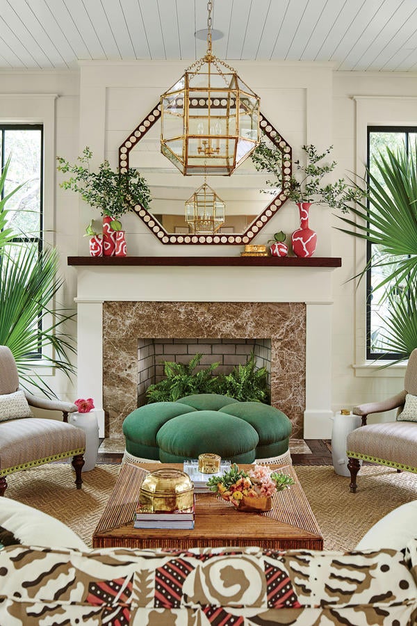
Designing for the Idea House was different than designing for a private client, explains Harper: “I think the biggest challenge in designing a house without a homeowner is you have to think about who you are designing the house for. What would someone who is going to live in this house need and want? I wanted to make the house as comfortable as possible and yet give it a sophisticated island vibe. I didn’t want the house to seem too pretentious. This is also a house that was built for entertaining, so we wanted it to be just as comfortable inside as it is outside.”
Some of the trends the editors noticed include: “A return to warmer colors like chocolate brown, greens, and yellows feels fresh again in this house. Lindsey went for broke on some splashy patterns—there’s a great Cole & Son monkey-print wallpaper in one room and Romo’s clementine-patterned wallpaper in another room,” shares Gowen. “She also painted some of the floors with big, Matisse-ish leaves. The living room sofa is upholstered in a wild fern pattern from Quadrille. Nothing is overkill, though, because she tempered it with quieter pieces so well. Sculptural statement lighting is another great trend from this house. There’s a big rattan orb in one bathroom and lots of sharp-edged lanterns and sconces from Circa and Serena & Lily throughout.”
The Idea House appears in the magazine’s August issue.


