Less than two months after her appointment as editorial director of House Beautiful, Joanna Saltz is ready to talk about her vision. The enterprising editor first joined the brand in the spring as editorial director of House Beautiful's website, where she oversaw the development and relaunch in June; in October, amid widespread layoffs of the House Beautiful editorial staff, she replaced Sophie Donelson as editor in chief of the print edition as well.
Saltz’s first print issue will be the January/February 2019 edition, which hits newsstands on January 8. In the meantime, she has made several major additions to the magazine’s team, including former Elle Decor editors Robert Rufino as style director and Carisha Swanson as market director, plus Amanda Sims (who powered Architectural Digest’s millennial-focused Clever platform) as deputy editor.
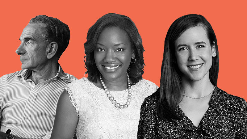
“I feel extremely lucky to have all of the new hires—I feel like we are creating a revolution, not a brand,” says Saltz. “We are embarking on a real mission to bring great design to the masses, and get people to understand, appreciate and invest in their homes—to make their dream homes a reality.”
We sat down with Saltz at Hearst Tower this week, where she shared what’s next for America’s oldest decorating magazine.
Your appointment was announced less than two months ago. What have you been up to since then?
I’m starting a new editors letter concept, which I’m calling Open House; it’s basically a roundtable of me and five designers. I had my first one about a week and a half ago—and to be honest with you, before the recorder got turned on, before the photographer came, to see these designers mingling and the excitement they had to see each other, it just was heartwarming. I have learned what an extraordinary industry this is—an extraordinary group of talent that really feels like they’re all rooting for each other. That, to me, has been probably the most eye-opening—this is an industry of cheerleaders and it’s great.
I don’t want to give too much away about the January/February issue, but we were talking about this concept of change. It feels like the right time [of year] when people are thinking about changing things, so [my Open House designers and I] talked about why people fear change, but also when it’s time to embrace it, and how these designers facilitate all those mixed emotions. The dichotomy is that clients seek out designers because they want a change, but when they are actually faced with change, they are like, ‘Wait, wait, wait, that’s too much, I didn’t sign up for this.’ The designers were all commiserating about how they want to push their clients beyond their comfort zones, because that’s when they know they’re doing their job best.
We also talked about the things they wished people would change in their homes. I’m excited about this format, because House Beautiful should be a meeting place for great design ideas and inspirations, whether that’s coming from designers, brands or ambassadors. I hope this roundtable will start that conversation. I think it’s a nice way to start the magazine, to show that this is a great platform for us to share and exchange ideas. This is certainly not “Joanna Saltz’s vision for how everyone’s home should be designed." I’m in the process of setting up my next one in L.A., and I’ll go to a different city every month.
What is the big-picture vision moving forward, and what changes will we see in the January/February issue?
I would like House Beautiful to be a place where you feel like you can take action to make your dream home a reality. We’re moving beyond this passive experience where you’re just looking and fantasizing. We already watch hours and hours of people doing things to their homes—why are we not taking that step? I want House Beautiful to become the place where people see an amazing idea, see an extraordinary interior, hear from a great designer, and then put it into action in their own space. The January/February issue will speak to how we are trying to create more intimacy with these spaces, but also more actionable advice and learning.
You started at HouseBeautiful.com with a digital redesign. How does that fit into what’s happening in brand?
When I first started at HouseBeautiful.com, we were really looking to open up the platform to a lot of different users. My main focus was to get House Beautiful back into the Google module, seeing us produce current and fresh content. That meant covering things that were newsworthy in the design industry, celebrity homes, those kinds of things. But I also wanted to give the brand a much more accessible voice. On digital platforms, you’re reaching a younger audience; I wanted to be able to speak to a wide range of people.
Obviously it’s important for us to speak to long-time homeowners, but I think a lot of the problems that long-time homeowners have are similar to the ones apartment-dwellers have. You’re dealing with things like space constraints and bathroom renovations, so we really tried to broaden our scope digitally to reach more types of homeowners.
 You'll see a slightly tweaked logo on the January–February issue, which is very reminiscent of past House Beautiful logos, and is also much easier to read on a screen.
We also gave the site a makeover—new colors and fonts—to make it a little easier to digest on mobile devices, which is more important than ever. And you’ll see a slightly tweaked logo on the January/February issue, which is very reminiscent of past House Beautiful logos, and is also much easier to read on a screen. Frankly, you would only notice it if you saw the two side by side; it looks amazing on newsstands, which is the first priority, but is also super clear on mobile devices.
What I like about the new logo is that it really reads classic when put into a classic setting—it reads traditional; it also reads modern. And to me, that speaks to the aesthetic of House Beautiful’s interiors: It’s where great design ideas come to life, no matter what your aesthetic is. It’s the ideas, solutions and design vision that you can get inspired by.
What were the metrics of success for the redesign?
When I started working on the digital platform, it was really about trying new things—testing what the audience response would be. In its 120 years, House Beautiful has taken a lot of chances. The social push, and certainly the digital push, was a step in that direction, too, of trying new things to see what the audience’s tolerance was, what the feedback was. Certainly I want to continue this tradition of House Beautiful being an innovator of space, but it’s also about engagement.
I think it’s super important as a media brand to entertain conversations with our audience. I wanted to make House Beautiful less of a passive experience. I even wanted to make home design and home design media less of a passive experience, so instead of just looking at things, you are talking and taking action. To me, an important metric is people who save and share, because that means someone is inspired by the idea. Maybe they aren’t going to do it right now, but they intend to do it in the future. Then, as a brand, you become part of someone’s life. For them to come back to you and refer to you later, that’s a trust-building exercise.
In the interior design world, some of the feedback was really negative. How did that impact your thinking moving forward?
It comes back to fear of change: We fear what we don’t know. My job over the last month has been to get people to understand who I am and what my plans are. What I want to add to this extraordinary brand is depth and a 360-degree view of all of this content. The magazine is extraordinarily important, and I want it to continue to be a beacon in the design community, but I also want to see that content come to life in a thousand different ways, on a thousand different platforms.
At the first Open House for my editor’s letter, Ashley Whittaker told me that sometimes she’ll put something into a project and the client will have a super negative response—like, ‘Get that table out of here. I absolutely hate that table.’ And she’ll say, “Live with it for two weeks, and if you still hate it, I will change it—no questions asked. But trust me and just live with it for two weeks first.” And she says that nearly 10 times out of 10, they'll eventually be like, “No, no, no. It’s right.” It’s when she gets that guttural response that she knows she's doing it right because she's making people take chances, take risks ... and I feel such an extraordinary relationship to that statement.
What do you want designers to know about House Beautiful?
For one, there aren’t enough hours in the day for me to be working with them. I had a conversation with a designer the other day where I was like, “Everything you’re doing is content for me.” The decisions you’re making at that showroom, the installation you’re going to look at today, where the tile’s going in, the meeting you’re having with the client, the stories you’re incorporating into that space, or the weird hutch you have to find a place for in that living room—that’s all content to me.
Are designers used to thinking of those things as content?
Certain ones are savvy to it, they just don’t have a platform for it yet. Which is why I’m like, “The doors are open. Come on in.” I’m not interested in just repeating what you see in the magazine on the digital platforms; I want you to get a different House Beautiful experience wherever you go, and I want that experience to relate to that audience on that platform—I don’t believe in one-size-fits-all content. I want you to pick up the magazine and for that to feel like a lush, saveable package of gorgeous inspiration, but then I want you to get something else elsewhere. We all want to broaden our audiences. And in order for us to do that, we need to be open to taking risks.
How is e-commerce or affiliate marketing going to be a part of the new site?
E-commerce is a huge focus for Hearst Magazines in general, and House Beautiful as an e-commerce initiative makes perfect sense. I imagine that our readers are looking to make changes to their homes, or renovate in a meaningful way, and are dreaming about what they can be doing with their spaces. And so, while some of the stuff you will see will be throw pillows and things of that nature, I also think fixtures and those kinds of things are important. But e-comm will continue to be a push. We’re in the middle of developing that strategy.
Tell me a little bit about the team you’re building.
Yes! Carisha Swanson [formerly a senior market editor at the Hearst Design Group, where she oversaw kitchen, bath and building coverage for House Beautiful, Elle Decor and Veranda for more than five years] is our new market director, which means that she’ll be responsible for all products that appear in the magazine, as well as host a video series about what’s new in the marketplace. She will also be the House Beautiful liaison at trade shows and manage initiatives such as the Whole Home Project and Kitchen of the Year.
 I want to fill my team with sharp-thinking, roll-up-your-sleeves innovators who don't care about the status quo.
Robert Rufino becomes style director, overseeing the design aesthetic of the brand and photography, leading partnerships with designers, and managing the coverage of interiors. Most recently, he was the interiors editor of Elle Decor; before that, he was interiors editor of Architectural Digest, senior editor-at-large at House Beautiful, and from 1996 to 2009, the vice president of visual merchandising and then vice president of creative services at Tiffany & Co., where he oversaw the brand’s global image. He is so deeply dialed into the community, and such a roll-up-your-sleeves kind of person. That, to me, is the pinnacle: Someone who has a drive for innovation but also doesn't care about status quo. Someone who wants to get the job done in the best way possible. I love people who are sharp thinkers like that.
And I just hired Amanda Sims, who came over from Architectural Digest’s digital vertical Clever—her first day was actually [Monday]. I’m still hiring for a few more positions, but at the end of the day, I’m building a team of people who have a deep love for this brand, who are great strategists, and who are excited to look at this as an amazing startup. It's an opportunity to rethink and reinvigorate.
Will everyone on staff be doing print and digital?
Fully integrated. I want executors. I want people who can start with an idea and think about how that idea comes to life on all of the different platforms, and see all of those different arms through. If you’re working on a story, you’re thinking about how the video comes to life and then you’ll see how the sidebars play out in the magazine. When you’re getting the photos, you’re thinking about what assets you’ll need to make this a really lush gallery online. It requires a different level of thinking.
How will all of those different elements be integrated?
Everything exists symbiotically. We think about our audience, but certainly the audiences online aren’t thinking about it month to month. They’re just digesting daily, and so, whereas you might see a beautiful bathroom in the magazine in a specific month, you might see that tile get installed tomorrow, and it might be an extraordinary experience to watch a video of that tile. You might see an interior with a gorgeous handwoven grasscloth from Phillip Jeffries come to life in the magazine, but then online we showcase why that wallcovering is so amazing, how it’s made, and people share it and say, “Oh my god, this is that grasscloth I was talking about. Let’s put it in our bathroom."
Is holding everything for print an obstacle that you’re thinking about, or will the content be more real-time than that?
One of the things I’m going to be working on is shortening the lead time for print, because we need to get more reactive in how we’re producing content. Nothing will feel like you’re being scooped anywhere. [Print and online] can live in tandem; this print experience is still going to feel beautiful and lush and inspiring, so it doesn’t matter that you might have seen the tile get installed earlier.
What do you feel like the audience wants from the brand right now?
We need to focus a lot of our efforts on inspiration online. House Beautiful has extraordinary rankings in the SEO universe and I want us to be forward-thinking tastemakers in that space. A lot of what we’re working on now is sort of the nuts and bolts—I keep relating it to actually doing a renovation in your home. ... It’s not pretty to fix the pipes and the duct work or to put new plaster on the walls, but it has to get done so the house doesn’t fall down.
We’re in a little bit of that: The foundation needs to be tweaked and solidified, and then we can start layering the beautiful things into it. I’m also just excited to hear what my new team will bring to the table. To take someone like like Robert or Carisha, who have been focused on print for the last however-many years, and teach them digital strategy on top of their extraordinary backgrounds—they’re going to be super machines.
You said actionable earlier, but you’ve never used the word DIY—why?
I don’t see it as DIY. I see it as getting to the end goal, but I can’t control how you’re going to get to the end goal. If I show you a beautiful wallpaper or a gorgeous powder room, I don’t know if you’re actually going to put it up yourself or if you’re going to hire someone to do it. That’s not to say that I don’t think there’s a place for us to help you figure it out if you need help figuring it out, but … I want to get you the solution.

