Even the most well-intentioned changes aren’t always met with excitement. House Beautiful, the 100-plus-year-old publication owned by Hearst, learned that lesson last week as it debuted a digital redesign—created by a team not affiliated with its print magazine—featuring a youthful logo and commerce-driven content. The announcement, which took over Instagram feeds with a nine-part video series, alarmed many followers with its snarky voice and entertainment focus.
“Did House Beautiful get hacked?” quickly became a common query within the brand’s social engagement. For many design enthusiasts, a post promoting the made-up term “ask-hole” (defined as a person who constantly asks for your advice, yet always does the opposite of what you told them) was off-brand enough to cut ties. “Let me know when a grown-up is back in charge,” signed off one commenter.
Corporate shifts within the media company have alluded to a digital rebranding for some time. Hearst announced earlier this spring that Joanna Saltz, Delish.com’s editorial director, would be the first editorial director of HouseBeautiful.com. (Saltz was said to be serving the same capacity at both titles.) The overall digital strategy, which is still in development, was conceived by Saltz and Troy Young, the new president of Hearst Magazines.
“The internet forces us to do something that’s entirely different from the magazine world,” Young said at a Design Leadership Network media event last May. “It forces us to find our distribution every morning when we get out of bed, so we have to find our audiences. We have to manufacture interest every morning, and the way that you do that is you have to figure out what people are talking about.”
Steve Blacker, an industry veteran who has held executive positions at Time Inc. and Hearst, says, “[Hiring] Young [was] a brilliant move by Hearst to put a proven digital executive over all their publications. The best thing about Troy is that he did not grow up in a print business model. He is highly creative, innovative and a hands-on executive.”
Today’s digital headlines on House Beautiful include more four-letter, sailor speak than longtime former editor Elizabeth Gordon would’ve likely ever let pass through the copyediting desk, while interiors by print regulars like Bunny Williams and Marshall Watson have been passed over in the digital feed for a tour of Cardi B’s nursery and light-up pool floats.
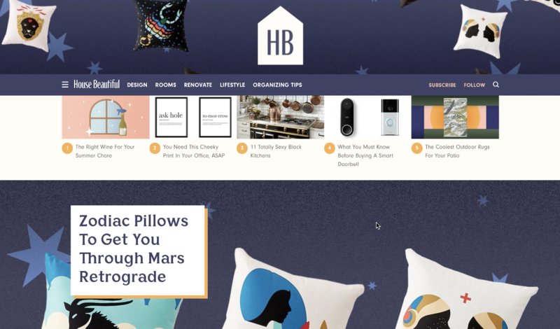
Generally known for discovering the next wave of design talent (one in five of its print subscribers is a design professional, according to the media kit), House Beautiful is shifting its digital focus toward commerce and video, creating a channel where inspiration meets entertainment.
“The brand had always been focused on a consumer who was looking for beautiful inspiration, stuff to fantasize about or maybe to share with her designer,” Saltz tells Business of Home. “But today’s digital audience also wants to take action—they want to buy, they want to learn how to do, they want their dream space now. So, while the magazine will offer tons of gorgeous imagery, the digital platforms will motivate people to roll up their sleeves, have a laugh, bring something amazing to life. The content will be jammed with well-produced utility, artisans who make amazing things, and ingenious yet approachable ideas. The look is clean and bold, and the voice is irreverent yet encouraging.”
Attracting the coveted millennial audience while retaining longtime print subscribers is no easy task. “Statistically, print readers are the ones investing in home more, because with the older age demographic, it makes sense,” said Newell Turner, editorial director of the Hearst Design Group, at the DLN event. “But there’s a growing audience coming, and digital opens that opportunity for our brands to reach out to those people and engage with them in an appropriate way.”
The question is whether a single editorial voice can serve multiple audiences. And if it can’t, which audience is the priority? Take that controversial “ask-hole” Instagram post: For every unfavorable comment from a longtime subscriber, there was an even greater number of positive comments from incoming enthusiasts. One commenter writes, “Everyone is so up in arms over this new direction but I have to say congrats on trying something new!”
Architectural Digest took a different approach when it launched the millennial-focused Clever, adding it as a channel on AD.com, rather than having it replace the main site. Editor in chief Amy Astley told Digiday at the time of the launch, “The first thing I felt when I got to Architectural Digest last summer was that I really wanted it to be the dominant source of shelter information for all audiences. ... It was like we were leaving a huge portion of the general population off the plate. Clever came from wanting to make a product that would be relevant for a new reader.”
Does innovation mean leaving behind the House Beautiful that designers know and love? By the look of its social feed, the answer may be affirmative. “I’ve been a faithful fan and subscriber since 1970 … this makes me sad,” comments one follower. “When I think of all the pages saved and torn from magazines, how I first learned of Sister Parish, Bunny Williams, Mario “The King of Chintz” [Buatta] … and I could go on and on. Obviously, I’m no longer the target audience.” And with that, the commenter signs off—with a crying emoji.

