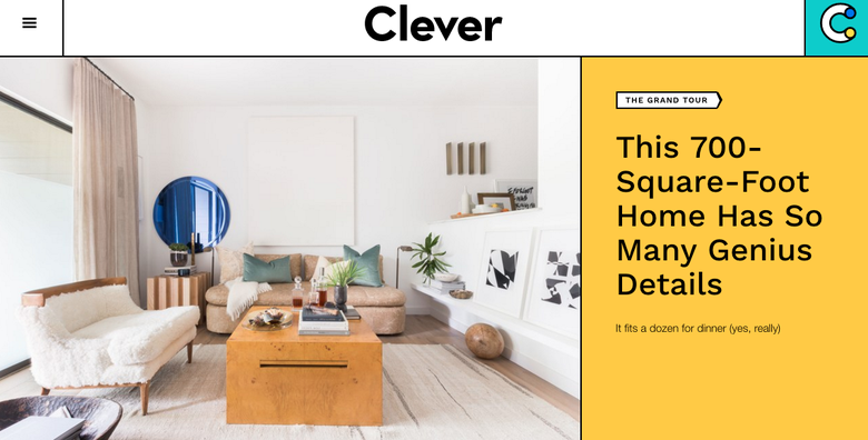
The founding editorial team’s preoccupation with unexpected, beautiful design led to CLEVER, the new digital destination Architectural Digest launched on Monday. It draws its name from small-space, residential design that, according to the brand, also makes readers think. The result is a site updated daily and living at an extension of AD’s dot-com, catering to the 18-to-34 crowd.
It has been REPORTED that the average age of AD’s readers is 53. Clever is serving as an avenue by which its parent brand hopes to reach design aficionados of another generation. Or, perhaps, of another income bracket. The site will likely invite a wealth of advertisers, of the Apartment Therapy mindset, who would not ordinarily consider AD’s traditional demographic their own.
Consider a selection of Clever’s debut articles: a $50 fix for kitchen floors in rental residences; an opinion piece on the persistence of millennial pink; a look at a 708-square-foot Austin, Texas, condominium (a far cry from, say, the 11,500-square-foot Kourtney Kardashian spread featured in AD this past July); and “We Went Into Debt for a Farm Table,” a true story about one writer’s dream piece of reclaimed lumber.

Three core editors are on staff at Clever, in addition to video and social teams. Going forward, the site will seek out projects that offer readers useable tips, such as for renovations. It will offer a Conversation channel, which spotlights personal stories; a video series with the likes of designer Nate Berkus; Orderly, an organization-focused section; and Rental Renovations, a DIY and before-and-after focused channel. Social media, including a recently launched Instagram account, is being counted upon to drive traffic, as is support from AD, both online and in print.
Clever's promotional reel
Amy Astley, editor in chief of AD and former Teen Vogue editor, told DIGIDAY that, before Clever’s launch, she began experimenting with budget-conscious editorial, to test the waters. The site experienced a 759 percent uptick in millennial visitors. Of her inspiration for Clever, she told Digiday: “The first thing I felt when I got to Architectural Digest last summer was that I really wanted it to be the dominant source of shelter information for all audiences. ... It was like we were leaving a huge portion of the general population off the plate. Clever came from wanting to make a product that would be relevant for a new reader.”


