Wellness and mindfulness may be the trends du jour, but one new showhouse is truly walking the talk. Tomorrow, House Beautiful opens the Whole Home Project, its inaugural custom-built showhouse—a direct result of the brand’s yearlong wellness initiative. Throughout four issues in 2018, the magazine’s editors have covered topics like how to get the best sleep or how to design a kitchen to get healthy. Meanwhile, designers and architects Linda MacArthur, Matthew Quinn, Sherry Hart and Michael Ladisic were putting those stories into practice as they drew up the plans for the Atlanta-based house, a proof of concept showing an interior space can evoke tranquility.
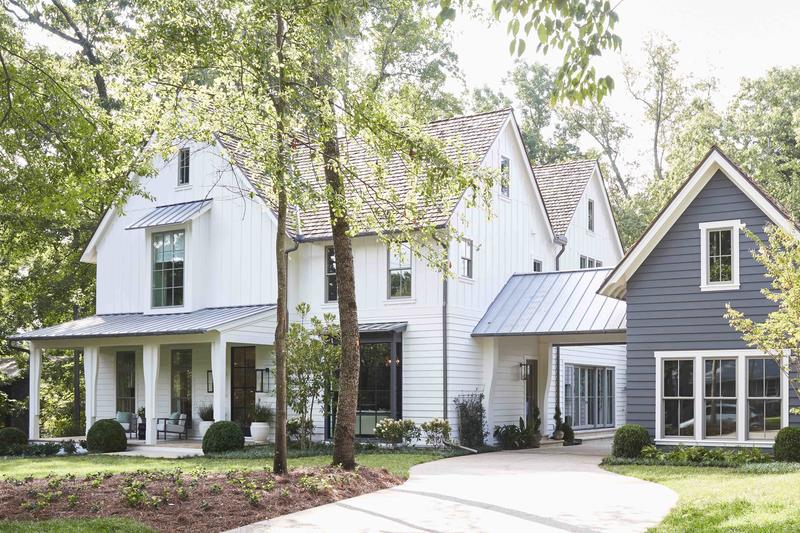
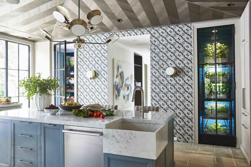
For Quinn, who designed the home’s kitchen, the planning that went into every choice was a powerful part of the process. “Every small decision, large decision—everything—was all about the wellness and health of the family moving into the home,” he tells Business of Home. Thinking about functionality, floor plans, and technology played a major role in the resulting features and footprint home. His own work in the kitchen was a prime example: “We have a cold larder and a grow closet in the kitchen—cool things that make eating healthy a part of [daily life],” he explains.
The kitchen also includes luxury appliances from sponsor Signature Kitchen Suite, which affirms that wellness is on the rise. The brand’s offerings in the home include a range with built-in sous vide technology and a refrigerator with a drawer that has varied temperature settings—features that encourage home cooking. “Better living through design is a growing trend,” SKS director of marketing Barbara Fuller tells BOH. “This is especially true in the heart of the home, where we explore the relationship between health and the kitchen.”
But the designers were focused on more than just features—the structural elements of the home were also built to support a certain notion of “living well.”
“Light was really important, not only with the lighting systems we used in the house, but even all of the window and door placements,” says Quinn. “We moved it to the outside of the house, right up against the backyard; there’s nothing but windows and doors and light flooding this kitchen, which is the space everybody lives in anyway.”
Lighting from showhouse sponsor Circa features prominently in the kitchen, including the Osiris Large Reflector chandelier—"a natural fit above the kitchen island," says company founder and president Gale Singer. "They even bumped up [the ceiling] into the second floor to accommodate it."
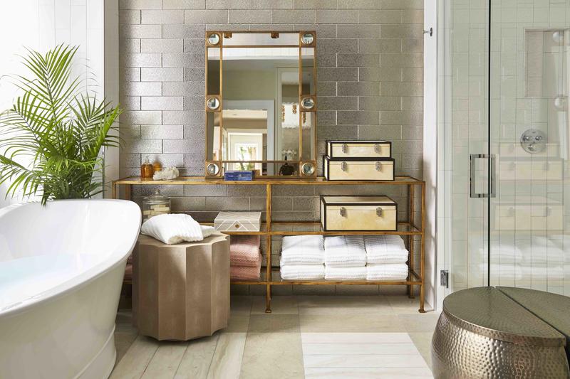
Other spaces got the same thoughtful treatment: “Dog rooms, spa-like bathrooms, really thinking through kids’ spaces and where the toys live, how you play games in the house, how you write an email in the house—we really thought about how you could live in this house happily, with structure (which makes you feel good as well), and from a healthy perspective,” says Quinn.
The idea for the project began with the concept that homes can do more than just be beautiful—they should help people live better too. “It’s really meant to bring to life these ideas that your home should work for you, for your goals,” former House Beautiful editor in chief Sophie Donelson, who spearheaded the project, told BOH. For example, the house features a fitness room instead of a dining room. “You cannot put it off, it’s right there,” said Donelson. “You can see it from the kitchen and think, I should work out. It’s really working toward your goals with you, making sure your house doesn’t undermine what you want from it, and a way of thinking about addressing the whole you.”
The team of architects, designers and editors who collaborated on the house also thought critically about the role of technology in the home, acknowledging that not all “smart” solutions are actually smart. “Technology can be cumbersome, and we made a point to make it easy,” says Quinn.
“The point of technology is to advance you to do things that aren’t playing with technology,” added Donelson. She argued that today’s homeowner wants more than just a beautiful house. “People are much more permissive, I think, with children, with hobbies, with understanding that there are passions in life beyond looking good at home, and I think that this home really embodies that. It’s a home for living. The point of decorating a home is to really live in it, not just to take the picture, walk away, and say, ‘Great job, we did it.’”
Want to find out how to design wellness elements into your own space? The 5,000-square-foot home is featured in House Beautiful’s upcoming issue and opens to the public this weekend. Those interested in attending can RSVP here.
Video introduction of the Whole Home Project, produced by Business of Home.


