With its heirloom-quality furnishings, Four Hands has outfitted every corner of the home: living rooms, bedrooms, dining rooms, dens and more. Now, in nuanced tonal prints and expressively abstract murals, the acclaimed Austin-based brand wants to cover your walls as well. Having built its reputation on durable, artisanal pieces that prioritize sustainability, the company is continuing its evolution into a complete lifestyle brand by introducing its debut collection of wallcoverings. The 20 digitally printed patterns encompass original designs conceived by the in-house Four Hands Art Studio, artworks by frequent collaborators such as Matera and Roseanne Kenny, and adaptations of whimsical illustrations licensed for exclusive use from content partners like Getty Images. All are printed on-site, on demand and on Terralon—a lightly textured, eco-friendly substrate made from 31 percent postconsumer recycled material.
“It’s a very thoughtful and curated selection,” says Brooke Elliott, director of art development at Four Hands Art Studio. “We’ve got such a great roster of artists, and we worked super closely with them, scaling patterns to the perfect repeat, making color adjustments and other refinements.” That precision extends to the collection’s color palettes, which vary per print. Incorporating such modern-day neutrals as terra cotta and olive green, along with plays on black as both a background and an accent, the combinations often pair different intensities of the same tone, subtly suggesting movement and dimensionality. “The pattern itself is important, of course. But the range of colorways allows us to connect with different customers, because the look and feel of a room can greatly change depending on if you go light and airy or dark and moody,” explains Elliott. The easy-to-clean, low-VOC, bathroom-safe wallcoverings are also contract-grade, meaning those reimagined rooms can be both residential and commercial spaces. “For this first collection, we wanted to check as many boxes as possible while staying true to the Four Hands aesthetic,” she says. Chosen with the brand’s overall design direction in mind, the colors complement the company’s new bath collection and provide a rich contrast as a backdrop behind its impressive armchairs, sofas and beds.
As the category takes root, Elliott foresees collaborating with more of Four Hands’ roster of 175 artists, in addition to developing new designs in-house. She expects to diversify with different substrates as well, while maintaining the company’s eco-conscious standards—printing on demand ensures no excess inventory, a practice that includes custom packaging as another means to manage waste. “We’re just scratching the surface,” she says of the nascent wallcovering program. “There’s so much more to come.” Below, Elliott spotlights some of Four Hands’ debut wallpaper designs.
PLUS
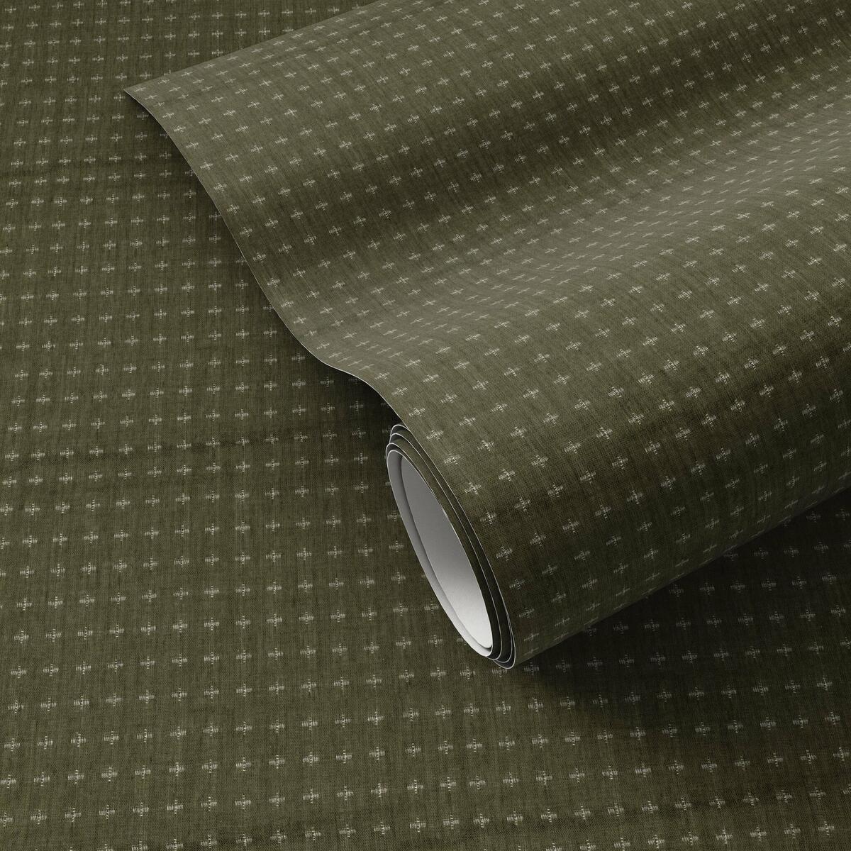
Organic tactility underscores a linear repeat in this digitally printed original wallpaper by Four Hands Art Studio. Available in gray, tan, olive and charcoal colorways, “this has the potential to be a tried-and-true pattern in many types of homes,” says Elliott. As with all designs in the collection, the Terralon base adds subtle texture that’s further enhanced in this case by the character of the source material. “Because it’s actually pulled from a vintage textile that we scanned in-house, and then digitally manipulated to multiply the crosshatch motif, Plus has the authentic look and feel of a fabric,” she explains.
LIMEWASH
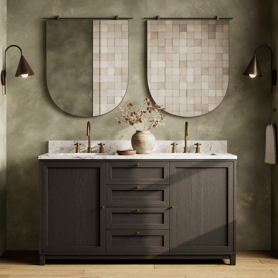
Painted canvas is scanned and digitally refined to reflect the nuances of real limewash in this statement-making mural, also by the Four Hands in-house studio team. “A lot of people want to feature the limewash technique on their walls, but doing so is a major commitment—and does take some technique, whether you’re trying to DIY or hiring a professional,” says Elliott. “This is an easier way to achieve that look, in an incredible array of colors.” Meant to fill entire walls, Four Hands’ equivalent makes the same impression, with the added bonus of being fully bath-safe. Artful adjustments to the original scan subtly emphasize depth and contrast, which is captured in a choice of seven shades, from classic Cream to warm Sesame and Terracotta to seductively deep Navy.
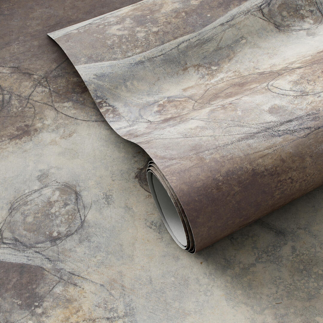
PENUMBRA
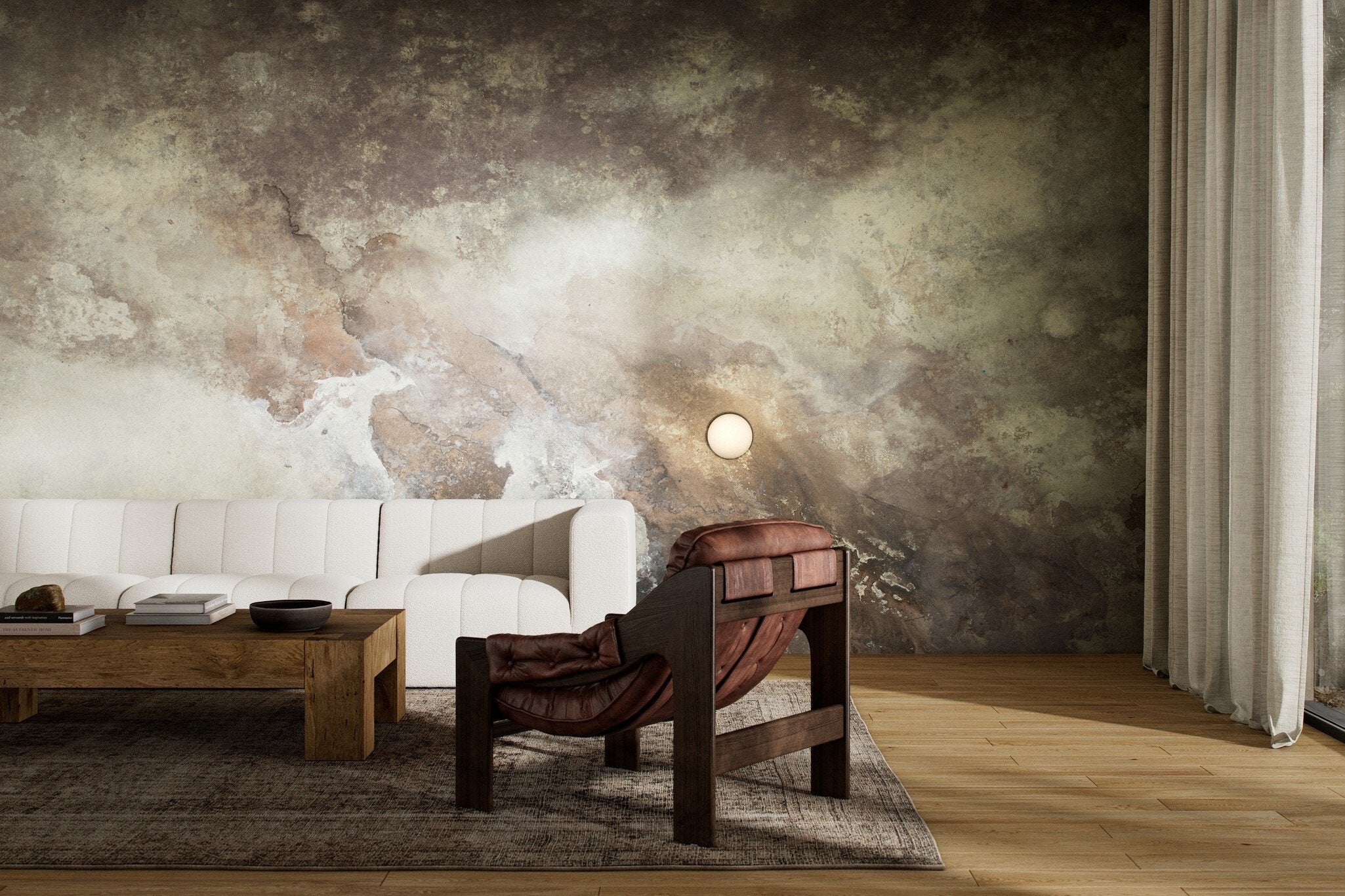
“The Penumbra series is based on some of our bestselling artworks, now adapted as murals,” says Elliott. Mexico City artist Matera paints enormous abstractions outdoors, allowing the whims of the weather to affect the canvases. “Elements almost get into the paintings, and the cool part is, we’re able to preserve all those nuances in the scan,” Elliott continues. The plum and mauve undertones in certain colorways evoke clouds passing over the moon, just as the style’s name suggests: The immense, impressionistic compositions are simultaneously soft and dramatic, conveying stormy undulations of shadow and light.
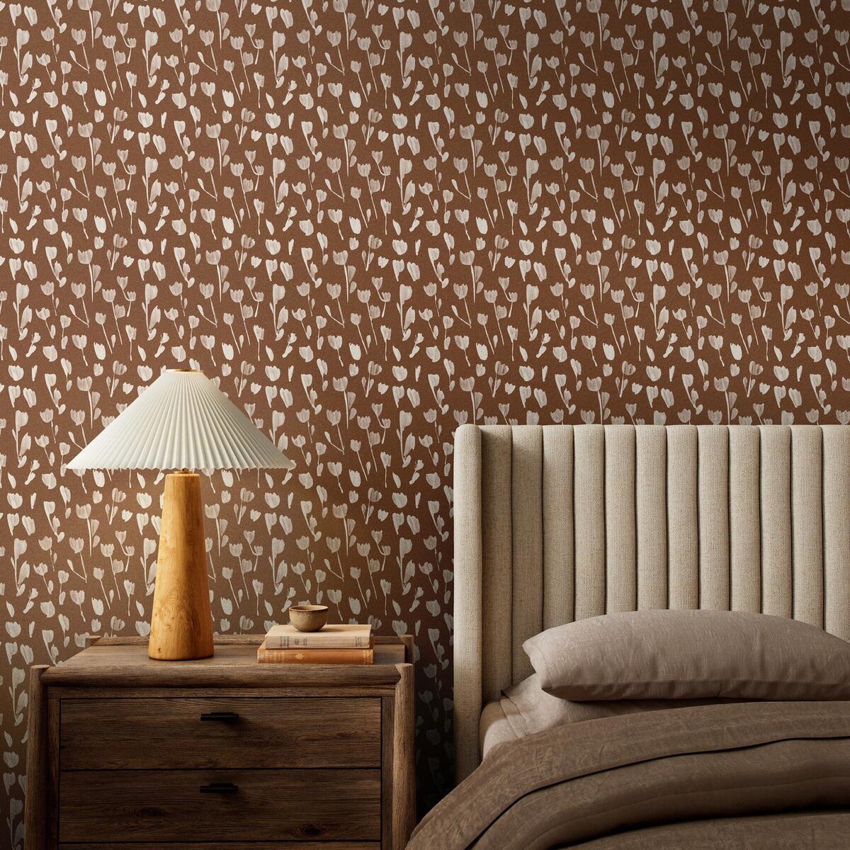
WILD FLOWERS I
From the contemporary to the cottagecore: New Zealand artist Roseanne Kenny drew inspiration from lithographic prints when creating her minimalist-yet-impactful linear floral pattern. “It’s got this delicate, almost feminine touch, but you can still see the brushstrokes,” says Elliott. The combination lends itself to multiple neutral colorways: Four Hands’ initial 12 offerings include various intensities of terra cotta, olive, black, taupe and tan. “We’ve been collaborating with Roseanne for a long time, and she’s super prolific, so it was fun to see her take on wallcovering,” Elliott adds.
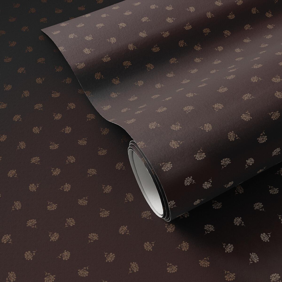
SMALL FLORAL
A ditsy floral counterpoint to the small square crosses of Plus, this print by Los Angeles–based artist collective Gold Rush Art Co. places a detailed, organic, asymmetrical motif within a structured repeat. “Small Floral has a dainty feel to it that’s deepened by lots of serene negative space,” says Elliott. The darker among its 10 colorways—particularly the tonal Black & Tan I—increase the sensation of coziness. “Going dark and moody with a more traditional pattern also broadens the appeal to a different type of customer,” she adds.
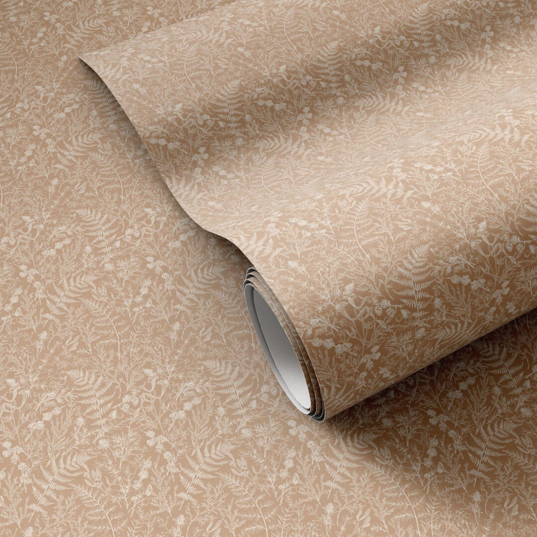
BOTANICAL
This Getty Images print is a personal favorite of Elliott’s. “It has a lot going on; it’s a bit more intricate,” she says. Small, seemingly hand-sketched, densely grouped fern fronds, berries, thistles, leaves and branches attain an almost dimensional quality depending on the interplay of color pairings. “We did two variations of green-on-green, for example, called Olive Night I and II, inversing the colors of the print and the background from one to the other. It’s the most subtle of shifts, but it gives each version a totally different feel,” she explains. The matte finish of the wallpaper suitably subdues even the most oppositional combinations among Botanical’s 14 colorways.
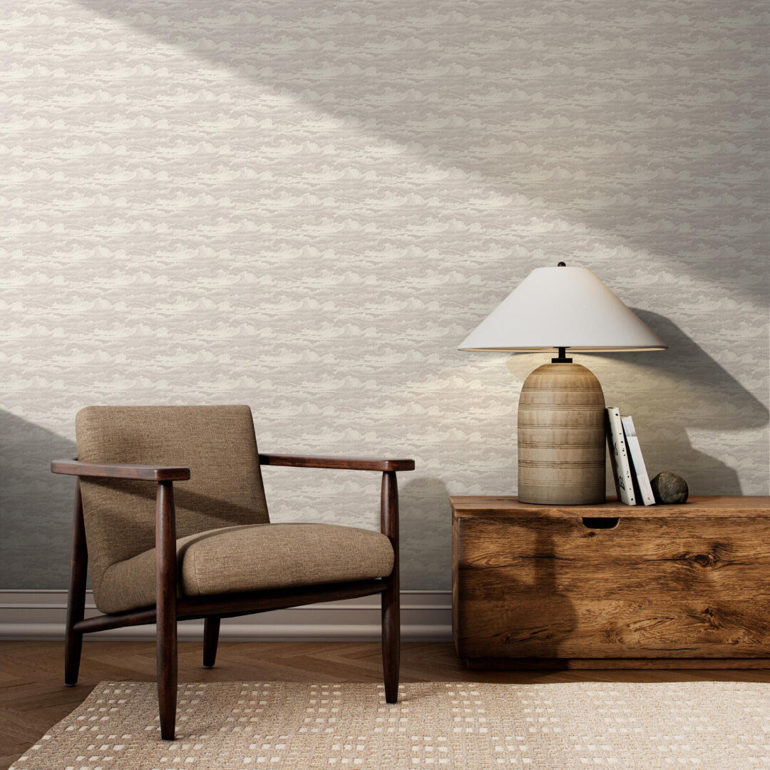
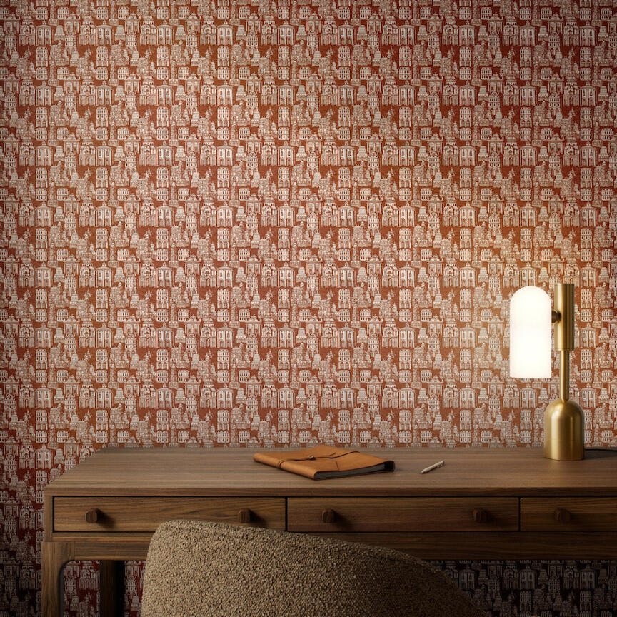
WAVEBREAK AND COSMOPOLIS
For some animated playfulness, these two Getty Images prints would be right at home in a powder bath or children’s bedroom, or as an accent wall of a sunroom or study. In the eight colorways of Wavebreak, Hokusai’s hypnotic foam-capped waves meet the imaginary margin scribblings of Herman Melville’s hand-inked Moby-Dick drafts. Architecture and travel inform the 10 colorways of Cosmopolis, its surface populated by vaguely European fountains, towers, palazzi and other curiously compelling city edifices—out of the corner of your eye, you could almost swear you spy Waldo hiding behind the buildings. Says Elliott: “Within a sophisticated collection of wallpaper and murals, Wavebreak and Cosmopolis add some fun.”
This story is a paid promotion and was created in partnership with Four Hands.
Homepage image: Adapted from abstract artworks by Mexico City–based artist Matera, the Penumbra series of wall murals provides a dramatic backdrop of shadows and light | Courtesy of Four Hands


