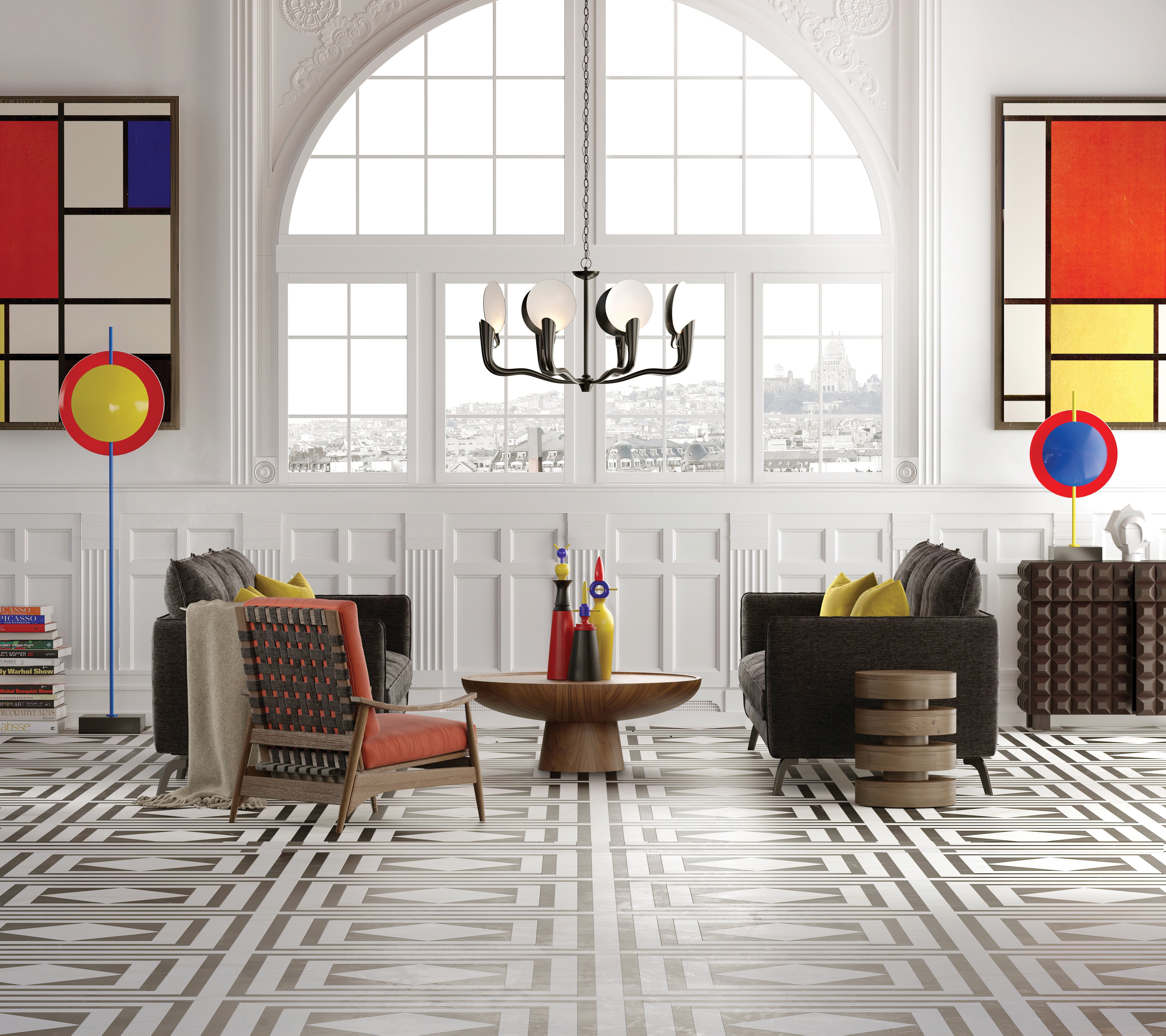
This season’s coolest color combo is a trio of elementary school classics.
Don’t let their simplicity fool you: Though they’re the most basic shades on the color wheel, primary hues can be used to surprisingly sophisticated effect. “Primary colors come with a sense of purity, simplicity and enthusiasm,” says professional color consultant Amy Wax. “The appeal lies in their youthful energy.” The role of these bold hues in design is a complicated one. While red, blue and yellow are the source of all other colors (black and white are used to create tone and value), their subdued secondary derivatives are arguably more popular in interiors. “The trick is finding a balance,” says Wax. “When paired with understated hues, primary-colored accents can elevate and energize a palette. They’re the sense of humor, and they’re honest and forthcoming.”
The significance of primary colors has long been explored by art and design theorists, most notably those from the Bauhaus school. Founded in 1919 by architect Walter Gropius, the movement emerged from war-torn Germany with a mission to unite the art world—and society—through a universal creative expression. “They were seeking to define modernity by stripping things down to basic colors and shapes,” explains design historian Alexa Griffith Winton, manager of content and curriculum at Cooper Hewitt, Smithsonian Design Museum. “Europeans witnessed so much death and destruction during World War I; the Bauhaus proposed the idea that in its purest form, art can unify and, ultimately, heal the world.”
BOH subscribers and BOH Insiders.


