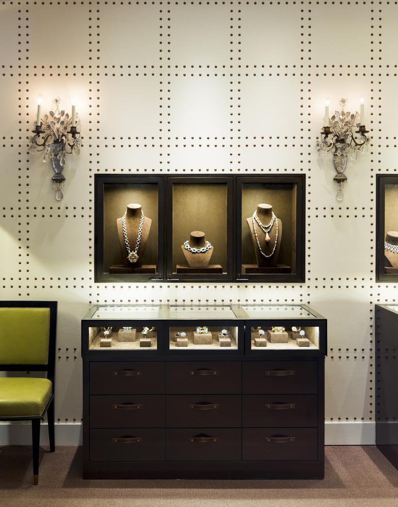
If you’ve ever uttered the words “Retail is dead,” you haven’t stepped foot into the David Webb flagship boutique on Madison Avenue, a jewel box of a jewelry store that is abuzz with clientele. Created by architect-designer duo Peter Pennoyer and Katie Ridder, it feels every bit like a private manse: a hushed, leather-walled reprieve from New York’s frenetic energy—yet walking in is like being invited to a showing of the crown jewels by Queen Elizabeth herself. Amazon and its ilk simply can’t achieve that; there’s no drone to replicate the effect. “The design is supposed to make you feel— coming from the hustle and bustle of Madison Avenue—that it’s a calm, comfortable envelope to relax in and look at jewelry,” says Pennoyer. “I think the secret is making an experience that will stay with the customer even if they don’t buy something on that visit. You want to give people a sense of delight.”
Delight is the perfect word for what’s missing from so many purchases. U.S. consumers spent $1.3 trillion in the second quarter of 2018 alone. More than $127 billion of those purchases were made online—still less than 10 percent, but growing three times as quickly as total retail sales over last year. No matter where they made the purchase, we’d wager to guess that the bulk of customers scuttled home with their new belongings unenthused by the transaction. A beautiful storefront (coupled with excellent service) can make all the difference—but how exactly do you go about maximizing a store’s physical design for success? Blast house music and pump in fragrance like Abercrombie & Fitch circa 2002? Create a minimalist white-on-white iteration of the Apple store? The answer depends entirely on who you ask.
Bringing the brand’s DNA into physical space is the obvious goal—and something that becomes much easier for designers when the brand in question already has a distinct identity. “We did a store for Tommy Bahama a number of years ago, and they wanted an urban New York flagship,” says Barbara Weinreich, former principal at MNA, who now teaches interior design at NYSID and Pratt. “We used materials that were beachy and resort-like but not Disney-esque—sandy-colored limestone, finishing the underside of the ceiling to look like elevated decking, and blackened metal for an urban finish. It helped it stay within the brand story but also elevate it and make it particular to its location.”
Retail designers can occasionally wind up feeling like they’re spinning plates, but there are tricks insiders are well aware of. “When you work on retail projects, you have to figure out how to get someone’s attention, and in a fairly short time,” says Barbara Reimelt, who launched the interior design firm and luxury retail consultancy Ninety Nine Group in 2014 and is the creative force behind some of the most iconic Ralph Lauren flagships and merchandising across Europe, the Middle East and Asia. Her company recently transformed Knoll’s Los Angeles shop into a homey escape, complete with a living room in jewel tones featuring a Piero Lissoni sofa that hadn’t yet been introduced stateside. “You don’t know who’s coming in your door or when,” explains Reimelt. To make sure everyone felt instantly comfortable, she tried to make each room evoke an emotion. “I tried to make them stop and wonder and sometimes even question: Wow, is that Knoll?” One of her tricks is deftly using color. “I don’t want to put anyone down, but sometimes I go into interior stores and all I see is beige-beige-beige-beige. They sell beige, and that’s probably the best-selling color, but I know from experience that using color in wise and intelligent ways can fuel retail buying.” In other words, a cherry red chair inspires awe—and purchase—faster than a blah brown one, even if that’s what the customer will actually end up ordering.

For Kate Gray, who designed Rebecca Atwood’s SoHo shop, retail spaces should feel aspirational yet approachable, especially on the home goods front. “Make it feel warmer and more homelike rather than austere and cold,” she says. “I wanted the lighting to not feel so commercial, so we broke up the track lighting with pendants and sconces—pieces on a residential scale.” The designer also notes that circulation is key. Even in a storefront with a small footprint, it’s important to make sure aisles are 3½ feet wide at a minimum to allow for plenty of laissez-faire movement. “You want to have as much on display as possible, but you also don’t want people to feel trapped.” (In other words, unless it’s a particularly rabid sample sale, you shouldn’t have to elbow others to peruse the merchandise.)
“These days, there are more lounge areas integrated into retail spaces, so it’s a more relaxed customer experience—it’s less of a hard retail transaction,” says Francis D’Haene, principal of D’Apostrophe Design, who designed the Jill Stuart SoHo shop and the Citizens of Humanity showroom in Chelsea, as well as collaborated with Rick Owens on the fashion designer’s downtown store. Take point-of-purchase displays, the retail equivalent of a grocery store putting throngs of grab-and-go items (magazines, chocolate) by the cash register. “In some retail spaces, there is no cash register anymore,” says D’Haene. “The transaction happens in the back, out of view.” For Kara Mann, who recently designed the Goop pop-up shop in Chicago’s Waldorf Astoria, “Shopping is still about a tactile experience. People tend to reach for things and touch, [but] you want to make things coveted. Having a beautiful case for jewelry, for example, means that you have to have assistance getting in and it makes it feel really special.”

The first store Pennoyer designed was for artist Keith Haring in SoHo. (The iconic Pop Shop, which attracted artists ranging from local graffiti kids to Madonna, lasted for nearly two decades.) “I made all the surfaces curved, and he went to town with his paintbrush on everything—he painted the ceiling, the walls, the column … he started going up the floor and I said, ‘Wait a minute!’” recalls the architect, laughing. “That store was a cool destination even if you weren’t going to buy a $20 T-shirt.” When the shop closed, the ceiling was cut out and hung at the New-York Historical Society.
In the Instagram age, museum-worthy in-store drama is all but mandatory. “There’s this compulsion to provide a stage in hospitality and retail—if you can provide some very, very cool backdrop that people want to take a selfie in front of, that seems to be very popular right now,” says Weinreich. “People have struggled with digital and retail for a long time. How do you keep it fresh? Do you do a live feed of the ocean like Hollister does on Fifth Avenue? Do you have an Instagram feed in your store of all these people trying things on saying, ‘Look at me, I’m at Lululemon!’? Then you have content for free that just rolls through and activates your space as it goes into the ether.” Reimelt, too, advocates going bold. “It’s hard to get inspired by sterility,” she says. “The first thing in retail is if you don’t have the right product, forget it. But if you have the best product but don’t show it right, it can get lost.”

Beyond the aesthetics, durability is key. Several designers noted the importance of selecting finishes that can stand up to punishing daily use—the proverbial bull in a china shop. “Be mindful of traffic that you get in a retail environment,” says residential architect Gil Schafer, who designed E.R. Butler & Co.’s retail store in Boston. “Have something that wears better for the long term.” Gray recommends spray-lacquered millwork and outdoor fabrics, which are hard to distinguish from the rest of the pack. As she says, “They don’t feel plastic-y anymore.”
Another important yet oft-overlooked tack: Allow the store in question room to grow and adapt. “One client was looking for something sort of minimal, but then as her boutique grew, she needed more space, more storage, more places to put product,” recalls Mann, who ended up going back and reinventing the original plan substantially. “Sometimes I think when people are starting a new company, you’re more budget conscious, and willing to invest more down the road,” she says. The lesson? “Leave room for expansions!”

For Raleigh-based MA Allen, flexible display space is a no-brainer. One business she designed intended to sell only nail polish, but later opted to carry beauty products and even home decor items. “Luckily, the retail display shelves were able to be adjusted and had enough depth that the new merchandise fit right in,” she says. “If we had designed the shelves just for the height and depth of tiny nail polish bottles, then we would have had to completely redesign and build new shelves.”
For Dominique Calhoun of Philadelphia’s Remix Living, there’s one thing retail designers often forget: ensuring the shop’s employees are happy. “I try to make sure that they feel productive in the space and love where they work,” Calhoun says. “When you’re looking at beautiful things, it gives you a whole different vibe, mentally. Beyond that, you definitely want to note what the employees need, whether it’s a break room to go back and chill in when they’re not in front of the customer, or a certain type of aesthetic. Make it functional for them as well!” The result—happier employees—helps make any sort of business thrive.
Ultimately, designing retail spaces is about creating places you want to be in yourself. “I wish I’d come up with the concept of combining retail with food or drinks or a coffee bar—any of those,” says D’Haene. “Customers seem to respond really well to them.” For the Goop pop-up in Chicago, Mann went for lifestyle branding above all else. “We wanted it to feel like you’re sitting in your girlfriend’s apartment getting ready for a party, having a glass of Champagne, going into the bathroom and doing your hair—you can’t have more fun than that!”