In the BOH series What I Love, we’re asking designers to build us a mood board of what’s inspiring them right now.
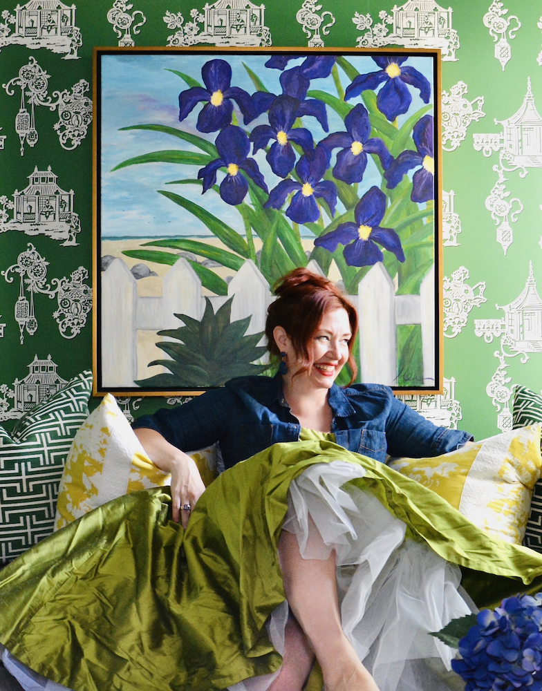
Make no mistake: Meredith Heron is a maximalist. The Toronto-based designer has an affinity for striking patterns and unexpected color combos. “More is more to me,” she tells Business of Home. “I go out of my way to include as many different fabrics as I can in a room without making it feel too matchy.”
True to form, Heron’s mood board showcases a medley of bold, disparate motifs, ranging from multitonal stripes to flame-stitched chevrons and animal prints, in contrasting hues such as red and green. “I like to challenge myself with colors that scare me,” she says.
Heron relied on a nuanced range of gradient blues to draw the palette together (and keep it from looking like a Christmas ornament). “I often use the same pattern in multiple colorways in a space,” she says. “I have also been known to choose a paint color that’s a slight shade off from a fabric to achieve a more lived-in feel—it’s a wonderful puzzle for me to deliberately not match.”
Here, the designer breaks down the details, from a cast-bronze cabinet handle to a tapestry-esque jacquard.
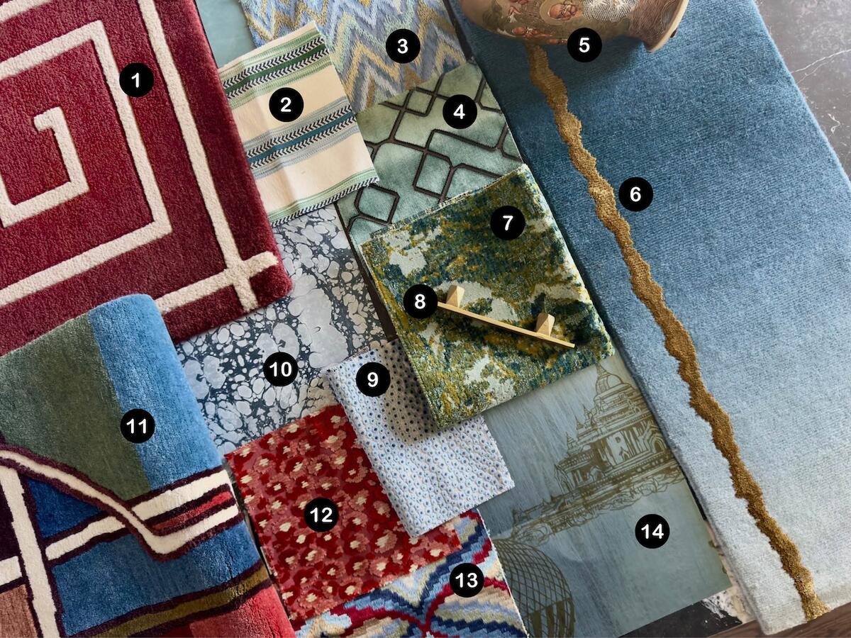
1. HANDSART KEY RUG IN MERLOT BY MEREDITH HERON COLLECTION
“I love this meandering key design and how it opens up a space.”
2. CAMBER STRIPE FABRIC IN GREEN AND BLUE BY JANE CHURCHILL AT COWTAN & TOUT
“The mint hues in this stripe allow me to lean more into the other more mutable greens in the palette.”
3. INFERNO FABRIC IN SAPPHIRE BY S. HARRIS AT FABRICUT
“I love a flame stitch, especially on a sofa.”
4. REGAL FANCY FABRIC IN VERDANT BY S. HARRIS AT FABRICUT
“This is the perfect art deco green. It’s deeper than mint, but with the sheen, it shimmers.”
5. ANTIQUE CLOISONNÉ VASE
“We love to buy beautiful vases, lamps and art at auction. It’s a great way to add a different lived experience into a house to tell a richer story.”
6. FISSURE RUG IN AZURE BY MEREDITH HERON COLLECTION
“I’m deeply passionate about ombres, and whether it’s rugs or fabrics, I’m always trying to include them in a space.”
7. MIDORI FABRIC IN VERDURE BY CLARENCE HOUSE
“This would look amazing on a tight-backed armchair or settee. It’s just so textural and yummy, and also looks delicious when paired with leather.”
8. PYRA MITERED HANDLE IN BRIGHT BY SHAYNE FOX HARDWARE
“Shayne is a friend of mine and a talented one at that. She is an Emmy-nominated, award-winning production designer here in Toronto, and she couldn’t find what she needed for a project, [so she] ended up starting a hardware company.”
9. DARWIN FABRIC IN BLUE BY JANE CHURCHILL AT COWTAN & TOUT
“I almost always use an animal print in every project, and though this is technically a dotted pattern, it could pass for a stingray or shagreen.”
10. MARBLE TILE 1 WALLPAPER IN PEBBLE BY THE VALE LONDON
“Melinda Marquardt, the founder and creative genius behind The Vale London, is a friend. We bond over maximalism. This paper would look divine on a ceiling or inserted in decorative molding to create a faux marble effect.”
11. VITRAY RUG IN RIOMAGGIORE BY MEREDITH HERON COLLECTION
“Finding rugs that complement each other is often a challenge, but because we design all of our own rugs and work with designers to do the same through our Meredith Heron Collection brand, it’s easy to customize an existing design to pair with another rug.”
12. CLEO FABRIC IN COPPER AND RED BY JANE CHURCHILL AT COWTAN & TOUT
“This has feathery, animal print vibes and helps create the ‘well-traveled’ feel I’m always after.”
13. GILES EMBROIDERY FABRIC IN RED/BLUE BY LEE JOFA AT KRAVET
“I always need a fabric that has the majority of colors I’m using in a room to act as my anchor.”
14. BAGAN WALLPAPER IN DEEP SEA BY THE VALE LONDON
“I think I yelped out loud when Melinda first presented this pearlescent paper to me in Toronto.”


