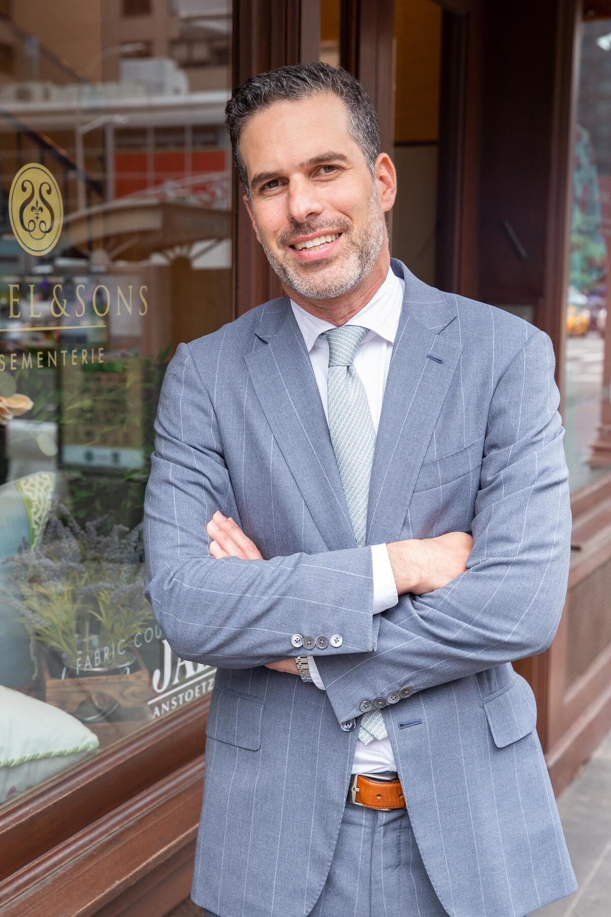
The exemplar of American passementerie, Samuel & Sons has served as an anchor of the home design industry from its town house on Manhattan’s East Side since 1998. Even when overall trends in furnishings emphasized streamlined modernity over embellishment, the family-owned company adapted, showcasing contemporary palettes, inspired patterns, tactile fiber combinations and meticulous craftwork. No matter the style of interior, Samuel & Sons maintained that custom trims, tassels, borders, braids, fringes and rosettes would always provide the essential finishing touch to elevate any interior. Now celebrating its 25th anniversary, the brand continues to innovate with new collections and acclaimed collaborations. Overseen by partner designer—and friend of the family—Timothy Corrigan, it’s even giving its flagship Third Avenue showroom a glow-up, to be revealed later this fall. Michael Cohen, president of the company, spoke with Business of Home about what it means to be both the standard bearer and style pioneer of premium quality trimmings for a quarter century.
On Samuel & Sons’ 25th anniversary, how would you assess the company’s legacy?
So much of who we are is rooted in family. My grandfather founded the original business, M&J Trimming, specializing in fashion, more than 75 years ago. Even then, we had an extraordinary selection of product—tens of thousands of items, always in stock. The business was based on the idea of discovery, a treasure hunt. Twenty-five years ago, my father, Sam, decided to launch a business [focused on] luxury trims for interiors, out of a brownstone on Third Avenue next to the D&D Building in Manhattan. When we opened in 1998, that was the beginning of what is now Samuel & Sons.
Back in the late 1990s, there was such an aura around the industry; an attitude that it was a privilege for people to shop in showrooms. We felt the opposite. The privilege was ours, to welcome in such extraordinary design talent. We were always committed to giving our customers the best experience at every touch point and treating them the way we would want to be treated. Being what we call customer-centric is one of our biggest values as a company.
When we first opened, we were curating product. Today, we’re innovating it. We have a full design studio and work with the top designers in the world. In the early aughts, we collaborated with Michael S. Smith. Roger Thomas of Wynn Resorts helped bring our trim into the hospitality space, and Laura Kirar introduced bold, Mexican-inspired patterns to our assortment. We’ve partnered with Lori Weitzner for nearly 20 years, incorporating such unconventional materials as cultured pearls, precious gems and hand-blown glass into her pieces. We’re working on our second collection now with Timothy Corrigan, to be released next spring, and we’ve even introduced a British design duo to our clients, Maddux Creative, who are very well-known in the U.K.
Indeed, they had a room in London’s Design Centre Chelsea Harbour Wow!house, which BOH’s Brand Studio featured earlier this summer.
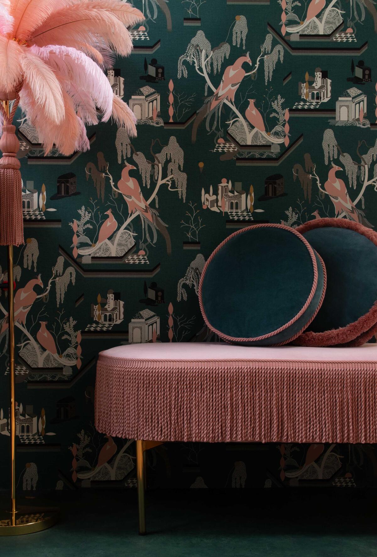
When we started collaborating with Michael Smith and then he was hired to redecorate the residential quarters of the White House for the Obamas, I thought, “Amazing!” Similarly, with Maddux, after we began working with them, they were selected as House & Garden’s and Homes & Garden’s 2022 Interior Designer of the Year. We want to expose our customers to a wide range of design perspectives. Maddux Creative is more eccentric and the colors are fun. The idea with Lori Weitzner was to introduce a modern romantic aesthetic to our collections. With Lori—with all our licenses, really—whether they’ve designed trim before is somewhat irrelevant. Our guidance is: “Don’t have any pretense or pretext in terms of ‘What is trim?’ What do you think it is? What is missing for you when you design a room?”
Re-imagining trim for the 21st century is the biggest thing we did in early 2000 or so. It’s also around the time I joined the business, when traditional tassel fringes and tiebacks were falling out of style, so much so that some fabric houses had stopped carrying trim altogether. That’s when we pivoted. How could we adapt passementerie to be more transitional or contemporary, tailored? That’s when we started doing more pipings and cords and borders and tapes.
Your strategic risk clearly worked out.
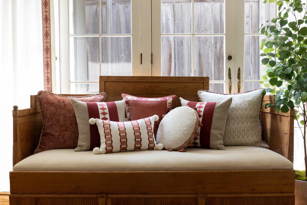
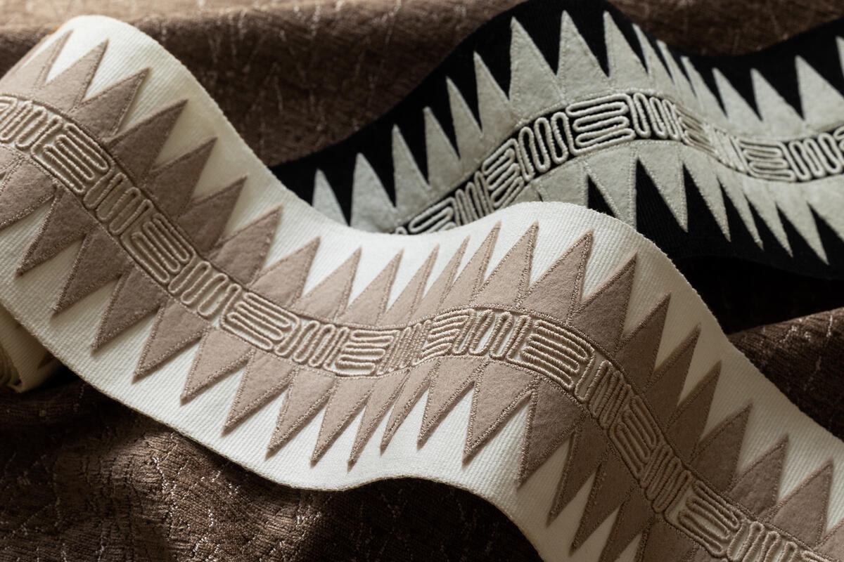
And there continue to be more opportunities to introduce new techniques, [such as] embroidered trim, which basically didn’t exist 20 years ago, nailhead trim, pleated trim. We’ve introduced different materials: leather and velvet, boucle and performance. As much as we’ve achieved, there’s so much more we still want to do. Just this season, we debuted Taos, our new trim collection of bold colors, ombre and geometric patterns inspired by the American Southwest. Its Sedona style surrounds a laser-cut velvet appliqué depicting a kilim motif with sections of intricate tweed embroidery. The felt triangle appliqués of Corrales, a wide statement border, symbolize the region’s majestic mountain ranges. Just the mention of colorways such as Painted Desert, Grand Canyon and Pinon conjure up the beauty of the landscape.
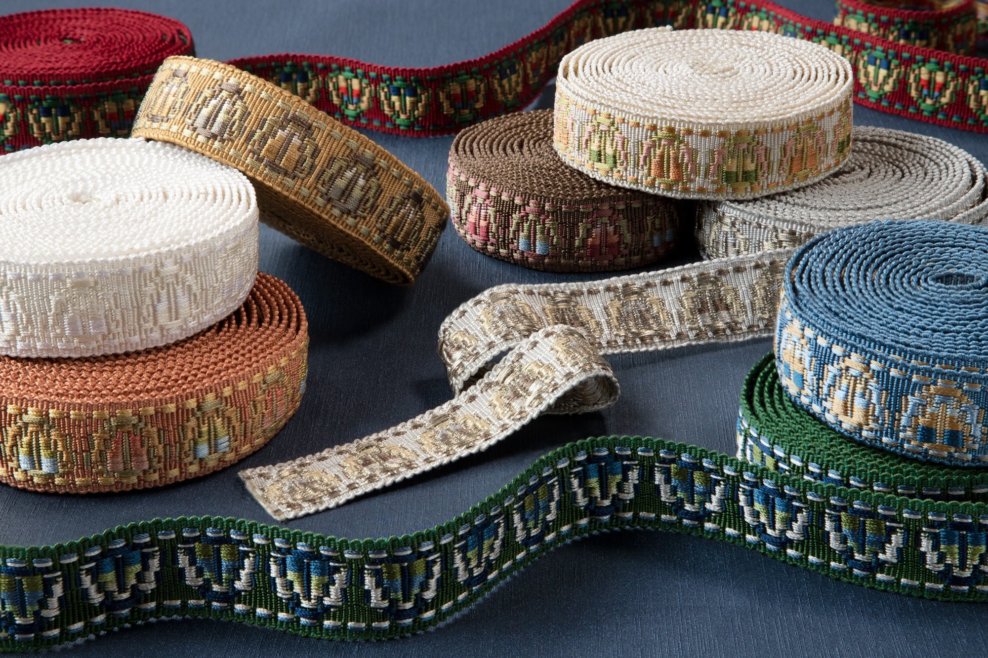
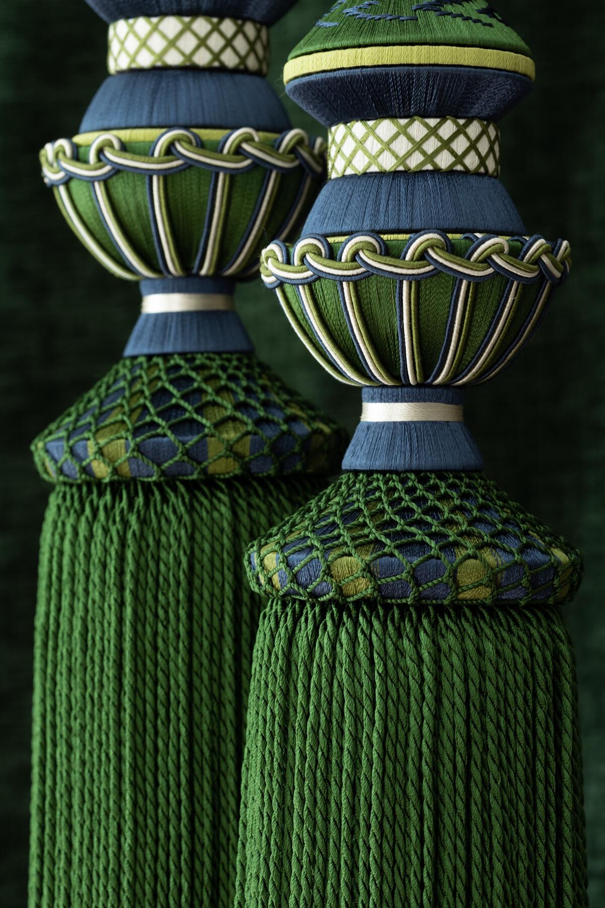
Because of our heritage and 25-year history, we’ve built up a network of artisans around the world who specialize in whatever type of product we’re creating. For a while there, passementerie might have seemed like a craft on the verge of extinction—certainly on the classical side, as styles were trending more contemporary and hand-crafted components were becoming increasingly expensive to make in Europe. All tassel fringe we offer is hand-tied. Any covered bead is hand-covered. Any pom-pom fringe is hand-cut. So much artisanal craftsmanship goes into our product that we’ve taken it upon ourselves to ensure these classical designs are available in a way that feels relevant today. Oftentimes we accomplish that with color or a change in material. Our Trianon collection, which is inspired by 18th century passementerie like you’d find in a French château and features hand-tied tassel and beaded fringes, braids and rosettes, is a perfect example of taking classical designs and putting them in fresher, multicolor palettes.
Samuel & Sons also does a tremendous amount of restoration work with The Metropolitan Museum of Art and similar institutions. We’re working right now on a project with the Henry Ford Museum. We’re able to apply our expertise to return things to their original beauty while helping support hand-weavers throughout the world.
It makes sense that as aesthetics became more streamlined, the interest would shift to simpler trims. At the same time, a pendulum swing back toward ornamentation seems inevitable—there will be a tassel renaissance.
Absolutely, and our goal is to create and supply the finest, most luxurious trimming for all kinds of interiors. What was new in our early history as a company was making the selection a bit more contemporary. What’s happening now is a renewed enthusiasm for classical trims. Don’t get me wrong, there’s always been that customer—
On the Upper East Side or in Palm Beach, perhaps.
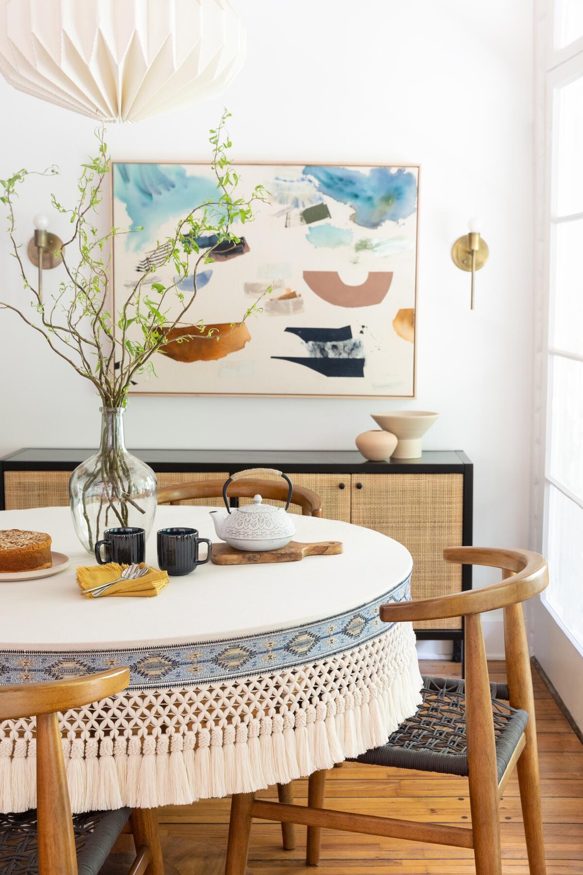
—but younger designers today, who didn’t live through the 1980s and ’90s, when traditional elements were dominant, are more inclined to use them now in surprising ways. Bullion fringe and other cross-weave tassel skirt fringes have been making a return. Skirt fringe on furniture adds a classical element to any room.
Designers are so creative. I’m always amazed by their ideas. They’re still using trim in traditional elements but thinking differently about it. I’ve seen nailhead trim around doorways, tassel fringes on dining chairs. Brush fringe, which was almost entirely reserved for pillows, is now used to upholster a sofa. Cord borders the leading edge of drapes. Classical trims are enhancing modern interiors, and contemporary trims are showing up in traditional spaces. The rules are changing.
Samuel & Sons’ popular print ads have also played a part in securing the company’s legacy—a colleague shared that the “sushi” ad was prominently displayed in the office of a previous job. Do you have favorites of your own?
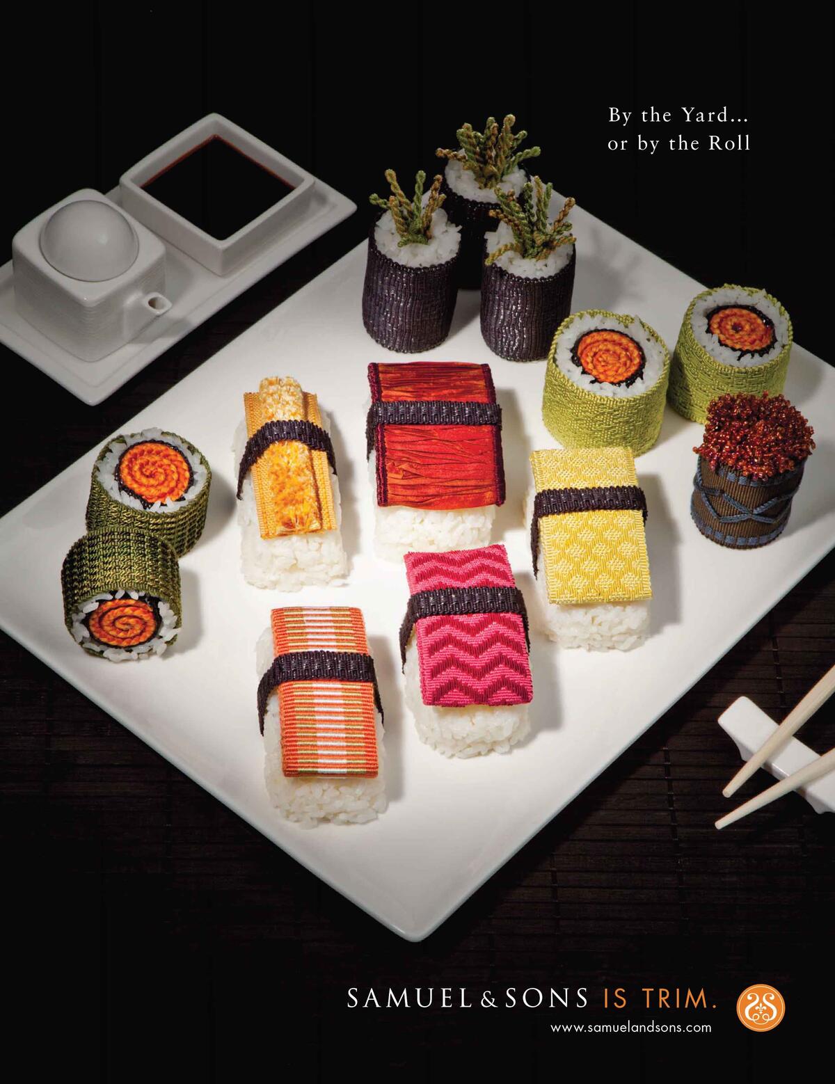
The playfulness that we exude in our ads reflects how we look at our family and our business. We feel very fortunate to be in this industry, but we also have fun with it. The ads are a way to capture the imagination of our audience. The ice cream cones come to mind. The beach chairs. Oh, my gosh, there are so many good ones.
Using a Greek key motif to trim coffee cups feels winkingly New York bodega, while fashioning Lori Weitzner’s trim into an elegant tiered chapeau recalls the midcentury fashion photography of Irving Penn and reads more European.
We’re very humbled to have a presence in Paris on the Rue du Mail. When we first opened shop there [in 2022], we realized that relative to the classical trims being designed in France, our product selection offered something different. The opportunity to scale internationally made perfect sense, and with Paris being the birthplace of passementerie, we wanted to have a flagship in the city as the base for our growth throughout Europe.
Come November, you’re about to reopen your landmark showroom in New York.
Over the last two and a half decades, Samuel & Sons has basically been on an opening spree, signing partners throughout the country, expanding throughout the world. Between Paris, London, Los Angeles, Chicago, Dallas and New York, we have six showrooms today. Although the New York showroom didn’t need to be renovated, it was time to create the best shopping experience in the world in our home market—what we consider the capital of the United States.
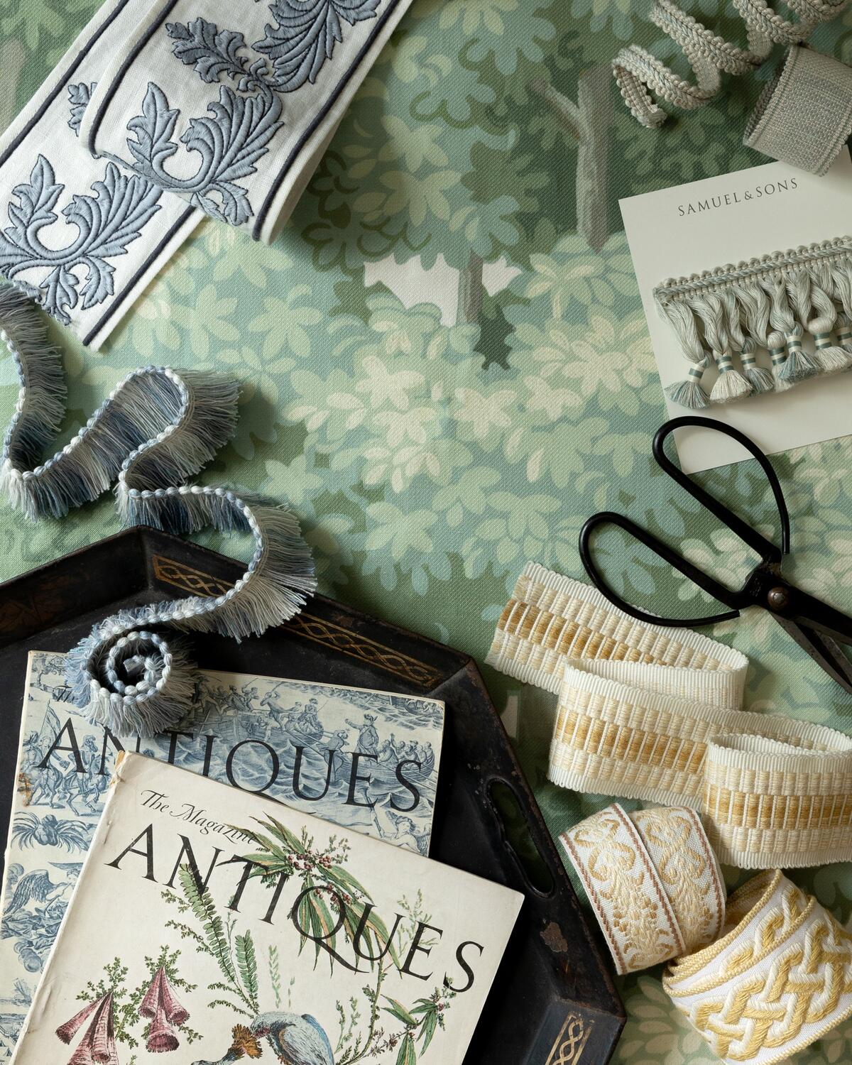
We’re so lucky to have Tim Corrigan as one of our design licenses. When I mentioned we were renovating the New York town house, he jumped at the opportunity to help. The showroom certainly offers that old-world experience, where you have the Crema Marfil stone, honey-colored wood and traditional shop counters. We’ve maintained many of those finishes, maintained our heritage, but improved the shopping experience itself. Replacing the counters with center tables so customers can get closer to the product. Updating the light fixtures. Creating a luxe seating area and sample-book library where you can browse. Adding a coffee bar. It’s about providing the most luxurious service imaginable while preserving the legacy of the original town house we opened 25 years ago.
It sounds gorgeous and traditionally New York, which is so important to keep among the growing urban forest of supertalls.
Gorgeous, but interactive, not intimidating, with the customer front and center, able to pull spools of product off the shelves and lay them against their fabrics to see how the fringe drapes and the silk feels and the colors pair. So much of trim is about coordinating with fabric, which makes the right lighting crucial too. All these factors were taken into consideration when updating the space.
Imagining the next 25 years, what comes to mind?
First, how grateful I am to be part of this industry and to have worked with such talented designers. It’s pretty remarkable that it’s already been 25 years, during which time the incredible Samuel & Sons team has built this business into the leaders in passementerie. That’s number one.
As we look forward, we always have a passion to bring passementerie to more people. What’s missing to some degree is the awareness around the many opportunities to use it. We’re thinking about how we can make it more accessible, create an education platform and offer it to clients around the world. We don’t have to sell pillows, for instance, but we can collaborate with a pillow manufacturer so that trim is a component of a finished product. By partnering with The Shade Store, we’re bringing the beauty of trim beyond the trade, to a retail environment where it doesn’t yet exist. Our Instagram is also a strong brand messenger.
We tell our designers, “If you’re doing a custom sofa, do you want it to look like something you can get at a mass merchandiser?” Add a piping or put a border at the bottom and now you’ve customized it. It could be a lampshade, a drape: Each presents an opportunity to introduce color, texture and craftsmanship. Our mission at Samuel & Sons is to elevate lives through design details, and trim is the finishing touch that makes all the difference.
This story is a paid promotion and was created in partnership with Samuel & Sons.
Hompage image: Celebrating 25 years in business, Samuel & Sons continues to innovate: Its recent Trianon collection includes a glorious array of multicolor ombre borders | Courtesy of Samuel & Sons


