No one does design quite like the British, and nowhere is that stylish eccentricity more exemplified than at the Wow!house in London’s Design Centre, Chelsea Harbour. For its second annual edition this summer, England’s only interiors showhouse has upped the ante, pairing a star-studded roster of world-class designers with local artisans and luxury brands to create impeccably appointed, often whimsical rooms. From tropical twin showers to a disco kitchen to a library literally destined for a château in France, each space is sure to inspire and surprise.
“It’s fantasy with its feet on the ground,” says Claire German, CEO of Design Centre, Chelsea Harbour, of her “mad lockdown idea” to construct a “democratically divided” 5,382-square-foot longhouse within the convention space. “Each designer has a fabulous room to work with.” In lieu of a traditional facade, the Wow!house entrance features 3D-printed geometric mandalas repurposed from 2022’s event by local architecture firm Mamou-Mani. “You would never know once you’re within the house that you’re within the Design Centre,” says German. “It feels incredibly intimate.” A custom soundscape by Guyanese-American harpsichordist Leslie Kwan and a signature scent by British bespoke candlemaker Wick & Tallow add to the sensory experience. With an eye on sustainability, most of the furnishings are for sale, and a portion of the profits will go to TP Caring Spaces, a charity founded by two of the Wow!house’s inaugural designers that creates holistic interiors for hospitals and other communal settings.
The 2023 Wow!house is open through July 6, so there’s still time to cash in a few frequent-flier miles and hop across the proverbial pond for a fresh perspective and exciting new sources to bestow a bit of British flair on your projects. “We have people visiting from all over the world,” says German. “It’s a way of unifying the international design community. Because of the vast array of products under one roof, even the French find it easier to come here rather than scoot around Paris.” Ahead, in order of appearance, the featured designers offer a peek into the concepts behind their individual rooms.
Iksel Entrance Foyer
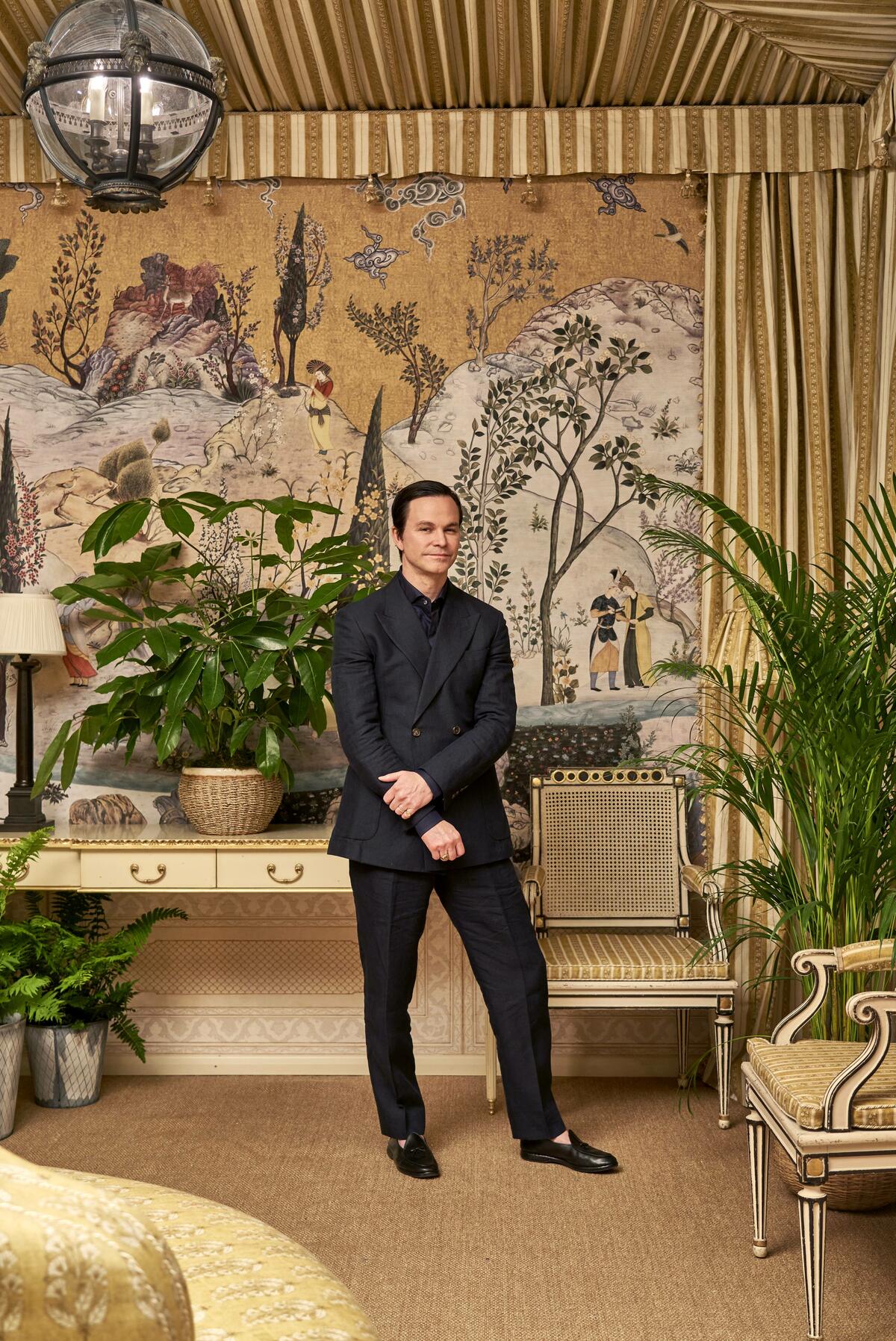
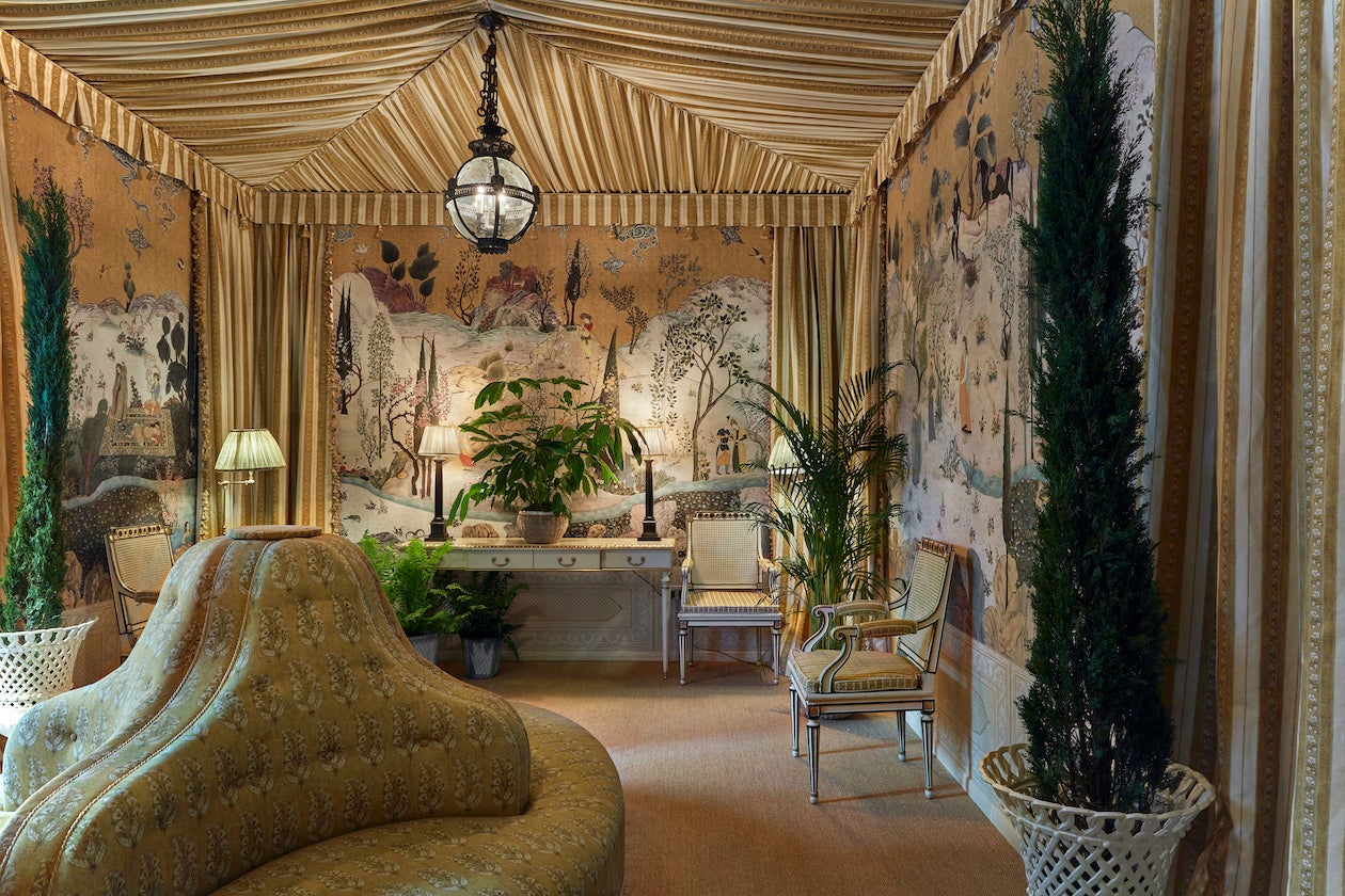
“Departing from the traditional entryway, we instead created a special place that feels more like a pergola, porch or veranda. To evoke an indoor-outdoor experience inspired by California, where we’re based, we wrapped the entire room in a custom Iksel wallpaper. It’s the highlight of the space, a beautiful landscape scene with a mix of Asian influences.” —Mark D. Sikes
The Legend Room
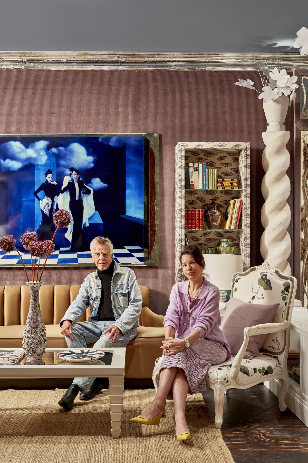
“The concept was to create a space for the fluidity of lifestyle that modern rooms demand. It’s a formal library that’s a foil for entertaining, but also a gaming room, a nest for watching TV and more—not unlike salons of the past, which were intriguingly hybrid. A mauve corduroy from Colony by Casa Luiza, the ultimate balm, swathes the walls. Pieces we’ve dreamed up with custom furniture-maker Justin Van Breda dot the space, marking our collection’s debut. We’re also displaying a dreamy new white plaster lamp in collaboration with the wonderful Matilda Sturley, founder of Legato Studio. The rugs are from Nicky’s collection for Silk Avenue, and there’s a play on a command control center done up with vintage sound equipment from Audio Gold. The only art is a vast, semisurreal image by famed fashion photographer Cathleen Naundorf. Diana Vreeland once said you have to give people what they don’t know they want. We always meld seemingly disparate styles with an air of››› spontaneity, guided by originality, wit and intellect. A good room is a game of contrasts, and we play it like Ping-Pong: one stroke of opulence, a rally back with some poetic modernism, and onward, all to establish that perennially elusive of qualities, atmosphere—for what is a room without it?” —Nicky Haslam and Colette van den Thillart
Dining Room
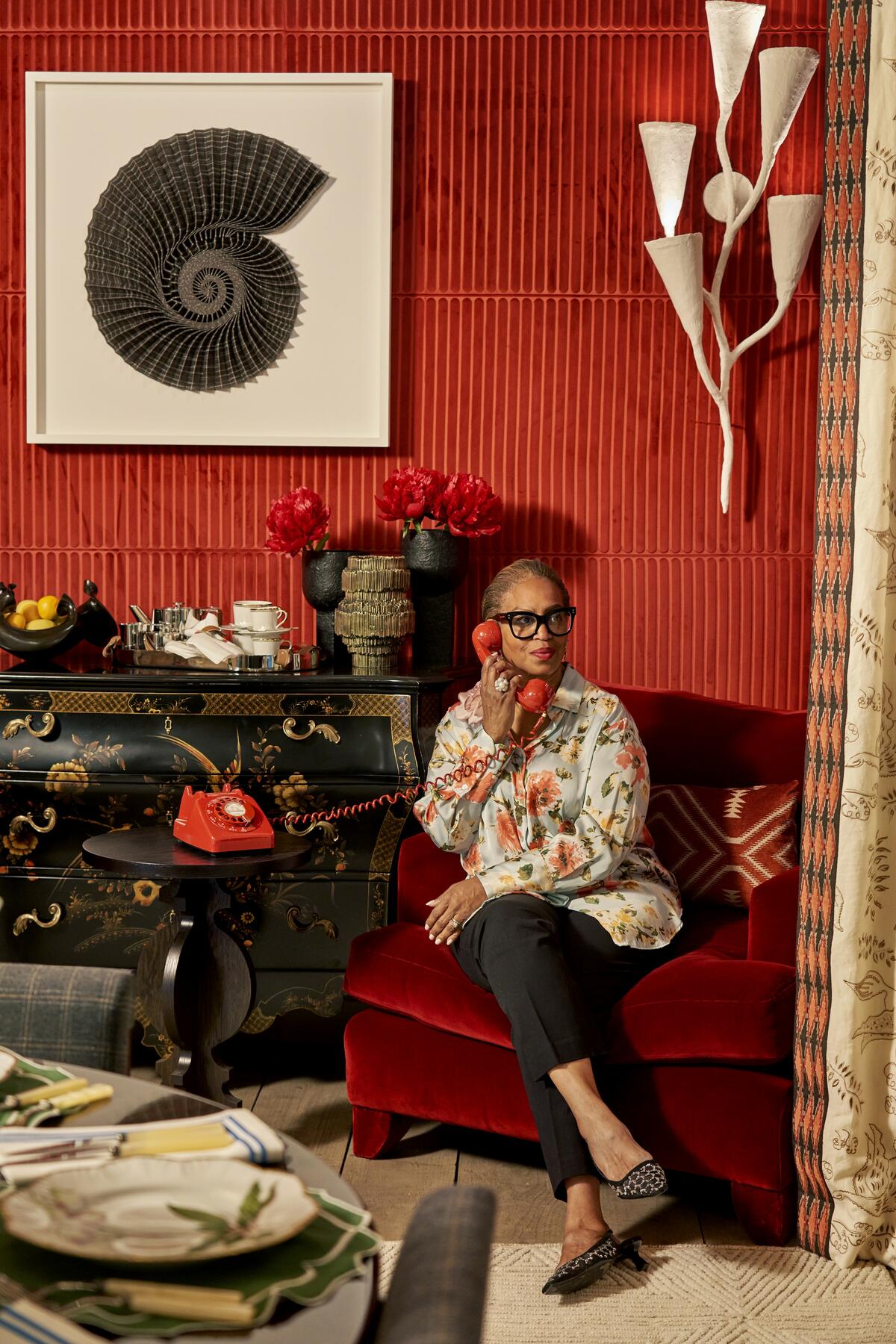
“My goal was to create an intimate and elegant dining room as a background to a beautiful vista while soft jazzy music filled the air. The Tatler space is a saucy niche to catch up on cheeky talk away from other guests, while the thatched ceiling brings a casual touch with its divine intricacy. Craftsmanship is always top of mind for me, and a thatched ceiling is very challenging to do, but I am thrilled with the results. I always enjoy working in London, where I’m constantly inspired by the architecture, including the mews with their gorgeous plantings. Design globally! Source globally! It’s important to get out of your comfort zone.” —Joy Moyler
C&C Milano Salon
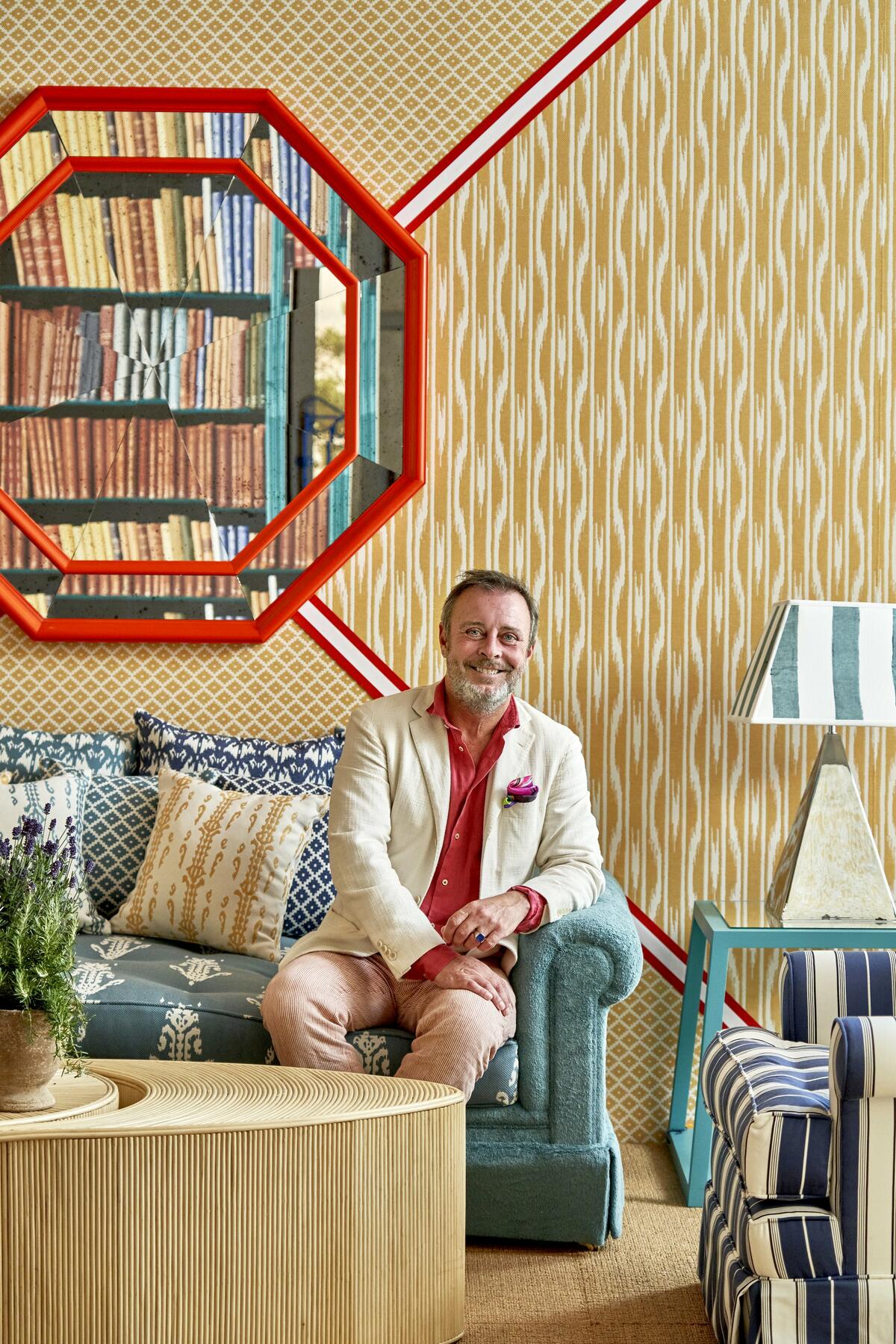
“By putting together unexpected combinations of natural materials like rattan and leather, I imagined Lo scrittore e il Mediterraneo—‘The writer and the Mediterranean’—as a warm seaside suite where a writer would retreat to find inspiration. The main piece of furniture is a bespoke sofa upholstered in green terry cloth, which speaks of summer and the sea. The unique motif of the hand-woven rug in recycled PET is inspired by a project in Milan by my grandfather, architect Piero Portaluppi. The ceiling takes center stage as the fifth wall in the room—as I like to say, ‘Always remember to look up in wonder!’” —Nicolò Castellini Baldissera
Drawing Room
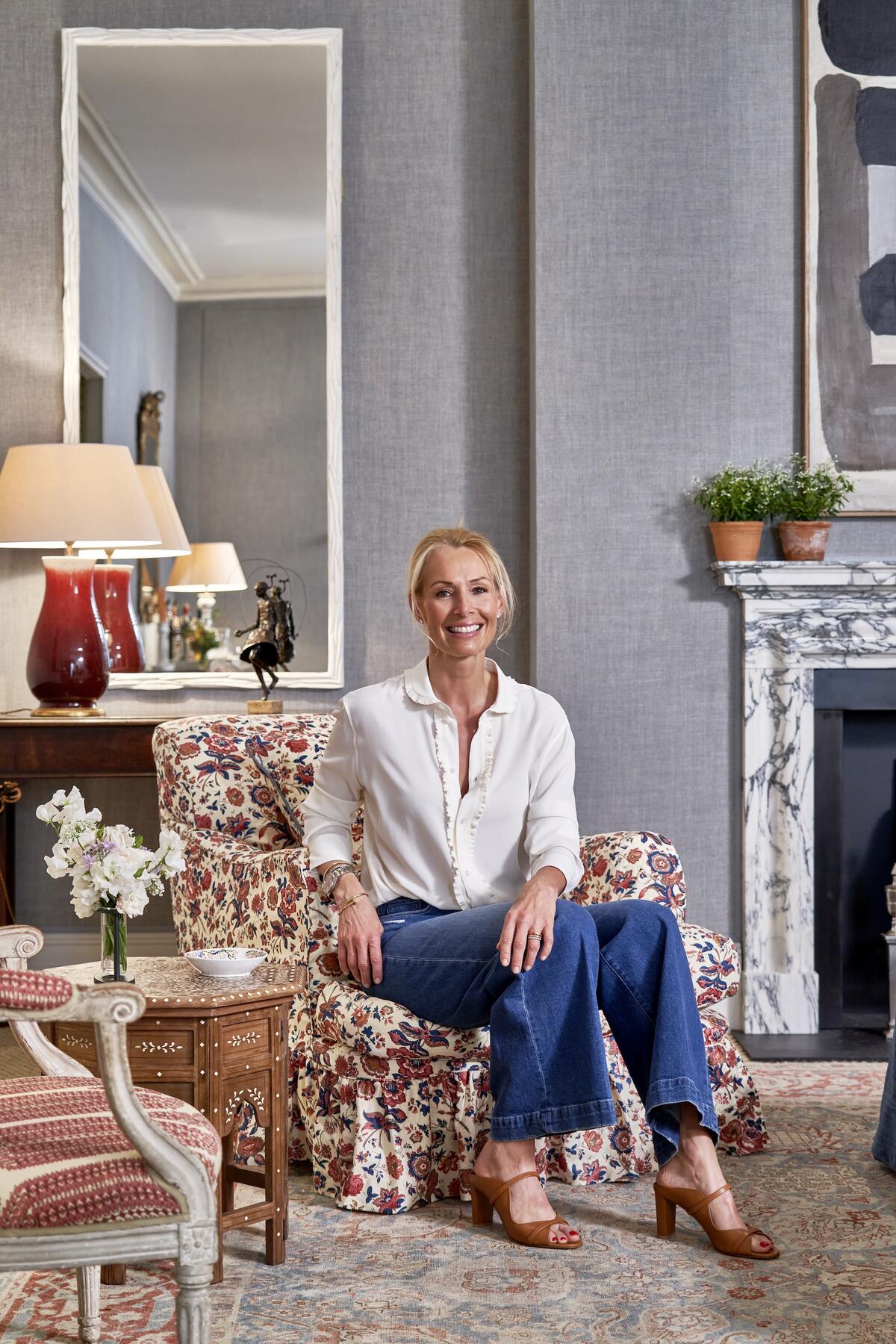
“The English look is slightly more layered, and our room is a good example of this, a quintessential Melissa Wyndham space that pairs antiques and modern pieces with patterns and textures. The fresh blue linen on the walls combined with the Italian-style chintz fabric and bright yellow sofa achieves this balance. I love the British pictures from Jonathan Clark Fine Art, which give a modern sophistication to the space.” —Vanessa Macdonald for Melissa Wyndham
Drummonds Principal Bathroom
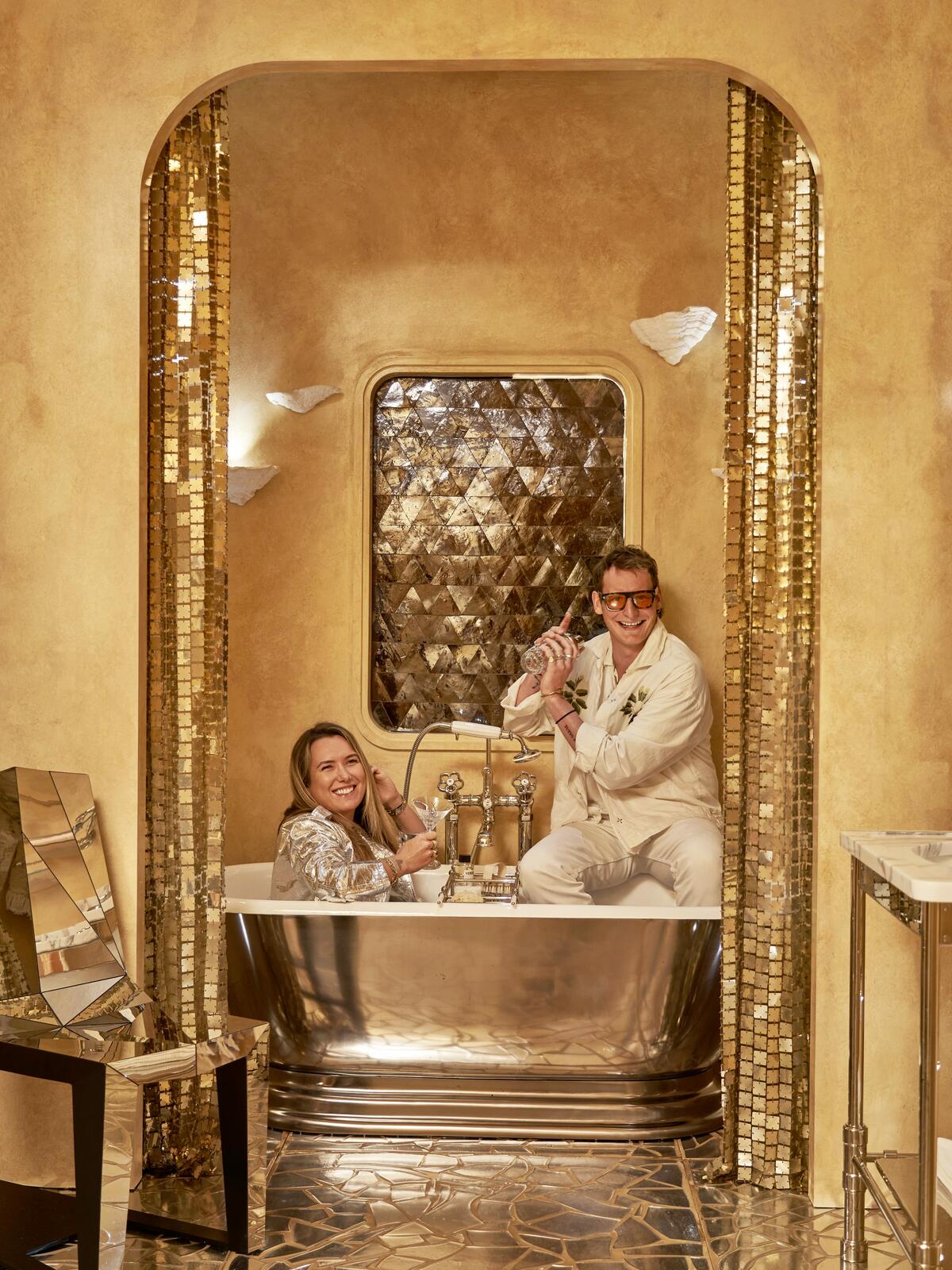
“Capitalizing on not having a client, we decided to do something slightly more avant-garde. I had a dream about a mirrored terrazzo floor, which led me to a retro-futuristic spaceship concept. Drummonds’s Meon skirted bath in Polished Iron has this fantastic classic but also very decadent disco-glam quality that is perfect for our scheme—especially when paired with our original, otherworldly 1970s Paco Rabanne space curtains!” —Lucy Barlow and Joshua Sear, Barlow & Barlow
Colony by Casa Luiza Principal Bedroom
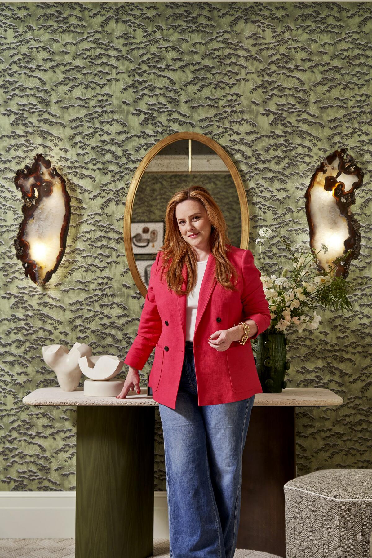
“By working with about 15 different shades of green inspired by Colony’s Sagano wallpaper, I created a bedroom that’s serene and luxurious. Carefully curated artworks bring in contrast and depth. The Luna console, with a special metal finish that adds a touch of elegance, serves as a functional and stylish surface for displaying personal treasures or decorative accents. Also notable are the glass ‘doughnut’ lamps by Tyson London: Their warm glow contributes to the overall ambiance. I’ve noticed a growing interest in incorporating artisanal craftsmanship into interior designs. Clients are increasingly seeking out one-of-a-kind items that tell a story.” —Natalia Miyar
De Gournay Morning Room
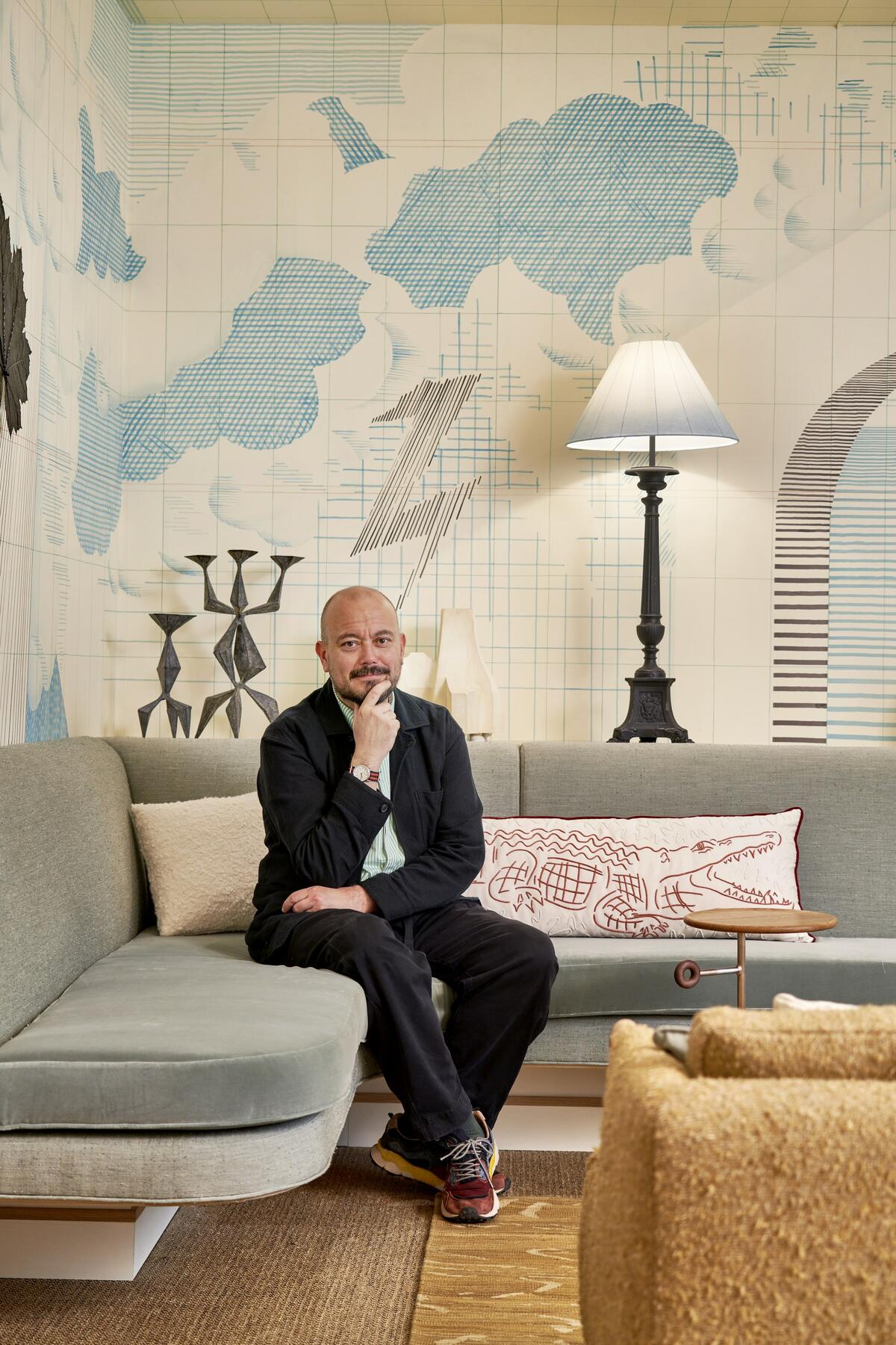
“It’s been exciting to work on a project that is wholly driven by a simple concept, and such a pleasure to watch it grow from a doodle in a notebook to acres of a custom, hand-painted silk wallpaper while still keeping the freshness and informality of the original sketch. The extraordinary furniture of boutique American brand BDDW—particularly the two armchairs—forms a characterful anchor point. Hanging over our own custom-lacquered red table designed as an assemblage of geometric shapes, a paper pendant by Ingo Maurer reinforces the art of drawing.” —Tom Bartlett, Waldo Works
Fromental Courtyard Room
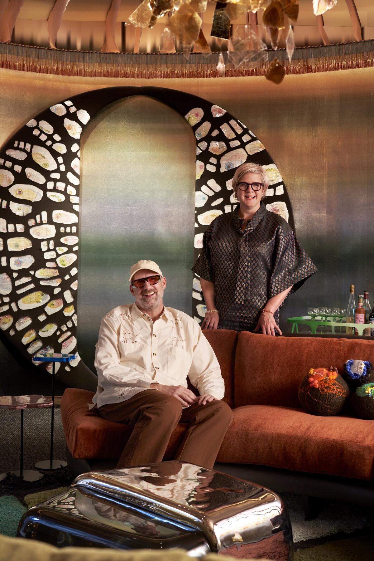
“Getting back to crafting for the pure joy of it when creating the courtyard space has been wonderful. Each element is imbued with our energy and passion, making the design truly meaningful. Creating the agatized embroidery on the pelmet, felting the shelves with the team at the Royal School of Needlework, using vintage and found treasures—all captured my imagination. Curating the objects and artworks for the cabinet-of-curiosities wall hopefully prompts a conversation-provoking aesthetic.” —Jo le Gleud, Maddux Creative
Alexander Lamont + Miles + Lauren Hwang NY Day Room
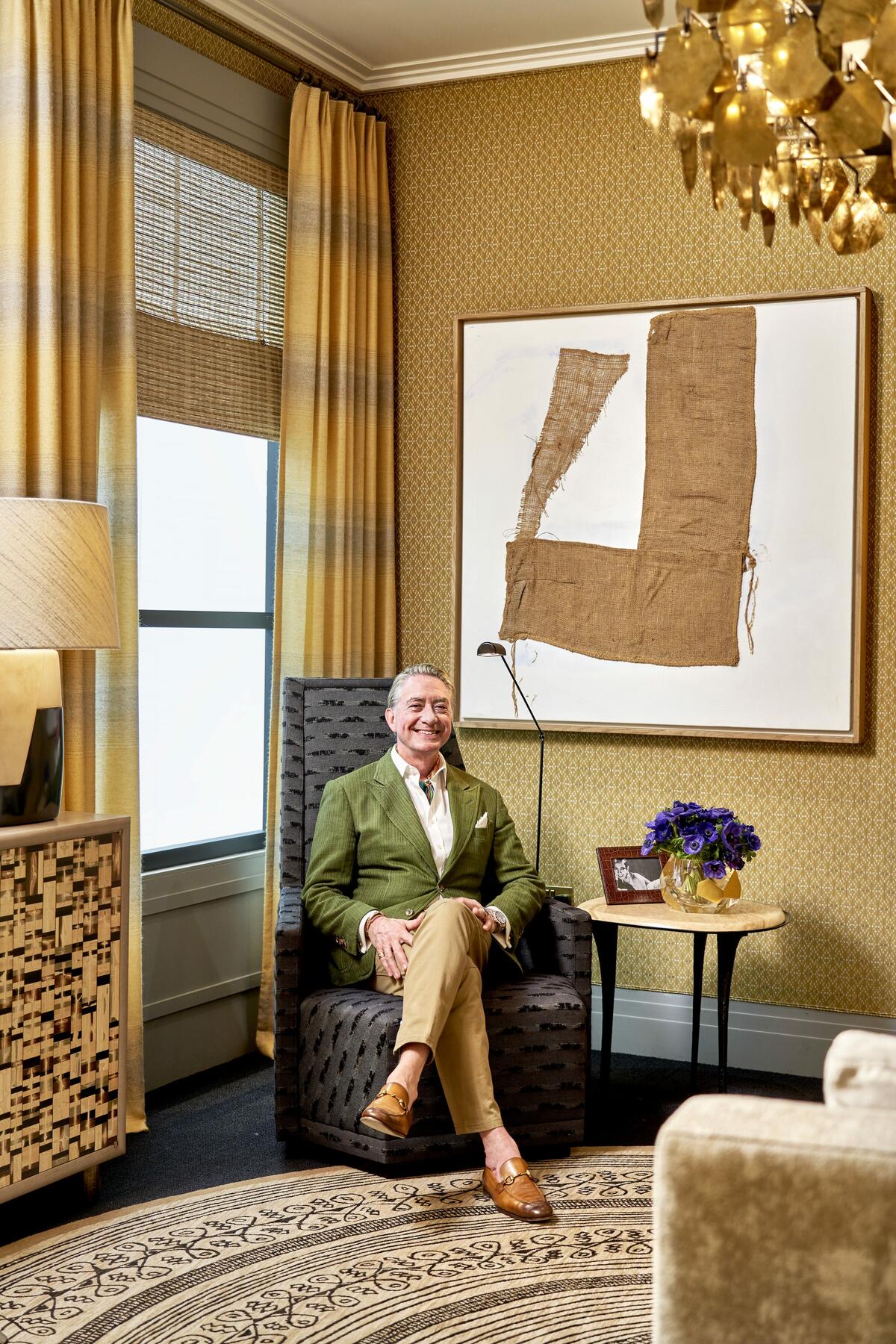
“Last year, Lauren Hwang came to London from New York to see the inaugural Wow!house and loved it so much that she vowed to be involved in 2023. Be careful what you wish for! To create a Jazz Age–meets–New Age lounge, I’ve used over 100 meters and nine different hand-woven materials from her collection in our room: parchment, silk, shagreen and mohair, for the walls, curtains, upholstery, even the lampshades. Two chairs from Marta Sala Éditions and hand-woven blinds by Anne Corbière are also notable. The room’s muse, Josephine Baker, would be in her element.” —Timothy Mather
House of Rohl Bathroom
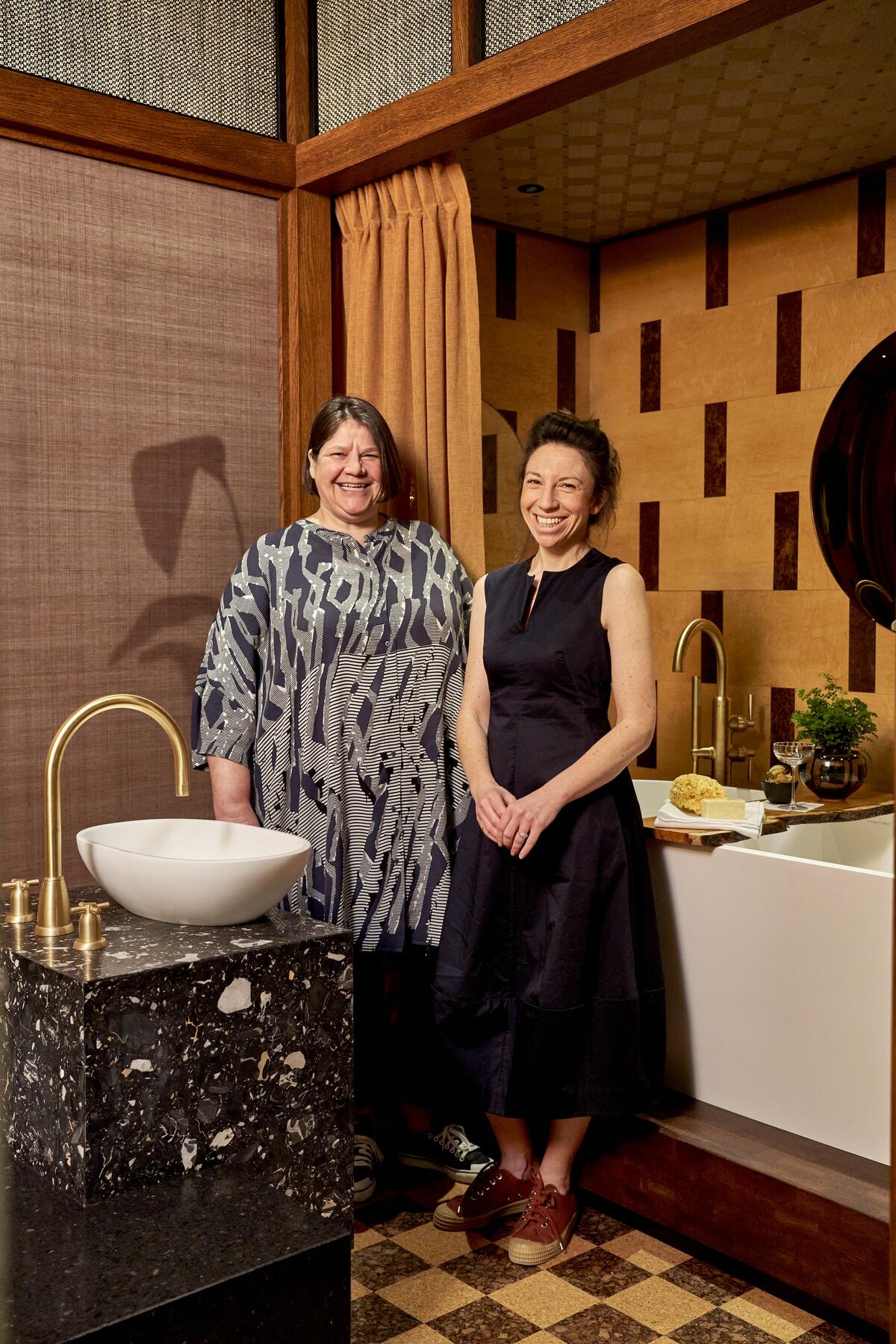
“We want to transport our visitors to a tropical resort where they’re encouraged to retreat, relax and indulge. Every detail has been considered to create an immersive experience. The subtle lighting and gentle rotation of the ceiling fan set the tone, and carefully selected natural materials in a curated color palette of tobacco and honey hues foster a tranquil ambiance. In the twin showers, you are enveloped by a backdrop of intricately woven textures and surrounded by exotic foliage—it’s the suggestion of being outdoors in a seductive setting. Raw clay complements Perrin & Rowe’s beautifully restrained Langbourn range of fittings. Whilst ‘helping’ us open packages, the two youngest members of Studio Mica (age 6) proudly announced that ‘the gingerbread had arrived!’ It was the clay brick tiles—beautiful but not quite edible.” —Carolynne Shenton, Studio Mica
Gosling Library
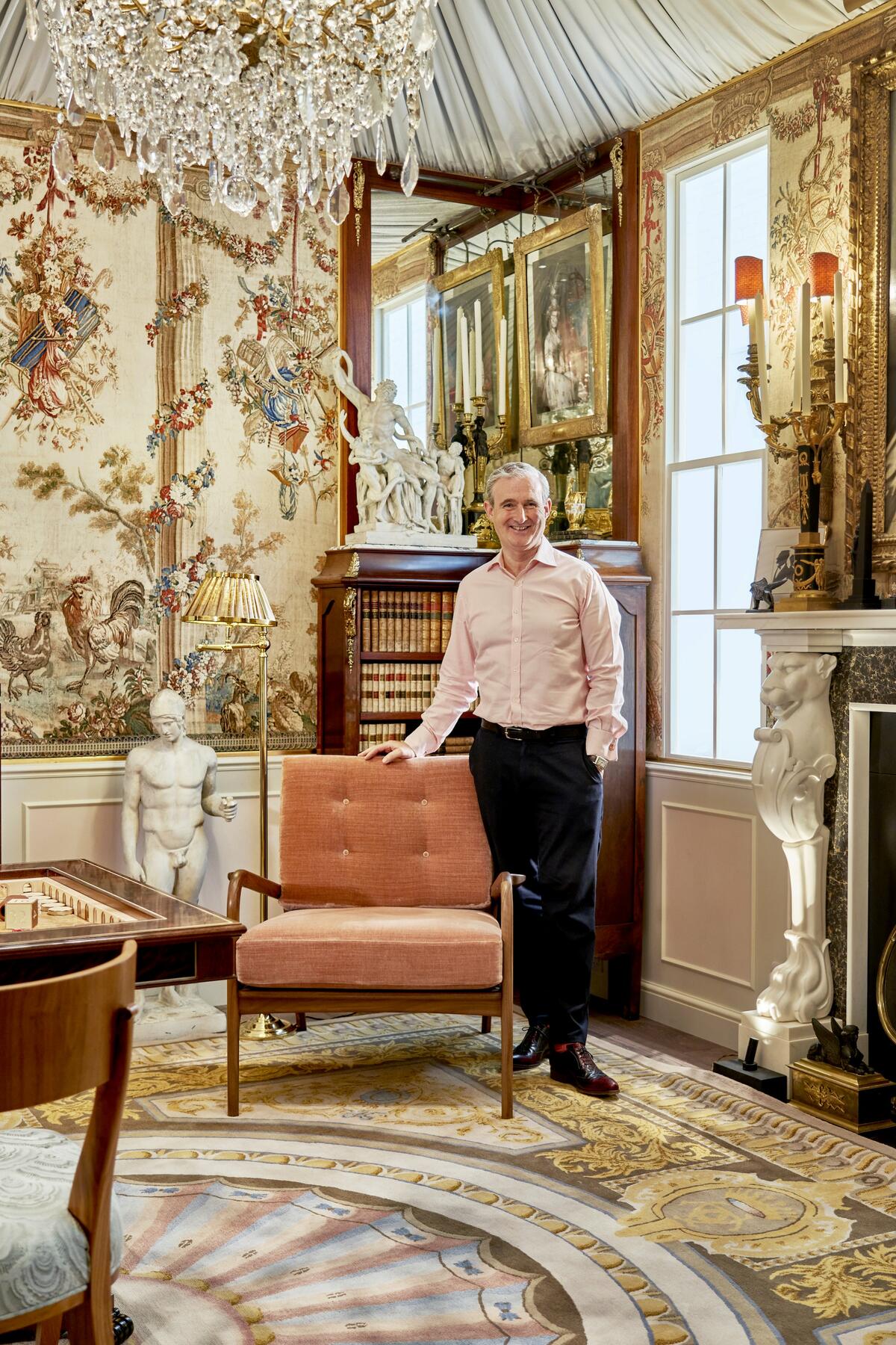
“About three years ago I decided to create a library at the Normandy château my partner and I are restoring, so I’ve been working on this one room for that long. After the Wow!house, it will go to France; this is the start of its wonderful life. Nearly every item in the room, from the rug to the bookcases to the pictures, is bespoke—even the centerpiece backgammon table. Collaborating with the legendary Lalique has been wonderful. We created a pair of plinths inset with incredible crystal figures from the 1920s. Displaying a collection is always so fascinating. My 83-year-old mother wants to visit every week just to sit in my library and show people around. In fact, my entire family wants to help. It’s going to be crammed with lots of little Goslings!” —Tim Gosling
Study
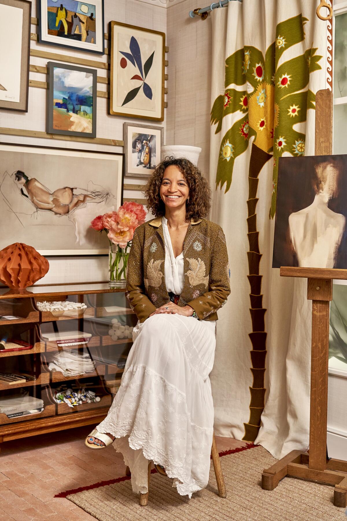
“South African artist Clementine Teniqua Crawford created a bespoke painting specifically for our study. Her depiction of the female form is sublime and enchanting. We’re also thrilled to display local Shropshire artisan Rupert Bevan’s gorgeous new collection of mirrors. Each is made of lightly antiqued mirrored cathedral glass lozenges carefully placed on a fumed-oak frame surrounding an antiqued mirrored glass center. The wallcovering by Mark Alexander, Abaca Patchwork in Alabaster, is due to be released in September. Hand-made from start to end, it’s a feast for the eyes. Together, these meticulously crafted pieces reflect the experiences of a true world traveler who has the utmost respect for other cultures.” —Clare Gaskin
De Le Cuona Bedroom
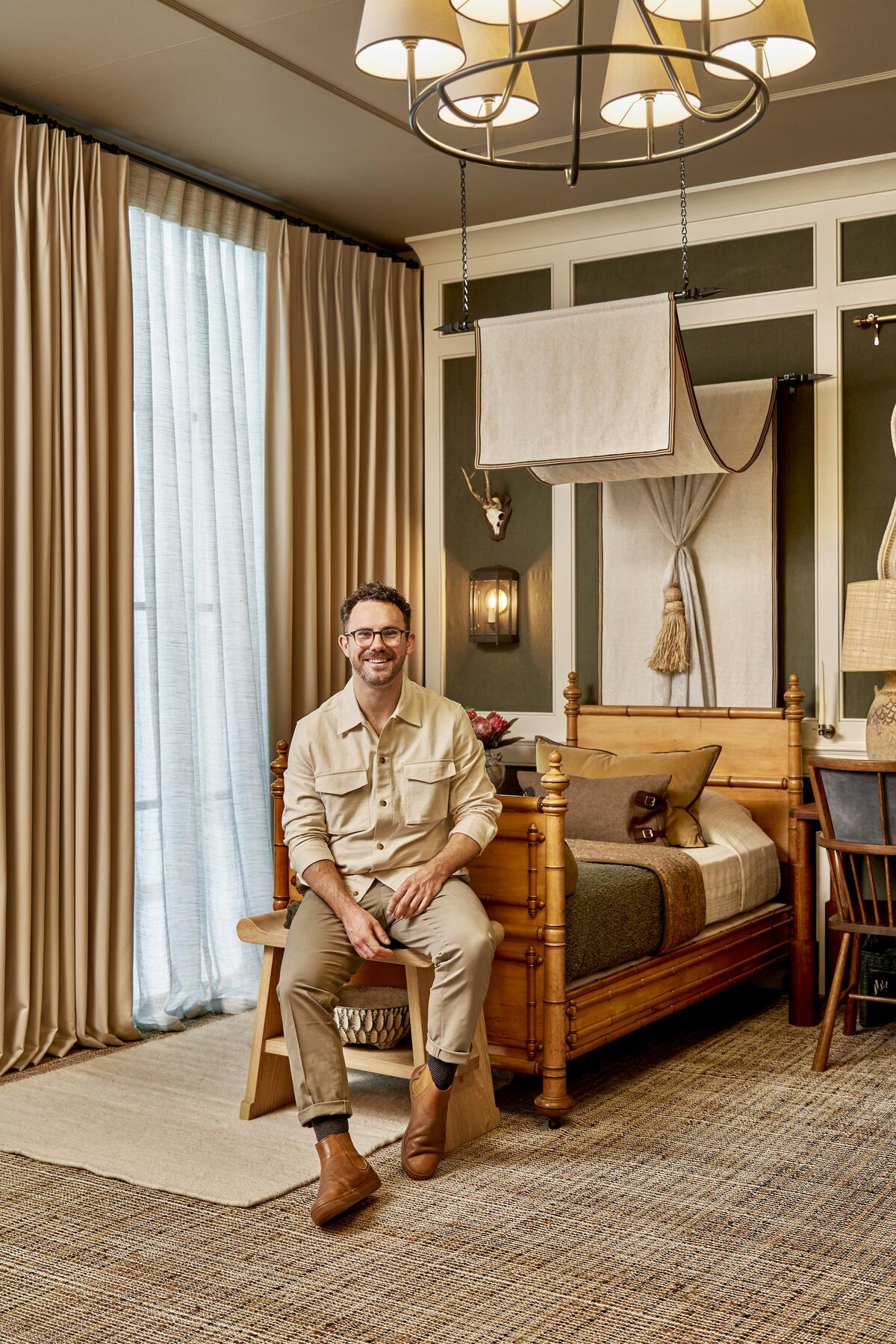
“In place of a primary bedroom, which is typically rather uniform, we opted to design something unexpected: a twin-bed suite. It allowed us to tell more of a story, to further drive the ‘Grand Safari meets London Town’ narrative. The room marries British design with quintessential South African elements in a genuine way, no gimmicks. It’s a trip to the motherland without the 24-hour flight from JFK.” —Christian Bense
Dining Room
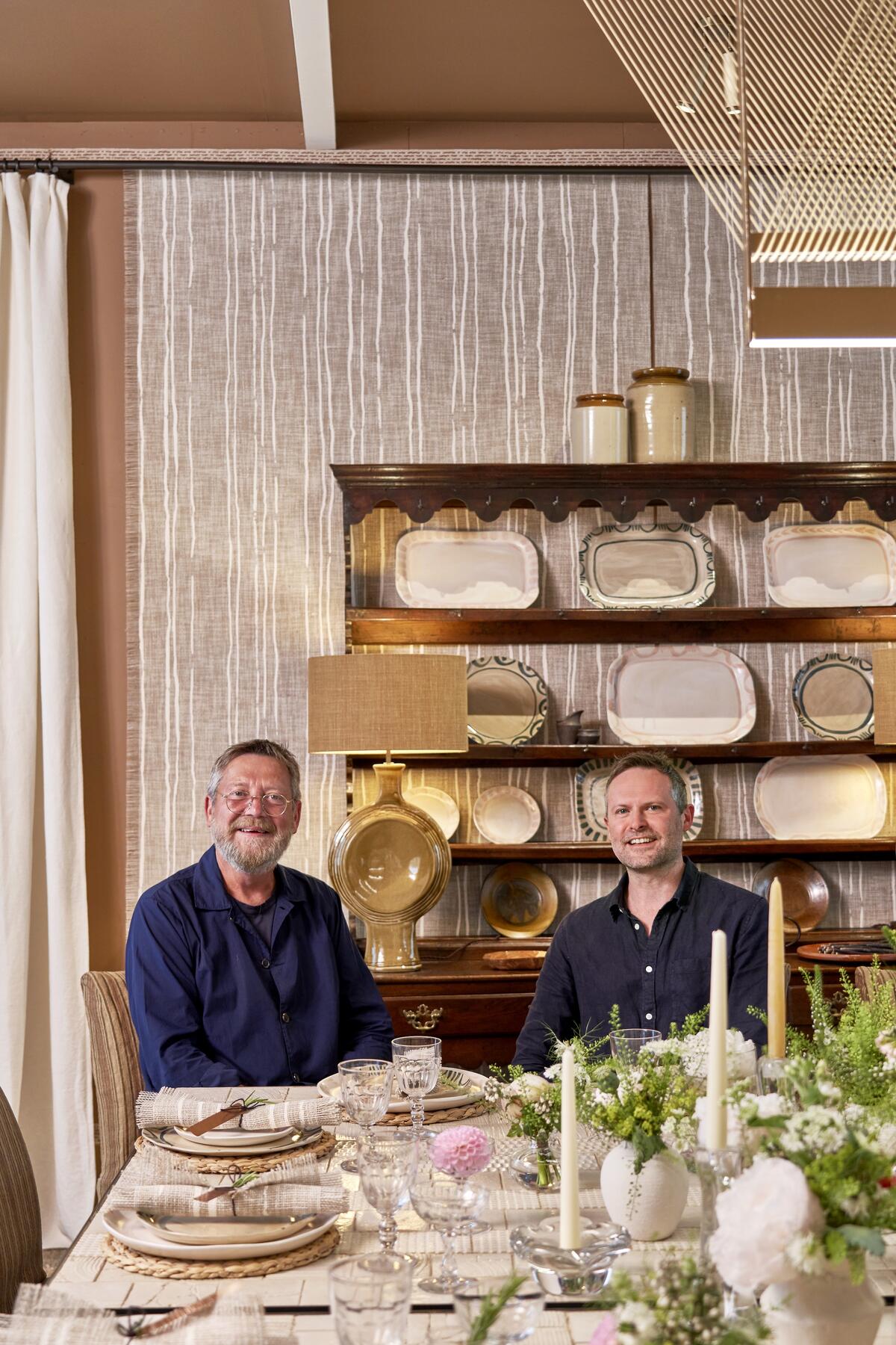
“It’s fitting that we were invited to design a dining room, as we’ve gained a bit of a reputation for our Friday lunch club. It indulges Jay’s love of cooking and our joint need for fun, informal afternoons shared with friends. The walls are originally hand-painted by us and re-created with our collaborator, Zinc Textile. The stonewashed linen curtains over the eight windows are inspired by a vintage French bedsheet. We use linen a lot, as it’s timeless, hangs well and suits both new and old, country and town. Because we expect lots of conversation and laughter, the walls are draped with fabric banners in a natural, open-weave jute to absorb sound.” —Martin Hulbert and Jay Grierson
Home Bar
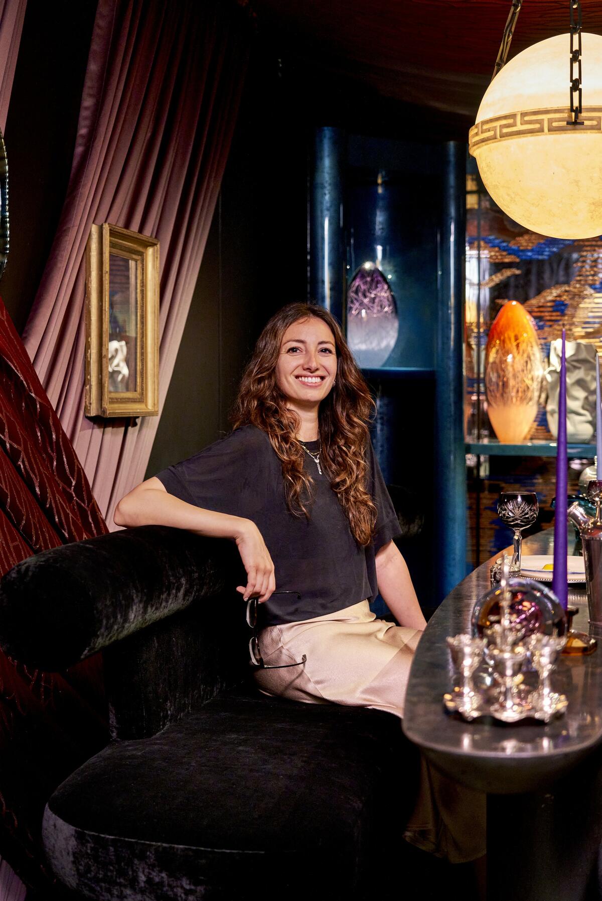
“We wanted to design something otherworldly, which took us to a cocktail breakfast bar on the moon. Using jewel-tone fabrics, plenty of Lurex, lots of mirrored elements and bold but comfortable curve-lined furniture, we created something full of color and sparkle with an intergalactic feel. A special Sterling Studios églomisé mirror in the center of the bar cabinet includes a bespoke pattern inspired by the aurora borealis, Saturn and shooting stars that melt into the custom Tim Page carpet, while the central table in black limestone by Donato Coppola features the constellation of the showhouse’s June starting date in faded brass. I loved adding meaningful touches like that to enhance our outer-space theme.” —Tala Fustok
Martin Moore Kitchen
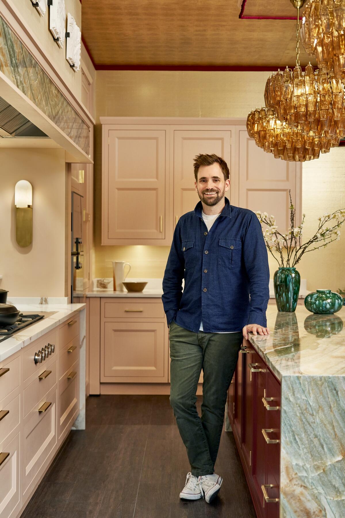
“With a gold-leaf ceiling, glittering mirror ball and walk-in cocktail cabinet adorned with jumbo gold sequins, ours is a disco kitchen! Think glamour, luxury and sophistication rendered in a melody of pinks, greens and golds. Meant for entertaining, this space features sumptuous velvets from Pierre Frey and Dedar, beautiful decorative trims by Samuel & Sons, seating by Ben Whistler, textured wallpapers by Altfield and Tracy Kendall, and decorative lighting from Pure White Lines and Visual Comfort. We are incredibly excited to be pushing the boundaries of what a kitchen can be.” —Henry Prideaux
Summit Furniture Terrace
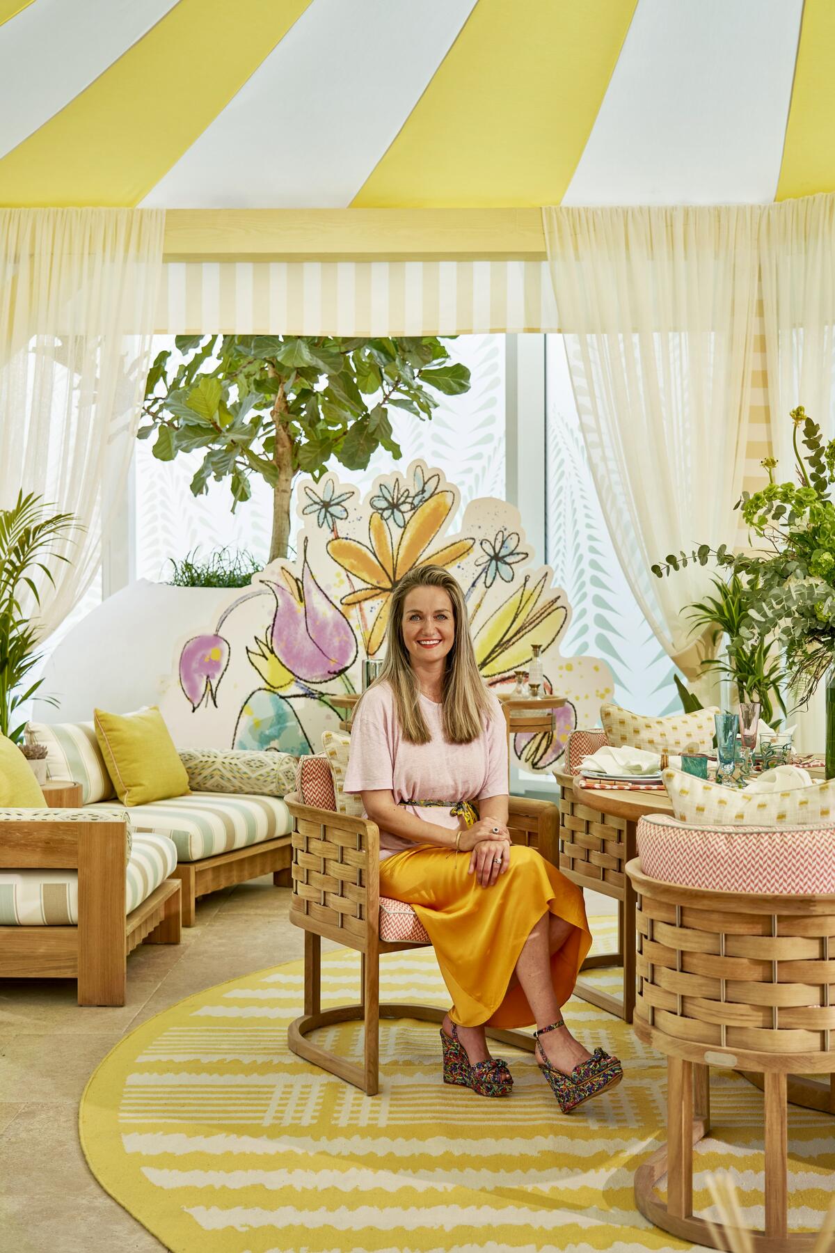
“Merging outside and in, the terrace is a playful space with a sense of nostalgia for the cosmopolitan coastal retreats of the Côte d’Azur and the regal glamour of Hollywood Regency style. Collaborating with Summit is such a joy. Our relationship spans more than 25 years, and in 2019 our shared passion for craft and design led to Arc, a contemporary, beach club–inspired collection that now sits perfectly within our terrace.” —Selina McCabe, Winch Design
This story is a paid promotion and was created in partnership with Design Centre, Chelsea Harbour.
Homepage image: The tented entrance foyer designed by Mark D. Sikes brings to mind a lush pergola; Turkish banquettes, vibrant plants and custom Iksel wallpaper beckon guests inside | James McDonald Photography


