In our new series What I Love, we’re asking designers to build us a mood board of what’s inspiring them right now.
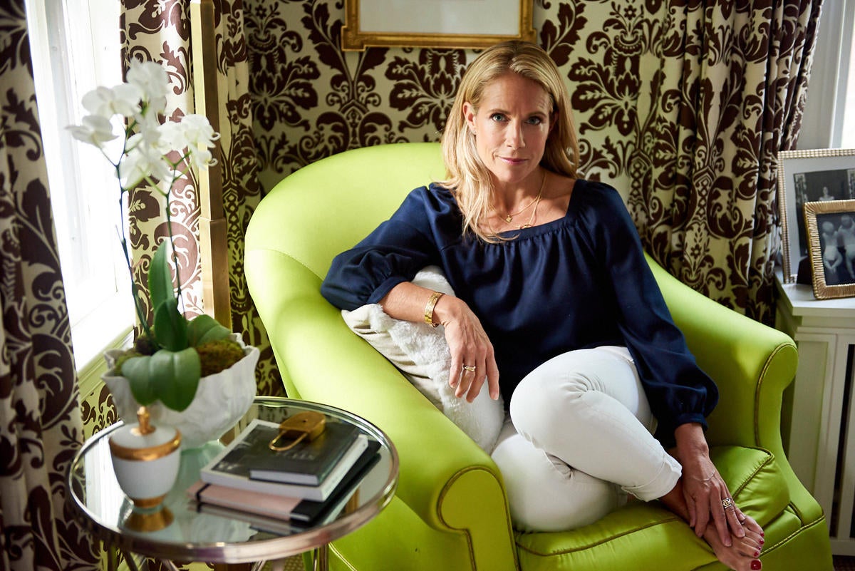
Known for her bold yet elegant spaces, Liz Caan is, above all else, a traditionalist. The Newton, Massachusetts–based designer relies on a mix of classic patterns, eye-catching colors and distinctive decor pieces to push the boundaries of traditional interiors. “I like to incorporate a little humor into my designs in a way that still feels timeless,” she tells Business of Home.
Her current flat lay offers an excellent case in point. Caan says the board, which is brimming with playful stripes, colorful prints and jewel-toned fabrics, was inspired by a vibrant floral wallcovering by Clarence House. “I pulled together a palette that spoke to all the seasons,” she explains. “There’s a mix of deep, saturated autumn and winter tones, as well as lighter spring and summer colors.”
A fearless approach to color and texture is present throughout the palette, which Caan describes as “happy yet not too sweet.” Her ultimate goal: modern traditionalism. “The wholesomeness of the materials is what unifies the flat lay,” she says. “A variety of contemporary and antiqued finishes also helps balance things out.”
Here, the designer breaks down the details—from bleached walnut wood samples to rich blue paint swatches.
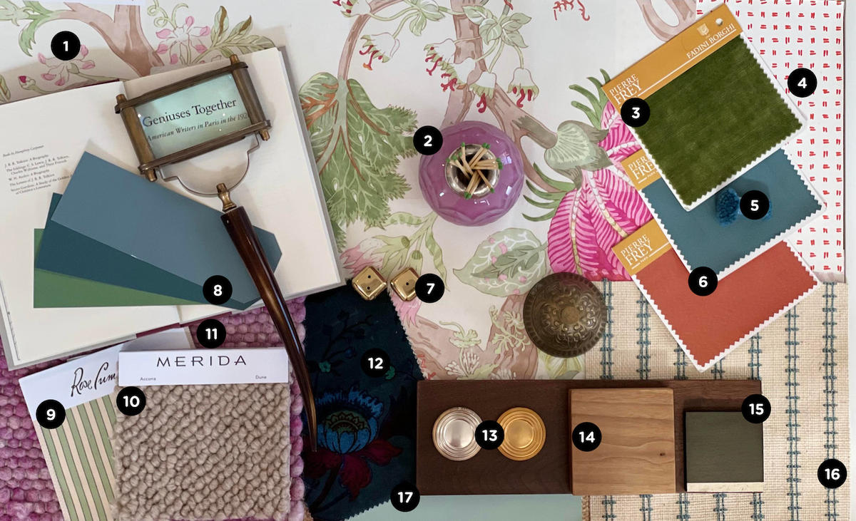
1. ARBRE DE VIE WALLCOVERING IN RANI PINK AND GREEN — CLARENCE HOUSE
“I started with this large vibrant floral,” says Caan. “I chose it for its cheerful palette, movement and scale.”
2. CRYSTAL MATCH STRIKER — KRB
“[This match striker by KRB] insinuates the scent of a candle or a fire,” she explains. “It also adds a beautiful color and shine, like a piece of jewelry.”
3. CAPRI II Fabric I6615018 — PIERRE FREY
“This mossy green antiqued velvet by Pierre Frey was the textile weight I needed for this scheme,” she says.
4. TATE WALLPAPER IN ORANGE on ALMOST WHITE — QUADRILLE FABRICS
“This small-scale printed wallpaper spoke nicely to the large floral one,” says Caan. “Varying scales create interest.”
5. CUSTOM DEEP BLUE COLOR POM — MERIDA
“Merida has the most beautiful pure wool and linens,” she says.
6. KARA FabRics I6619010 AND I6619006 — PIERRE FREY
“The silk taffetas, in a spicy orange and petrol blue, help balance out the palette,” says the designer. “Depending upon the application and proportion of these tones, the room could take on very different personalities.”
7. BEVELED DICE — SIR/MADAM
“Oversized solid brass dice invite some fun and imagination into the scheme,” says Caan.
8. DE NIMES, HAGUE BLUE, and CALKE GREEN Paints — FARROW & BALL
“The Farrow & Ball colors complement the floral wallcovering, while also bringing in some opposition,” she says.
9. JACQUELINE STRIPE IN GREEN — ROSE CUMMING
“I always try to incorporate a stripe with a floral, and this silk stripe was the perfect scale for the bold wallpaper,” says the designer.
10. ACCONA Rug IN DUNE — MERIDA
“The Merida Accona rug was the most appropriate neutral, in my opinion, to ground the palette,” explains Caan. “It also adds a textural element.”
11. WOVEN TEXTURES RUG 7704 — ELIZABETH EAKINS
“I loved the organic and natural feel of this rug executed in a cheerful pink,” she says.
12. MAJORELLE VELVET FABRIC IN PETROL — HOUSE OF HACKNEY
“The House of Hackney velvet palette provides a nice contrast to the floral wallpaper,” the designer explains.
13. POLISHED SILVER AND BURNISHED GOLD Finishes — NANZ
“Mixed-metal finishes are imperative in a space, and there is nothing more beautiful than sterling silver and burnished gold,” says Caan.
14. BLEACHED AMERICAN BLACK WALNUT — SAWKILLE
“The bleached American walnut is a truly warm wood that helps balance out some of the more upscale finishes,” she says.
15. CUSTOM WOOD SAMPLES
“Mixing woods and finishes in a space creates layers and interest,” she adds.
16. TRAX Wallpaper IN White STEEL Birch Burlap — CREZANA
“This embroidered burlap wallpaper adds another texture element, showcasing the craftsmanship of embroidery on a very basic and rustic texture,” Caan explains. “The structured pattern also works well in opposition with the larger, more traditional patterns.”
17. GREEN BLUE Paint — FARROW & BALL
A soft shade of greenish blue plays up the cool tones of the pink-and-green floral patterned wallpaper that inspired Caan’s flat lay.
Homepage photo: A flat lay by designer Liz Caan | Courtesy of Liz Caan


