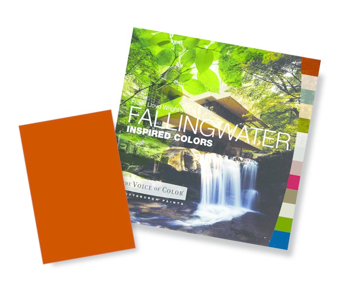
A new paint collection by PPG Paints based on an original palette developed by Frank Lloyd Wright in the 1950s adds modern colors and coordinating stain colors inspired by the architectural icon’s aesthetic. For the collection, PPG’s color experts worked in collaboration with the Frank Lloyd Wright Foundation.

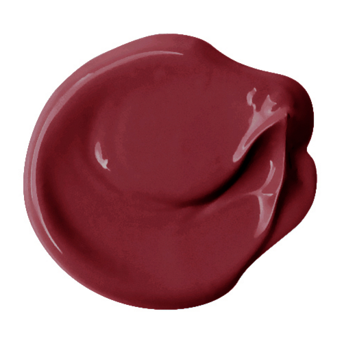
Among the colors: Wright Deep Rust and Crushed Cinnamon, which reflect the Wright’s use of iron-ore, and nature-inspired hues like Wright Oak Bark, Fig Branches, Wright Green Olive and Woolen Vest.
“The PPG Paints brand Frank Lloyd Wright color collection consists of a blend of Wright’s carefully selected palette from the 1950s with additional modern colors and coordinating interior stain colors, showcasing how harmonizing the palette is even many years after its inception,” says Dee Schlotter, PPG senior color marketing manager.
“Even the colors chosen more than 60 years ago stand strong today and coordinate with modern textiles and materials—a true testament to Wright’s timeless design sense.”

“Wright drew from two sources in determining his palette: the nature of the site, and the nature of the building materials,” says Lynda Waggoner, vice president and director of Fallingwater. Stuart Graff, CEO and president of the Frank Lloyd Wright Foundation, says, “PPG has the trend expertise to work with the tones from Wright’s original palette and add new hues and wood stains consistent with his vision.”


