


Remember a couple of months ago, when it seemed like every brand under the sun was announcing their own color of the year? Now that 2020 has some meat on its bones, it’s worth asking: What is the color of the year? Well, it depends on who you ask.
In what has become a cottage industry within the home furnishings business, the race to select the color of the year attracts participants from across the spectrum. Of course, just as important as your color selection—some might say even more important—is getting the word out about your choice and eliciting the corresponding press coverage.
The final months of 2019 produced a plethora of palettes, with enough options to satisfy just about anyone’s color preferences. The predictions have come from a wide swath of sources, including home decor media, paint companies, forecasting services—and of course Pantone, perhaps the best-known color predictor of all.
Pantone began life making color cards for the cosmetics industry in the 1950s, but since the 1960s has been focused on the design and graphics fields, supplying color standardization systems that allow color communication among people on different continents speaking various languages—a way to keep hues consistent across space and time.
In 1999, the brand began selecting a color of the year, relying on a complex method that looked at trends and color usage, but largely has been a proprietary—not to mention arbitrary—process. That year it selected Cerulean, and ever since, its color choice has been highly anticipated, garnering extensive press coverage, including on the front page of The Wall Street Journal.
In a pattern that calls to mind a chicken-and-egg situation, Pantone color selections often become self-fulfilling prophecies. Recent choices, including Living Coral (2019), Greenery (2017) and Radiant Orchid (2014), have proven to be particularly popular, showing up across the home and fashion industries. Others, like 2012’s Tangerine Tango and 2009’s Mimosa, have turned out to be harder to move into the product mainstream.
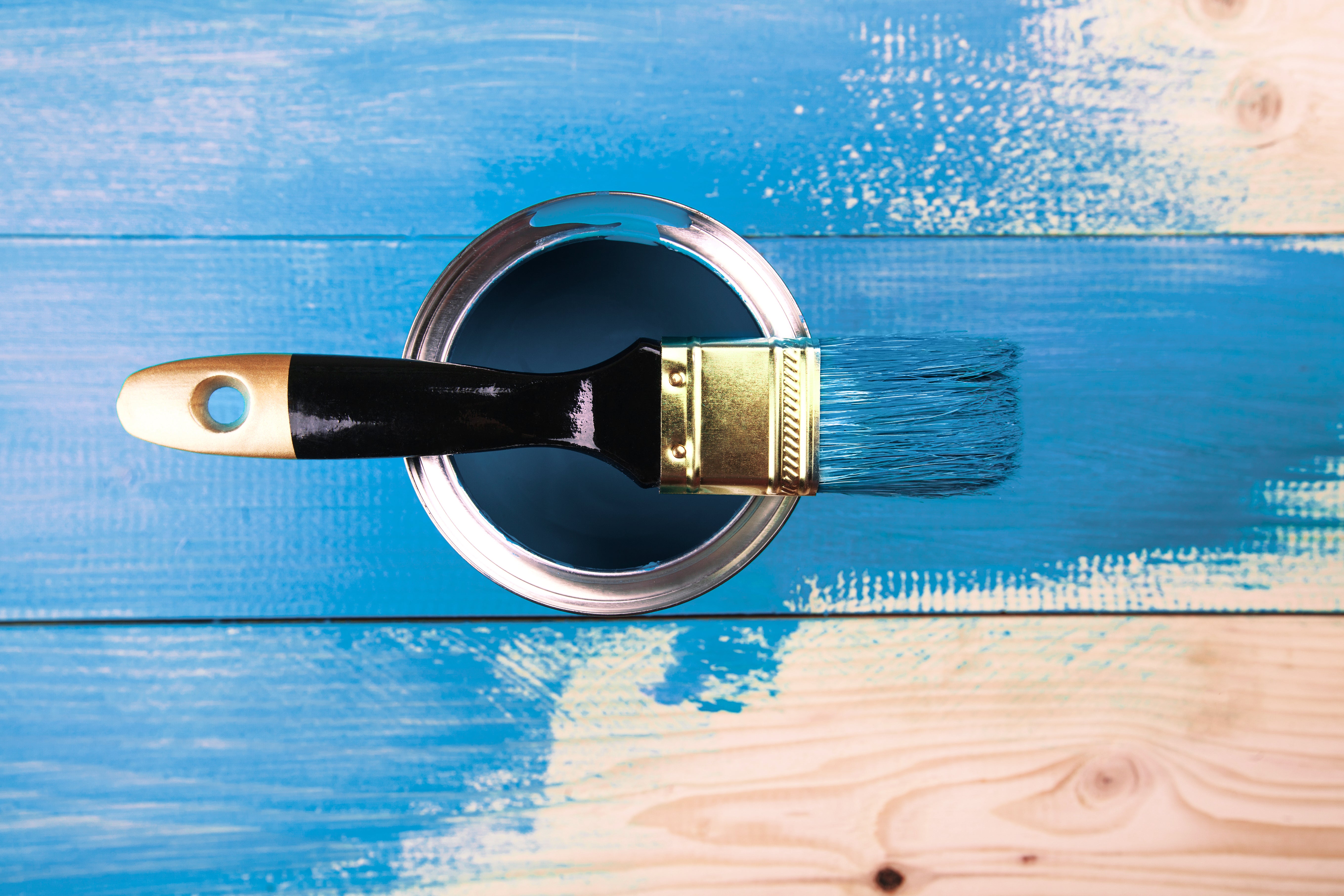
In December, Pantone anointed Classic Blue (that’s Pantone color #19-4052 if you’re keeping score) as the 2020 Color of the Year, setting off stylists around the world to get out their color chips. “It’s a color that anticipates what’s going to happen next,” said Laurie Pressman, the vice president of the Pantone Color Institute, which selects the Color of the Year. “What’s the future going to bring as we move into the evening hours?”
While other sources have been in the color-picking business for some time, this year in particular has brought out the prognosticators. Paint company Benjamin Moore picked First Light, a pinkish hue that it said reflects the morning, rather than Pantone’s evening. Also thinking pink is paint supplier Valspar—with Bombay Pink—and HGTV Home by Sherwin-Williams, which selected a blush shade called Romance.
Paint brand Sherwin-Williams—not to be confused with the aforementioned branded collaboration with HGTV—seemed to be on the same color wavelength as Pantone, naming Naval its choice for 2020. Yet another paint supplier, Behr, chose Back to Nature, an outdoor-inspired green; Glidden picked a blue-tinted gray called Whirlwind; and PPG gave the nod to Chinese Porcelain, another shade in the blue family.
But it’s not just paint companies making color picks. Etsy, the e-commerce site for handcrafted products, announced chartreuse as its choice, saying the bold shade of green is “known for increasing energy, encouraging unconventional thinking and evoking feelings of growth and harmony.” Trend forecasting company WGSN settled on “neo mint,” which looks exactly like it sounds.
Most of the paint companies’ predictions come in the context of an entire range of complementary tones—because if one color of the year is good, a dozen must be even better. And whether any of these forecasters consulted Chinese zodiac signs is another matter entirely. Now that we’re fully into the Year of the Rat on the Chinese calendar, feng shui aficionados say that gold, blue and green are considered particularly lucky colors for 2020, while we are urged to avoid yellow and brown.
Makes sense: Avoiding yellow and brown for your home and wardrobe is pretty sound advice to follow in almost any year.
____________
 Warren Shoulberg is the former editor in chief for several leading B2B publications. He has been a guest lecturer at the Columbia University Graduate School of Business; received honors from the International Furnishings and Design Association and the Fashion Institute of Technology; and been cited by The Wall Street Journal, The New York Times, The Washington Post, CNN and other media as a leading industry expert. He was also a guest on the BOH podcast, and his Retail Watch columns offer deep industry insights on major markets and product categories.
Homepage photo: Shutterstock.com


