In the BOH series What I Love, we’re asking designers to build us a mood board of what’s inspiring them right now.
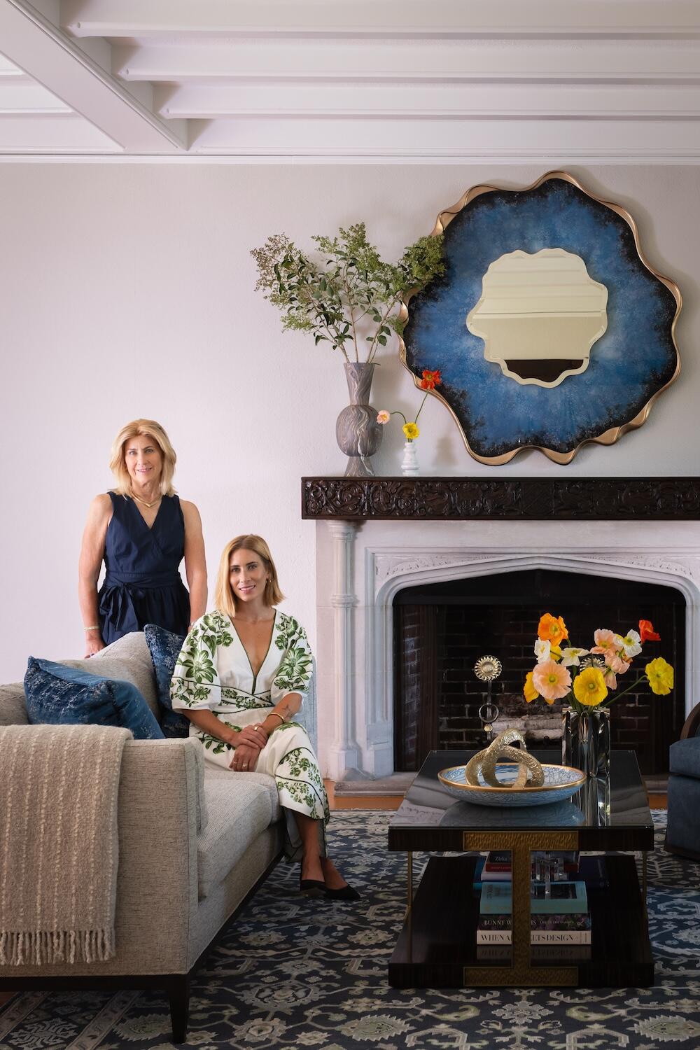
Susan Hayward and Jillian Hayward Schaible love rich mineral tones. The mother-daughter duo behind Milton, Massachusetts–based Hayward Design House gravitate toward warm, saturated hues (think amber, garnet and terra cotta) that bring depth and personality to a room.
The firm’s current mood board supplies a superlative case in point. Anchored by a kaleidoscopic Emma J Shipley fabric, the pair layered an array of gem-like shades that draw from the polychromatic upholstery pattern. “The fabric’s interesting colors allowed us to have fun with different jewel tones,” says Hayward Schaible.
The final scheme showcases a rainbow of bold but earthy textures and hues, ranging from a sapphire demilune pillow to a vase adorned with amethyst sisal grass. “The prints and shapes feel playful and light, while the colors and finishes add a luxurious feel to the flat lay,” she adds.
Here, Hayward Schaible breaks down the details, from fringe trim to polished brass hardware.
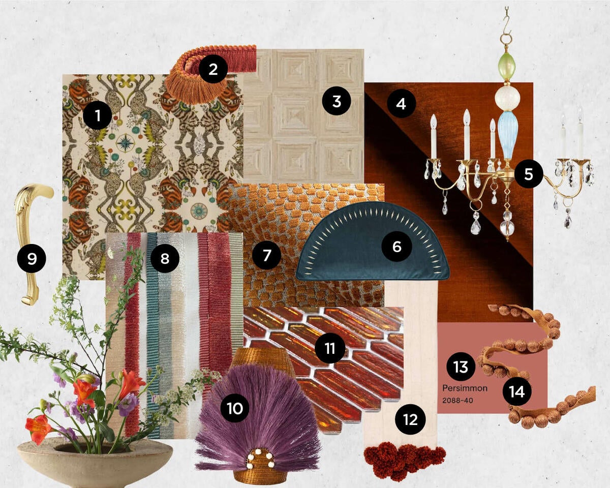
1. CASPIAN LINEN FABRIC IN GOLD BY EMMA J SHIPLEY
“Available in both linen fabric and wallcovering, this print inspired the foundation of our design. The mythical spin on this animal print feels playful yet elevated, with rich hues and interesting lines.”
2. SOJOURN FRINGE IN SUNSET BY KRAVET
“We love how this fringe plays off the lion’s mane in both texture and color. Paired with the Caspian fabric, it is the perfect addition to a custom pillow in this space.”
3. BAMBUSA 12x24 TILE IN CREMA WITH FASCIA TEXTURE BY BEST TILE
“The concentric squares in this tile add a three-dimensional feel to the floor, in a natural tone that pairs nicely with the overall palette.”
4. HIGH IMPACT FABRIC IN PERSIMMON BY KRAVET
“A rich, mottled velvet on a bench cushion pulls the rusty tone out from the lion’s mane in a simple yet beautiful fabric.”
5. ELLA CHANDELIER WITH VINTAGE MURANO GLASS BY LOUISE GASKILL COMPANY
“Each one of Louise Gaskill’s pieces are unique works of art. Using recycled Murano glass in blues and greens is a lovely complement to the Caspian print.”
6. MOAB DEMILUNE DECORATIVE PILLOW BY EASTERN ACCENTS
“Gem tones peppered into this space add contrast, and we loved the demilune shape of this pillow.”
7. FLURRIES FABRIC IN TERRACOTTA BY THOM FILICIA FOR KRAVET
“The raised [pattern of this] velvet fabric adds dimension and texture.”
8. BODENHAM FABRIC IN APRICOT BY KRAVET
“A pillow in this fabric would complement the mottled velvet.”
9. KENSINGTON DOOR PULL IN LIFETIME POLISHED BRASS BY BALDWIN
“We think of hardware as jewelry, and this door pull is both natural and elegant—the perfect accessory.”
10. FANNED OUT SMALL TALL VASE IN TOBACCO BY CHARLIE SPROUT
“Handmade vases in natural fibers are always a favorite, and the pairing of rusty orange with a soothing violet is an intriguing match.”
11. ARTEMIS POLISHED GLASS IN SUNSET BY SOHO STUDIO
“A polished glass tile for the wall catches the light to add extra shimmer and depth.”
12. SOLID MUDCLOTH POM POM THROW BY CHARLIE SPROUT
“We are always layering throws over seating for extra comfort and a lived-in feel.”
13. PERSIMMON PAINT BY BENJAMIN MOORE
“Persimmon is the crux of our color palette, a hue that encompasses earthy oranges and rosy undertones.”
14. JUTE BALL CORD IN CLAY BY KRAVET
“This jute ball cord is fun, natural and monochromatic.”


