Ah, summer in London: You could take in the city from atop the giant Eye; sync your iWatch with the OG, Big Ben; hail a horse-drawn carriage to Buckingham Palace in hopes of a surprise princess sighting; or pop in for a proper spot of tea at Harrods. Better yet, never mind that bollocks. For the next few weeks, far above and beyond such typical tourist fare, the definitive place to be is Design Centre, Chelsea Harbour for Wow!house—the most stylish edition to date.
Having just won House & Garden’s 2024 Spotlight Award this spring, the innovative showhouse proves the third time’s a charm with a brand-new cohort of A-listers, legends and rising stars behind each of its rooms. Founded by two industry vets, United in Design, Wow!house’s partner charity for 2024, addresses the lack of representation of Asian, Black and other minority or disadvantaged communities in the field. To help fund these efforts, a portion of all ticket sales will go to the organization. Other initiatives supporting its mission include special programming throughout the show’s run and an online directory of emerging talents across various disciplines—many of whose work can be seen in the myriad rooms.
Globe-trotters have till July 4 to get inspired in situ by the immersive, imaginative installations. After that—guided in part by the sustainability experts at Positive Luxury—absolutely everything, from mosaic clawfoot bathtubs to Murano swan–like chandeliers, must go ... on to another location or use, that is, reflecting Wow!house’s commitment to recycling and repurposing. So make like Shakespeare and get thee to England before then. To prepare, let the designers talk you through their rooms, from the fantastical Italianate entrance to the tropical island terrace at the end.
zoffany entrance hall
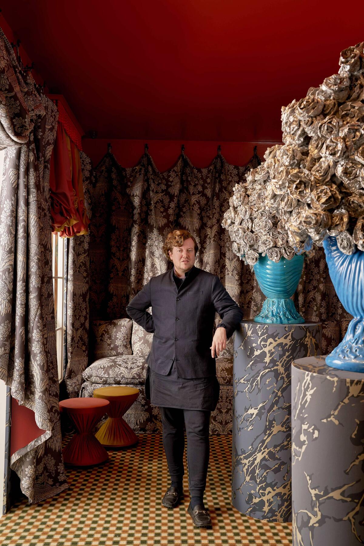
“In an ancient Sicilian palazzo swathed in damask and rich with the scent of roses, figures in incredible dresses swirl around the dance floor. It doesn’t matter whether Alain Delon or Claudia Cardinale is on your fantasy dance card: This room, evocative of the ballroom scene in Visconti’s 1963 cinematic epic Il Gattopardo, is a party we’d all love to be at! Although the design is based on historical research, I anticipate surprising people with how damask can be used to dramatic effect. I often look to the work of Maison Jansen and the stage-set magic of Oliver Messel: My installation of repurposed aluminum foil is inspired by both his work and Portuguese Baroque silver—a challenge I couldn’t resist! I was hugely privileged to use Zoffany’s woven, printed and embroidered fabrics, made through traditional techniques, going back to not only the great country house Temple Newsam, where the company was founded, but also several incredible mills across the U.K. Its Long Gallery brocade swathes the walls, while its sumptuous wool satin upholsters the sculptural banquette. Following Wow!house, the textiles will go on to a second-life exhibition in association with the Queen Elizabeth Scholarship Trust. We’re inviting a group of artists to create their own interpretations, which will be featured this fall at Voysey House, originally designed by the great Arts and Crafts architect C.F.A. Voysey for Arthur Sanderson and now Zoffany’s new London home.” —Benedict Foley
WATTS 1874 LEGEND ROOM
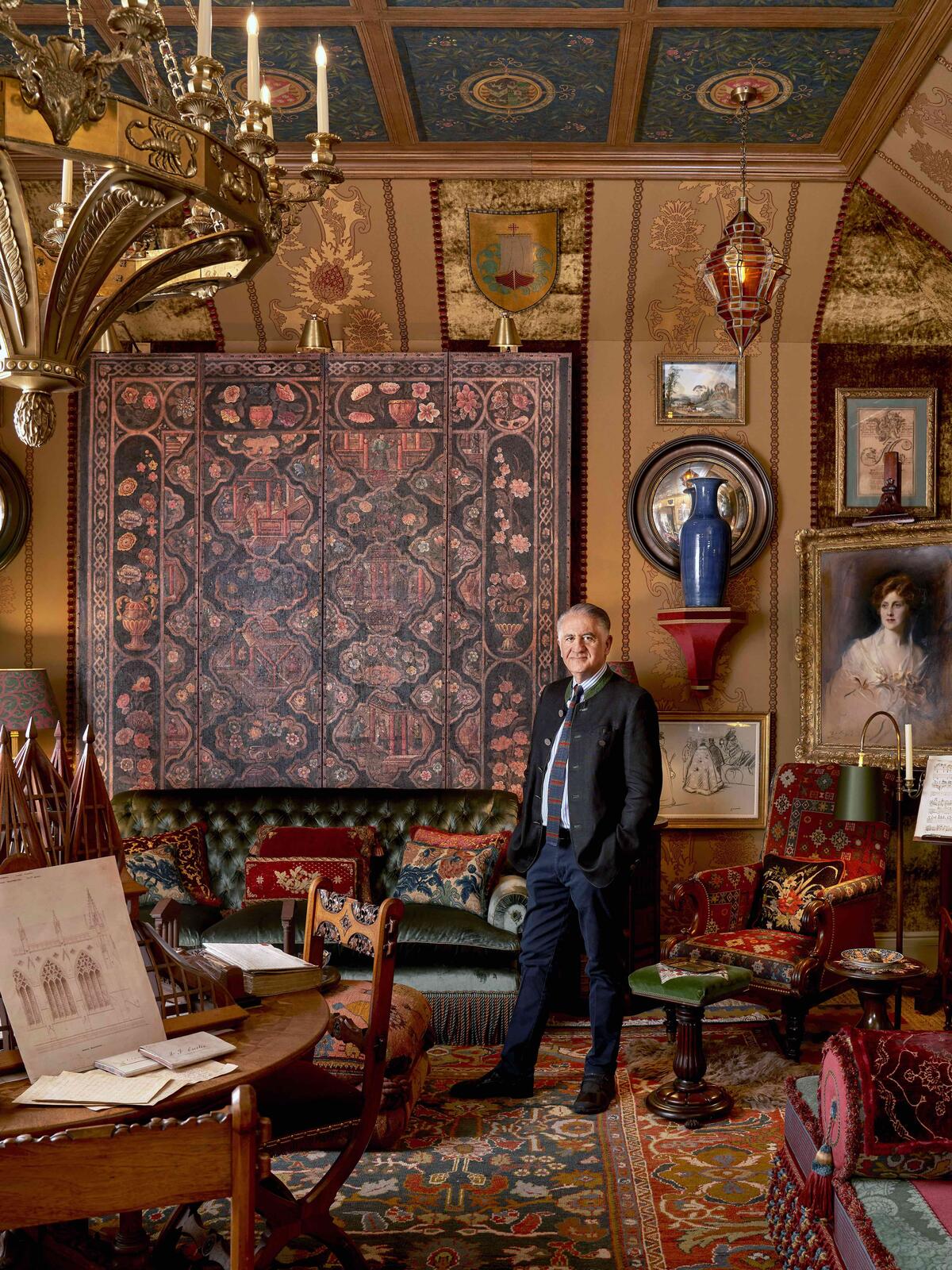
“The Gilbert Scotts were a dynasty of architects renowned for the Gothic Revival churches and buildings they designed in the 19th century, and George Gilbert Scott Jr. (sometimes known as ‘Middle Scott’) co-founded architecture and design firm Watts & Company 150 years ago. In honor of their legacy, and this milestone anniversary, this room represents a private space where they could work, receive friends, eat, rest and reflect. The fabrics and trimmings Watts 1874 produces today are another inspiration. I was compelled to bring in many different elements for my imagined Gilbert Scott characters, so I went through the Watts archive, focusing on fabrics that were initially inspired by 15th and 16th century Italian velvets, and came up with a scheme. Many of the velvets were red, but I refined the palette to more of a tobacco—as seen in the terra cotta Constantinople pattern. Around an immense, ecclesiastical stone fireplace from Westland London, I used as many antique pieces and textiles as possible, the beauty of it being that they marry well with the Watts fabrics. The result is a textured room that looks as if it’s been there forever, with each new generation of the family adding its mark over time.” —Alidad
THE STUDIO FOR DEDAR
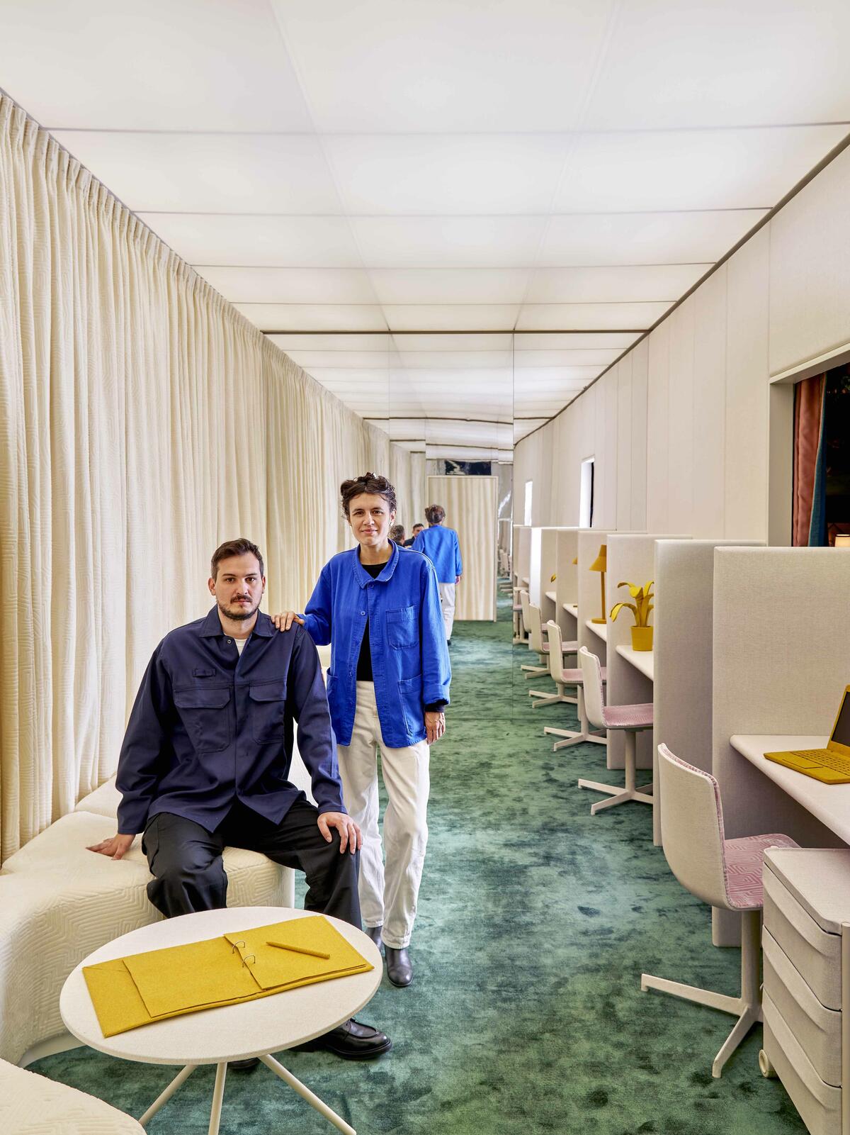
“Appearing as a sculpture whose profile echoes the lines of Dedar’s Déjà Vu Jamais in Ivory—a jacquard velvet in Egyptian makò cotton evoking a labyrinthine path marked by ancestral engravings—the sofa plays the main role in our minimalist, monochromatic room. It’s a characterful element, reinforced by the same fabric for the curtains. Considering that textiles are capable of communicating through color (or the absence of it), white is the primary hue, spaced out with a few brighter dots as accents. The intrinsic and expressive qualities of Dedar’s yarns—from the cubist-influenced Jamu Jungle jacquard to Didgeridoo, a raffia weft interlaced with a linen warp—dominate the space and are reiterated infinitely by the mirrored back wall. The softness of the sofa embodies the home side of this contemporary studio-office, while sharper forms depict the traditional work cubicle. Combined, they present a cynical interpretation of modern life, in which home and office merge to become hybrids. The lyrics of ‘Senza Fine’—‘Without End’ in English—by Italian singer Gino Paoli perfectly fit this theme, giving the room its name. The song is the central track on its playlist.” —Nicola Campri and Claudia Mainardi, Fosbury Architecture
THE RUG COMPANY DINING ROOM
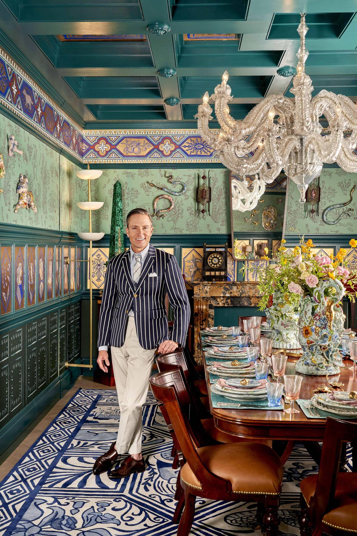
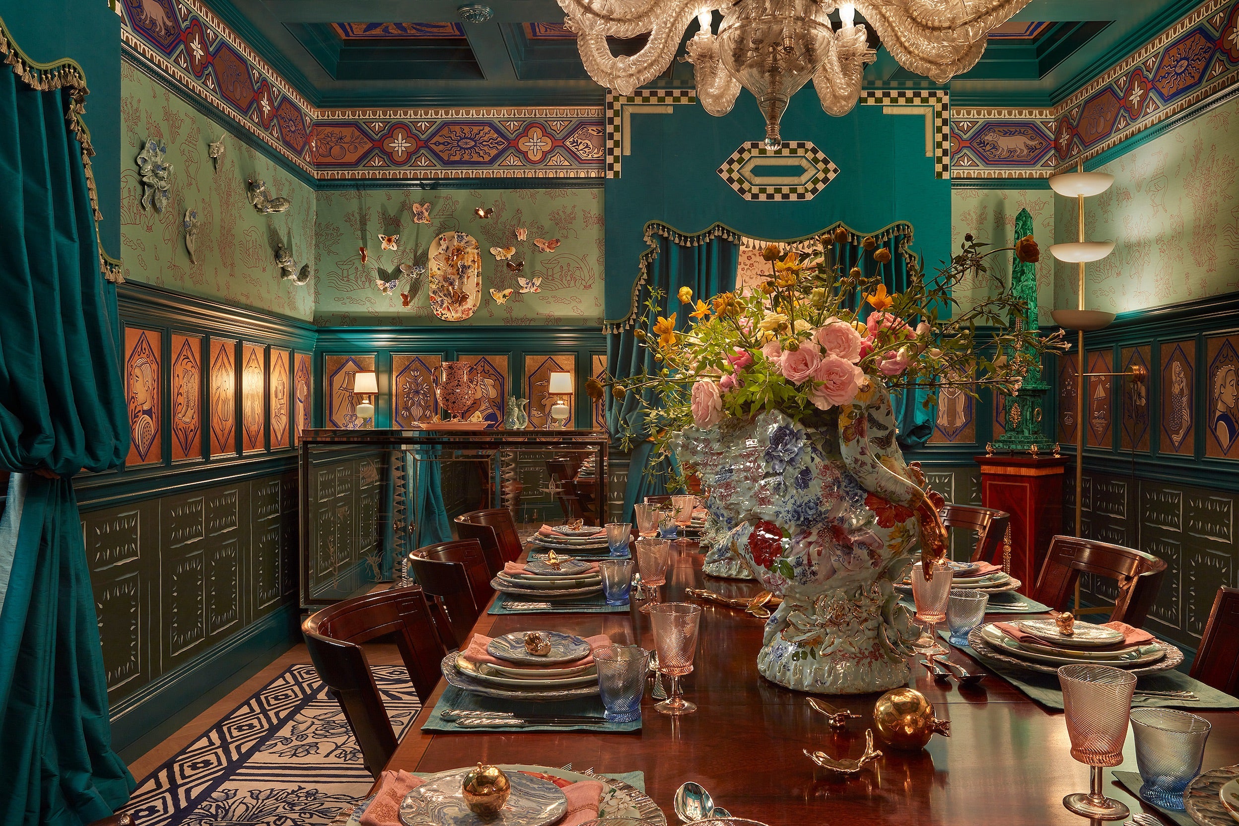
“The Transmutation 1 chandelier by Thierry Jeannot serves as our anchor. It appears at first glance as an exquisite crystal fixture, but upon closer inspection reveals itself to be made from meticulously cut pieces of recycled plastic, challenging our preconceptions about the value of materials and what constitutes luxury. The French-born, Mexico City–based artist first hand-crafted this design in 2011 from local trash, with sustainability and social equity in mind: Jeannot teaches disadvantaged people which bottles to salvage and employs them in the production process. In contrast to that contemporary piece, a bespoke offering made with The Rug Company called A Life Reflected is inspired by the storytelling traditions in delft and azulejo tile work dating to the 14th century. Fromental helped create a custom wallcovering to complement it, and for yet more historical context, we’ve set them within our interpretation of William Morris’s legendary Green Dining Room at the Victoria and Albert Museum, merging the carpet’s blue-and-cream colorway with a surrounding blue-green palette. Most of the furnishings are antiques, topped by vintage accessories. Linda Fahey, a ceramicist from San Francisco, crafted a pair of swan centerpieces, as well as dinnerware and creatures that ‘climb’ the walls, all from porcelain that’s individually collaged in a modern variation on the transferware technique. By reflecting both the hand-made beauty of bygone eras and decorative arts from all over the world, our goal is to delight guests with aesthetics at every turn—underfoot, overhead, on the table—creating the ultimate setting for a romantic summer brunch.” —Ken Fulk
TISSUS D’HÉLÈNE DRAWING ROOM
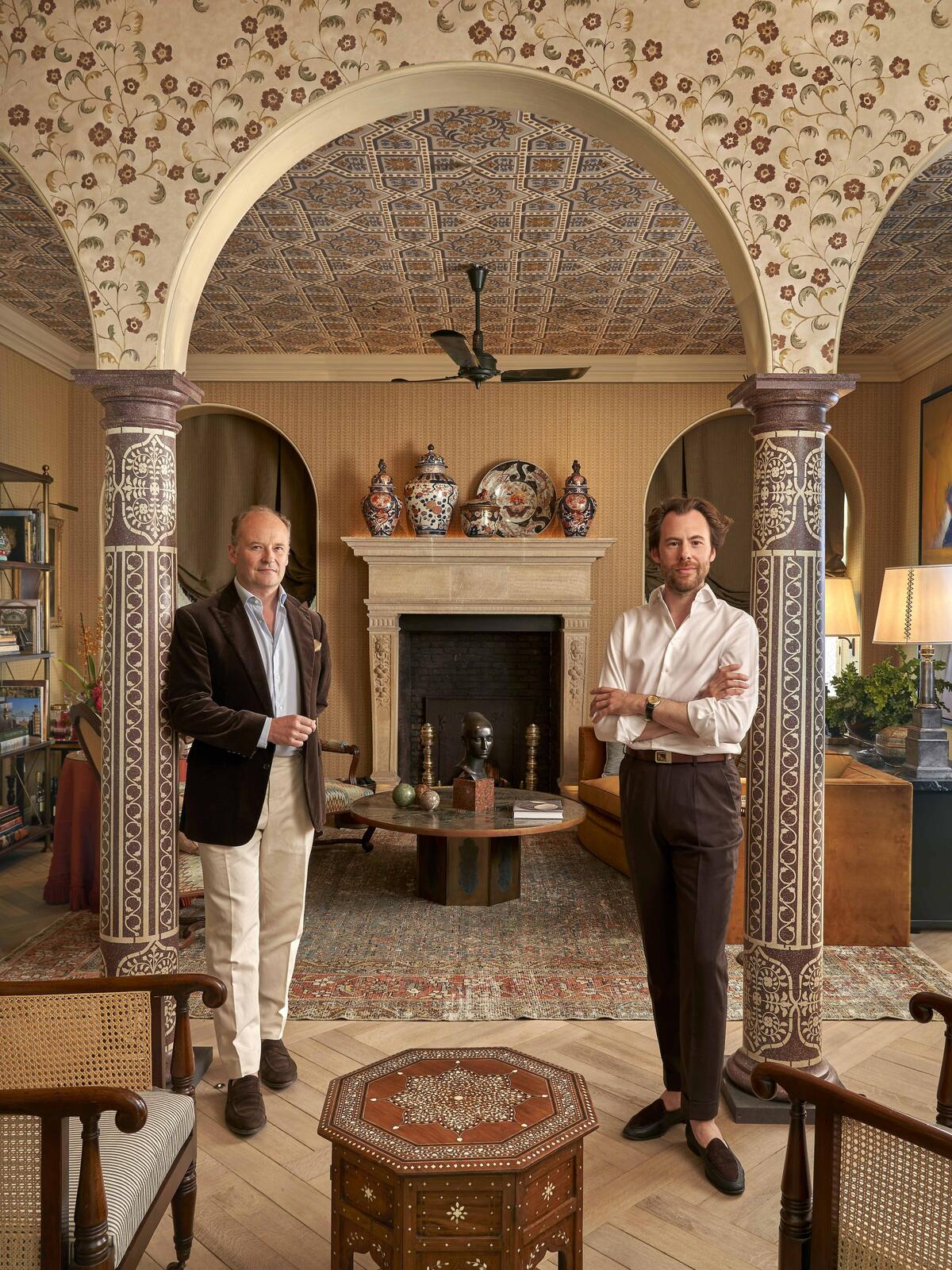
“As with all our projects, we started with architecture as the foundational element, constructing a colonnade to encourage visitors to weave through the space. Next came the antique French limestone fireplace from Thornhill Galleries, its monumental proportions providing a focal point. Nothing in our design is prescriptive or predictable, an ethos evident in a custom-made, block-printed linen called Tulsi Bagan co-created with Namay Samay that gives the impression of a coffered ceiling. Our colors reference classic patinas, mixing ochers, greens and blues. Layered umbers and enveloping cognacs in the embroideries and velvets meet a slate-gray ceiling, which cools the room and connects with the bone-dry gray parquet flooring. Balancing rich burnishing with a pared-back historical veneer, the palette feels established in time. Even the brass étagère and wall lights have a dusting of age. Inspired by a classic country house, this design conveys the sense of comfortable, underplayed elegance that comes with early summer evenings, when the sun is dipping low and everyone congregates in the drawing room to while away the hours, cocktail in hand.” —Guy Goodfellow
JAMB LONDON PRIMARY BEDROOM
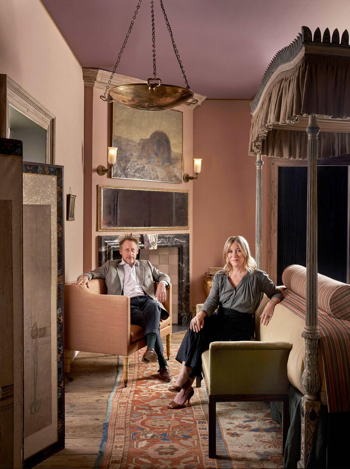
“Rooms that reverberate with echoes of the past are where we feel most at home. That’s why this bedroom recalls the early 20th century—the last great era of the English country house. We were drawn to the aura of prewar affluence in Edwardian England, a time of prestige and power, on the cusp of great change. It was also a period of decadence, and the silk walls and Italian marble of our bedroom live up to this. Velázquez’s portrait of Queen Isabel of Spain became the basis of our color palette: She poses before a grand curtain of dusky pink blushing to deep rose, her black-and-gold dress standing out with great elegance, her lead-white face and hands delicate upon its exquisite form. But through our choice of materials, we also tempered the sumptuous details in pursuit of a faded opulence. While the pink silk walls from Claremont could easily have been commissioned by a sultan, we contrasted this with cornices and doorframes not dissimilar in character to driftwood. The interplay between materials also had to be just right. The black lacquer coromandel cabinet from China, an embroidered lion from West Africa and a 19th century paisley textile from India showcase the diversity of our influences. Hand-dyed linens, Grigio Carnico and Breccia Medicea marbles for the fireplace, and duck egg tiles are all in happy conversation. Ironically, we relied on technology to travel back in time, replicating the soft glow of candles with TM Lighting. Part of our new trio of four-poster beds, the Palmira is a reproduction of an exceptionally carved Chippendale-era piece, the posts painted and then distressed so that they assume the dry, layered surface of an antique. The hope is that it becomes something of a stage, on top of which sits the room’s protagonist.” —Will Fisher and Charlotte Freemantle, Jamb London
HOUSE OF ROHL PRIMARY BATHROOM
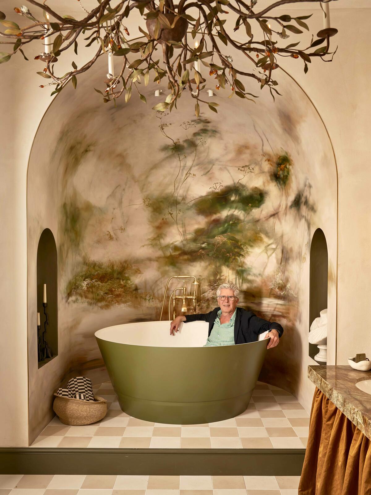
“Like in the Met Gala’s theme, ‘The Garden of Time,’ nature strongly influences the design of our bathroom. House of Rohl’s opulent Victoria + Albert Taizu tub serves as the dramatic centerpiece. In bespoke olive green, it’s the ultimate main character. A collaboration between the brand and renowned Hong Kong–based designer Steve Leung, it’s inspired by the porcelain of the Song dynasty and is a natural fit with the space’s curvaceous framework, notably the up-lit domed wall decorated with an ethereal mural by French artist Claire Basler, whom we commissioned for her outstanding ability to encapsulate both serenity and a sense of movement. The surrounding layout includes transitional areas to shower and rest, designated by a checkerboard application of three different-sized tiles from Mosaic Factory to whimsically delineate the space. The smaller the tile, the more private the area becomes—something we refer to as the ‘Alice in Wonderland effect.’ Koyohen border tiles in Vintage Green from Raven were chosen for their amber flecks, which echo the warm tones in the wood accents and marble vanity. Placed vertically, they extenuate the curvature of the shower. The remaining walls and ceiling are rendered in Clayworks, a plaster manufactured in Cornwall from abundant raw materials to provide breathable, low-carbon finishes.” —Christina Gregoriou and Rina Kukaj, Michaelis Boyd
COLEFAX AND FOWLER MORNING ROOM
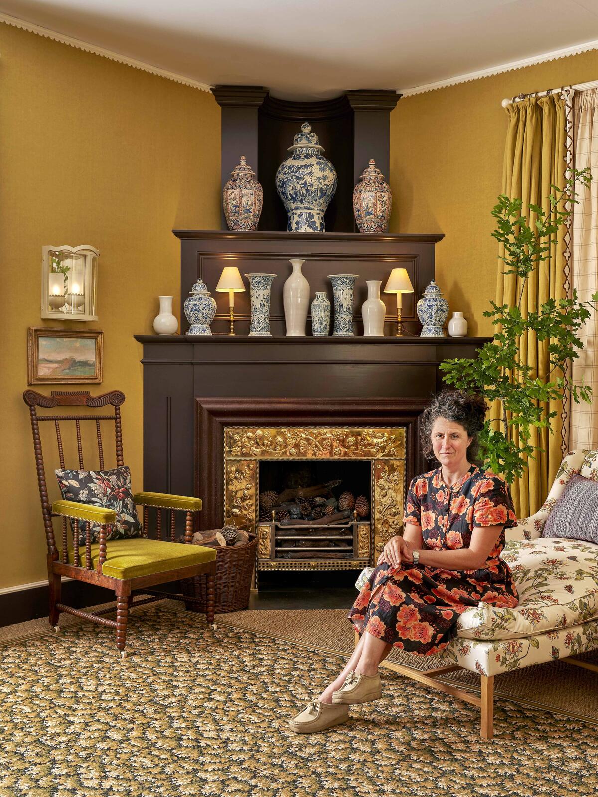
“Nothing is more glorious than being in a sun-filled room. To convey that warmth, I’ve wrapped the walls in Sound, a gorgeous saffron-yellow linen, and used the same fabric for the curtains, lined in Honeysuckle chintz and trimmed with Gothic Stripe block-printed by hand on raw silk exclusively for this space. Everything else stems from that. Traditionally, a morning room faces east, to be used early in the day to get the most out of the light. I imagined this as an informal space in a country house, where you could throw open the windows and let the outside in. It has everything—a daybed for naps, a desk to write at, a full bookcase, and beautiful accents like delft vases on the mantel and abstract landscapes on the wall. While the fabric wallcovering is soft and cozy, the corner fireplace intimates the solidity of an old building. Gibilaro Design fitted their magnificent brass grate with a clever water-vapor fire. It’s actually pretty low-tech, but fun to suggest flames in the hearth. I’ve balanced it with the enormous daybed opposite, which is based on a sofa in famed Chanel jewelry designer Fulco di Verdura’s flat. It’s one to throw myriad pillows on and get lost in. The green, brown and black rug grounds the space, and cushions made from antique textiles add patterns that reference different times and places, as well as resonating with the dominant yellow and a pair of David Hockney iPad paintings. For the soundtrack, I’ve chosen birdsong—to remind us all to breathe!” —Lucy Hammond Giles
McKINNON AND HARRIS COURTYARD
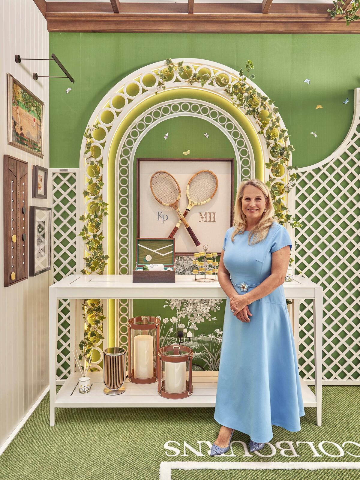
“Little details, down to the custom-monogrammed tennis balls from Anya Hindmarch, were important in creating a playful theme that feels real and wonderfully immersive, capturing the style and historical formality of an English tennis pavilion. I like to imagine Roger Federer just out of view, gone to get a refreshing glass of water between games. Central to the design is a favorite item of mine: the iconic Dr. Johnson tennis umpire chair by outdoor furniture specialists McKinnon and Harris. An elegant interpretation of the classic piece, it’s the star of the space. (There was a question of whether it would fit, but with careful 3D modeling, it did. Phew!) Cascades of pink silk roses clamber up the white trelliswork for a touch of color, framing the silk wallpaper, hand-painted by Fromental with botanical scenes in our brand-new Chelsea Green hue. The pattern is part of our An English Butterfly Garden collection, which raises funds for the British charity Butterfly Conservation, and we’ve hidden little mice, hedgehogs, and a smattering of bumblebees and butterflies in it, so there’s plenty of fauna to spot among the foliage. Paired with the bespoke Tennis Lawn rug by Colbourns, featuring dappled green shag pile intercut with woven white service lines to look just like a grass court, it creates an enveloping hit of lush greenery. The scent of orange blossoms diffused throughout the room adds to the sensation of being in an English summer garden, while strawberry-and-cream truffles from Charbonnel et Walker served alongside scones and champagne will convince visitors they’re courtside at Wimbledon. It’s tennis heaven!” —Katharine Pooley
SCHUMACHER COURTYARD BEDROOM
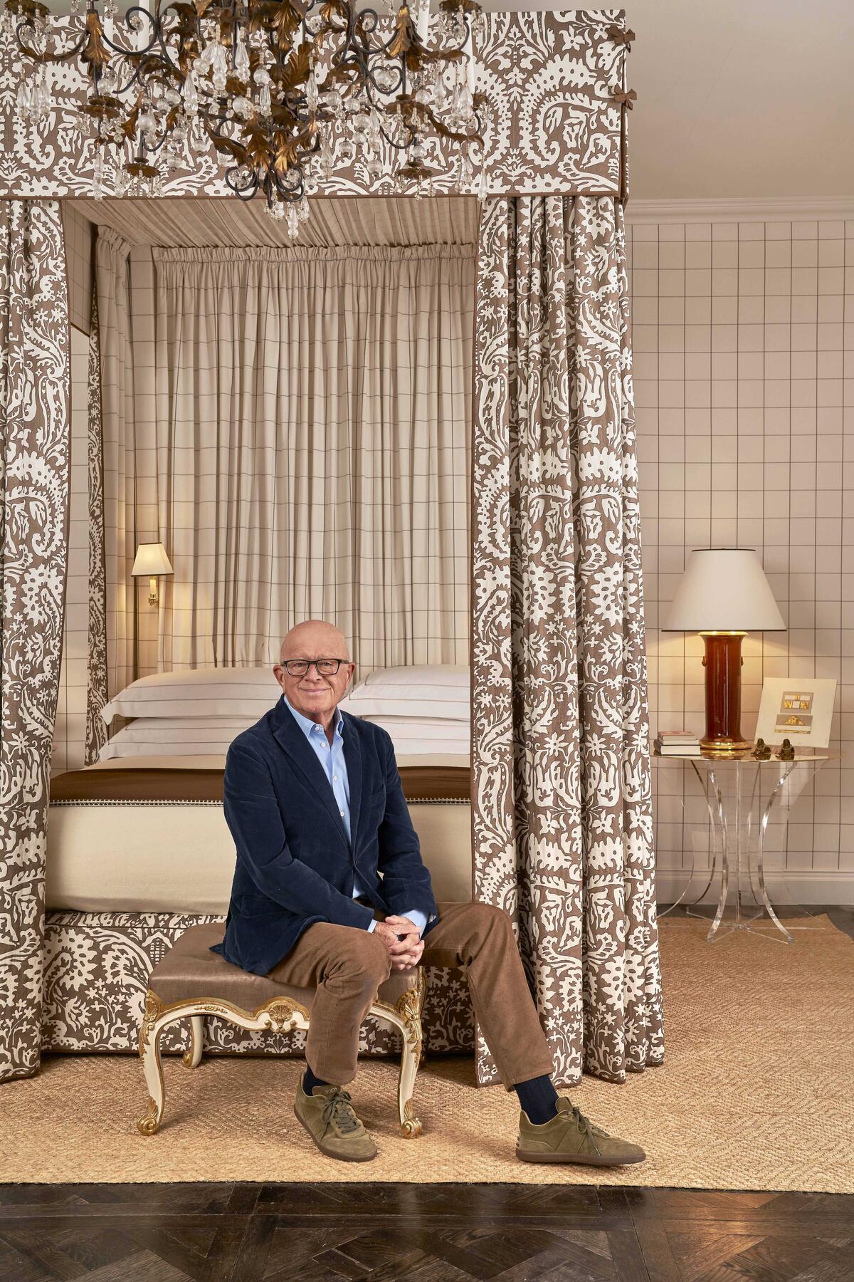
“The essence is from the 1960s and ’70s. The Rupert Bevan mirrored chimney breast, polished parquet flooring and abaca rug all reflect influences from my career over the past 40 years. We’re known for our four-poster beds in lavish large rooms that also have a desk, a comfortable chair and other elements—I love designing bedrooms that are also sitting rooms. The Woodman check, the Suffolk damask: All the fabrics are from my new Schumacher collection. If we can, we always upholster the walls in a bedroom. It gives a lovely resonance and makes it feel cozier. It could have been blue or green, but as a nod to David Hicks, I chose chocolate brown. It could be argued that chocolate is timeless.” —Veere Grenney
ZIMMER + ROHDE BEDROOM SUITE
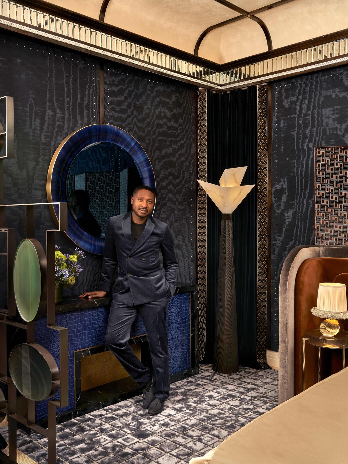
“While every piece in the suite is special, carrying its own bespoke story, I have a particular fondness for the work of my muse, Sor Sen, an artist based in Abuja, Nigeria. The two oil paintings, Entwined III and Soaking It In All II, were specially commissioned for this space. Incorporating elements of my heritage into my designs allows me to showcase the extraordinary talent from my homeland and support their remarkable artistry. These paintings add a personal and cultural touch that enriches the room’s overall narrative. Its primary theme is the art of travel, inspired by the elegance and allure of the Orient Express—a concept that emerged as I delved into Zimmer + Rohde’s 125-year-old archive, uncovering fascinating connections to that golden age. I was struck by the iconic textiles from the early 20th century. From appliqués to jacquards, they embody a tradition of craftsmanship. Choosing the fabrics was a thoughtful process. It started with Dimora, an exquisite blue moiré renowned for its movement, on the walls. From there I worked with Will Foster Studios to create custom finishes—faux bois to match the polished mahogany, faux vellum for the ceiling, and faux marbling to replicate the luxurious look of the Nero Marquina fireplace—all executed by hand with such precision that they blend seamlessly with the original materials. Collaborating with Brooklyn sound designers Gray V, we curated an ambient soundtrack that elevates the atmosphere. The effect is transcendent, taking guests back to a time of opulence, when journeying was as much about the experience as the destination.” —Tolù Adèkó
SICIS BATHROOM
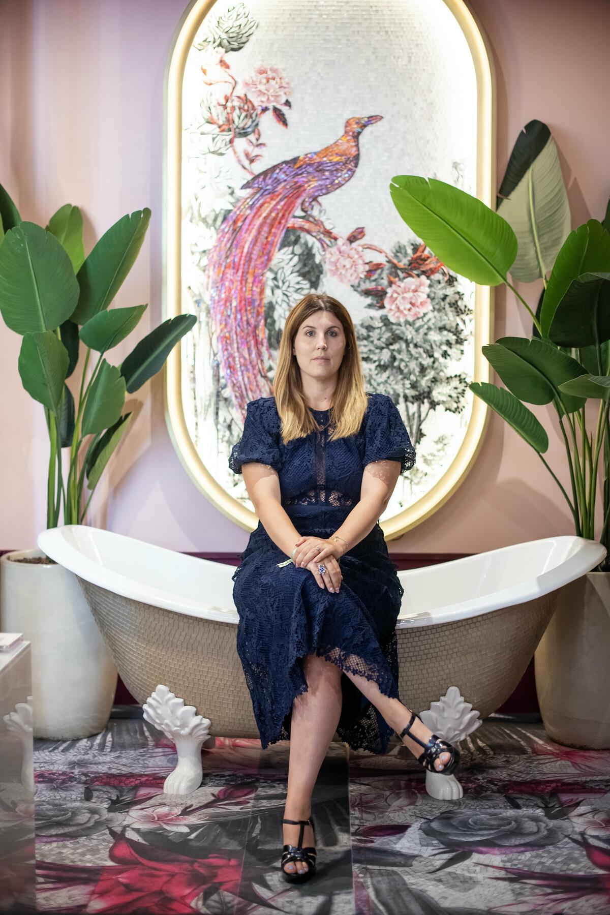
“An oasis of luxury designed for relaxation and rejuvenation before a gala evening, our bathroom celebrates ‘harmony in contrast,’ juxtaposing materials, textures and colors. Blending timeless and modern elements, we achieved balance and intrigue through unexpected pairings, such as rough surfaces with smooth, and minimalist with more ornate accents. The Alba bathtub, hand-tiled in the Colibrì Chantal mosaic; Vetrite glass plinths supporting delicate oval washbasins; and Mystic Flower faux mosaic wallcovering, all crafted by Sicis, convey these contrasts. Symbolizing the vibrant beauty of nature in full bloom, the palette incorporates a dynamic range of colors that mirror the myriad hues found in springtime. Glass slabs and hand-painted wallpaper, along with the mosaic, evoke the tactile essence of that seasonal awakening. To enhance the natural light, we added strategic fixtures and reflective surfaces. Doing so opened up the perception of space.” —Maurizio Leo Placuzzi
CHASE ERWIN LIBRARY
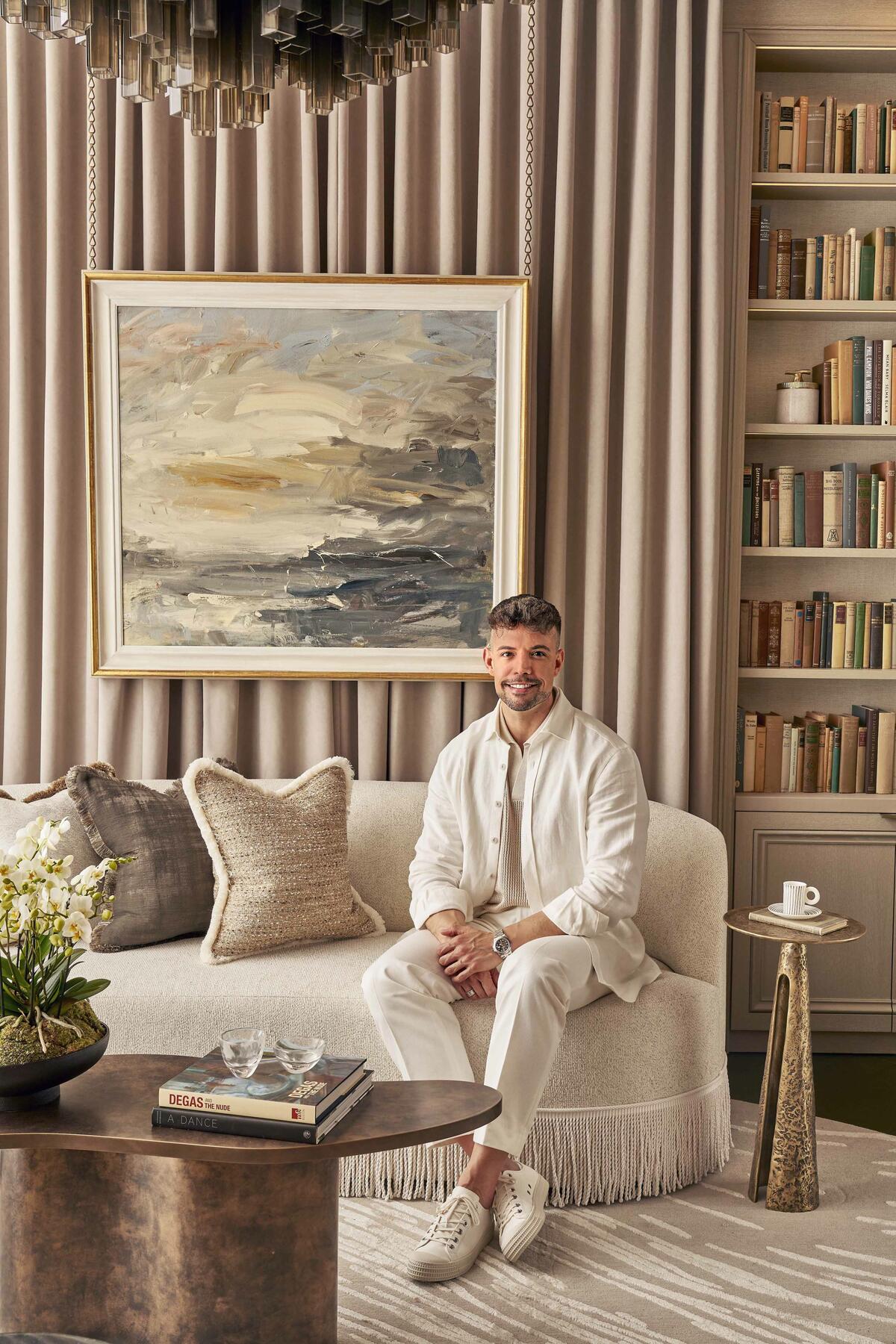
“I attended the English National Ballet School when I first moved to London, and in my opinion, Swan Lake remains the epitome of elegance and romanticism. These influences informed my design. Usually, libraries are heavy and dark and filled with joinery. By adopting a lighter color scheme and lots of freestanding furniture in addition to pale built-in bookcases, this became a fresher space. I opted for a warm, earthy palette favoring browns, mustard and deep forest green. Chase Erwin has the most delicious fabrics. Selecting an assortment from old and new collections for the upholstery and throw pillows, I felt like a kid in a candy store. To create a cocoon, I wrapped the room with sumptuous walls of curtains reminiscent of the heavy drapery found in theaters. I also translated balletic references to interiors, using swivel armchairs I designed for The Sofa & Chair Company, decadent tassels and bullion fringe, even secret doors. Atop a green leather floor, the rug resembles the rippling surface of water, and on the ceiling, Fromental wallpaper provides a stylized forest. Suspended between the two, Fiona McDonald’s Murano glass Thea chandelier recalls the feathered costumes of Tchaikovsky’s swans. It’s enchanting. I also love the Miami cocktail cabinet from Rupert Bevan: Its mirrored surfaces remind me of reflections in a lake.” —Andrea Benedettini
THE STUDY
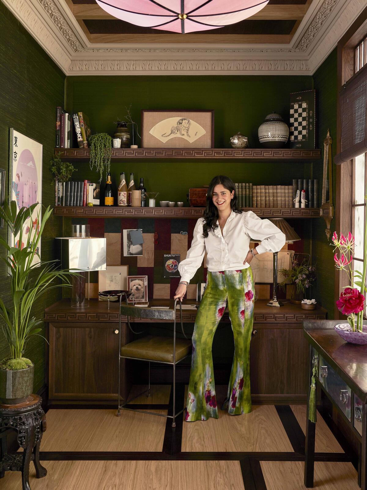
“Living in Hong Kong for many years, I traveled often to Japan, inspired by the design there. I’ve fused this love with my admiration for England’s beautiful Georgian cities. I referenced their proportions when dividing up the study, taking the traditional timber flooring of drawing rooms and adapting it to a tatami five-module system, which has a central square piece. Much of the layout was dictated by the shoji screen. We created it using traditional paper, modifying the scale to align with Georgian windows and backlighting it with tree silhouettes. Conceptually, having such large windows and abundant natural light meant we could go darker with the walls, so I chose a silk wallcovering in forest green from James Hare. Because the room had to feel comfortable and well-lived-in, I opted for antiques and materials like silk, adding a sense of the contemporary with stainless steel. I love the shape of the rotating Mini Castle cocktail chairs I created with Kuhn Upholstery: The bottom pleats are inspired by battlements. The pattern of the corkboard above the desk was abstracted from a Japanese kimono. It pairs expertly with the custom Ebisu modular shelving unit made from stained walnut by joinery specialists Hannaford, and provides such an interesting backdrop for the Brajak Vitberg desk lamp from The Oblist.” —Anahita Rigby
thE SITTING ROOM
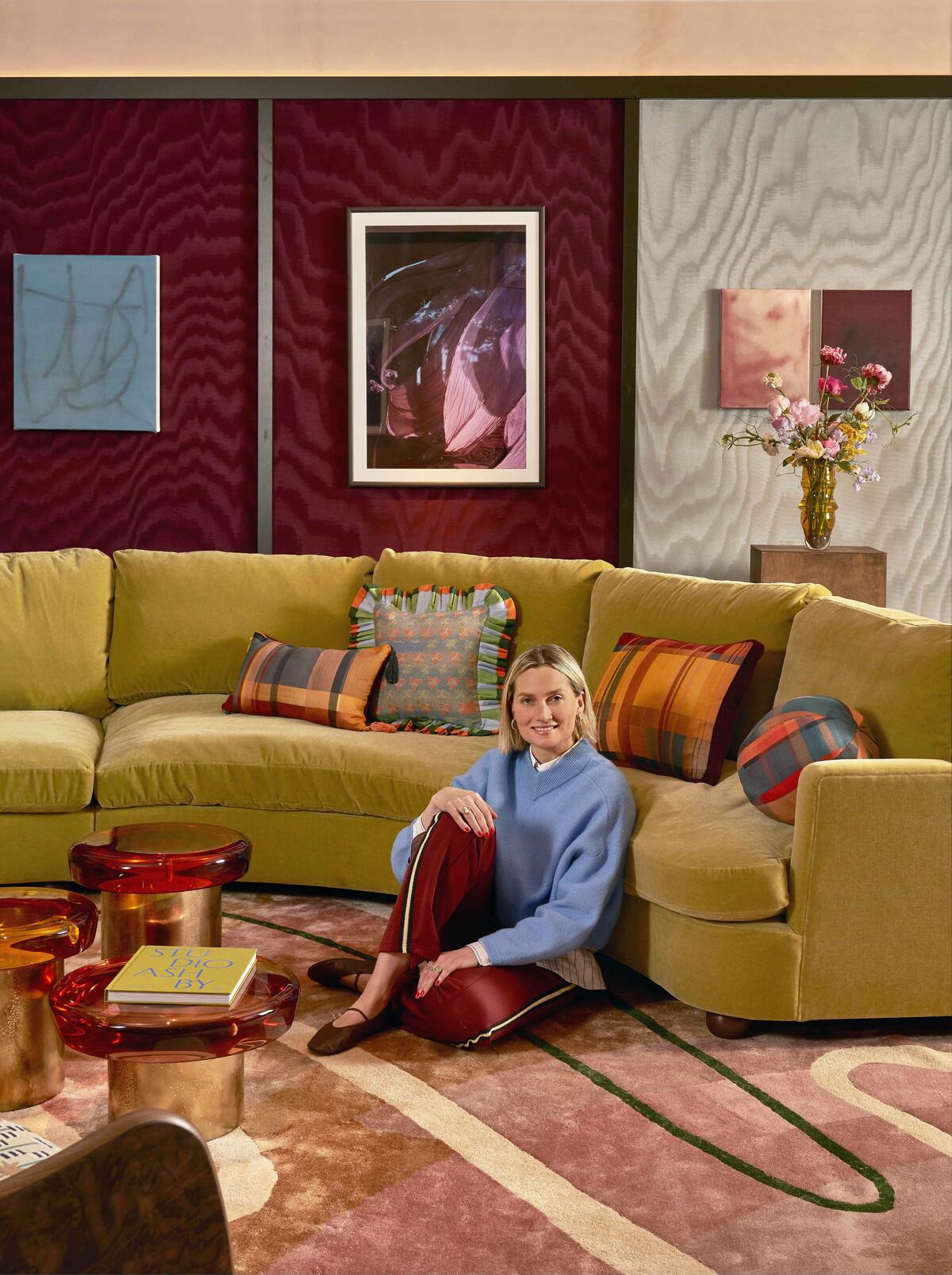
“Charlie [Casely-Hayford] and I moved last year and are in a new home that we haven’t done anything to yet, so I had fun imagining what our sitting room might look like in this new chapter of family life, with three children and all the happy chaos that brings. This space is designed to hold us all in familiarity and comfort, individually and together. It’s a soulful, Sunday afternoon feeling. In partnership with the charity I co-founded, United in Design, I filled the room with pieces from my favorite emerging professionals and friends. The abstract rug by Priya Ahluwalia for Shame Studios is a masterpiece: It sets the tone. For seating, I chose the Dining Windsor by Wilkinson & Rivera and the Sculpted Arc sofa from our own Sister by Studio Ashby line. I wanted to use materials in their simplest forms: wool, silk, mohair and oak. And I’ve been curious to experiment with cork flooring, which has a lovely matte finish. For lighting, we opted for the sculptural Daub lamp by B.C. Joshua and the minimalist Marsha lamp in Honey Amber by Meseme. We have a beautiful portrait by London-based photographer Lily Bertrand-Webb; paintings by Rejina Pyo; and sculptural vessels by Jahday Ford, Millie Harris and Darren Appiagyei scattered across plinths and shelves. The palette centers soft, earthy tones that blend with the natural materials throughout. The deep blues in Bertrand-Webb’s portrait offer a refreshing point of contrast to the warm neutrals—evocative of a clear summer sky.” —Sophie Ashby
THE DINING SPACE
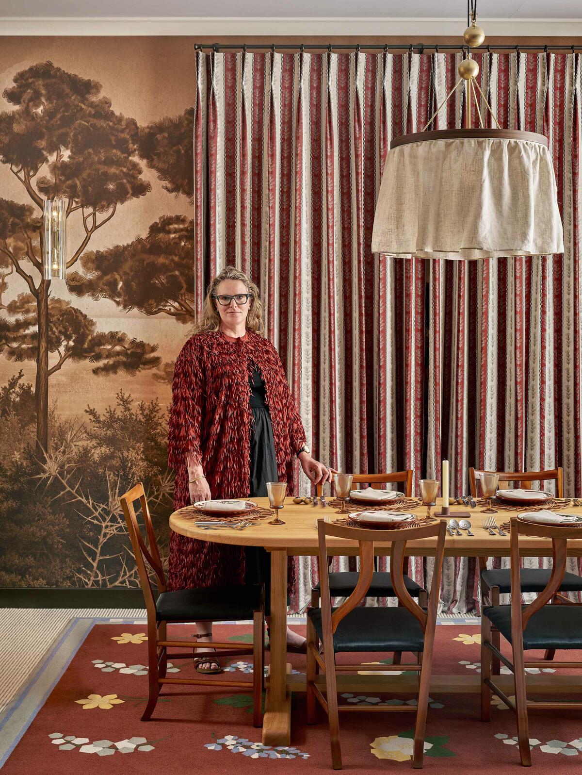
“A bespoke Adam Ellis treescape in earthy hues immediately immerses you in the warmth of the room, complemented by a statement tile fireplace in similar tones. To create it, we worked with Robert Emile Atelier, who supplies hand-crafted Moroccan bejmat tiles in incredible colors and irregular finishes. This natural palette formed the basis for the fabrics, furniture and lighting to follow. Custom-made by The Rug Company to mimic the flora in my Cornwall garden, the hand-tufted rug is another highlight—and the perfect foundation for interesting vintage pieces like the astonishing astrological table from Hone Gallery and the circa-1950s dining chairs designed by Josef Frank for Svenskt Tenn. I wanted it to feel not like a traditional dining space. Dividing it up into separate zones linked by color and texture allows for more flexibility and the option of having one or two different dining areas depending on the occasion.” —Suzy Hoodless
tHE HOME BAR
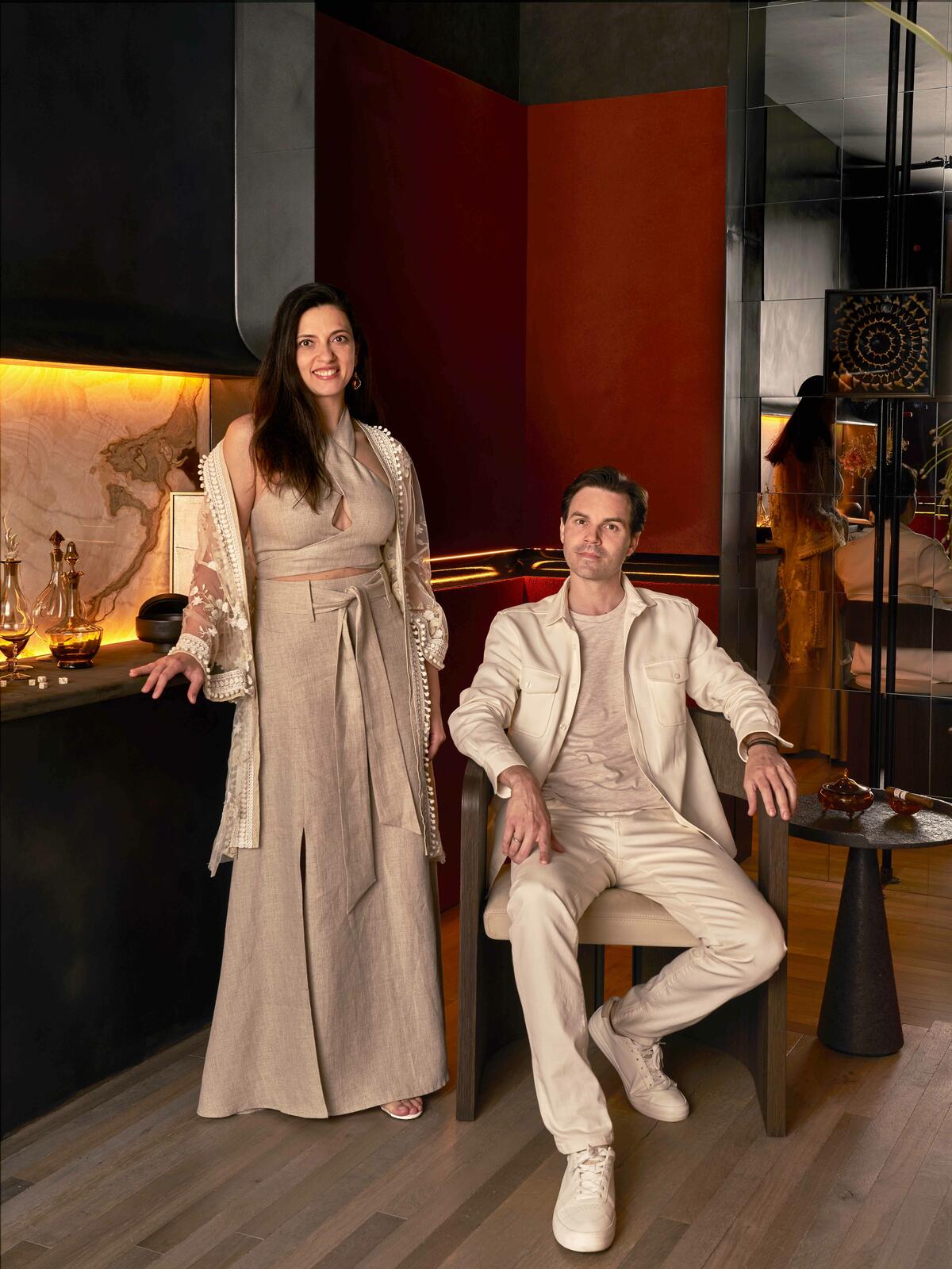
“Returning home at the end of the workday, just before dinner—or right after a long meal—a sanctuary for relaxation, contemplation and socializing welcomes you. Reach out to the sleek, bronze-accented bar and pour yourself a drink. As it calms you, unwind in the comfortable Aeneas lounge chair, rest your glass on the Perseus side table—both from Warrior, our debut furniture collection—and savor some alone time with your thoughts. Or on celebratory days, invite your family and friends in and let them thrill to the discovery of its curated details. This is a room for those who appreciate the finer things. Marrying the delicate sensibilities of the East with the streamlined aesthetic of the West, it pays homage to the heritage of our ancestors through the use of traditional materials and techniques. But we’re also forging a new language of design, one that challenges conventions—highlighted, literally, by the bespoke scheme we conceived with DesignPlusLight, PSLab and Flux London. It’s about creating something fresh and forward-thinking while still drawing inspiration from the past, captivating all who experience it.” —Özge Öztürk and Alexandre Simeray, Oza Design
MARTIN MOORE KITCHEN
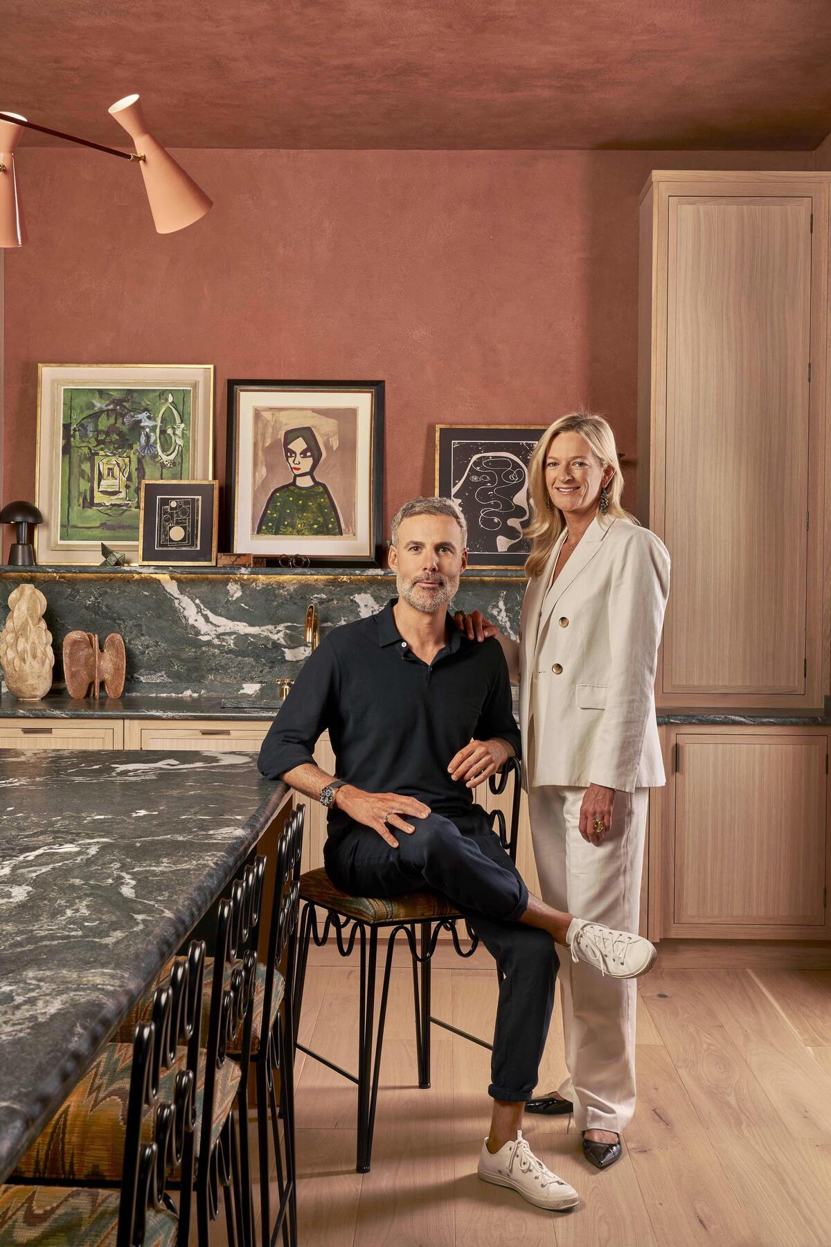
“Working with Yorkshire-based luxury furniture makers Martin Moore, we’ve concocted a kitchen that’s more than just a place to cook. It’s a space with personality, filled with art and decorative objects, yet nothing is gratuitous. Grounded by the furnishings, there’s an emphasis on finishes: brass, hand-made Moroccan tiles and—most dramatically—dark green quartz worktops. Excitingly, Martin Moore is showcasing its new Legacy 50th anniversary collection. Crafted from natural oak in a pale washed finish, it’s subtle and elegant, the cool tone of the wood letting the room’s more reflective elements pop. Fitted with professional-grade features, state-of-the-art Gaggenau appliances are perfect for serious home chefs and complement the clean lines of the Legacy pieces. In eye-pleasing contrast, a 1930s art nouveau chair stands (or sits) as the antithesis of fast interiors. Materials are all-important in a luxury kitchen, for functionality, tactility and aesthetics. Key components in ours include a natural granite island lined with artisanal tiles—very much a Studio Vero signature—and a plaster wall finish that provides more texture than the typical flat paint. The FF&E is quite sculptural, as seen in the Italian brass chandelier from 1stDibs, lamps by Collier Webb and unexpectedly shaped Rachel Donath barstools. We adore the taps from Waterworks. And the combination of antique and contemporary accents from Abask, Willer and Two Poems is the icing on the cake. Both the washed-oak furnishings and natural materials influenced the palette of olive green, terra cotta and other earthy tones. We wanted the kitchen to be warm and inviting, a place where people linger. This is London, after all!” —Romanos Brihi and Venetia Rudebeck, Studio Vero
SUMMIT TERRACE
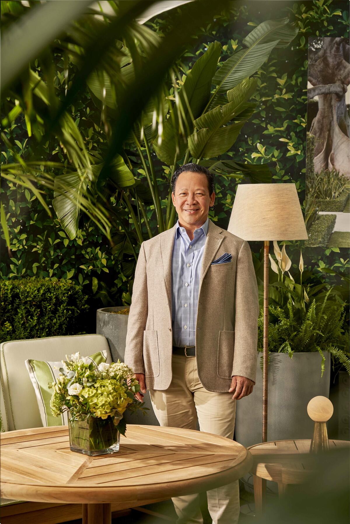
“Inside, we are all yearning for more nature. My travels to St. Barts and Mustique, as well as my work in Florida and the Bahamas, inspired this tropical oasis reminiscent of prewar Palm Beach—a lush terrace in the civilized jungle of Chelsea. I was thrilled to partner with Summit, a company known for its pioneering sustainable tree farming practices throughout Southeast Asia. Its Arc collection suggests the elegance of sailing the seas through its laminated teak intertwined with brushed marine-grade stainless steel, while its Modular series adds to the luxurious outdoor lounge atmosphere. Cushions in Surf’s Up from the Pashmina performance line are detailed in Peridot in the London Crosshatch fabric from Summit’s Nina Campbell collection. They’re paired with throw pillows in Bahama Basket, Madagascar Stripe and Shanghai Labyrinth patterns, also in Peridot, grouped to convey the greens of foliage and the whites of sandy beaches. My favorite flower is the oxeye daisy, celebrated in the Happy Daisy rug I helped design with Jennifer Manners. Hand-woven using her award-winning sustainable performance fibers, it’s bursting with cheerful 3D daisies against an ombre green background. This runner is guaranteed to bring a smile to everyone’s face as they skip off into the sunset after an inspiring visit to the 2024 Wow!house.” —Fernando Wong
This story is a paid promotion and was created in partnership with Design Centre, Chelsea Harbour.
Homepage image: Ken Fulk’s dining room design for the 2024 Wow!house features a statement chandelier made from recycled plastic and a pair of swan centerpieces crafted from collaged porcelain | Courtesy of James McDonald


