In the BOH series What I Love, we’re asking designers to build us a mood board of what’s inspiring them right now.
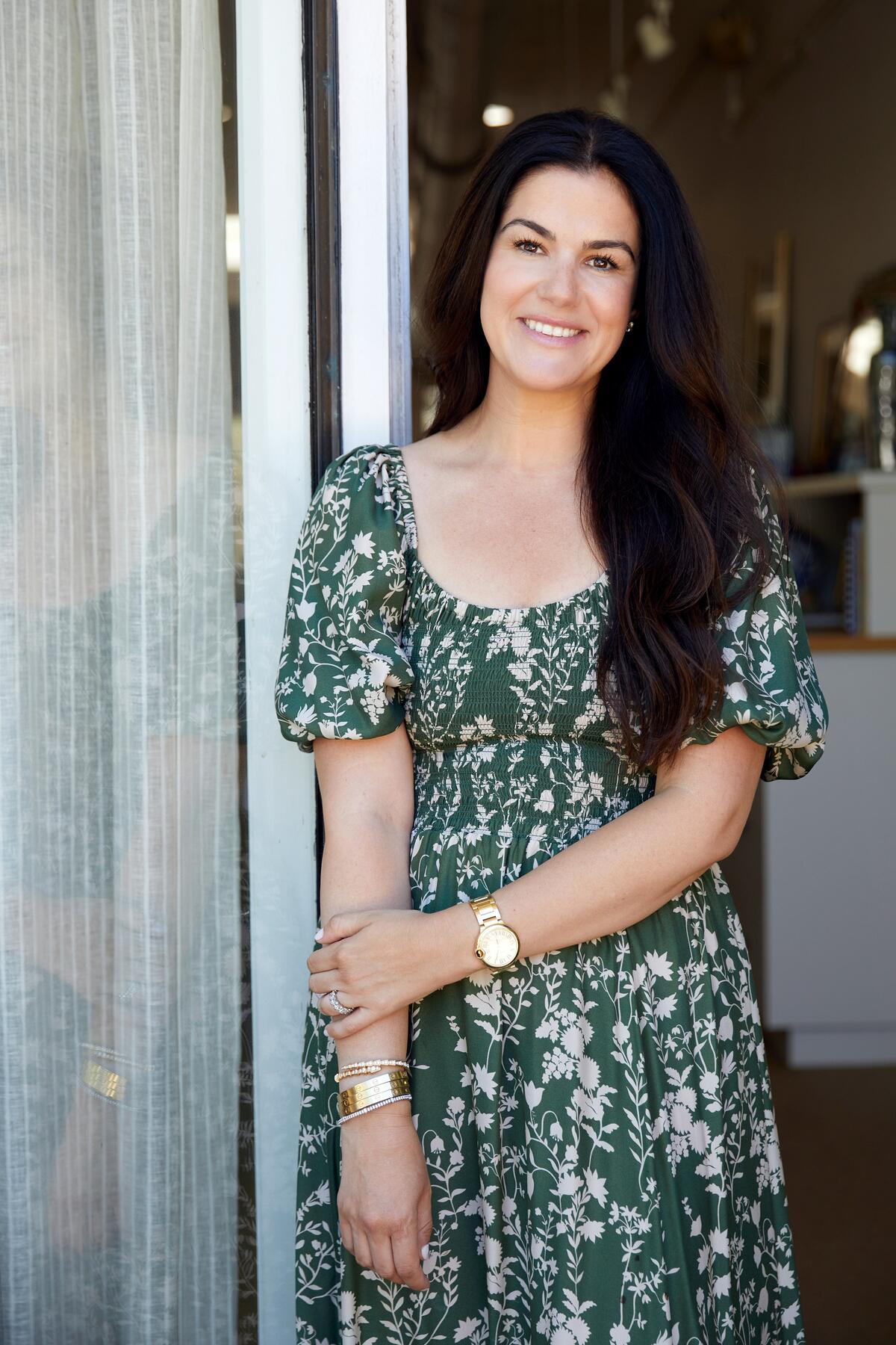
No matter the season, Alexandra Kaehler celebrates green. The designer, whose eponymous firm is based in the Chicago suburbs where she was born and raised, considers her favorite color a new neutral—and knows it can evoke different moods depending on the palette it’s a part of. “It’s so versatile,” she says. “It can be bright and happy, but also subtle and quiet.” And in the case of a vintage Murano vase, playfully pointy too.
Kaehler chose the green colorway of a go-to Brunschwig & Fils print as the jumping-off point for her mood board, which features materials meant to decorate a casual, year-round sunroom “without it feeling overly botanical—because sometimes people worry that green means floral, especially in patterns.” To weave in suggestions of autumn, she added textural raffia, plush corduroy, and warm, grounding limestone. “Green paired with browns and beiges can read very cozy fall,” she says.
Classic glass doorknobs, campaign-style hardware and a tailored ticking stripe round out the mix—all in conversation with Kaehler’s main character: “Green is the hero of the scene,” she says. Here, the designer describes her selections and how she envisions them working together.
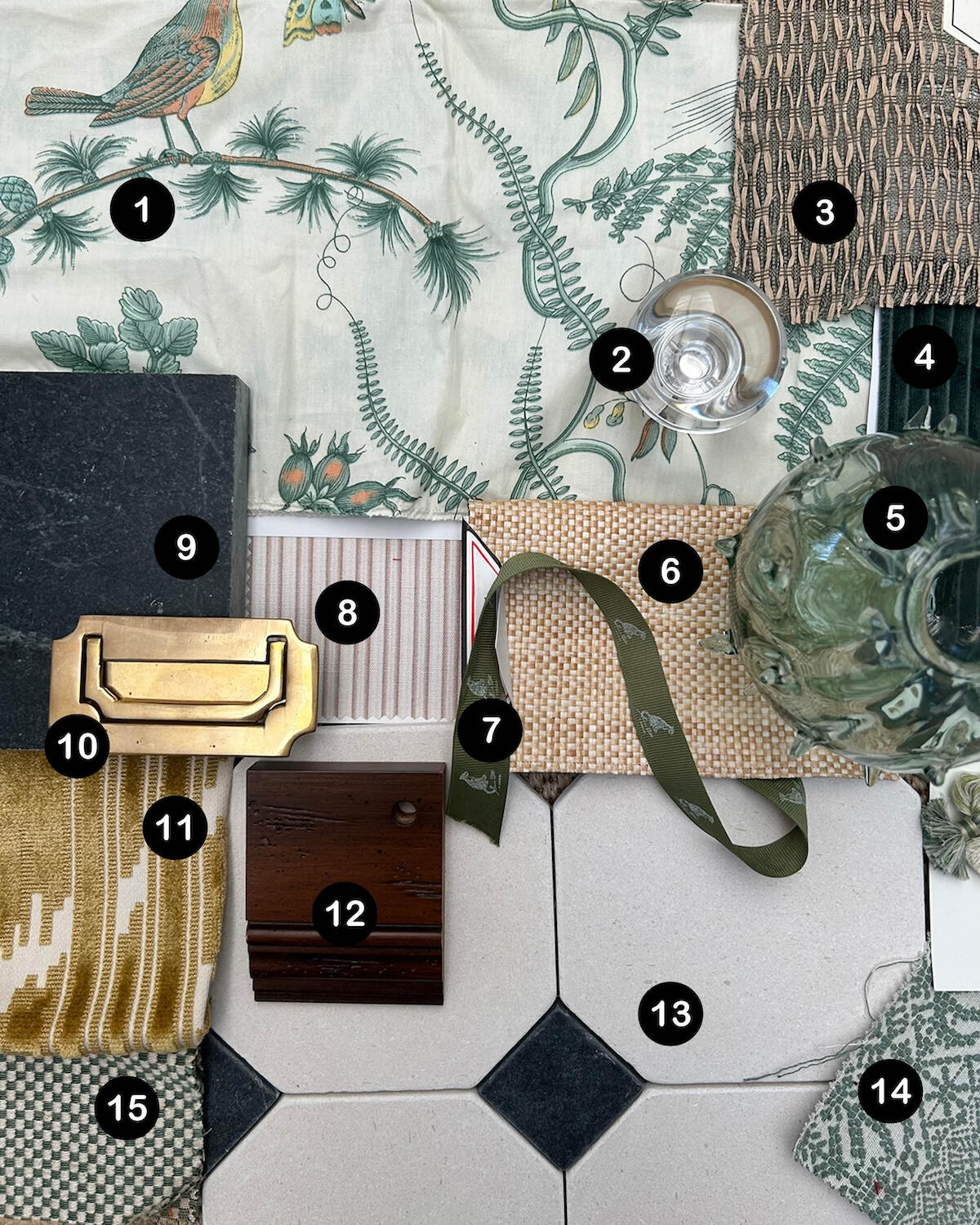
1. BIRD AND THISTLE FABRIC IN GREEN BY BRUNSCHWIG & FILS
“I consistently find myself gravitating toward patterns that are organic in movement and have a leaf-and-vine motif. The birds in this fabric offer an opportunity to pull in a lot of unexpected colors, providing touches of butter yellow, turquoise, even orange. They pair beautifully with the greens and browns—it feels fresh and unexpected. For pillows, chair upholstery and window treatments, this fabric is a classic.”
2. SIMPLE GLASS DOOR KNOB BY P.E. GUERIN
“I think of hardware and lighting as jewelry in a room, so a glass doorknob is an opportunity to add something a little dressier. To me, it reads a bit more on the feminine side. I envision it on French doors, though it would be beautiful against dark wood too. It feels like a chic and slightly more elegant element to contrast with the rest of the pieces.”
3. SHANTY FABRIC IN 03 BY ZAX+FOX
“This olive green fabric has a raffia look to it that offers dimension without feeling like a rug. A sisal can introduce appealing tactility to a room, but it can be hard to add natural, organic elements beyond that. I love that this is a soft textile you could use for window treatments: It brings in all that yummy organic texture, but also has a sheer quality to filter light.”
4. CORDUROY FABRIC IN PINE BY CASTEL
“We’re indulging in a little bit of luxury here. I didn’t want the space to feel overly formal, but I didn’t want it to be too casual either. Mixing in richer materials helps achieve that balance. There’s a weight to corduroy, but paired with the other textiles, there’s also a lightness. This would make a beautiful fabric for plump club chairs—so cozy to sit on. And visually, the rich forest green gives your eye a nice spot to rest. Because it’s a corduroy, not a silk velvet, it still can be interpreted as casual—whereas the Schumacher cut velvet is overtly formal.”
5. VINTAGE MURANO VASE
“Such a find! We take pride in collecting special, one-of-a-kind pieces for the spaces we design. Objects like this Murano vase make a room come to life. It has such a unique, soft green color, and I love the spiky texture—it feels playful, not too serious. You could put a huge bunch of hydrangeas in it, pop it on your coffee table, and you wouldn’t need anything more.”
6. RAFFIA QUADRI FABRIC IN NATURAL BY CASA BRANCA
“This raffia almost has the hand of a wallpaper, even though it’s a textile. I picture it upholstering a cross between a table and an ottoman, because it’s durable and reads as a hard material, but it’s actually soft. Along with the soapstone, it brings durability and wearability to the selections.”
7. GREEN RIBBON BY ALEXANDRA KAEHLER DESIGN
“I pulled in our signature green grosgrain ribbon because it feels so authentic to the colors I personally gravitate toward. You could use it as trim for pillows or the leading edge of the ticking-stripe drapes—maybe the side without the little leopards on it!”
8. NANTUCKET TICKING FABRIC IN NANTUCKET RED BY ALEXANDRA KAEHLER X MERINDA STUDIO
“For that classic feeling, you’ve got to have a ticking stripe. I love the way it pairs with more organic patterns like the Bird and Thistle fabric. The stripes create a sense of order when juxtaposed with prints that have more movement. I like the scale of this particular stripe with not only the Brunschwig & Fils fabric, but also the Zak+Fox sheer: Its repeat is really small, so it doesn’t fight them; it falls right in the middle. If you used the Zak+Fox fabric as a Roman shade, this ticking stripe would be pretty as drapery panels. A vertical stripe can elongate a space with lower ceilings, drawing your eye upward.”
9. HONED SOAPSTONE BY TERRAZZO & MARBLE SUPPLY
“Soapstone has so much dimensionality; it can read black and dark gray and chalky, but it also has gorgeous green undertones. I love that subtlety. And as a natural material, it ties in with the stone on the floor. I see it as the countertop of a bar in this sunroom, or as a tabletop. A fireplace surround would be stunning.”
10. MILITARY CAMPAIGN STYLE FLUSH MOUNT RECESSED HANDLE IN POLISHED BRASS FROM VINTAGE HARDWARE & LIGHTING
“The warm brass of the campaign hardware contrasts beautifully with the glass doorknobs and the greens, browns and beiges of the palette. It’s a nod to the vintage furniture we often incorporate in our designs. And it’s unlacquered brass, so it will patina over time. Antiques always have the most intricate hardware that can’t often be replicated or easily sourced, so I like that if we were having a custom piece built, we could add hardware with some detail to it that didn’t feel too contemporary.”
11. MURAT VELVET FABRIC IN GOLD BY SCHUMACHER
“I would use this gold cut-velvet ikat sparingly, so as not to overwhelm the space. It would be beautiful as a lumbar pillow on the sofa. The ikat is such a luxe complement to the other patterns. I do think if you used it to, let’s say, upholster a chair, then it starts to read much more formal, which is not what I’m going for here. It’s perfect as an accent.”
12. WOOD SAMPLE WITH ESPRESSO FINISH BY REDFORD HOUSE
“I envision a campaign-style chest, and this rich, espresso-colored wood would feature the brass military hardware. The warmth of natural wood is so important in a space like this, especially with a stone floor. It keeps the ambiance intimate.”
13. CUSTOM BLACK-AND-WHITE TILE BY THE FINE LINE
“You see these types of diamond patterns quite often in a Carrara, like a gray-and-white marble. And there’s a place for that. But this is limestone, and I love how much warmth it brings. There’s something so innately cozy about its natural color.”
14. BURIAM FABRIC IN SAGE BY PENNY MORRISON
“It’s all about the play on scale: how it’s a small, dotted pattern but the repeat is quite a bit larger. A print like this would enliven some big, overstuffed pillows on the corduroy club chairs. And as floor cushions, they’d fit right into the garden sunroom theme.”
15. CHEQUERBOARD STITCH FABRIC IN EMERALD BY FLORA SOAMES AT JAMES
“I find that a small-scale checkerboard pattern reads slightly masculine; I like how it speaks to what’s going on with the limestone floor, playfully echoing the grid without feeling repetitive. I picture this fabric upholstering the sofa—with the elongated, gold ikat lumbar pillow across its center.”


