


Here’s a bet. Reach over to your stack of design magazines, pick one—any one—and start reading. Somewhere amid the descriptions of sun-filled living rooms, regal arches and vivid hues, you’ll find something described as a “blend of old and new.”
I just tried it on a 2018 issue of Elle Decor sitting on my shelf. There it was, on page 125—a house in San Miguel de Allende is described as an “ode to both the old and new” of the Mexican hill town. All in all, it took about seven minutes to find.
Describing something as “both old and new” is not unique to interior design, but it is uniquely common in this industry. You’ll find some variation of that phrase everywhere—not just in magazines, but in designer bios, Instagram captions, mission statements and ads for everything from fabric to scented candles.
It’s so common that you’ll often see design writers—maybe bored by its overuse—twist it, turn it or fancy it up to breathe some life into the phrase. Hence more baroque variations like the future nods to the past or the old dances with the new. A personal favorite: In a recent issue of Architectural Digest, the writer Mitchell Owens quotes architect Peter Marino as describing his style as an old-and-new martini, where “the tradition [is] the gin, the completely modern touches are the vermouth.”
In speaking with a handful of design writers, a few reacted with a weary laugh when I brought up the everywhereness of the old-new juxtaposition. “The other one I like is ‘a combination of indoor and outdoor living,’” said Tim McKeough. “It’s overused. But on the other hand, it’s something we all want!” “Old and new” is equally unavoidable. It’s a cliché of design writing the same way red sauce is a cliché of Italian cooking—you’re going to make it.
Of course, most clichés come from a place of truth. “Mixing old and new” is more than just a useful turn of phrase—it’s a quality that the industry seems to reflexively prize. Why?
Getting to the origin of “old and new” leads to some strange places. Go too deep, and you find yourself asking just-took-freshman-philosophy questions like, “What exactly does ‘new’ mean?”
But “old and new” is genuinely hard to define, mostly because when you start poking at it, you realize that the description can be applied to anything. A product that was recently released is, by definition, “new.” And unless it comes from outer space or was crafted in an experimental lab, it references an idea that came before—the “old.” Great. That’s true of any product, whether it’s an Apparatus sconce, a Schumacher velvet, a new toothbrush or a Tesla. Surely, if a definition can fit anything, it means nothing.

Because the idea is so slippery, it’s tempting to dismiss it as empty marketing jargon, the way “curated” and “timeless” have become zero-calorie word garnishes enthusiastically sprinkled over every product description and press release. But “old and new” is different. We know it means something, even if it can be hard to say what, exactly.
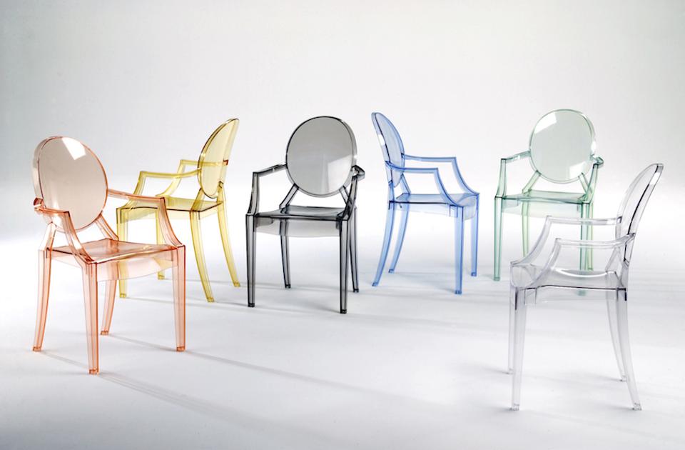
I reached out to Los Angeles designer Timothy Corrigan—a self-described lover of mixing old and new—and we had an enjoyably loopy conversation on the subject. Corrigan cheerfully embraced the concept’s contradictions. Philippe Starck’s famous Louis XVI-in-Lucite ghost chairs? “Those are new,” he said. “Even though they’re 20 years old.”
“It’s about a new idea, a new approach,” added Corrigan. “‘New’ really means an idea. It’s not about being physically new—it’s about the concept being fresh.”
The answer to the old-new riddle is easy to intuit but hard to explain. The “old” doesn’t always refer to literal age. More often than antiquity, it’s about a cultural idea of the past: toile, Chesterfield sofas, hand-craft, ornate detailing and overstuffed pillows. Likewise, “new” doesn’t necessarily mean “recent.” It, too, encompasses a bucket of concepts—the future, the unexpected, technological progress, mechanical production, clean lines and plastic.
That distinction between old and new creates absurdities. Plastic injection molding was invented in 1872, but we wouldn’t say that Vitra Panton chairs lovingly reference old-school craft. Likewise, a hand-knotted rug made in 2022 wouldn’t be celebrated as “brand-spanking new!”
“A mix of old and new” is subjective judgment hiding in objective language. It pretends to describe time, but really it describes taste, culture and comfort. It’s a frame we put around a thing, not the thing itself.
That’s what “old and new” is. But why is the design industry so obsessed with that particular frame? I floated the topic with a handful of people in various corners of the industry and, unsurprisingly, got varying answers. Product designers talked about the challenge of finding new ideas in a sea of sameness. Writers talked about wanting to avoid the cliché. Marketing experts talked about the enduring appeal of nostalgia.
Corrigan described the appeal of blending old and new as a study in contrasts. “You need one to notice the other,” he told me. “The same way you might blend rough and smooth textures to draw attention to each, I try to put familiar and unexpected things together to make each sing.” To him, the appeal of blending old and new is kind of an aesthetic technique—another tool in the kit.

Wendy Goodman, New York magazine’s design editor, described the appeal of “old and new” as almost elemental, akin to our need for companionship or affection. “We’re explorers, and you start to explore when there’s a little bit of a surprise. You respond to things that give you new information,” she told me. “When you look at a room that’s all one style, or one period, it’s really boring. It doesn’t give you a lot of information.”
They’re both right. I’d add that the appeal of blending old and new is particularly suited to the emotional landscape of home. In technology, cars, beauty products, entertainment and even fashion, pure newness is frequently the pitch. You could describe an iPhone as “carefully mixing references to the tradition of Alexander Graham Bell with curated nods to the future,” but no one does.
Home is different. It’s where we want to be at our most relaxed, and where we find ourselves at our most vulnerable. We let our guards down; we sleep; we’re literally naked. On a basic human level—back to prehistoric days—it’s a place where we crave comfort and familiarity. Great home products, and great rooms, tend to acknowledge that need. “New” catches your attention, but it’s hard to only do “new” at home.
All of that leads to a final point: In the design industry, when we talk about “a blend of old and new,” the balance generally tilts toward “old.” Design products are rarely sold—or even described—as blazingly cutting-edge, with a subtle reference to the past. The opposite is the norm.
In that light, describing products or styles as “a blend of old and new” can feel like shorthand for a kind of nervous reassurance: “Yes, there’s a little new in there, but at the end of the day, we’re mostly delivering the traditional, the familiar, the tried-and-true.” Still, designers, marketers and even editors ignore new at their peril.
Goodman happened to take my call while in the middle of a move from one apartment to another—the ultimate old-new moment—and described her temporary dwelling, a room at The Marlton Hotel designed by Sean MacPherson, to illustrate the power of the mix. “My room has 18th-century paneling, wonderful carpeting and sconce lighting, but also a huge overhead light that banishes any nostalgia,” she told me. “That one gesture of that light fixture is really what that hotel is about. If he had hung a glass chandelier that looked like it was trying to be 18th century, it would have been, ‘Oh, God.’ But he’s saying, ‘No, I’m in on the joke!’ That’s really interesting.”
Homepage image: Phillippe Starck's Ghost chair | Courtesy of Perigold


