This month, Business of Home takes a look at three design books that caught our eye: a handbook on color by textile designer Rebecca Atwood, a career-spanning monograph by star French designer Pierre Yovanovitch and a look at the classic Mackinac Island Grand Hotel by Carleton Varney.

Living With Color by Rebecca Atwood
Textile designer Atwood’s new book Living With Color is just as lovely and whimsical as her debut tome, Living With Pattern. Atwood encourages the reader to think about how color makes them feel and not to shy away from hues that bring them joy. She walks readers through the process of creating a palette and, using real homes as examples, shows how using color can create spaces that are soft and subtle as well as vibrant and bold.
More than just a style guide, Atwood’s book takes the conversation around color in refreshingly unexpected directions: She writes eloquently about the Himba tribe in southern Africa, who have many names for the color green but none for the color blue. She uses the example of the Himba to spur readers to consider the language that surrounds color as well the hues themselves. It’s a comprehensive look that encourages a more thoughtful discussion of a design building block. —Haley Chouinard
The showstopper: In the section of the book focused on real homes, there’s an apartment in Queens, New York, that uses a bold palette of blue, orange and tomato red that blends together to create a surprisingly soft, dreamy effect (page 124).
Choice quote: “Open yourself up to new ideas about texture, usage, tint and shade, and the positive associations that follow will surprise you.”

Pierre Yovanovitch: Interior Architecture by Pierre Yovanovitch
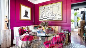
Over the course of a 20-year career, Yovanovitch has perfected a blend of two seeming opposites: grandeur and humor. One image from this, the French interior designer’s first monograph (what took so long?), sums up the look nicely: a large, impressively stern monolithic sculpture serves as the backdrop for three fuzzy armchairs with teddy bear ears. Richard Serra, meet Goldilocks.
Elsewhere, the much-lauded designer (his is often the only French name on the AD100 and Elle Decor A-List) creates modern palaces and exquisite hideaways across Europe and occasionally New York. His work is a testament to the fact that a strong voice—not play-it-safe restraint—is what makes a room feel classic and timeless. —Fred Nicolaus
The showstopper: There are a lot of contenders, but Yovanovitch’s work on his own home—a sprawling Provence chateau called Fabrègues—is tough to beat. A pitch-perfect combination of classic French architecture and playful modern detailing, it's a thesis statement for the designer’s aesthetic as a whole (page 49).
Choice quote: “Some people dread moving houses. Personally, I have repeatedly made the choice to make it happen. Regularly changing my living environment is something I relish. It feels to me like a breath of new life.”

Rooms to Remember by Carleton Varney
On a tiny island in Lake Huron sits Michigan’s Grand Hotel, which boasts, among other hallmarks, the world’s longest front porch (that this writer has a few fond memories of running up and down as a kid during summer vacations). Varney was tapped to redecorate the Victorian hotel in 1976 and this fall, he’ll release Rooms to Remember, his 36th book, which gives readers a tour of the iconic property.
Among the highlights are the First Lady Suites, collaborations between Varney and each former first lady—many of whom he worked for personally on both private and official projects—to create a space that reflects their personal aesthetic. Other rooms are inspired by an array of figures from history and pop culture alike, from Napoleon Bonaparte to Gloria Vanderbilt. Varney’s sense of humor is felt throughout: Witness the “Reagan Red” he used in the Nancy Reagan suite. With more than 40 years since Varney first took the hotel on, it’s easy to see why the place still occupies a place of pride in his portfolio. —Haley Chouinard
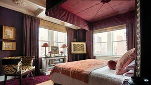
The showstopper: The Napoleon Suite, with its appropriately over-the-top palette of sumptuous reds and playful grandiosity.
Choice quote: “Each year I add ephemera—be it photographs, artworks or other pieces that I happen across that relate to the room. I continue to collect for Grand Hotel to this day.”
Homepage photo: Design by Pierre Yovanovitch, photo by Jérome Galland