Showhouses are designed to provide inspiration—but often visitors walk out with ideas that feel more aspirational than attainable. Enter the Real Simple Idea House, the magazine’s second-annual showhouse, located in a new-construction townhome in Brooklyn. Brimming with solution-oriented design and DIYs, the space swaps fussiness for elevated accessibility.
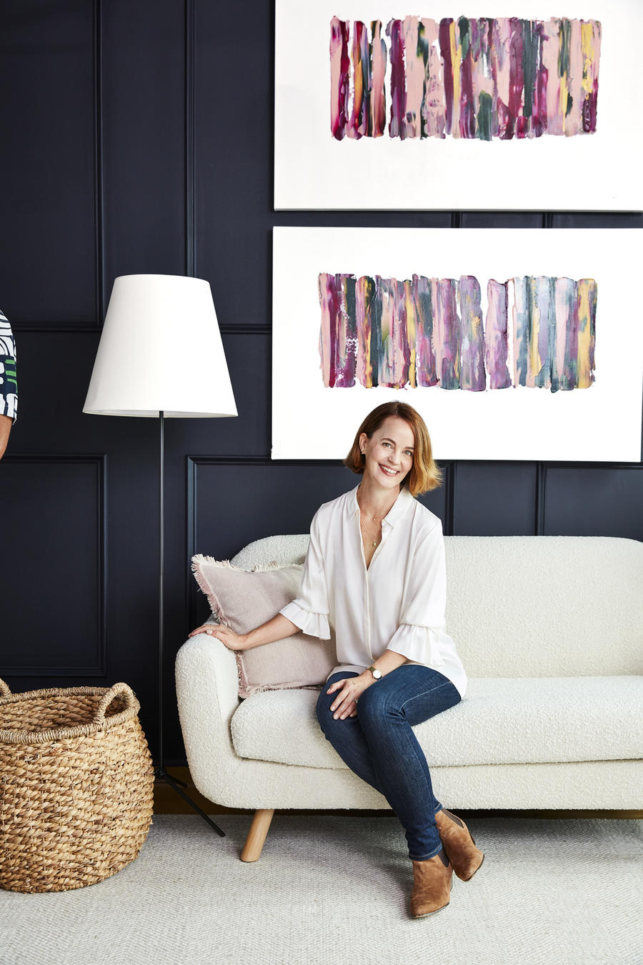
In addition to spaces designed by Real Simple’s editorial team, the brand tapped designers Anita Yokota, Cortney Bishop, Shavonda Gardner, Carmeon Hamilton, Emilie Munroe, and Paige Sumblin Schnell; DIY bloggers Mandi Gubler of Vintage Revivals and John and Sherry Petersik of Young House Love; and organization experts Ashley Murphy and Molly Graves from NEAT Method to furnish the home with inspiring—but also functional and affordable—furnishings and solutions.
In a sign of the brand’s focus on ideas that visitors can truly take home with them, the Idea Home is completely shoppable via smart codes. “We're creating an idea home for real life and real people,” said Leslie Yazel, editor in chief of Real Simple, in a statement. “We'll show how a home can be both incredibly beautiful and extremely organized—and making it shoppable creates an elevated but accessible experience, just like the Real Simple brand itself.”
The showhouse will be open to the public on October 24; the home’s interiors, as well as tips and takeaways from its designers, are also featured in the brand’s October issue, which debuts September 20.
BOH caught up with Yazel to talk about how to make a showhouse for the Real Simple reader, why accessibility matters, and what design decision (briefly) kept her up at night.
You chose a home in Brooklyn for last year’s inaugural Real Simple Idea House—and have said that at the time, it felt like a risk. But the house was a huge success. What is it about the borough that resonates with your audience?
You want the location to be a magnet for all your events but I also wanted it to relate to the Real Simple audience. So while Manhattan is great for dinner and a Broadway show, Brooklyn feels more homey, a little quieter and more relaxed, and the spaces reflect more of our readers’ experience nationwide—good closets, a laundry room, outdoor entertaining space. We are keeping it real in Brooklyn!
What was important to bring forward from the first iteration of the house? And what elements were new?
The crucial idea we kept: Real items that real people can purchase or DIY. I love the expressions on people’s faces when they tour the home and learn how affordable and accessible so many of the items are—but we still have aspirational items and a few custom things to spark ideas. And organization is key. Real Simple is a magazine about living an organized life (as much as any of us can!), and so we again brought in the NEAT Method organizers to corral and streamline and create solutions with a list of questions: Where will the mail go? Where would someone hang a robe? How do you keep the fridge neat? (Answer: Clear mini lazy Susans on the shelves.)
What’s your favorite takeaway from this year’s home?
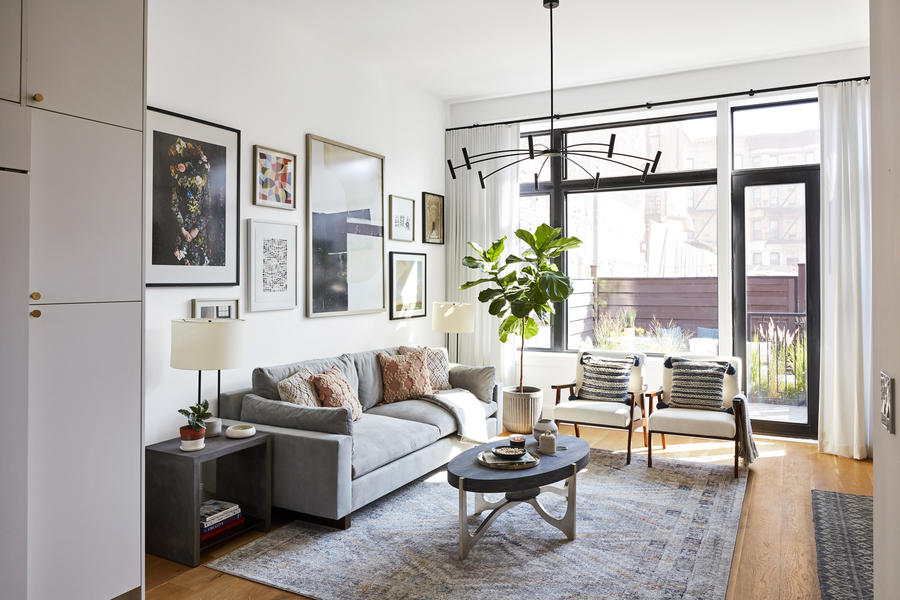
So hard to choose! One design challenge that we mastered this year is how to design around a TV. If you don’t have a separate viewing room, how do you make it functional without making it a dull focal point? Samsung’s Frame TV really solves that—when it’s not being used as a television, you can display works of art on the screen. If you use it as part of a gallery wall, it doesn’t even vibe TV. You feel that when you see it in the home.
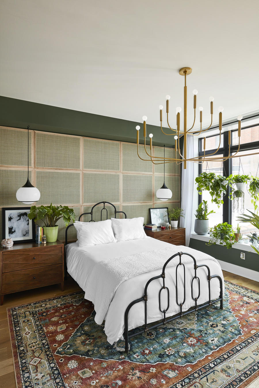
Window treatments are always tricky, and I love what Mandi Gubler of Vintage Revivals did in the master bedroom by hanging a row of leafy plants across the windows that will continue to grow and create a natural “curtain” for the room. It’s something that anyone can do at any price point. (She also chose the double dresser from The Home Depot in that same room that my husband and I just assembled for our own bedroom last weekend—I saw it and realized what an affordable find it was. That’s the beauty of an idea home.)
What’s the secret to creating such meaningful experiences for partner brands?
Not everything would work in the home; we’re selective. Our home director, Stephanie Sisco, has a magical touch with these integrations, and because we want the home to feel real—shampoo in the shower, detergent in the laundry room—integrations are natural.
But another strategy is how we use the idea home to host sales calls. The Home Depot, who is a sponsor this year, came through last year and saw how people could experience their products firsthand. Plus, our publisher, Daren Mazzucca, is supportive of editorial vision and our brand aesthetic—and that’s key. Glade is a sponsor and its integration is subtle—I love being in the home with a group and holding up their three-wick candles and saying, “It burns for 24 hours and costs less than $5 and the wicks are self-trimming,” and making people guess the brand. We’re featuring products that are easy to get excited about, and that’s really the secret.
How did you select the designers who participated? And what was their mandate when they got assigned their rooms?
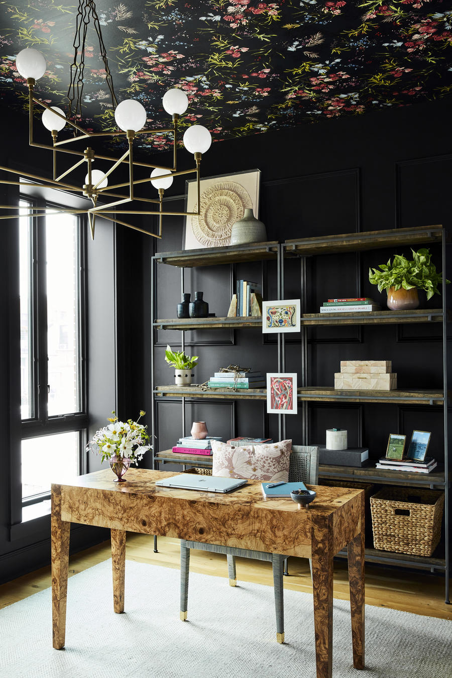
It came down to designers from across the country who understand our brand, who won’t go too nutty with high price points, but will push us a little out of comfort zones, too. Take Shavonda Gardner and Carmeon Hamilton—they put wallpaper on the ceiling of the home office! I was a little nervous when they sent the mood board, but of course it’s a brilliant move and a real showstopper moment in the home. I only lost a little sleep over that one.
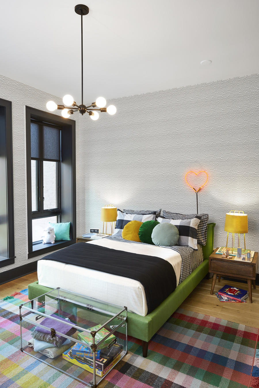
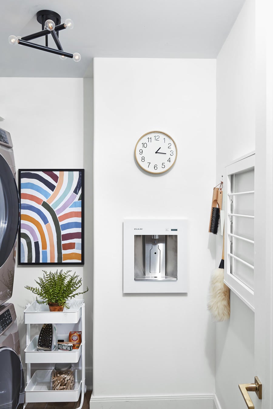
After our team’s walk-through, we kept talking about the water bottle refiller in the laundry room. How do you create those modern, high-tech moments in a way that feels practical and thoughtful?
After I met with Elkay last year, I spoke with a lot of families I know around the country about whether they would really use a bottle refiller in their homes. It was a new idea for many, but people suggested they would want it to encourage kids to keep hydrated in a playroom area, or refilling a water bottle on the way out the door so that they wouldn’t end up buying a plastic one, or having one near the backyard so that people weren’t tramping through the kitchen for water. In the Real Simple Home, ours is in the laundry room near the playroom, which goes well with our Laundry Room Theory: You’re in the laundry room more than you realize—take some steps to trick it out, say, with wallpaper or a nice piece of art or a water bottle refiller—and it’ll boost your mood that little bit each time you’re in it.


