In our series, What I Love, we’re asking designers to build us a mood board of what’s inspiring them right now.

Rachel Cannon is having a moment with warm colors. Lately, the Baton Rouge, Louisiana–based designer has found herself gravitating toward rich neutrals over cool hues. “I’m tired of all the light blue and white designs that have drenched our region,” she tells Business of Home.
Her present flat lay further illustrates the point. Designed with a fashion-forward client’s home in mind, she employed a medley of creamy neutrals and brassy golds to create a comforting and eclectic tone. “The palette is muted and soft, echoing her kind personality,” she says.
Cannon describes the final scheme as “edgy, with a hint of femininity,” brimming with tactile, all-natural finishes and simple yet sophisticated graphic motifs. “Warmth can be created through color, but also through texture,” she says.
Here, Cannon breaks down the details—from grasscloth wallpaper to antique mirror samples.
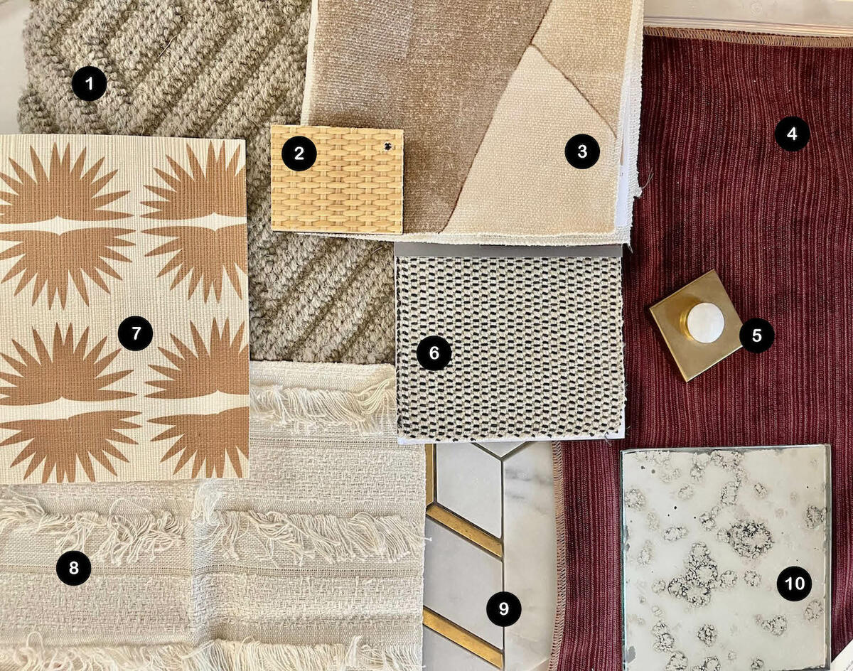
1. CADENCE RUG IN SILVER RIBBON BY FIBREWORKS
“This Fibreworks rug is completely classic. It is free of trends, durable for the foot traffic that this space will experience and will go with nearly everything we add to the design. It’s not the first time I’ve specified it, and it certainly will not be the last.”
2. NATURAL RATTAN POLO FINISH SAMPLE BY VILLA & HOUSE
“This grasscloth finish sample from Villa & House is timeless and versatile. I love that it brings a subtle texture to side tables, dressers and storage solutions.”
3. DISTRICT FABRIC IN SILT BY KELLY WEARSTLER
“This fabric by Kelly Wearstler is quite popular in the blue/green colorway, but I love it even more in the Silt color that showcases varying shades of sand. It sticks with the bold, graphic patterns that represent our client’s style.”
4. 90198L76 FABRIC IN 76 (AUBERGINE) BY CENTURY FURNITURE
“We were very intentional about selecting a deeply saturated color as the statement hue for the space, and fortunately, our client embraces bold shades.”
5. MODERN GLAZED GILT FINISH SAMPLE BY JULIE NEILL
“This sample is from one of my favorite lighting resources, Julie Neill. With natural and neutral textures, it’s nice to add a splash of brassy gold to the space to balance things out.”
6. CAYUCOS INDOOR/OUTDOOR FABRIC IN CARBON BY SCHUMACHER
“It’s important to mix in a nearly solid fabric to complement the bold graphic patterns in the space.”
7. CRANE GRASSCLOTH WALLPAPER IN GOLD BY KRISTY STAFFORD
“I love this grasscloth wallpaper for its warm colors, texture and graphic design. I’ve been leaning into warm colors lately for the inviting feel they provide.”
8. ACADIA DRAPERY FABRIC IN IVORY BY SCHUMACHER
“I love the warmth and texture this drapery fabric brings to a space.”
9. LAVALIERE INTERMIX MOSAIC TILE IN ALLURING WHITE WITH BRASS BY DALTILE
“I often use a mosaic tile design, and this one feels just right with its warm metal detailing and geometric pattern.”
10. ANTIQUE MIRROR SAMPLE
“I love the patina and the nonrepeated pattern that an antique mirror finish provides. I’ve used antique mirror finishes on side tables and accent mirrors, and the aged look it brings to a room is always welcomed.”
Homepage photo: A flat lay by Rachel Cannon | Courtesy of Rachel Cannon Limited Interiors


